Bumble went public on Thursday, and investors were very much interested in swiping right. The dating app, which soared in its first day of trading, is well-known for letting women make the first move. And in fact much of its success is due to this fundamental design decision.
Head of product design for the Bumble app Lara Mendonça joined the company in September 2019, when the core user interface had already been established. But the last year and a half has seen whirlwind expansion for her team—which grew from 1 person to 12—and was key to laying the foundation for this week’s wildly successful initial public offering.
Key to Mendonça’s overall design philosophy is putting women—whom she describes as “vulnerable users”—first. That might sound like a strange characterization, but consider how excruciating it can be to use dating apps as a woman. “Most of all, it’s a women-first app. We don’t hide that. It’s part of our mission,” Mendonça says. “Solving problems for women is something that will solve problems for everyone. Part of that is a principle that I believe in that when you choose a vulnerable user, instead of an average user, you are designing for more people and designing a product that will be better for people in general.”
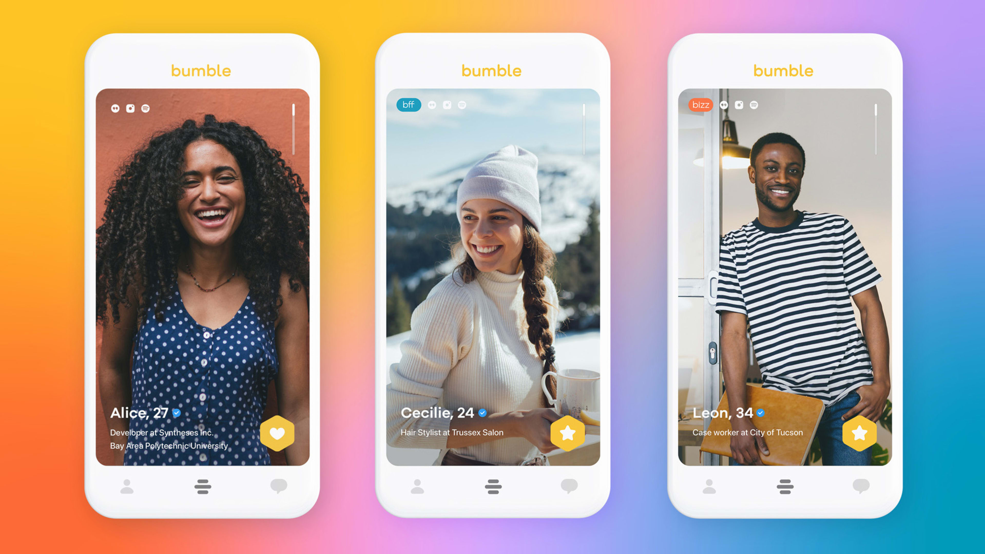
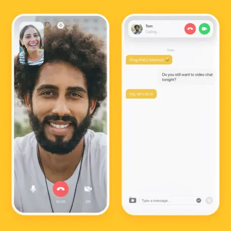
The app’s bright yellow color is meant to spark happiness. Mendonça’s team has also introduced diverse illustrations that are meant to represent an audience of all backgrounds. Simple interaction models make it easy for people to use Bumble without feeling cognitively exhausted. (Dating does enough of that on its own.) Most users sign on to the free version of the app, according to Mendonça, who adds that her team’s goal “is to make our user successful using the free product.”
“The singles market is huge. We are looking for people with values,” Mendonça says. “We push for kindness, respect, healthy relationships—people looking for love and friendship in a healthy, equitable way.”
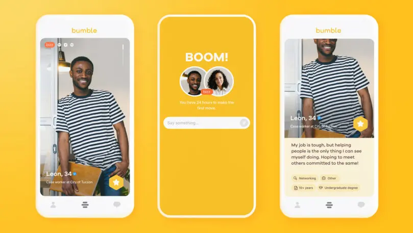
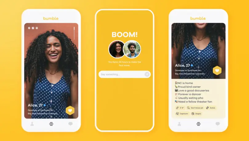
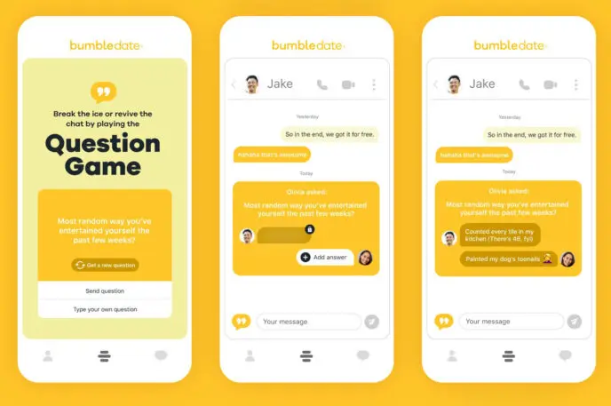
She calls the design of the emotional side of dating the app’s “EX,” and this plays out in finding ways to make the interface feel both fun and safe. One example is a kind of game-show question game that users can play with their matches in chats. It’s one experience that makes interaction less about inane small talk and more about surprises. Mendonça plans to introduce more such experiences throughout the year.
But ultimately, it’s what the app doesn’t do that makes it so successful. With a robust team, Mendonça tackled opportunities to improve small parts of the user experience, improving discovery features and navigation, and simplifying the onboarding process with fewer questions. “We wanted to give more personality to that area of the app because it’s the first impression,” she says.
Now that those functional improvements are out of the way, Mendonça says her focus is on raising the dating app design standard. She says it’s easy for her team, which works cross-functionally, to have conversations with other departments about how to continually improve the app. Mendonça brought content and visual designers onto the product team to work together on the copy that appears on each screen, and to integrate visuals like the previously mentioned illustrations. That’s why, she says, “you can see changes in the app that pushed our users to see the value in coming to Bumble versus other companies.”
Mendonça adds, “The mindset we have now, the team we have now, reflects the diversity and unique point of view of our users. We gave enough signs to investors that we are getting there even if the team is in its infancy.” The design team under her tenure—a year and a half in the making—has made the most of the famously bright yellow app. And now it’s helping make the company a whole lot of green.
Recognize your brand’s excellence by applying to this year’s Brands That Matter Awards before the early-rate deadline, May 3.
