


Times have been changing at the San Francisco Symphony. Michael Tilson Thomas, the orchestra’s music director of 25 years, stepped away from his role in 2020. In came innovative Finnish conductor and composer Esa-Pekka Salonen. And with him came the need for new branding that reflected the symphony’s next act.
[Image: courtesy Collins/San Francisco Symphony]The orchestra tapped the San Francisco office of design agency Collins for the rebrand, giving it a mission to showcase SFS as the “orchestra of now,” according to SFS creative director Larry Williams. Key to this was establishing SFS as a place of innovation and correcting for classical music’s perception problem: that “classical” equals dusty, static, and historical, not contemporary.
The Collins team, led by creative director Louis Mikolay, created a type-forward new brand that’s decidedly contemporary and dynamic, with an elongated serif typeface that, like music, shifts based on mood, context, and medium. The modernized brand is more friendly and accessible, widening the tent by targeting not just younger audiences, but an array of music aficionados, whether classical fans or not.
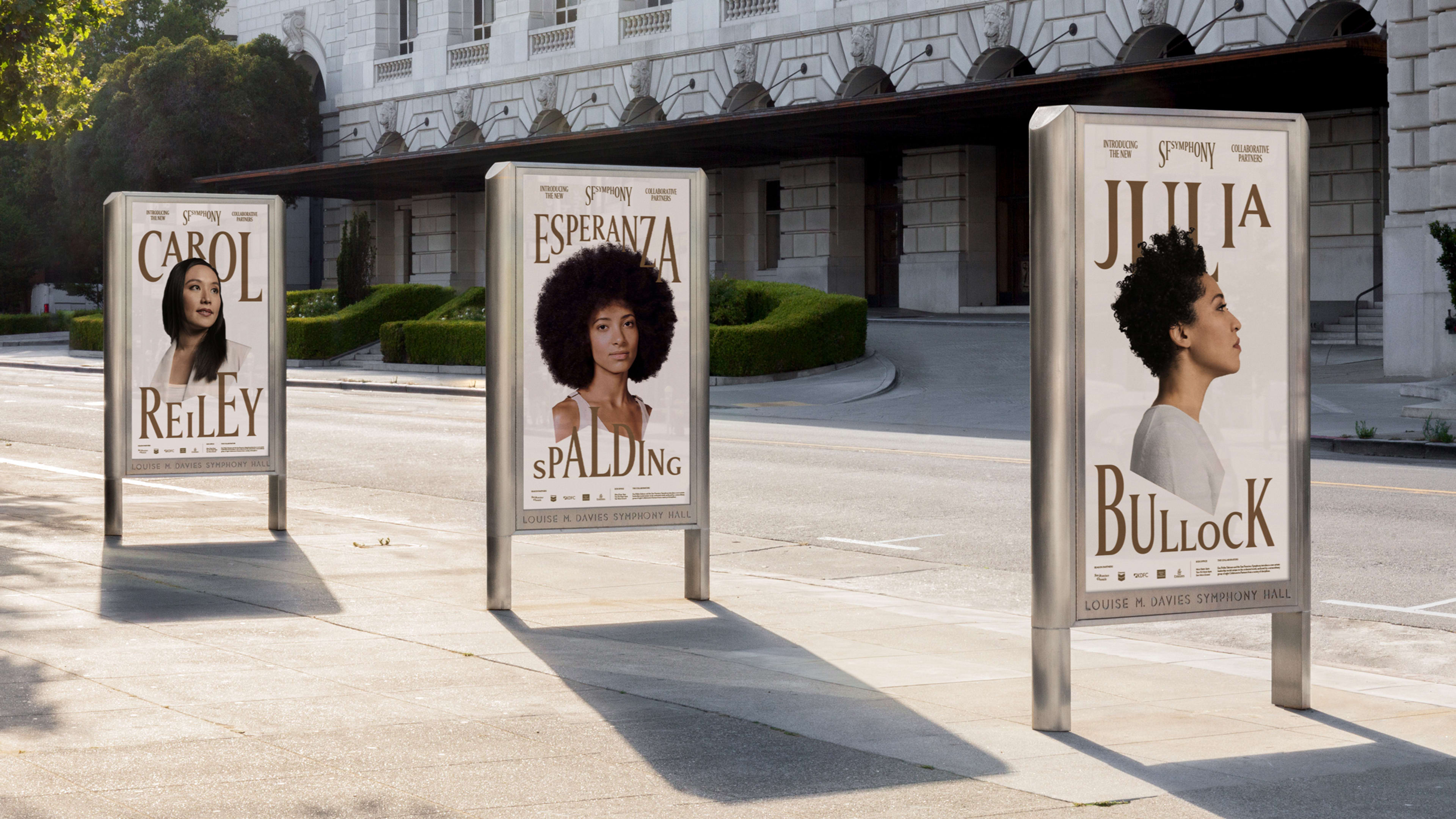
[Image: courtesy Collins/San Francisco Symphony]The need for a brand refresh speaks to a longstanding trend of orchestra audiences skewing older. The average age of audiences at the Metropolitan Opera and the New York Philharmonic was 57, according to The New York Times. With the introduction of Salonen, the San Francisco Symphony is introducing an “entirely new blueprint for modern symphonic music,” according to a spokesperson, which includes a new leadership model made of eight partners. You don’t have to know classical music to know all of their names: Bryce Dressner of indie rock band the National, artificial intelligence entrepreneur Carol Reiley, bassist Esperanza Spalding, classical vocalist Julia Bullock, experimental flutist Claire Chase, violinist Pekka Kuusisto, and composer and pianist Nicholas Britell.
[Image: courtesy Collins/San Francisco Symphony]The modern approach plays out in its new look, which patrons will see on everything from posters outside the box office to tickets to the website and social media. The static typeface of yesteryear, which looks the same no matter where it’s applied, is gone. In its place is a new custom, variable typeface called “ABC Symphony” that evokes the sensation of singing. The typeface “has all the qualities of traditional classical music: sophistication, elegance, slight grandeur,” says Mikolay, but with a key difference: The team gave it a contemporary behavior, so “it can react, stretch, and skew and bend in reaction to sound.” Letters in the same word might be incrementally shortened or attenuated, so the logo, which reads “SF SYMPHONY,” arcs from left to right like a crescendo. Some words lean forcefully to the right for emphasis, like a pianist playing forte.
[Image: courtesy Collins/San Francisco Symphony]The color palette is playful too and expands from the classic black and white to sandy off-white and olive green, bright pinks, aubergine, okra, and electric yellows and limes, all inspired by the colors of San Francisco. The secondary color palette is so wide that it’s easy to make your own associations with other music genres—the vivid yellows and oranges reminded me of the psychedelic rock posters by designers such as David Byrd and Victor Moscoso at the ’60s-era Fillmore East. The Symphony+ logo seemed to evoke Madonna’s namesake album. When I asked Mikolay about these associations, he says they weren’t sources of inspiration for the identity itself—they took more inspiration from the branding flexibility of other contemporary art institutions, such as London’s Tate Museum or the Whitney.
And they knew what they didn’t want it to evoke: the grandeur and old-school feel of original, big European symphonies. “It was a deliberate move not to go anywhere near that, and say this is San Francisco, this is the place that’s reinventing the world yearly or monthly almost, and we need to feel like that—in a way that doesn’t alienate all those existing audiences and in a way that can be taken seriously by the global classical music scene.” (Some longstanding institutions, like the Paris Opera, New York Philharmonic, and Boston Symphony are also introducing new approaches to programming to get younger and more varied audience members in seats.”)
The brand also includes a digital tool called a “Symphosizer.” The interactive audio tool allows you to play around with the type yourself by typing words that change in size and shape depending on how loudly you speak. It’s currently available on Collins’s site, but it will also be a tool for the San Francisco Symphony creative team to build content of their own in the future.
In all, the rebrand is a balance of the traditional and timeless, according to Mikolay. The brand is fresh enough to have outside audiences give it another look, but familiar enough to keep those season ticket holders in their seats. Ultimately, the onboarding of a new musical director meant a new opportunity for the symphony to broaden its appeal—and maybe give classical music a modern hit.
Recognize your brand’s excellence by applying to this year’s Brands That Matter Awards before the early-rate deadline, May 3.
