We’ve seen a devastating onslaught of COVID-19 data over the past year. The virus has killed more than 430,000 people in the U.S. and more than 2 million people around the world. These numbers can be daunting, and after nearly a year of public health restrictions, it’s easy to get numb to what they represent.
A new COVID-19 data tracker from The New York Times brings fresh immediacy to the numbers, with searchable, county-level visualizations that show more relevant information to readers.
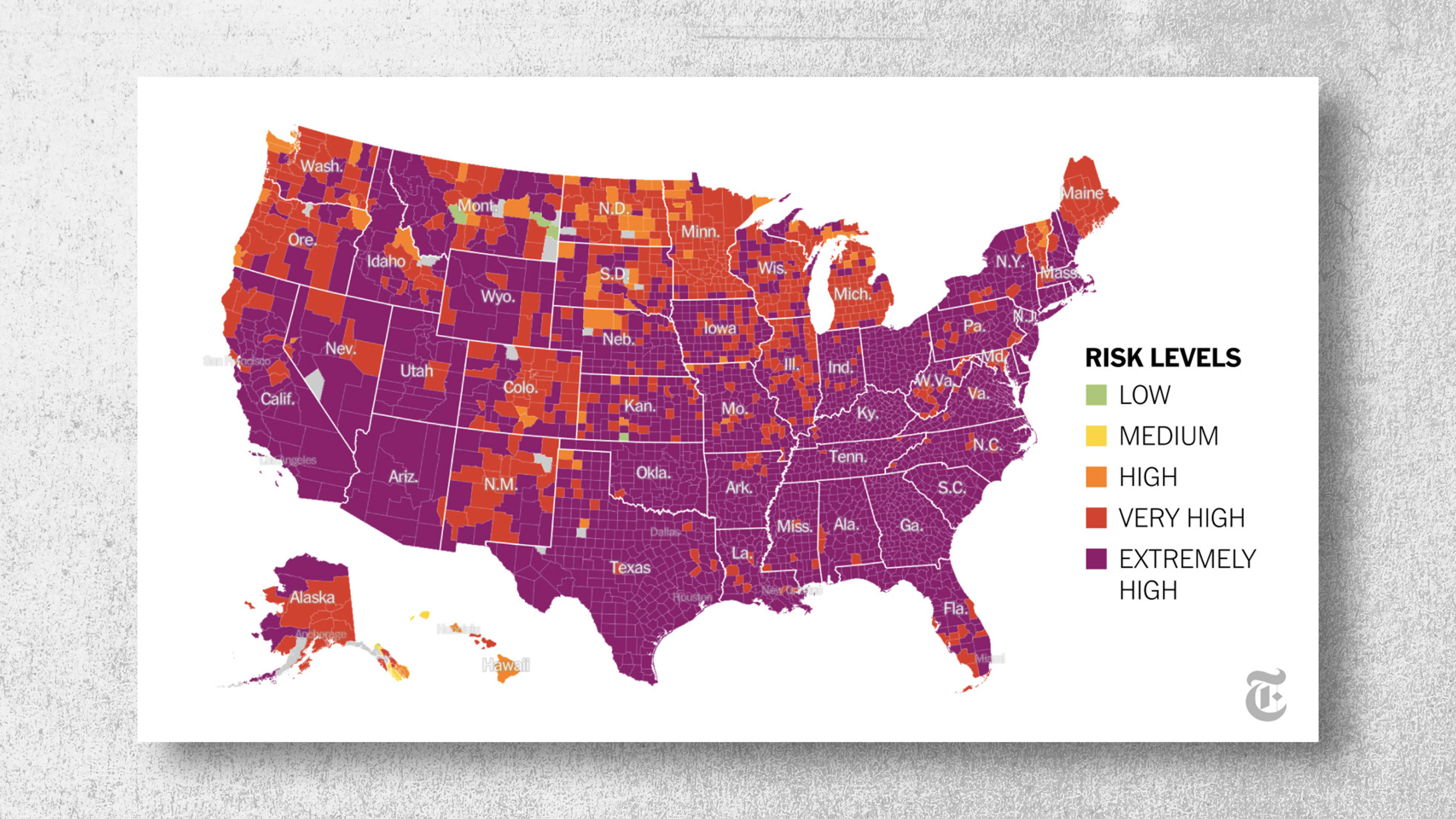
Graphs, charts, and visuals have been an intrinsic part of understanding the pandemic. The line chart that tracked and projected case numbers gave us the vocabulary “flatten the curve,” while The New York Times’ layouts have consistently shifted to express the gravity of this moment. This web package takes data visualization a step further by pairing the data with actionable information; it’s not just a reference point. It’s a guide.
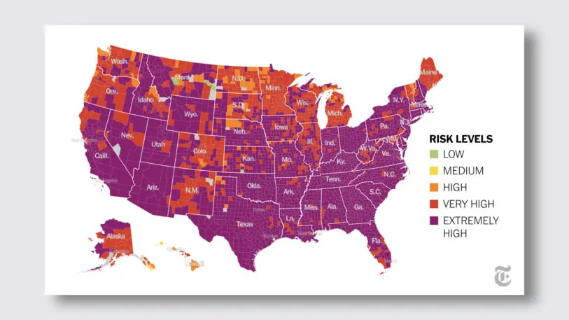
The project is chock-full of information. The national map on its front page is a sea of sameness—covered in extremely high risk purple and very high risk red. But users can drill down into the data by searching for their county. This opens a dedicated county page that shows data unique to that area, like hospitalization rates, cases since April, deaths over time, and a heat map showing the ICU occupancy at local hospitals. Each county also has a drop-down menu of activities you should stay away from (i.e. hanging with friends indoors) and ones that are okay (getting medical care).
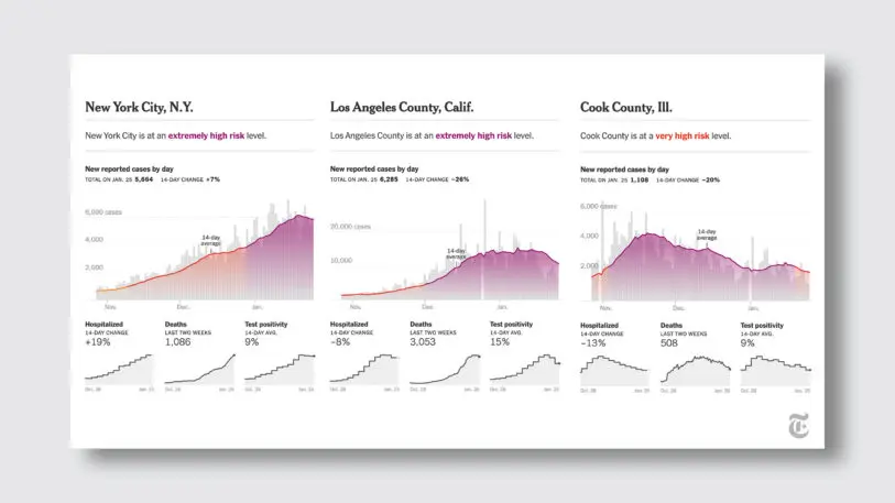
It also gives the data an immediacy that the news—or even other national trackers—often doesn’t convey. “If you can see yourself in this data set, it creates an additional attachment to the story,” says Andrews. “The local angle on this, [which] places you in this story, is one way to make that feel more personal.”
Andrews’ team hopes that building a personal connection to rather impersonal pieces of data will encourage people to better manage their risks and make more informed choices. And hopefully, put these numbers in the past for good.
Recognize your brand’s excellence by applying to this year’s Brands That Matter Awards before the early-rate deadline, May 3.
