
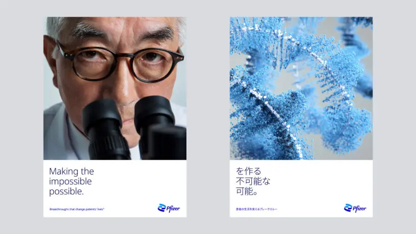
Pharmaceutical giant Pfizer has unveiled its most significant brand refresh in about 70 years. It includes a new logo, dropping the blue pill shape for a double helix-inspired mark, which conjures the science that gave rise to the company’s COVID-19 vaccine. It’s the final step in a shift the company began in 2019, moving from a diverse collection of consumer brands to a more science-driven agenda creating prescription drugs and vaccines.
Over the past couple of years, the company has spun off both its consumer health and off-patent drugs divisions, shedding familiar brands like Advil, ChapStick, and Viagra. Today, Pfizer’s best known product is a COVID-19 vaccine, created in partnership with BioNTech SE. The new brand identity is meant to convey Pfizer’s transition to what CEO Albert Bourla has called, a “smaller, science-based company.”
“As it became clear we had a highly effective vaccine that was going to be a game-changer, we moved very quickly to finalize this work because it was the last chapter in the book, not the first,” says chief corporate affairs officer Sally Susman.
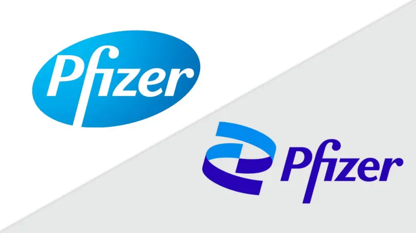
The logo won’t win any design awards. Even with the swirling mark, it still has the corporate look of a gray suit. (On the bright side, it doesn’t resemble an Urban Outfitters pop-up shop, or modular synth festival in Berlin.) But it does a better job of capturing Pfizer’s aspirations than the previous logo, which was shaped like a pill, and helps the company shed some of the less savory aspects of the pharma industry’s image, like opioids and erectile dysfunction pills.
[Image: courtesy Team Design]Pfizer is leaning hard into the narrative that it is a champion of science. In April, the company launched a “Science Will Win” ad campaign, as a cheerleading exercise for the vaccine race. Pfizer released its newest ad for the campaign to coincide with the identity refresh. The tagline has become the company’s own: “This is the way.”
“Science is bigger than any individual. It’s not a chest-beating campaign,” says Susman. “We’re humbled by the responses we receive. Every morning I get texts and emails from people describing their experience getting the vaccine or administering the vaccine, people crying, taking selfies, even praying while they’re being inoculated. It’s moving. ‘Science will win’ has become a mantra within Pfizer. We have masks and T-shirts that say ‘Science Will Win.’ We often sign off our Webex conference calls with Science Will Win. It’s lodged itself very deeply.”
Recognize your brand’s excellence by applying to this year’s Brands That Matter Awards before the early-rate deadline, May 3.
