In August, after months of nail-biting, Joe Biden’s campaign announced that Kamala Harris was the VP candidate. And while her presence on the ticket was historic, the logo itself wasn’t especially out of the box. In fact, the design community largely believed that it was effective but predictable.
That was the point.
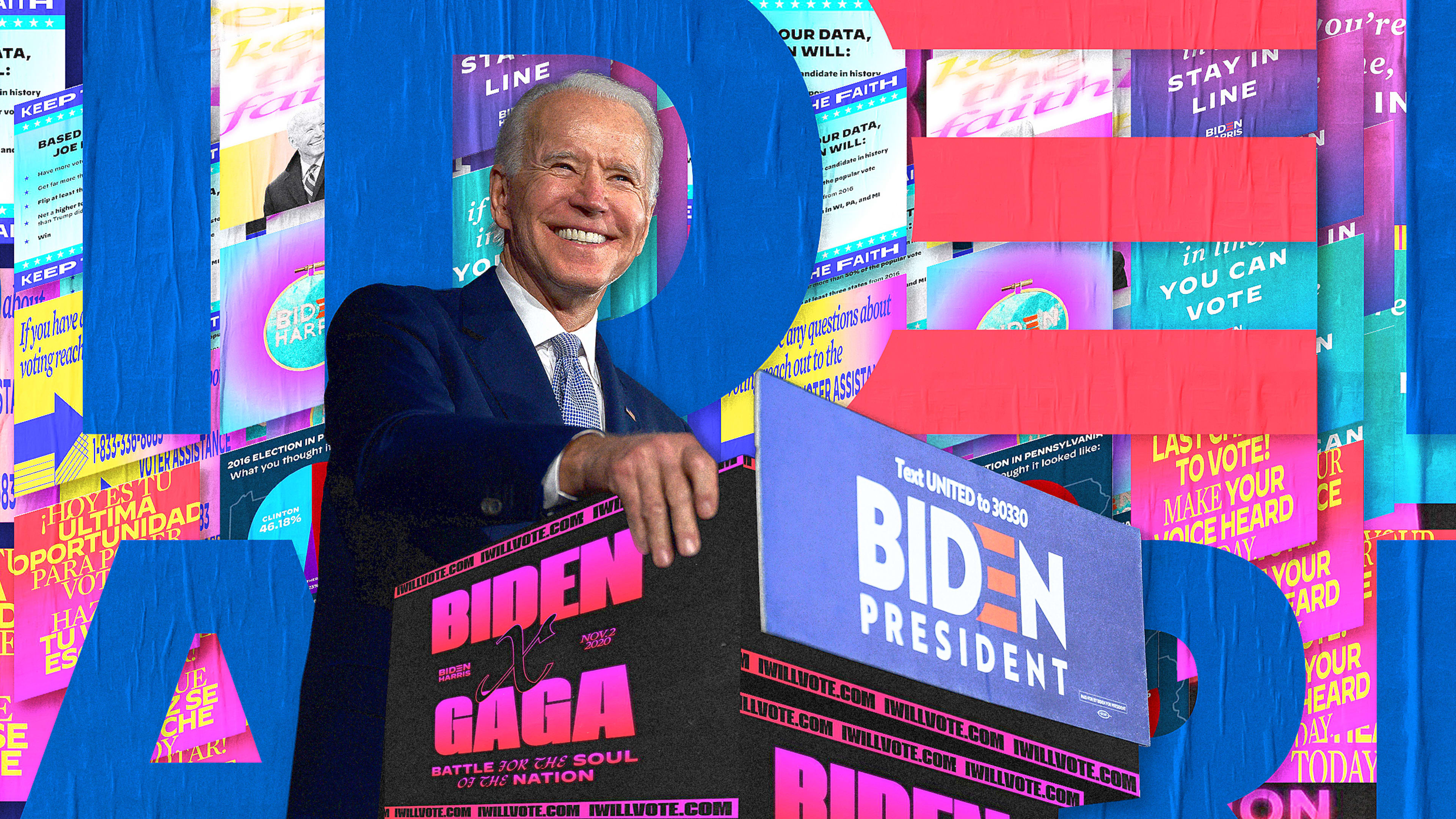
This Biden-Harris logo marked the beginning of the final stretch of the campaign and the last pitch to American voters. The mark would “define the future of the country,” according to senior creative adviser Robyn Kanner. It had to appeal to millions of people from all walks of life.
But in 2020, finding common ground seemed like a tough sell. And designing for broad appeal is actually much harder than it looks, especially because Americans have never been more divided. They disagree on everything from law enforcement and racial justice to education and healthcare. And this year has underscored perhaps the biggest divide: over the very nature of facts themselves. So how do you design a brand that speaks to people with such different beliefs?
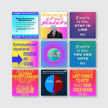
Goodbye, blue and red. Hello, hot pink, rainbow gradients, illustrated infographics, and artist collaborations that appealed to younger, more diverse groups. Making sure that these marginalized and threatened communities felt heard and valued was especially critical to Kanner, 33, who is a trans woman, and deputy design director Carahna Magwood, 27, a Black woman and single mother.
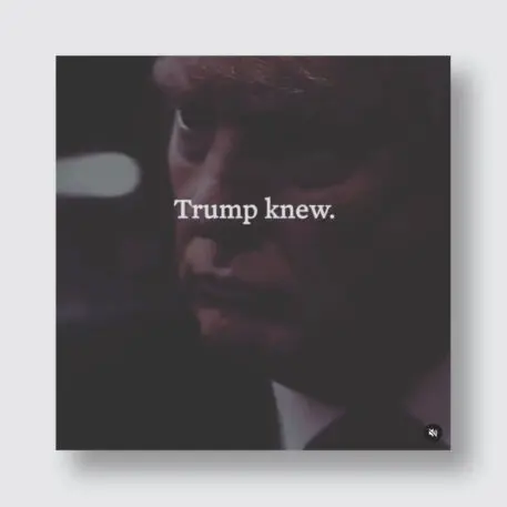
Unlike Trump’s branding, which used a sledgehammer of aggressive, repetitive, messaging, the Biden design team reached key demographics with the precision of a scalpel. Where Trump visuals gave users an ultimatum, the diversity of Biden’s approach was meant to convey that no matter who you are, there’s a place for you. And it offered an aspirational vision of the United States.
“While we did focus on red, white, and blue, and as much as we love this country, we were adamant about presenting it in a way that felt new,” Magwood says. Kanner recalls how critics initially pegged the brand as boring. All she thought was that it was working. “One of the things that I’m proud of was we never designed for designers,” Kanner says. “We always designed for the American people.”
“Arrogantly, I was like, ‘I want to help elect the next president of the United States.'”
Kanner didn’t always expect to lead the design of a presidential campaign. She grew up in rural Maine, a quiet kid who was bullied and not that interested in school. Her father, who had multiple sclerosis, died when she was 19, which led her to drop out of college and become addicted to Xanax and alcohol. But even as she was grappling with the loss and “terrified of the world,” she realized she had to “get out and find purpose.”
She left her home state of Maine and started transitioning at 20. But she worried that being trans would put her in a box. She funneled that anxiety into design. “I have used so much of that fear in making art, because it was the only thing that made sense,” Kanner says. “It felt like it couldn’t be taken away from me no matter what.”
It was then—before anyone knew that Biden would lead the Democratic ticket—that Kanner started thinking about how to defeat Trump. Kanner had watched Trump divide the country and destroy the policies she valued, and she was determined to make him a one-term president. A message of unity, Kanner thought, would be the way to beat him. Kanner joined Beto O’Rourke’s campaign in the primaries, and joined Biden’s team as senior creative adviser in March 2020.
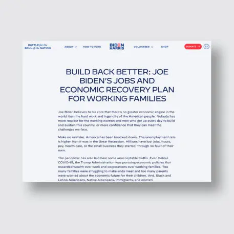
She became convinced on the campaign trail. She says the campaign’s willingness to listen to the voices of Black women and make changes was “significant to me.” She cited a conversation with Biden about the slogan “Restore the Soul of the Nation,” as one example, which the campaign has used as a key message in speeches, social graphics, and videos since the campaign’s early days. (Biden described its meaning in a Des Moines Register op-ed.)
As a young Black millennial and mother to a Black son, Magwood didn’t want a “Make America Great Again”-style return to the past, as she thought “Restore the Soul of the Nation” suggested. She told Biden so. That led to meetings with senior staff to clarify its messaging—that it speaks to Biden’s faith as a practicing Catholic and emphasizes the moral responsibility of the presidency. That convinced Magwood that Biden was sincere in his intent to listen and grow.
Design strategy: Convey macro values in micro detail
Kanner and Magwood used their own life experiences and those of others on their team of 25 to craft a strategy that was inclusive and unifying, much like Biden’s campaign strategy aimed to be.
The logo design was informed by the decisions of the Obama and Clinton campaigns, but Kanner and her team chose to take it in a different direction. Obama’s 2008 “O” logo, designed by Sol Sender, was an instant hit, the perfect encapsulation of a historic presidential run. Hillary Clinton’s logo, designed by Michael Bierut and less universally loved, used a similar strategy common to corporate branding: a single letter or core icon that could be modified to convey the candidate’s appeal to different groups.
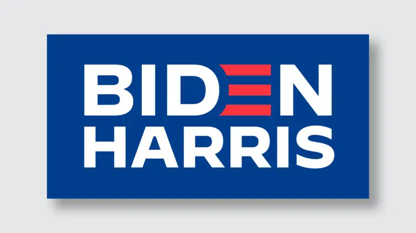
The Biden-Harris logo wasn’t meant to be an icon in either sense of the word. Rather, Kanner and type designer Jonathan Hoefler, whom Kanner brought on board to develop the campaign’s typographic system, decided to refine the existing wordmark Biden used in the primaries designed by Mekanism’s Aimee Brodbeck. They reworked the wordmark with Decimal, one of the typefaces from the campaign designed by Hoefler and inspired by wristwatches. (Kanner calls it as “true as time.”)
“It was an unusual inversion, allowing the typography of the message to dictate the design of the logo, but I think it worked, especially given how well the typography always captured the voice of a candidate who expresses himself with clarity and purpose,” Hoefler explains. “Everyone felt that this was a campaign that genuinely had a lot to offer to people on the political margins, and there was nothing to be gained by trying to dazzle them with our cleverness.”
https://twitter.com/robynkanner/status/1279428212641202182?lang=en
Introducing a new logo at that point in the campaign could have invited speculation about its meaning or a possible change in direction for the campaign. “I know that a lot of designers were probably hoping to relive the thrill of 2008, when we all first saw Sol Sender’s iconic logo for Obama, which is deservedly the high-water mark for political graphics,” Hoefler says. But Obama was new to politics at the time, and that required a different design solution. Biden had five decades of experience and was a household name.
“The ‘rising sun’ logo became the shorthand for Obama, but in Biden we already had a convenient and recognizable handle: ‘Biden,'” Hoefler says. So instead of creating something completely new, Hoefler focused on getting minute details right, like giving the Biden and Harris names equal weight.
Magwood recalled a conversation with Clinton campaign design director Jennifer Kinon, who advised her that the role of the design team was to continue to push the needle after they got the messaging from the communications team, and they did so by putting the slogan on yard signs, merchandise, and social graphics. Magwood also pushed to get Biden’s associated COVID-19 plan onto hand sanitizer.

https://twitter.com/robynkanner/status/1325194983788302336
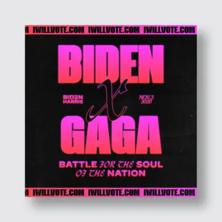
To further signal the campaign’s connection to younger, digitally savvy voters, Kanner and Magwood made trendy gradient treatments a frequent visual motif. These had a personal symbolism for Kanner, who described them as having a joy that contained a “brand-new feeling for life.” A clear example of this is the “victory” gradient used to announce Biden’s win. The gold emerging from the base is reminiscent of a sunrise or, as Kanner puts it, God’s first gradient. There were also less divine color choices: reds and blues meshed together to signify unity in social graphics and live-event backdrops.
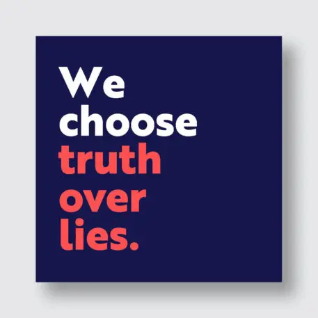
“I would say that the biggest misconception of rapid response is that it’s difficult,” Kanner says. It just takes practice. They prepped by watching Rocky 3, and perhaps more expectedly—old debates like Clinton versus Trump in 2016, and Biden against Paul Ryan in 2012, and then mocked up fake merchandise, social graphics, and video in real time, so when the real debates happened the team was ready to go. The “truth over flies” flyswatter was ready in five minutes. “[The design team] was such a well-oiled machine that when it came down to it, it was just like running a drill,” Kanner says, referring to their ability to respond quickly to news events.
Kanner had been struck by how the villains in the television show Mr. Robot were always directed away from the camera, never making eye contact. So she called Sam Esmail, the show’s creator, to ask how he positioned those characters in the frame to reduce their power. Biden’s design team employed these visual tactics against Trump.
You can’t kern your way to a winning political brand
The Biden visual identity was a powerful antidote to the Trump brand, but it was also an antidote to Clinton’s. Trump’s 2016 election led to some unprecedented soul-searching in the design community. Clinton’s campaign design was too corporate, too prim, too inaccessible, embodying many of the criticisms of the candidate herself. It was “good” design, in the sense that it was beautiful and clever, but it wasn’t necessarily effective at luring the voters she needed to lure.
Kanner and Magwood took those insights to heart and created something distinct, playing fast and loose instead of striving for perfection. Though Biden and Clinton are both establishment Democrats, their design strategies were very different. Design, of course, is just one ingredient in the primordial soup that gets a candidate elected. And in this case, it was the right ingredient at the right time. Just look at the ballot box.
Recognize your brand’s excellence by applying to this year’s Brands That Matter Awards before the early-rate deadline, May 3.
