Fast company logo
|
advertisement
This website gorgeously illustrates whether your investments are ruining the planet

[Image: courtesy Clever Franke]

BY Lilly Smith1 minute read

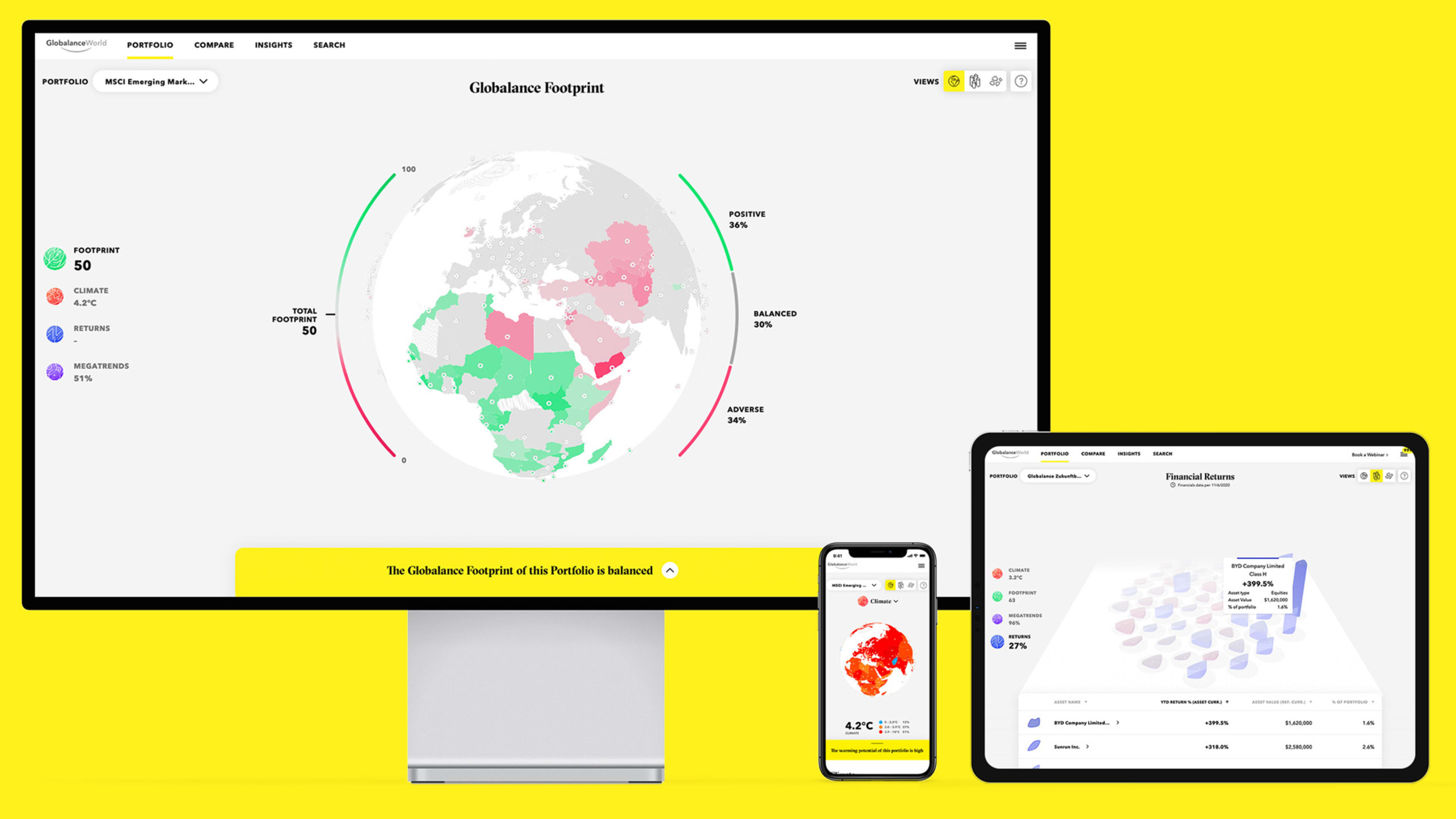
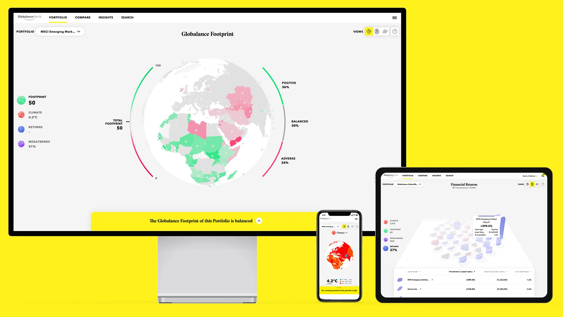
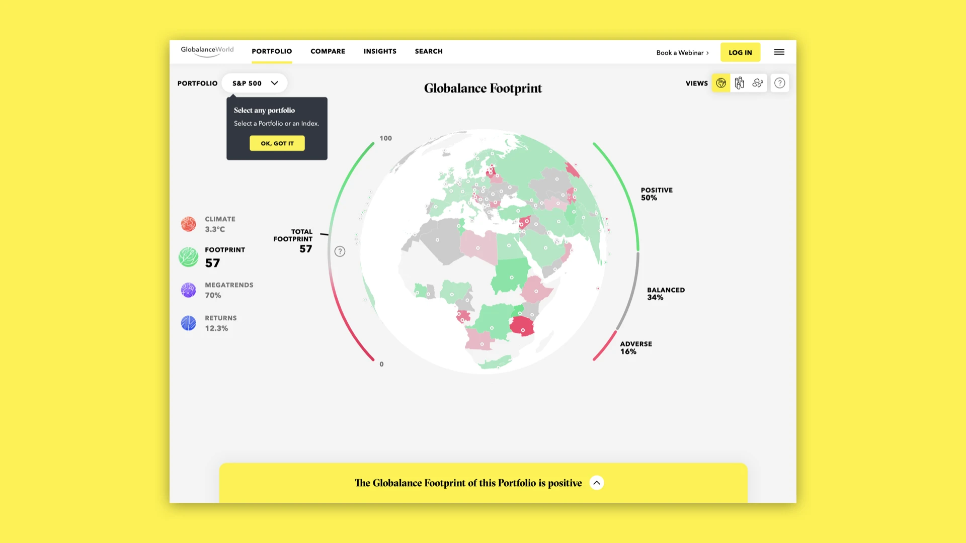
All investment platforms will show you the financial value of your portfolio. But a new visual platform made by Dutch design firm Clever Franke for Swiss bank Globalance goes a step further: It maps your portfolio’s macro-level social and environmental effects.

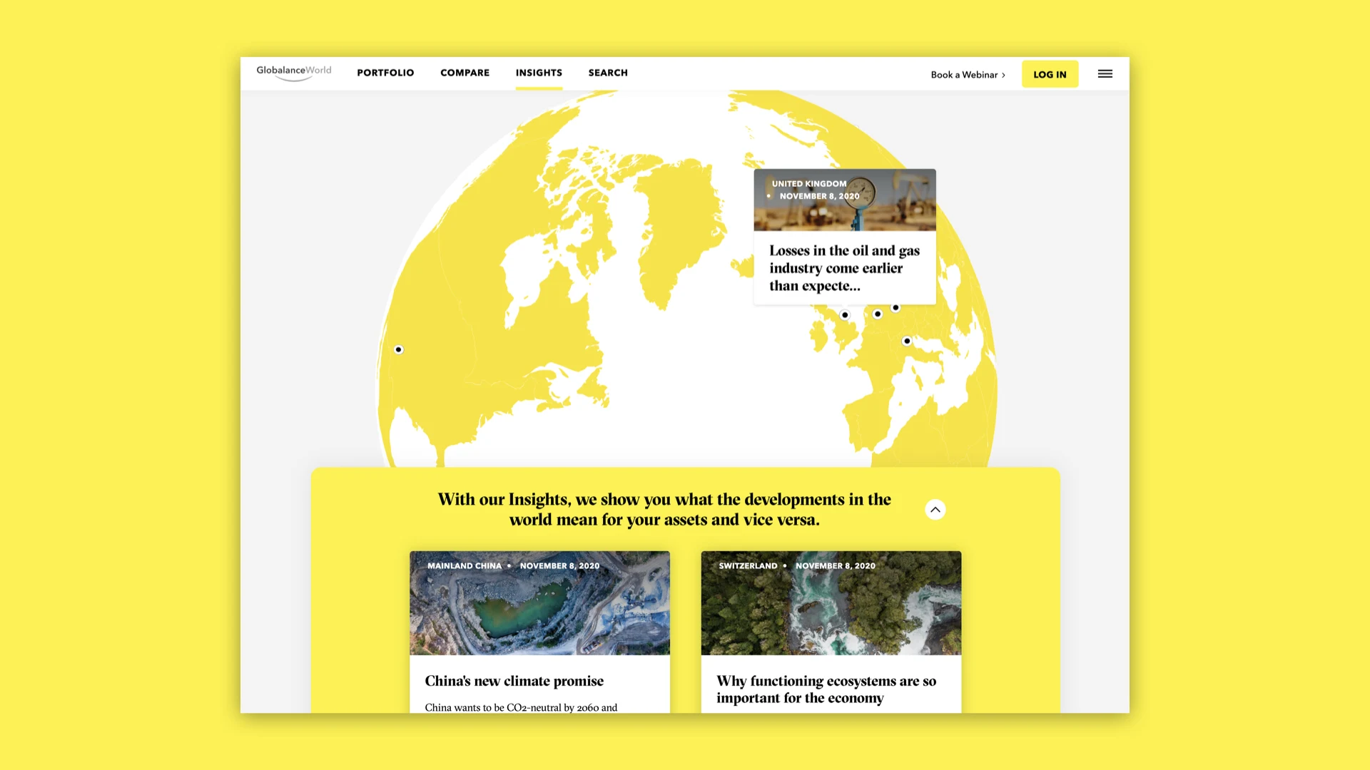
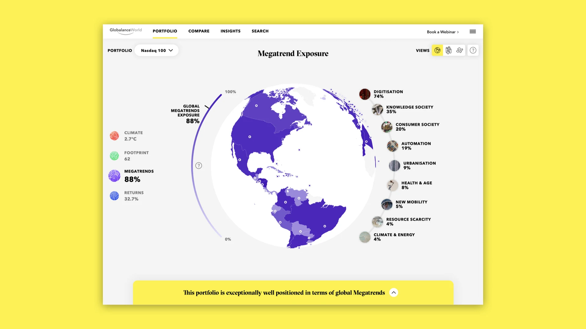
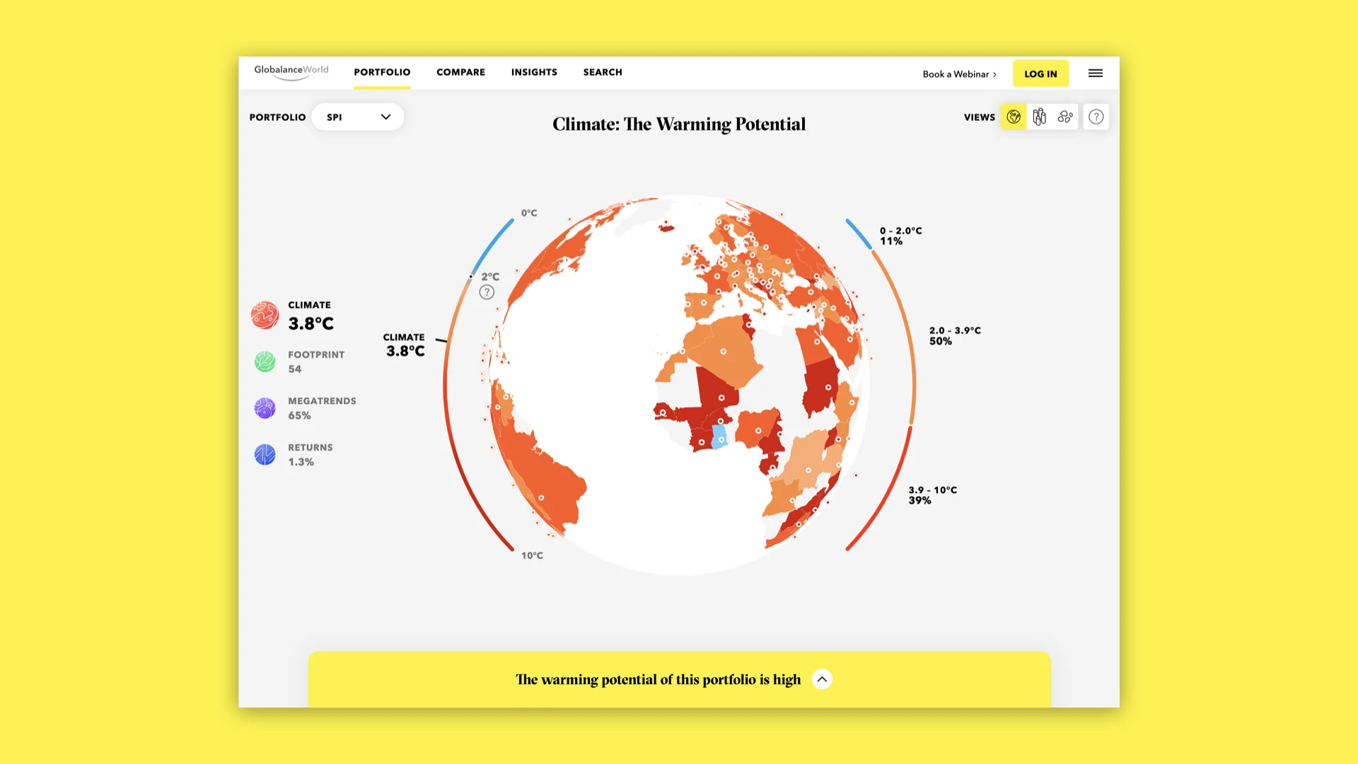
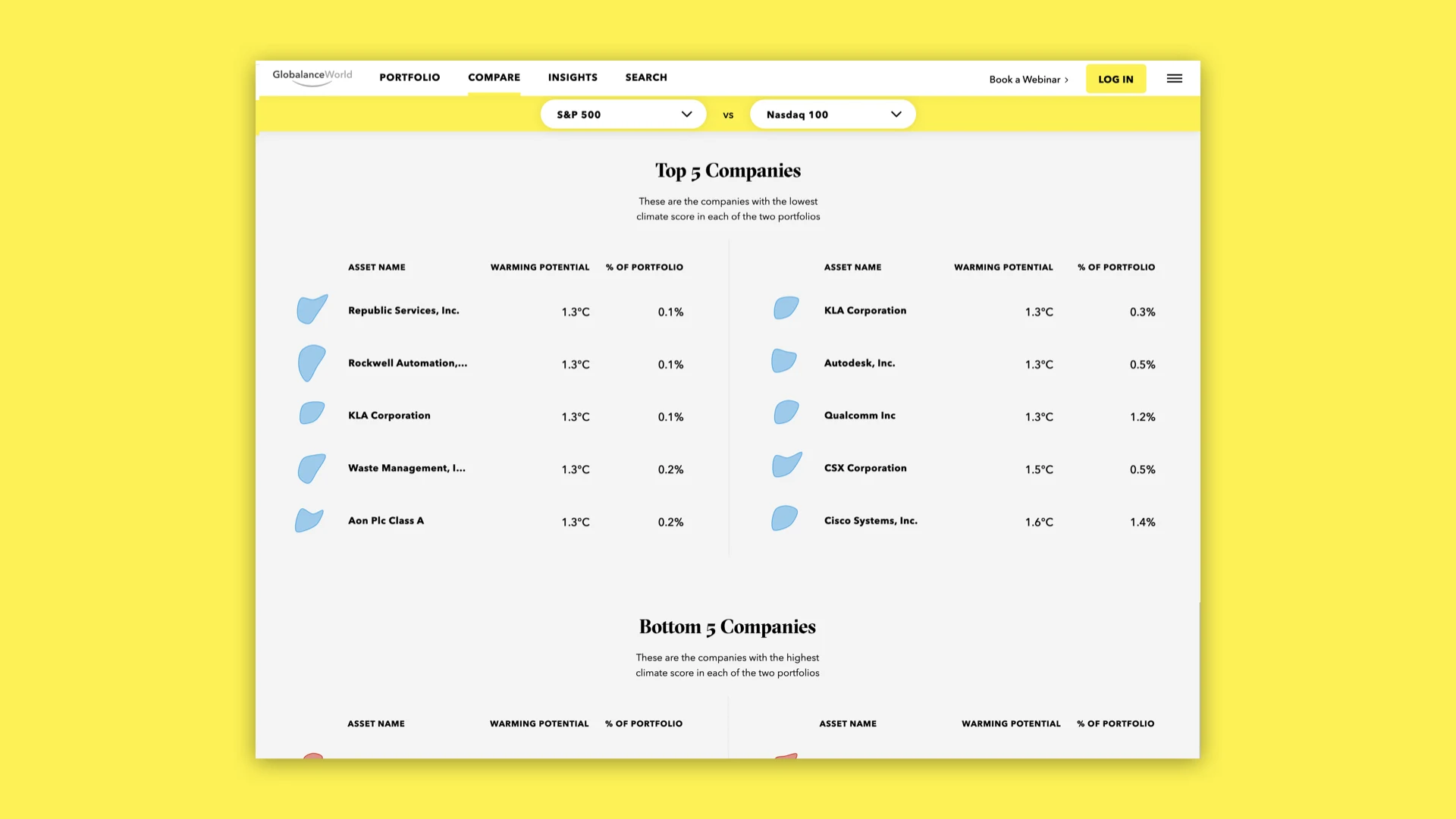
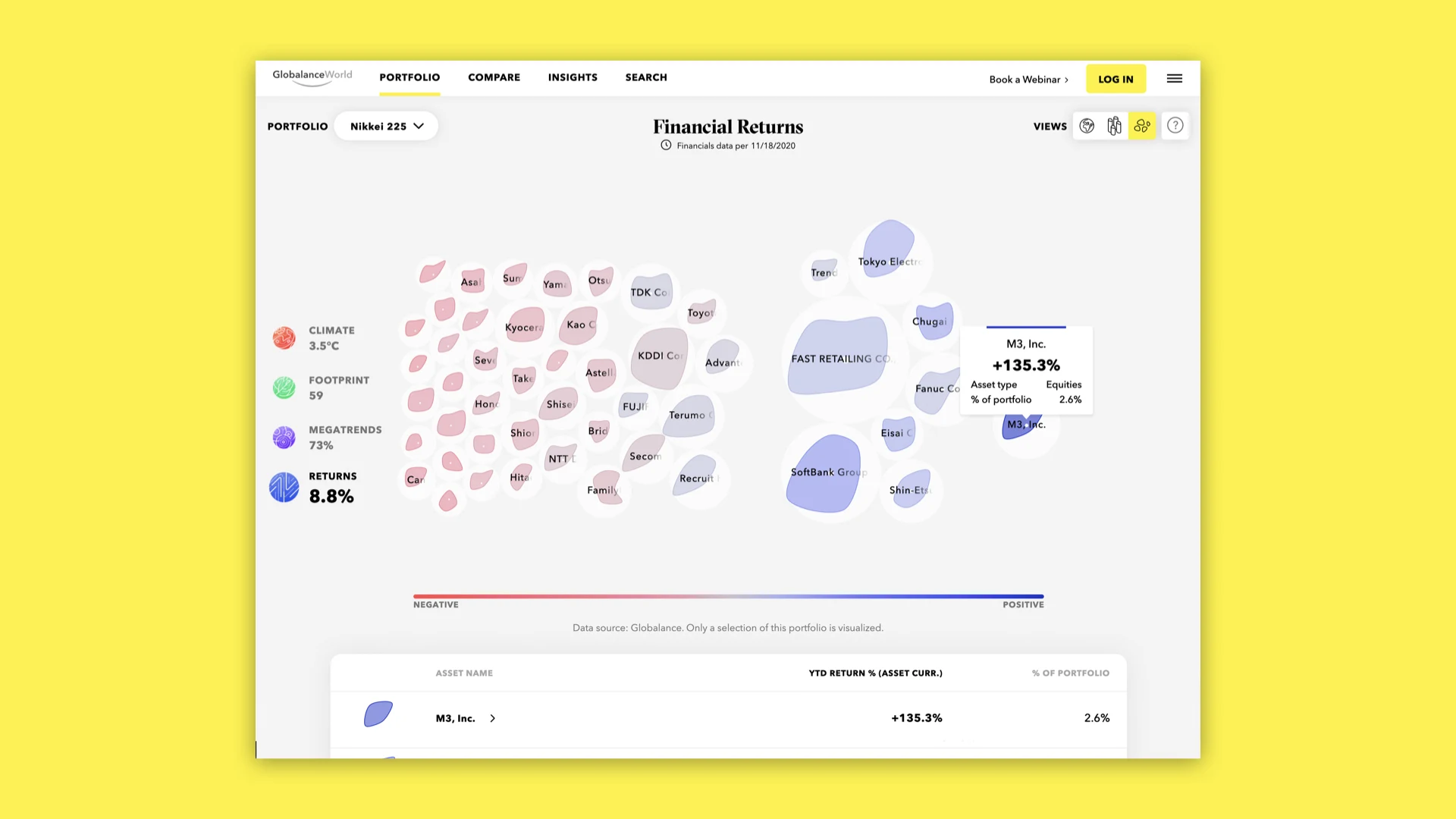
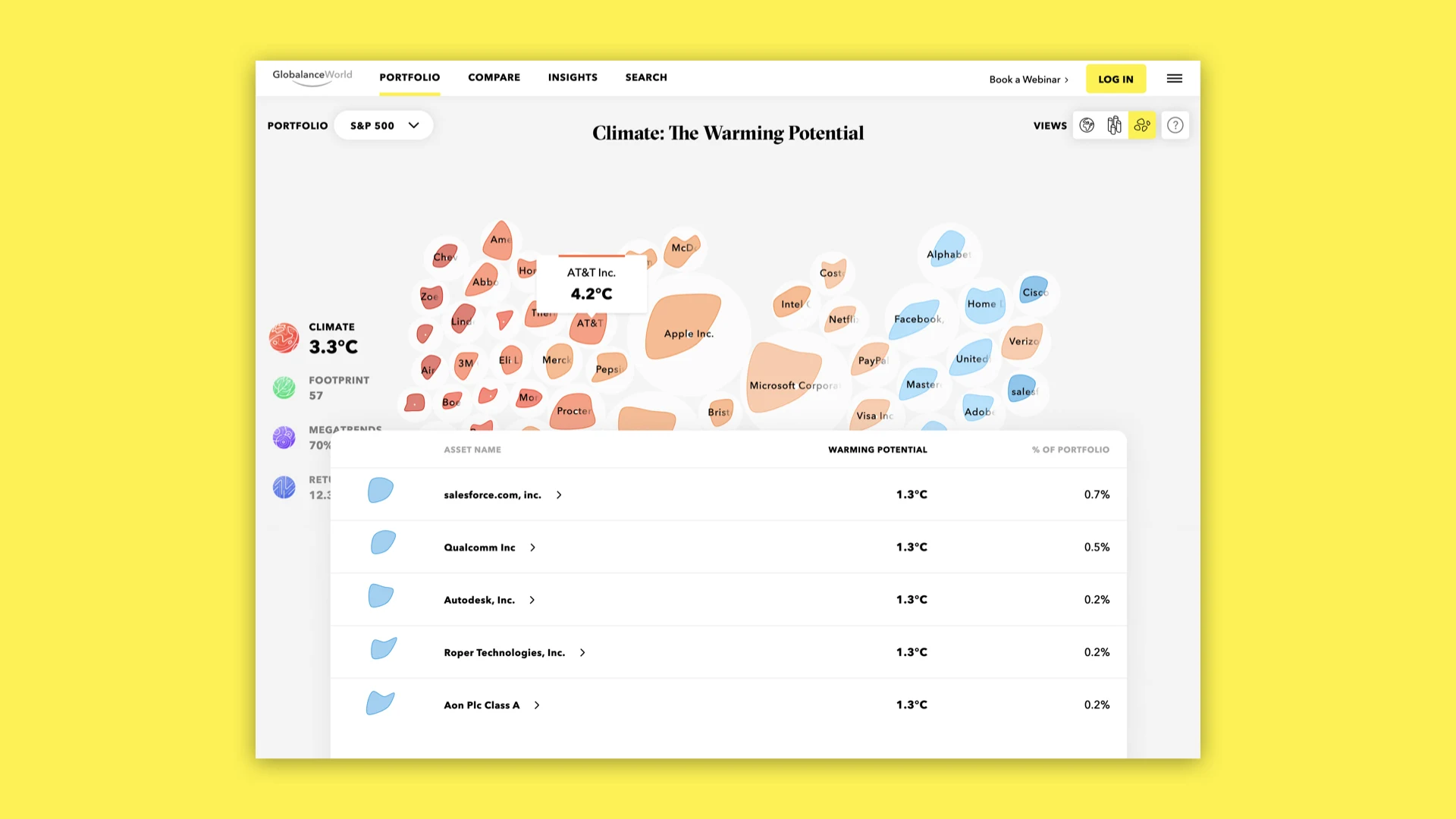
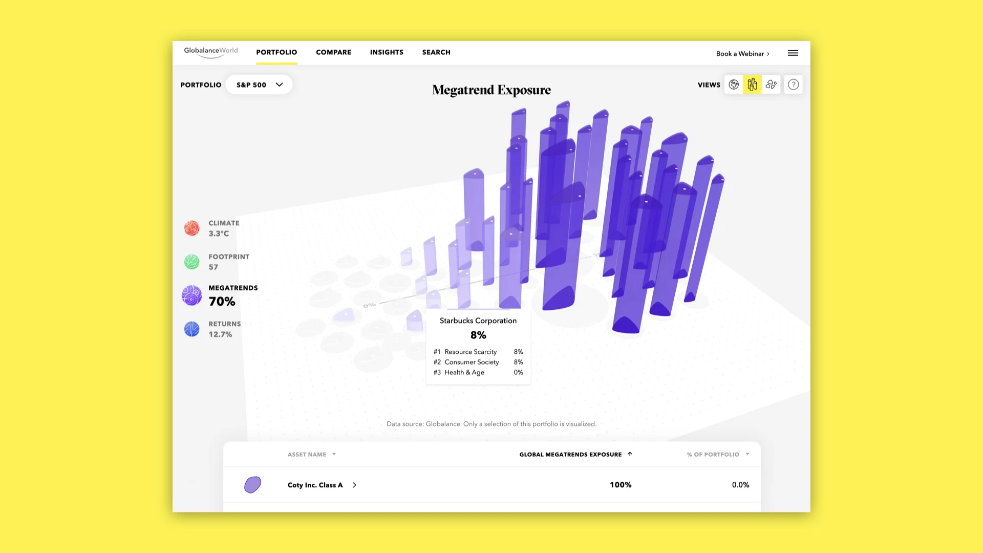
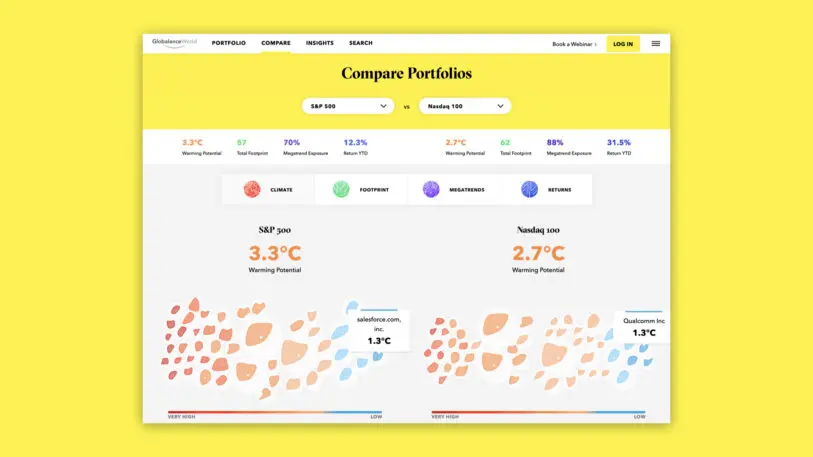
The interface, called Globalance World, makes it easier to figure out how your money can do good. Users can review the impact of everything from entire market indices like the S&P 500 to individual companies like Microsoft through a series of data visualizations. What’s more, each portfolio or asset can be looked at through four perspectives: climate, megatrends, footprint, and returns. Users with a Globalance portfolio can also get a personalized map that shows the impact of their personal investments.

[Image: courtesy Clever Franke]
The platform relies on a few key visuals. The first is a data visualization that shows the effects of your investment on aninteractive 3D globe. Take climate, for example. Does your selected portfolio align with the 2 degrees Celsius climate stabilization plan set by the Paris Agreement? If it’s covered in orange landmasses, the warming potential of this portfolio is too high.

advertisement

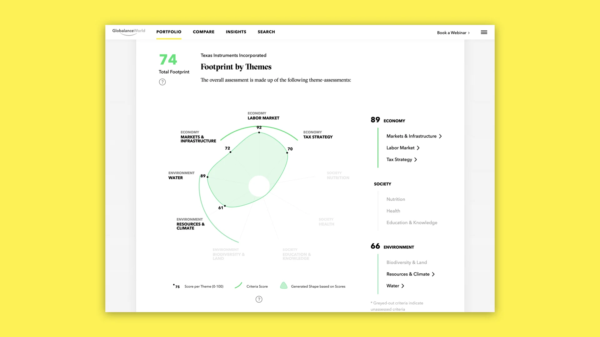
Another helpful, at-a-glance visual is an organic pebble shape used to represent individual assets in map view. Though you can’t see them, the pebbles each have nine different axes based on data points that together measure a company’s overall footprint on everything from labor markets to biodiversity. The contrasting shapes and sizes allow for quick, intuitive comparison. But you can also click on individual assets for more detail on what the shape actually means and how it aligns with bigger trends. (Up to a point, that is, then the interface will prompt you to create an account.)

[Image: courtesy Clever Franke]
“I think investment portfolios and the way financial information is designed has a long way to go,” says Thomas Clever, cofounder and managing director of Clever Franke, who explains that existing financial visualizations put too much emphasis on two things: hard financial information without context, and short-term, reactive information. Clever contends that providing investors with macro-level details on the impact of their portfolio shifts their attention to more conscious investments.

Recognize your brand’s excellence by applying to this year’s Brands That Matter Awards before the early-rate deadline, May 3.

CoDesign Newsletter logo
The latest innovations in design brought to you every weekday.
This site is protected by reCAPTCHA and the Google Privacy Policy and Terms of Service apply.
Privacy Policy

ABOUT THE AUTHOR

Lilly Smith is an associate editor of Co.Design. She was previously the editor of Design Observer, and a contributing writer to AIGA Eye on Design. More


Explore Topics