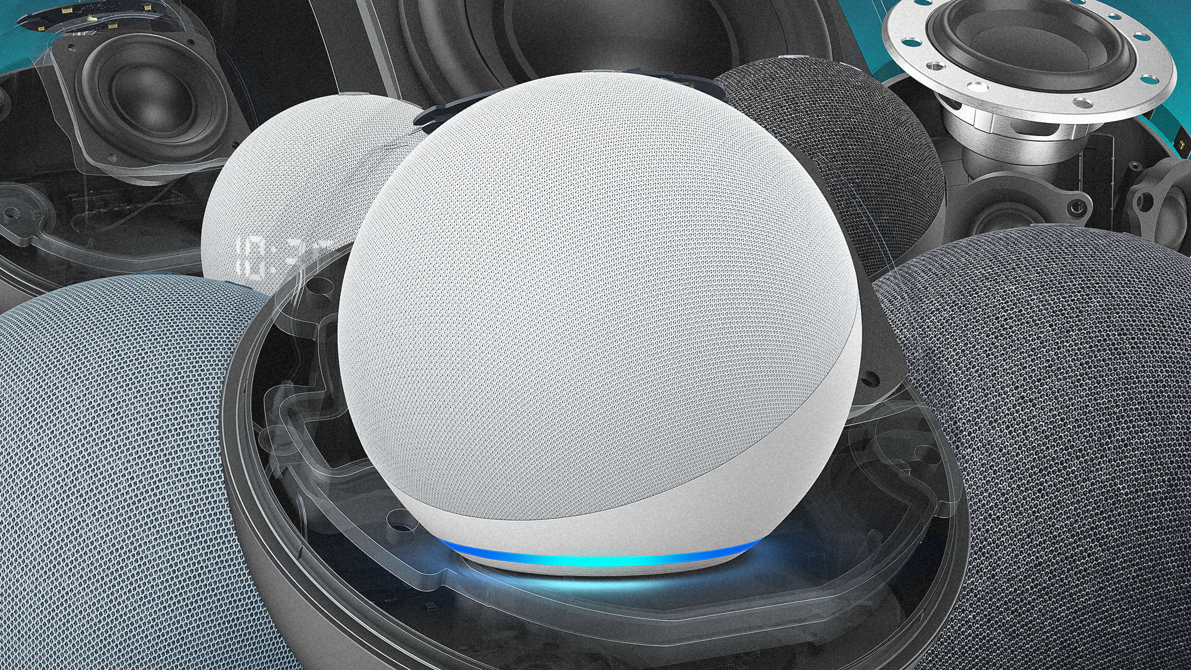
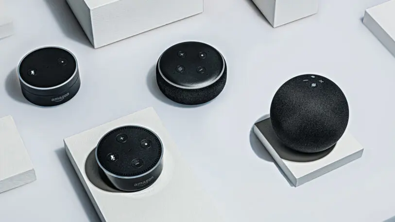
With Black Friday nearly upon us, you will no doubt see a slew of deals on a product that’s grown to be synonymous with Amazon itself: the Echo voice assistant speaker. Designed internally by Amazon’s secretive Lab126 hardware team, the first Echo launched in 2014 as a hard, black cylinder. Over the years, it’s spawned several iterations, including the smaller Echo Dot hockey pucks and screen-wielding Echo Shows, and each time, Amazon has expanded its base. In 2019, the company announced it had sold 100 million Alexa-powered devices to date.
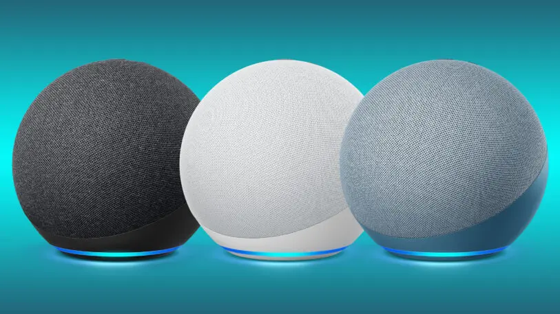
Why a sphere, and why now? We explored that question in an exclusive interview with members of Amazon’s own design and product team.
The short answer is that the sphere solved a lot of practical issues that the team faced when creating the new Echo. The longer answer is a story of Amazon’s unrelenting consumer testing, and an ever-changing concept of where and how technology fits inside our homes.
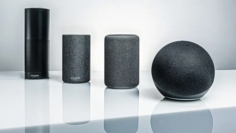
Building the original Echo
A Pringles can. That’s how Miriam Daniel, vice president of Echo and Alexa devices at Amazon, remembers the shape of the original Echo. The device was radical for its time. Of course we had Siri on iPhones, but there was no known object in our living rooms that we talked to on a regular basis. So the team anchored it in something more familiar: A speaker.
“At the time we also looked at a lot of form factors. The leading use case was music,” says Daniel. “If you want someone to understand this device and what it can do, you have to make something familiar to them. So making a speaker . . . made a lot of sense.”
That explains the Echo’s large grill holes, to allow sound in and out, but what about the cylindrical shape?
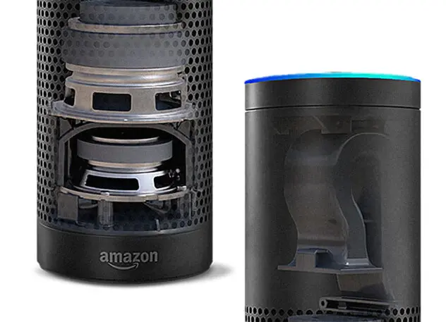
Over the past several years, however, Amazon has gotten better at capturing speech using fewer microphones. Now, Echoes need just two to four as opposed to seven.
“Technology has moved on,” says Green. “You can’t ignore that.”
Designing generation four
As the company approached its fourth generation of Echoes, designers had all sorts of ideas as to how the devices could evolve. But instead of just comparing these notes in a lab, they brought sketches and prototypes to a long-standing pool of more than 100 customers from across the globe, who offer early and repeated feedback, scoring what they see. This process is typical for Amazon product design.
“We ask them questions, show concepts, roll in feedback, [iterate], and as time goes forward we make sure scores go up rather than down,” says Green. “It sounds silly, but you start at a utopian dream. [The Echo] is going to do this [or this], but it costs a lot of money, so you want to make sure you make the right tradeoffs as you move forward.”
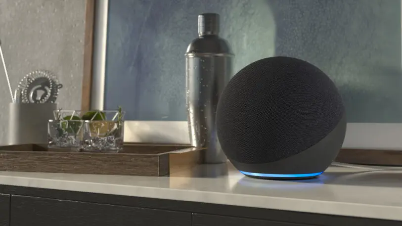
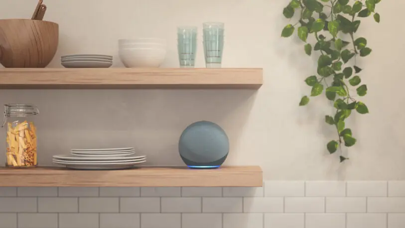
“If you put speakers next to a TV, people want them to look like the TV. They want holistic experience,” says Green. And the first-generation Echo was designed with a glossy black finish that’s comfortable inside an A/V system. “But as soon as you move those speakers away from the TV . . .[consumers] want them to blend into the personal items beside the bed or the kitchen bowl and spoons.”
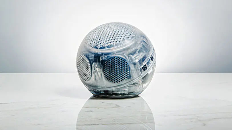
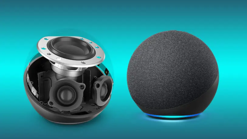
In this new arrangement, two tweeters (known for crisp highs) point right at the listener, and a subwoofer (known for bass) points toward the ceiling.
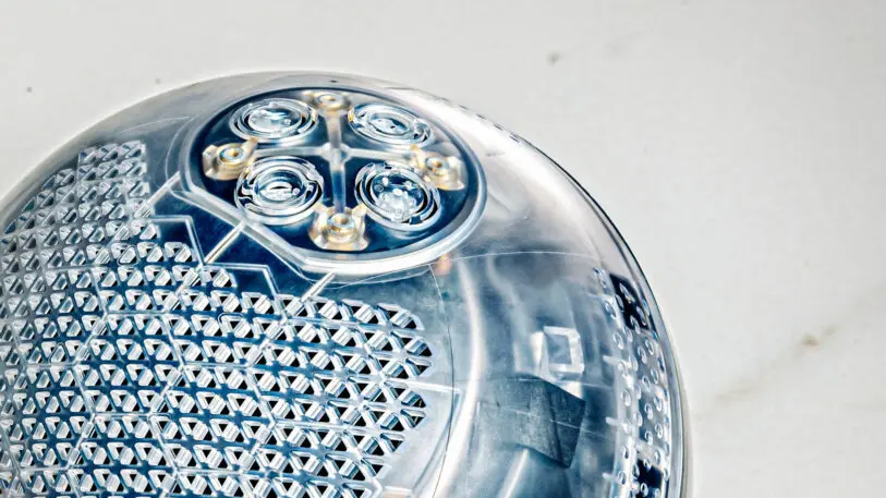
The sphere had other advantages too. A sphere has the lowest surface-to-volume ratio of any shape, meaning a spherical speaker could be small while packing in a lot of tech. Everyone inside Amazon began believing in the sphere, but there was a catch: brand equity. “You have this icon of a cylinder, but you want push in this new tech . . . and get it to a price point adopted by as many people as possible,” says Green. “We realized we had to make a hard choice.”
Riding the zeitgeist
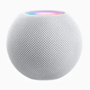
Anyone following smart speakers will notice that Apple also debuted a spherical assistant this year with its HomePod Mini. So I asked Green, was this just a case of convergent evolution? Or was some other trend driving both companies to a sphere?
The other most significant change to the spherical Echo was to the light pipe—that glowing ring on top of the Echo that signals it’s talking or thinking. For the fourth generation, that light pipe has been moved to the bottom of the device, to reflect off tables or countertops, and provide a more ambient lighting experience that blends into one’s environment—with a catch.
Once you hit the privacy button on your Echo, deafening it from hearing your speech, the ring glows a DEFCON 2 red until you unmute it. (Note: Google uses an orange to convey mute for its Assistant, as does Sony’s new PS5 controller that has a mic built in.) It’s not just overt; it’s borderline warlike, adding a Red October glow to your space. Echos have always glowed red when muted. Now your environment does, too.
When I mention this design decision, which seems to punish consumers who prefer privacy, Daniel acknowledges, but brushes off, the criticism. “[Red] makes for a strong [statement]. There’s always a tradeoff. Is it too bright? Annoying? Too in your face?” she muses. But she argues that the greater benefit is that “it gives people a sense of comfort knowing the mic isn’t working.”
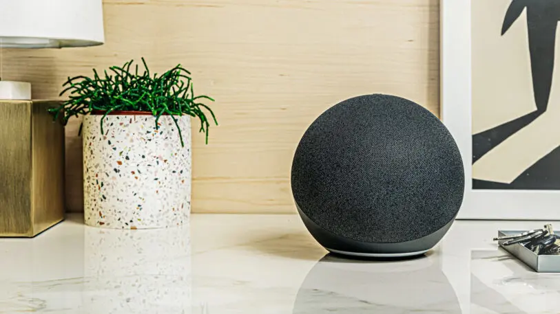
“I can’t talk about what’s coming out in the future, but the hard decision, from going to a cylinder to a sphere, had to be backed up not only by technology but customer feedback. We have plenty of quotes, things like . . . people said the cylinder looks safe but the sphere looks special . . . looks from the future,” says Green. “That . . . gave us confidence to go with the sphere. Are we going to copy and paste it [next time]? We’ll go through the same process again. We’ll be very methodical on what we do next.”
Recognize your brand’s excellence by applying to this year’s Brands That Matter Awards before the early-rate deadline, May 3.
