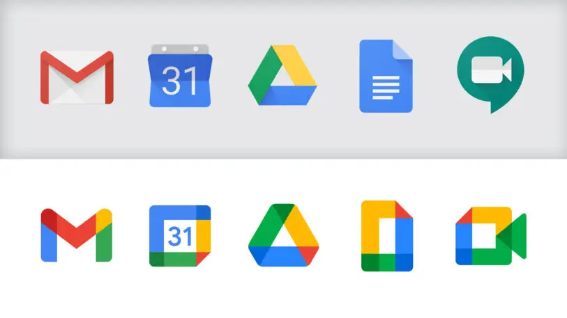
In October, Google released a new suite of icons for its popular apps including Gmail, Calendar, and Drive. The plan was good: Unify Google’s brands with icons that match one another with the same basic color treatment Google is known for. But the execution was questionable. People complained that the icons matched so much, you couldn’t tell them apart. Indeed, at a glance, it can be hard to tell Maps from Drive from Home. Even Jennifer Daniel, a designer at Google, expressed frustration at the new look:
I have straight up given up trying to "find" the google maps icon on my phone and just trust I'm biking in the right direction. I am free!!!! https://t.co/2i3OgZPx6O
— jennifer daniel (@jenniferdaniel) October 27, 2020
And then there was another issue: The Gmail logo, formerly a white envelope, was now a multicolored “M.” It simply looked off.
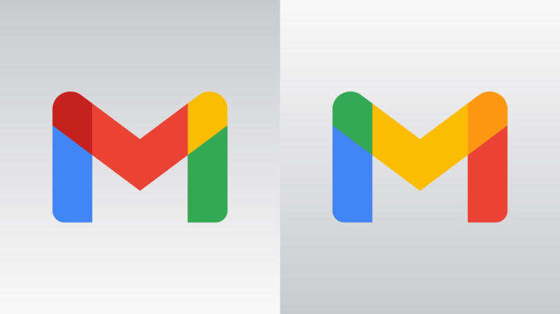
Now, thanks to Evan Blass, who publishes photos of leaked phones for a living, we know why. Blass is not a professional designer, but he rebuilt the Gmail logo in a way that makes more sense. Take a look:

The other Google logos don’t blend colors at all. “Google has redesigned most of its app icons in much the same manner—but with the others, it’s clear that the colors merely represent contiguous, nonoverlapping segments,” says Blass. “With the Gmail ‘M,’ however, they segmented off the upper corners of the letter exactly where the lines overlap. So I think that made the lack of blending more prominent.”
Blass’s fix was to blend colors in all the overlapping segments, so blue and yellow make green, and yellow and red make orange. At a glance, Blass’s version is just less confounding to the eyes. Why didn’t Google take this approach in the first place?
When we reached out to Google last week, the company declined an interview on the new designs—but a spokesperson did share some clarifications on the intent behind the year-long design process of the new icons. First off, when designing the new Gmail logo, the company tried to tie it visually to the old logo, which was a red “M” on a white envelope. “A key focus was for us to modernize the icons while making sure to emphasize elements of the legacy apps that defined them, like Gmail’s classic M and prominent red color,” the company writes.

The Gmail logo is suggestive of a larger problem in the redesign: It elevates consistency above all else. Consistent branding can help create a coherent identity, but it’s not the only relevant factor. Google’s new logos look like a pile of the same side-by-side graphics. And while they do successfully portray “Google” the company, they aren’t so successful at portraying what we actually value Google for: email, maps, and scheduling.
Recognize your company's culture of innovation by applying to this year's Best Workplaces for Innovators Awards before the extended deadline, April 12.