Political gaffes or so common they could be their own subgenre. A slip of the tongue or a mispronounced word can create its own news cycle and doom a campaign. But such errors aren’t limited to the spoken word. Messaging mistakes and missed opportunities are just as possible with a candidate’s visual brand.
We asked two experts—Susan Merriam, founder of the Center for American Politics and Design, and Ben Ostrower, founder and creative director of design agency Wide Eye—about the best examples of presidential political brands. Now they’re hashing out the worst political branding of all time. This conversation has been edited for length and clarity.
Susan Merriam: Design in politics is very much an expectations game of a particular office at a given point in time; one has much higher design expectations of a candidate running in a post-Obama presidential race than one has for a lawn sign or social post of a local congressional race. At this point, we expect a certain level of professionalism by presidential campaigns to hire adequate designers, and we sometimes question a campaign’s abilities when something is put out that is subpar.
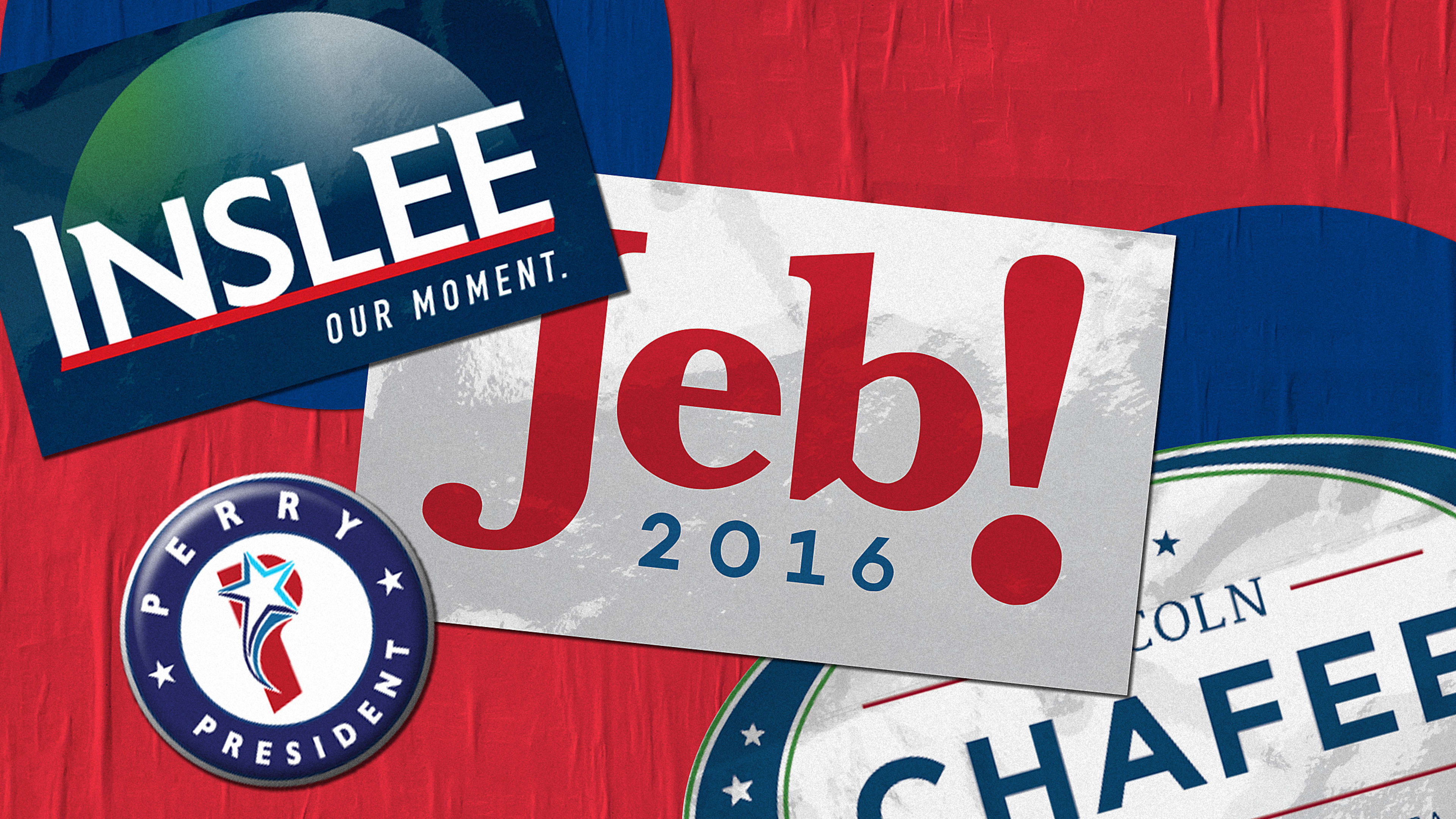
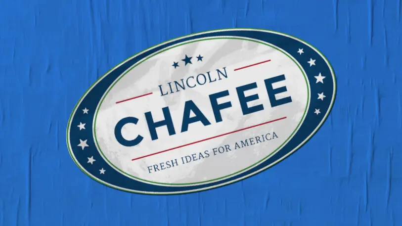
A runner-up for this award goes to [Rhode Island] Governor Lincoln Chafee’s 2016 presidential campaign; his slogan, “Fresh Ideas for America,” simply does not align with the dated aesthetic of his graphics and photography.
Thankfully, campaigns have more recently stopped trying to use a candidate’s initials to create a shape, finally realizing, I hope, that authentically replicating the success of the Obama “O” mark is almost impossible.
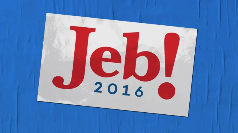
I’d also toss in Jeb Bush’s “Jeb!” branding from 2016 for dishonorable mention. The execution of that logo and brand were fine, but the false energy of the logo was such a mismatch to the candidate that it only served to reinforce the feeling of the campaign’s inauthenticity.
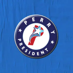
SM: Completely agree regarding Rick Perry’s branding; the logo is jarring for its technical challenges and for its blatant baseball-aesthetic choices. Sports obviously has a huge role in American culture and therefore the aesthetics and spectacle attributes bleed into politics, but this logo is just too much and way too literal. Ironically, candidates Tommy Tuberville and Colin Allred both had serious involvement in sports-related careers but chose not to showcase that in their political logos (that being said, their ad campaigns are a whole other matter).
[The sports] aesthetic reminds me of the branding of Eddie Mauro, a Democratic candidate from Iowa who ran for U.S. Senate this election cycle to no avail; his logo is tamer than Perry’s, but his website looked more like an advert for a new show on ESPN with the phrase “In the Cage with Eddie Mauro” bursting across the screen with flashy graphics and sports diagrams. Nuance is lacking in much of design in politics, and while I applaud breaking the norms of what we’ve come to expect in political graphics, branding reminiscent of a family pastime can be subtle and can be further reinforced in secondary levels of communication from the campaign.
The Jeb! logo debacle seems to be a case of being in the wrong place at the wrong time. I’ve seen pictures of Jeb Bush using a logo with first-name emphasis and the exclamation mark in campaigns for Florida governor from as early as 1994 without a problem; whether it was the increased media coverage on the national stage, the year 2016, the negative effect of his brother’s presidency on his campaign, and shall I say a rude competitor in the Republican party, the logo was dragged down in political history along with Jeb’s campaign.
If you can allow me a coda on this, I think the thing that endlessly fascinates me about political branding (and that this back-and-forth validates) is just how delicate it is as an art form.
No political brand exists in a vacuum: The best of them authentically convey the voice and the style of the candidate, are participatory in a way that allows supporters to affiliate themselves with it, work effectively within the dominant medium of its day (FDR: radio; Eisenhower: TV; Obama: the internet), and all the while balance both the design expectations of the moment while also subverting them just enough to make a statement.
As it becomes a topic that more and more people love to chatter about with each successive election, my sincere hope is that our understanding of the relationship between design and politics also deepens. It’s not just about logos or colors or slogans, “political branding” is about a comprehensive design system that plays an active role in building a relationship between prospective leaders and their constituents. A campaign that doesn’t invest in branding, whether they like it or not, is still beholden to the rules of it.
Recognize your brand’s excellence by applying to this year’s Brands That Matter Awards before the early-rate deadline, May 3.
