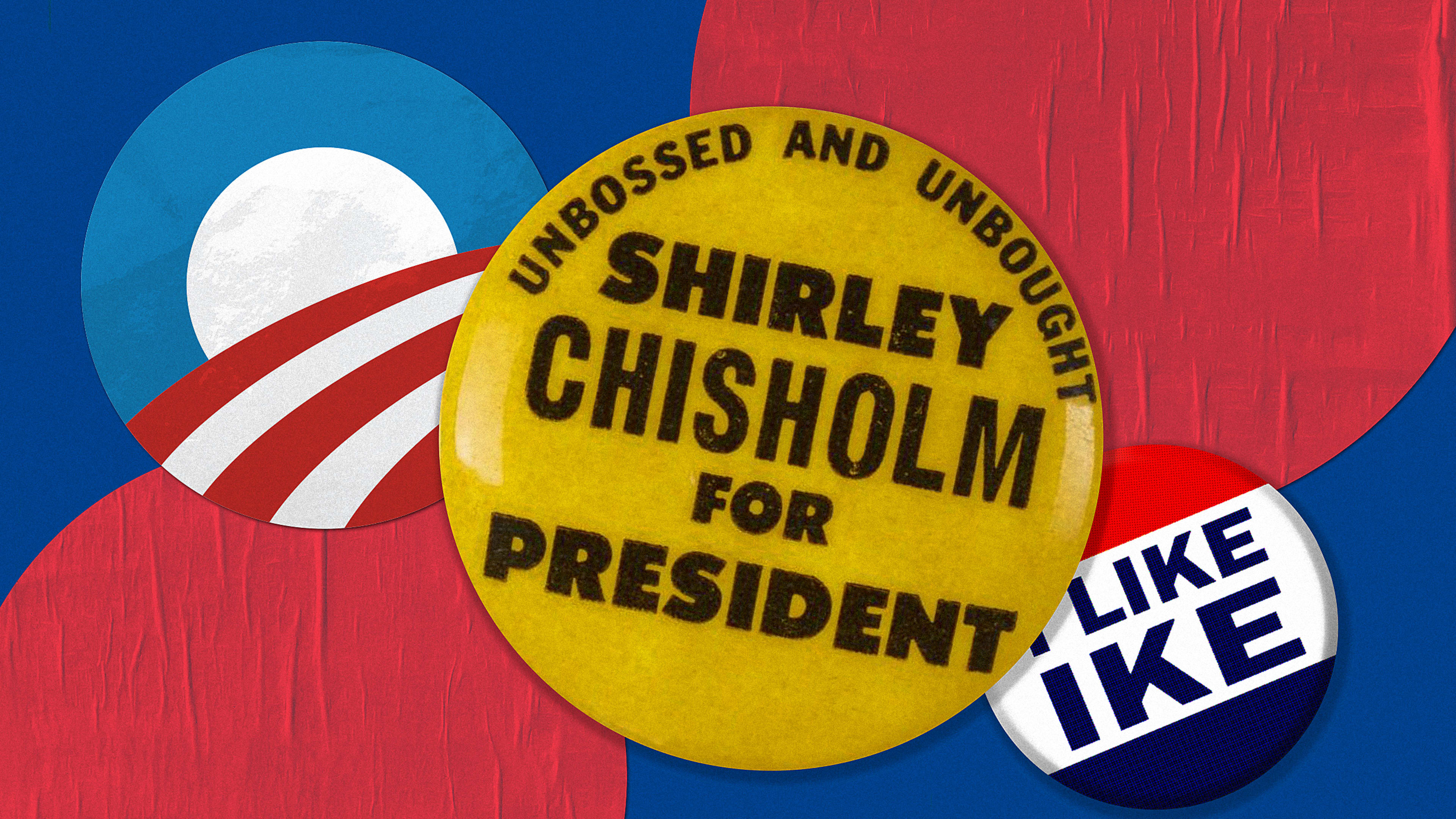
Politics is not for the faint of heart. There’s mudslinging. Grandstanding. And your candidate’s message needs to cut through it all to connect with voters. That’s where a memorable visual brand steps in. So which campaigns did it best?
We enlisted two experts to hash it out. Ben Ostrower is the founder and creative director of design agency Wide Eye, which developed brands for Bernie Sanders’s and Kamala Harris’s presidential campaigns, and Susan Merriam is a cofounder of the Center for American Politics and Design. The two of them debate the best political branding of all time—the campaigns that were able to break through the rancor of election season and affect change, even if they didn’t end up winning. This conversation has been edited for clarity and length.
Ben Ostrower: Firstly, this is not an easy question—there’s so much that goes into branding a campaign and its impact. How appropriate was a visual brand for the candidate? Beyond the initial artwork, was it well executed and utilized by the campaign? Did it evolve with the campaign and the candidate? Did it have a positive impact, more broadly, on the perception of politics? On pop culture? On art?
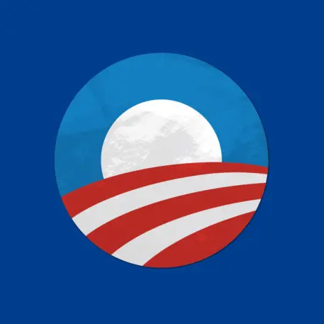
While I think the answer possibly shifts a bit based on the way you frame the question, the branding that comes out on top for me considering all these angles is Obama 2008.
Susan Merriam: My initial reaction to this question is to say the Eisenhower 1952 presidential campaign for its memorable slogan “I like Ike,” which was easily interpreted graphically across applications at a time when it was challenging to maintain brand consistency. The simplicity and emotive quality of the branded slogan have had a lasting impact on American politics. More than half a century later, many Americans can still recite the phrase and could describe the campaign button even if they were not alive when it was in use.
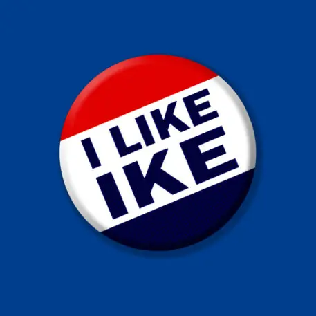
Ben: Full disclosure, “I like Ike” was my runner-up here. It takes no more than a quick Google Image search to see how ubiquitous the brand was: Buttons, T-shirts, cups, old rotary phone dials, sunglasses, bumper stickers, neckties, and more. In the same way that Obama 2008 was the first to demonstrate the full power of the internet for national political branding, Eisenhower in 1952 was the equivalent for television. Watch an “I like Ike” ad on YouTube, and good luck getting that jingle out of your head. A lot of modern campaigns could actually learn a thing or two from Ike 1952: Keep it simple. Brand consistency matters.
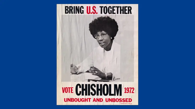
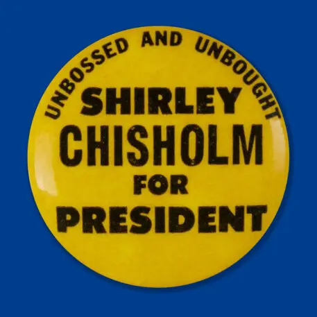
Was McGovern’s campaign one of the worst branding mistakes forged by the Democratic Party, or is there another way to evaluate a campaign in visual disarray? Did a grassroots, bottom-up visual system become a visual representation of the far-left candidate stereotype, to his detriment? The 2016 presidential campaigns would demonstrate the opposite of this; the highly orchestrated, top-down branding expression of Hillary Clinton’s campaign sometimes seemed too much when in contrast to the lack of design and meme-like work produced by the Trump ’16 campaign.
Fast Company: Ben, what separated the Obama branding from the “I like Ike” branding for you?
Ben: I will say that despite my honorable mention here for “I like Ike,” for me, Obama 2008 wins hands down for having created an intricate visual language that extended well beyond just a slogan and lots of memorable commercials and merchandise. The Obama “O” logo evoked an idea and a feeling of hope without saying a single word. The brand communicated even if you don’t speak English, for example. And the supporting graphical material: Gotham Bold in almost any arrangement and the bright blue gradients only compounded that expressiveness. This might explain, for example, why there were so many Obama brand copycats around the world following 2008 (not just in the U.S.).
Political visual branding is arguably the most important visual proxy for the candidate, and Obama’s graphical material managed to convey the emotional heft of his oratory and his persona almost without him even being there. In a lot of ways, that’s a credit to the sheer charisma of Obama the candidate, but the brand and the design unquestionably carried the message. And there’s also the pop-cultural impact on top of the official campaign materials: Shepard Fairey’s Hope poster and countless other artists creating works. Relative to almost any other American political campaign before it, Obama 2008 leveraged visuals to extend the reach of the campaign.
Susan: Obama’s branding worked, no question about it. It does make you wonder what would have happened in political graphics if Obama hadn’t won the Democratic nomination or hadn’t inspired the same level of support from the public; would the optimistic Obama “O” have seemed ill-advised?
Recognize your brand’s excellence by applying to this year’s Brands That Matter Awards before the early-rate deadline, May 3.
