


COVID-19 has changed the way we shop. Even with much of the U.S. back open for business, online sales were still up 40% in August versus the year prior. And Americans have spent $107 billion more online than they had last year by this point.
The days of lazily strolling through store aisles are over, at least for a while. And nowhere is this trend more clear than in Walmart’s new store design, which the company is unveiling for the first time today. The design will come to 200 stores around the U.S. by the end of 2020, and 800 more by the end of 2021.
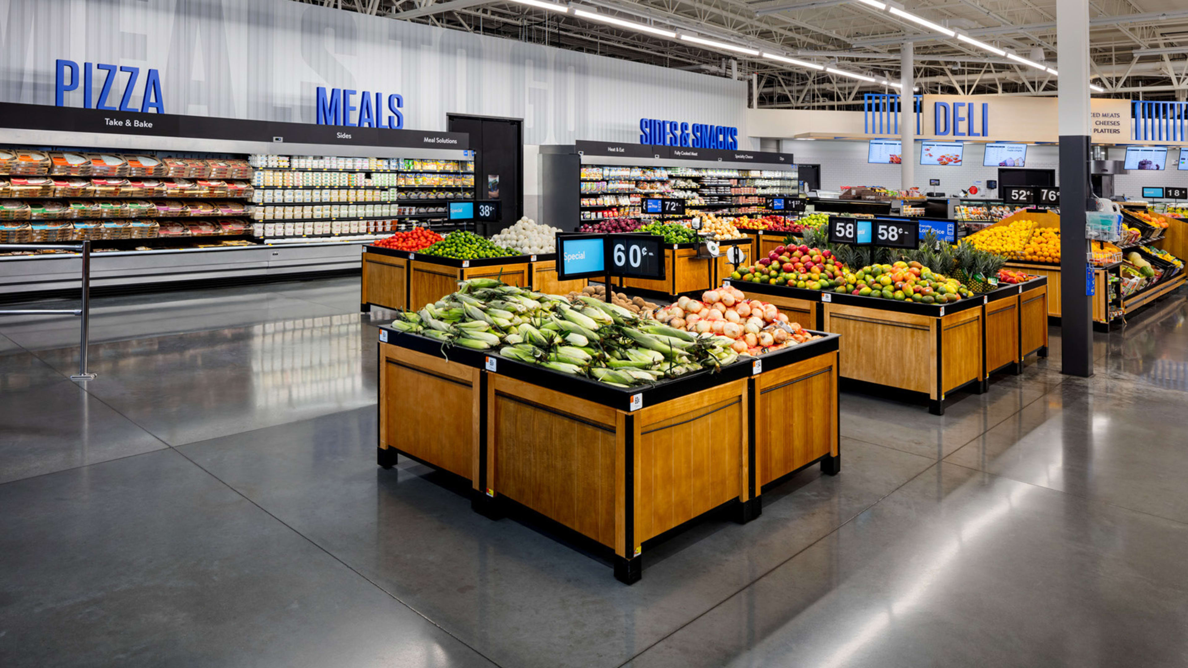
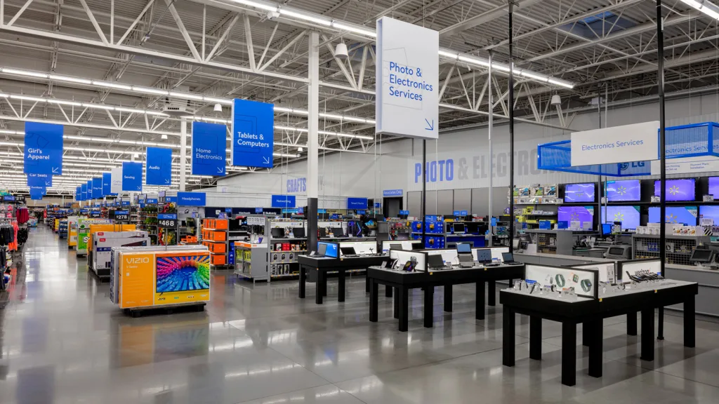
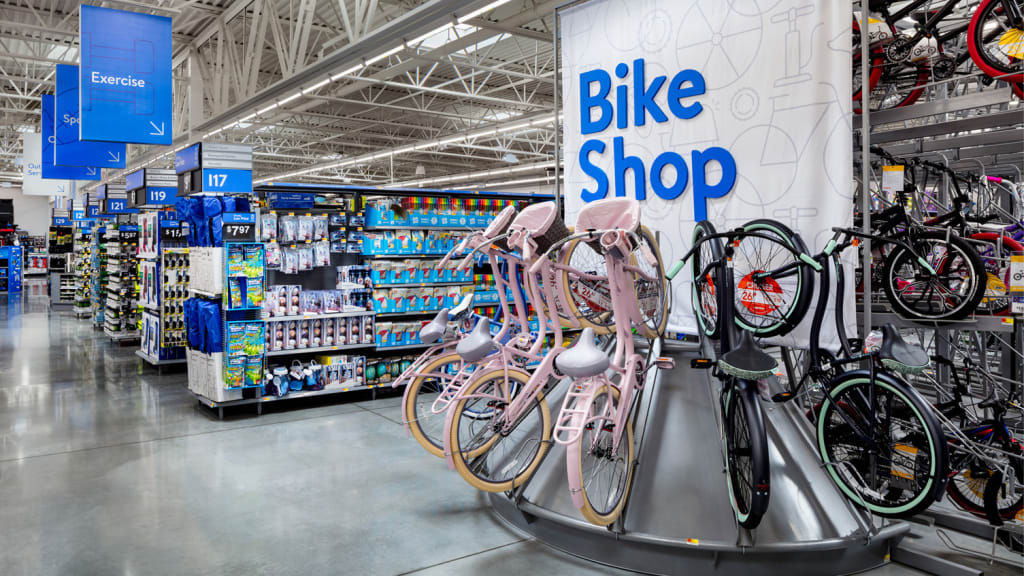
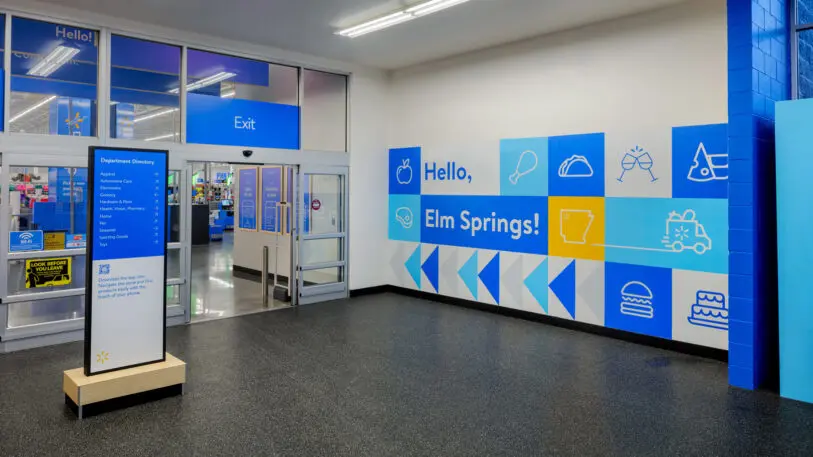
At a glance, it honestly might not look that different. The stores will still have similar snug aisles and unfinished, warehouse-style ceilings. But the updates are in how you navigate that space. Walmart is rearranging many items across the store, consolidating categories such as electronics, toys, and baby products into their own dedicated sections rather than having some items scattered. Then they’re loading these stores with clearer signs to point you around the space. These signs match up with the exact categories and icons you’ll also find inside the surprisingly great Walmart app. The intended effect is what the company is billing as a “seamless” shopping experience between the digital store and the physical one.
“We’ve always known customers want to get in and out of a Walmart as quickly as they can. Not in a bad way. You don’t want to waste time,” says Janey Whiteside, EVP and chief customer officer at Walmart, who adds that this desire has only increased during the pandemic as people want to feel safe. Speed and clarity become a lot more important than what retail had been championing before: experience. There will still be areas to experience products—these special spots will be dubbed “beacons” and allow you to test strollers or gadgets. But it’s hardly the experiential approach to retail pioneered by companies such as Apple and even Walmart’s big-box competitor, Target.
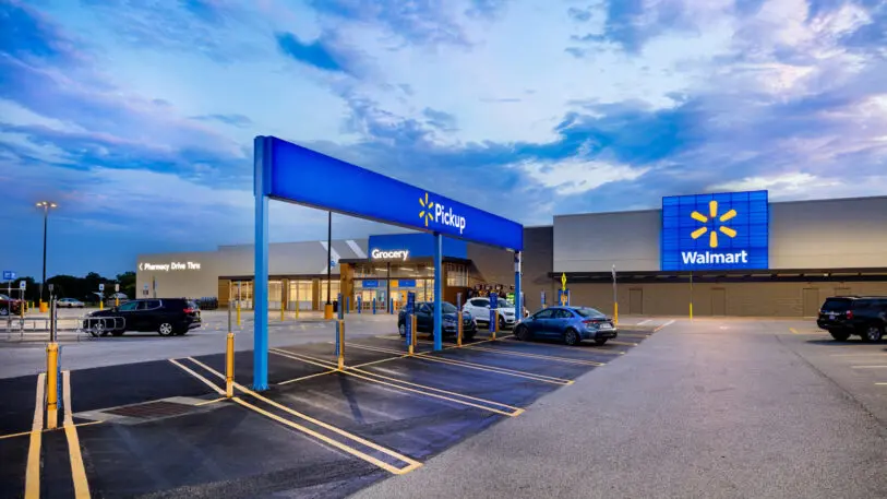
In 2017, Target renovated its brand by spending $7 billion redesigning its stores to be more browsable, creating moments of serendipity with sections often set up to spotlight just a few products (which are often designed and sold by Target). For Target, the strategy worked almost instantly, and by 2018, foot traffic increased to its highest numbers in a decade. But to many of us in 2020, the joy of burning a Sunday afternoon with a latte at Target has been overshadowed by the threat of a pandemic petri dish (which is why, as in-store visits stalled, Target’s curbside pickup expanded by an unbelievable 734% earlier this year).
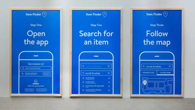
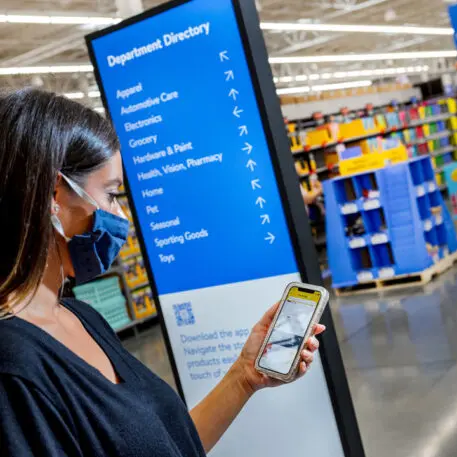
Walmart dubbed these tools “navigational efficiencies.” And you’ll see them when you walk in the door but also in new, oversized blue labels over areas that read things such as “CHEESE” or “SEAFOOD.” For people who don’t read English, these giant words might not help much. But by having the same icons in the multilingual app as on many of the other Walmart store signs, Whiteside argues that people should be able to translate various sections more easily.
Recognize your company's culture of innovation by applying to this year's Best Workplaces for Innovators Awards before the extended deadline, April 12.
