
Mail-in voting will be absolutely essential this year as the pandemic is still in full swing. And for many of us, requesting a ballot is fairly easy. You just go to your state’s website and order one.
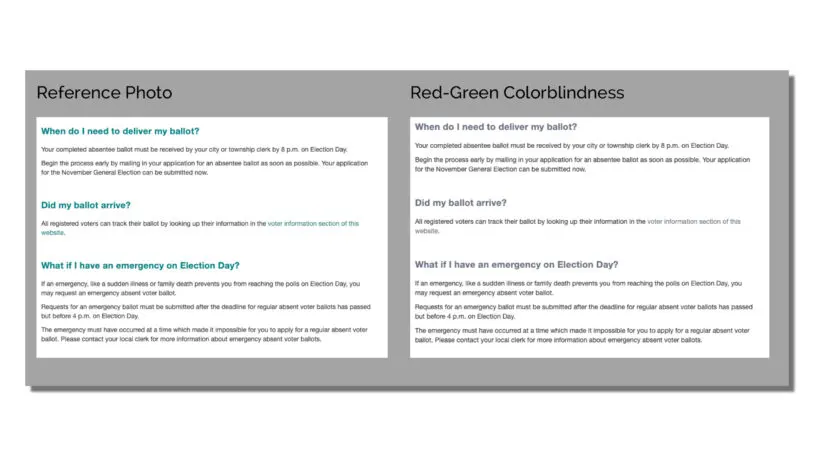
But if you’re one of five Americans with a disability—ranging from color blindness to severe mobility limitations—it’s not necessarily that easy, even online. Because a recent analysis that tested the accessibility of all 50 states’ mail-in voting sites discovered something terrible: The average accessibility score was 77%, or what you might think of as a C+. Some outright failed, such as Alaska and Georgia, which each scored 20%. In fact, 20 states scored somewhere between a C and an F.
What is going on? It seems to be a product not just of carelessness, but perhaps of too much reliance on automated testing tools.
The study was spearheaded by Catharine McNally, accessibility lead at the digital agency Phase2, who published her results on Medium. McNally herself relies on a cochlear implant to hear and is used to encountering accessibility problems not just in her professional life, but in her daily life too. As she puts it with a laugh, “Don’t assume I can use ASL because I’m deaf. I don’t know ASL—find different options for communication!”
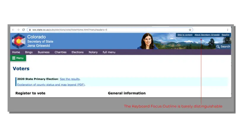
Vote.Utah.Gov – tabbing misses most content. [Image: courtesy Phase2]And that’s really the point of accessible design—also sometimes called universal design. You can’t create just one perfect interface for a single type of user. Instead, you need to use best practices to include the more nuanced edge cases, too. Maybe someone can’t use a mouse, so they rely on hitting “tab” on their keyboard to hop around the page. Or maybe someone can’t see, so they rely on speech software to read labeled parts of the page aloud.
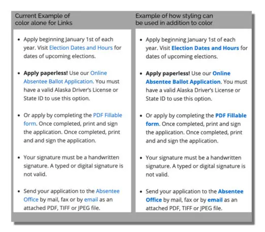
“I want states to realize, a lot of accessibility issues are just about being aware of one line of code,” says McNally. “That is everything to somebody else who needs that.”
Connecticut tabbing [Image: courtesy Phase2]But McNally doesn’t want to lead some takedown of poor-performing states, shaming them for these errors, especially understanding that government budgets can be tight. She just wants to see the problems fixed. And she realizes, there’s a good reason they may have slipped by in the first place.
“Alaska was in really bad shape. But they have an 80% Lighthouse score. Georgia has a 90% pass rate in Lighthouse but a 20% [from manual testing],” says McNally. “That’s a shining example of how automated testing isn’t good enough.” Indeed, tools like Lighthouse can only flag up to 30% of all errors, according to most industry experts. The others fall through the massive cracks.
But there is good news. After publishing her findings, a few states reached out to her directly, seeking her advice to make repairs. She’s currently working on a report for the state of Colorado, at its request.
“I want to help these states,” says McNally. “Because we have to make sure everyone has the access and opportunity to vote.”
Recognize your brand’s excellence by applying to this year’s Brands That Matter Awards before the early-rate deadline, May 3.
