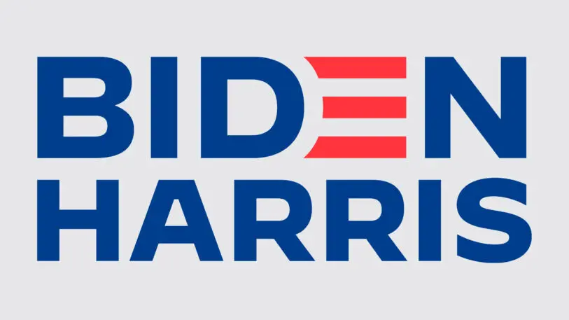
Anticipation had been building for months about who Joe Biden would pick as his running mate. Finally, the announcement came. The Democratic ticket officially had a vice president. And a new logo.
Senator Kamala Harris competed against Biden in the presidential primary, but once they joined forces, their logo needed to make a case for unity amid a deep political divide.
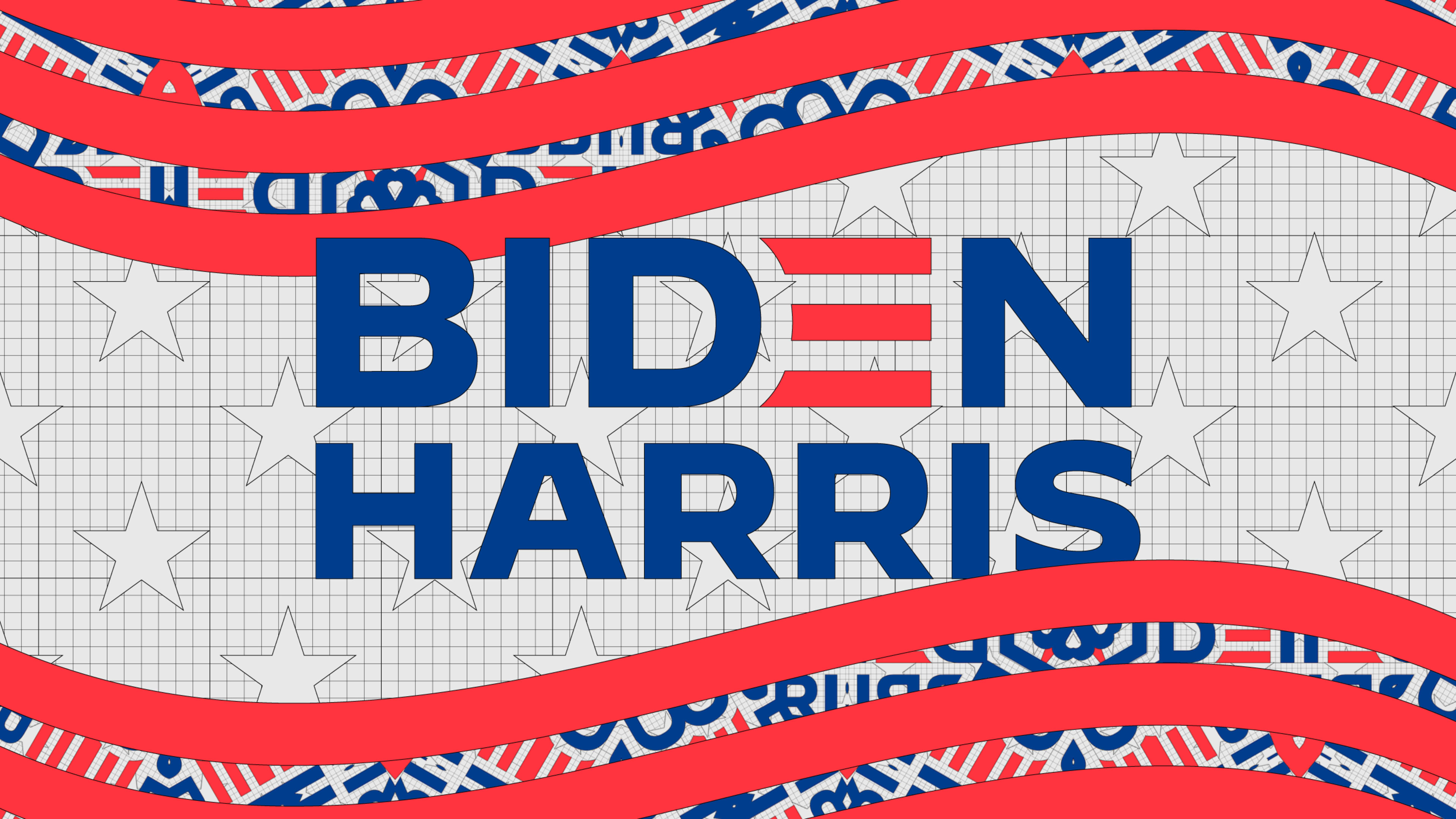
In keeping with that idea, Robyn Kanner, senior creative adviser for the Biden campaign, worked with an in-house creative team to develop the new logo, which was unveiled yesterday when Harris joined the ticket. It built on Biden’s original brand and logo, which was designed by ad agency Mekanism, the Biden campaign tells Fast Company exclusively.

While the new logo is type-focused, it’s designed to communicate more than just which box to check on Election Day. “[It] represents an America that is strong, bold, and unified,” says Kanner.” Joe Biden knows that governing partners must work in lockstep, as he did with President Obama, and the visual alignment of Biden and Harris in the logo helps convey the powerful impact of a strong partnership and unified America.”
The last stretch of the presidential campaign is here and the stakes have never been higher. Now that the ticket has been announced, does the campaign branding convey its message? We asked 10 experts to weigh in.
The typeface is beautiful—and perfect for this election
Biden’s original logo used the typeface Brother 1816; for the Biden-Harris logo, it adopted Decimal. Decimal, along with another typeface, Mercury, were developed for the campaign by type foundry Hoefler & Co. Several of the experts we talked to praised the typeface. Jesse Reed, partner at Order design, said it “looks like a winner” and “was deployed perfectly”; Deroy Peraza, partner and creative director at Hyperakt, called the changes put in place by Kanner a “significant improvement in the production value and craft of the brand identity.”
“Decimal is a gorgeous typeface and a perfect fit for the Biden campaign. The updated logo is a logical and elegant evolution of the brand. Decimal, inspired by the typography of vintage watches and clocks, feels simultaneously timeless and forward-looking. It manages to strike a perfect balance between being strong, trustworthy, and official, and warm and accessible.”
—Ben Ostrower, founder and creative director, Wide Eye, which developed Harris’s campaign brand
Who cares about aesthetics?
The 2016 election sent aftershocks through the design industry. While many experts agreed that the Clinton campaign’s work was objectively better, it didn’t seem to matter—Trump still won. It spurred conversations about “good” design versus “effective” design, and in 2020, some experts wonder whether that distinction even matters anymore.
“I never, ever thought I’d say this after a lifetime in professional branding, but on the spectrum of good branding versus effective branding, I’d say at this point it is irrelevant. Frankly, the Biden-Harris logo could have been scribbled on a napkin and I’d be happy. Trump’s brand is beyond repair and is now more dangerous than ever. The soul of our country is at stake. That being said, Biden’s choice of Kamala Harris is inspiring and history making, and Jonathan Hoefler’s typography is strong and impactful. The overall execution is confident and clear, and I can only hope it helps get people to the polls.”
—Debbie Millman, chair of the Masters in Branding program, School of Visual Arts
“Politics are personal and emotional. If you like a candidate, you’ll likely like their logo. It was made in their image, after all. What’s most important then is for design to deliver as much information to as many people as possible, then to make the path from that information to voting as easy as possible. And the Biden team is doing a fucking fantastic job at that.”
—Jennifer Kinon, partner, Champions Design; design director, Hillary for America
“This is not so much about aesthetics of the logo or website. This is about the moment. The latest design tweaks are a very good start, and now it’s up to all of us to meet this moment—and win it.”
—Matt Ipcar, executive creative director, Blue State; worked on both Obama campaigns and served as a creative adviser for Elizabeth Warren’s primary campaign
“Do people really care about aesthetics in an election year like this one? I look at it as aesthetics rather than branding because I haven’t seen much of what I’d call a visual brand from the Biden campaign—which may be a good thing.”
—Eddie Opara, partner, Pentagram
It’s not groundbreaking, and that’s on purpose
The visual identity in some ways mirrors a classic approach to choosing a VP: “Do no harm.” Many presidential candidates aim to choose a running mate who won’t open the ticket up to fresh attacks and help cast a wider net. The Biden-Harris logomark is rooted in classic Americana, which ideally both the center right and political left will feel comfortable rallying behind.
“The new Biden-Harris identity is handsome. Nothing groundbreaking or experimental, but for the audience he’s speaking to (everyone in America), this hits the mark.
“I’ve never been a fan of the equally justified and stacked combination (Biden and Harris being the same width), but I also assume that someone on the campaign side probably requested it that way. Because Kamala Harris’s name is longer, it becomes smaller than Biden’s, which sort of puts them on uneven playing fields. I get that one’s running for president and the other is vice, but seeing them equally represented might have been stronger? Again, not that important in the grand scheme of things!”
—Jesse Reed, partner, Order design; codesigner of identity and campaign guidelines for Clinton campaign
“Without placing a clear value judgment on the aesthetics of this particular composition, it appears to be designed to offend the least amount of people. The one thing it says loud and clear is ‘I’m risk averse,’ and perhaps that’s exactly what the people in Wisconsin, Michigan, Pennsylvania, Arizona, and Florida, etc., are looking for right now? I’d be surprised if Biden’s opponents have much to say about his campaign identity, and perhaps that’s precisely the point?”
—Scott Starrett, founder, Tandem NYC, which developed Alexandria Ocasio-Cortez’s campaign branding
“Biden’s brand and tagline strike a ‘principled patriotism’ tone. I’d wager that [most] of the Democratic base will feel a ton of comfort with this identity. Why? Because it feels like we’re in Obama days again.
“Where other candidates were using their brands to highlight their unique personal identities and show they were willing to take some risks, Joe’s brand is the opposite—it’s very much about not taking risks, about getting back to where the Democratic Party left off after Obama. It’s familiar and comfortable territory for the part of the centrist Democratic base that long for a return to ‘normalcy.’ Biden is following the same script that got him to the White House last time around and taking as few risks as possible to try to secure this victory. It’s not the most exciting approach, it’s not the most progressive, but it might just work. I hope.”
—Deroy Peraza, partner and creative director, Hyperakt; designed Pete Buttigieg’s presidential campaign branding
It doesn’t say anything new
“Let’s be honest: it’s not a good logo. Why does the E deserve to be the highlight of the identity? How about emphasizing the B as his first initial? And turning an E into three lines is something we’ve seen.
“For such a consequential election—and now an historic candidacy—I could see them taking a fresh look at Biden’s somewhat amateurish logo from the primary and maybe doing something more dynamic and innovative. (Harris’s logo for her own primary run was much more original and carried a message.) However, perhaps this bulky, uninspiring mark reflects exactly this ticket’s promise: a safe, predictable return to normalcy. I’ll vote for them.”
—Sagi Haviv, partner, Chermayeff & Geismar & Haviv
“Strategically, what I interpret from the mark is a strong sense of partnership—a unified front. The candidates are being presented as a team. Their names are more even both in scale and weight.
“Unfortunately, the Biden-Harris branding lacks some energy. It feels like the obvious, expected solution, and it doesn’t necessarily say anything new. If you think back to the Hillary logo, it had an iconic symbol that was memorable, and the arrow implied forward momentum. There was a story embedded in the branding. What’s the narrative for the Biden-Harris brand?”
—Douglas Sellers, executive creative director, Siegel+Gale
Recognize your brand’s excellence by applying to this year’s Brands That Matter Awards before the early-rate deadline, May 3.
