For much of the United States, all the coronavirus arrows are pointing in the wrong direction. More than half of all states are seeing an increase in new cases, pushing the country’s seven-day average on an upward trend. According to The New York Times, yesterday saw the highest number of new cases since April.
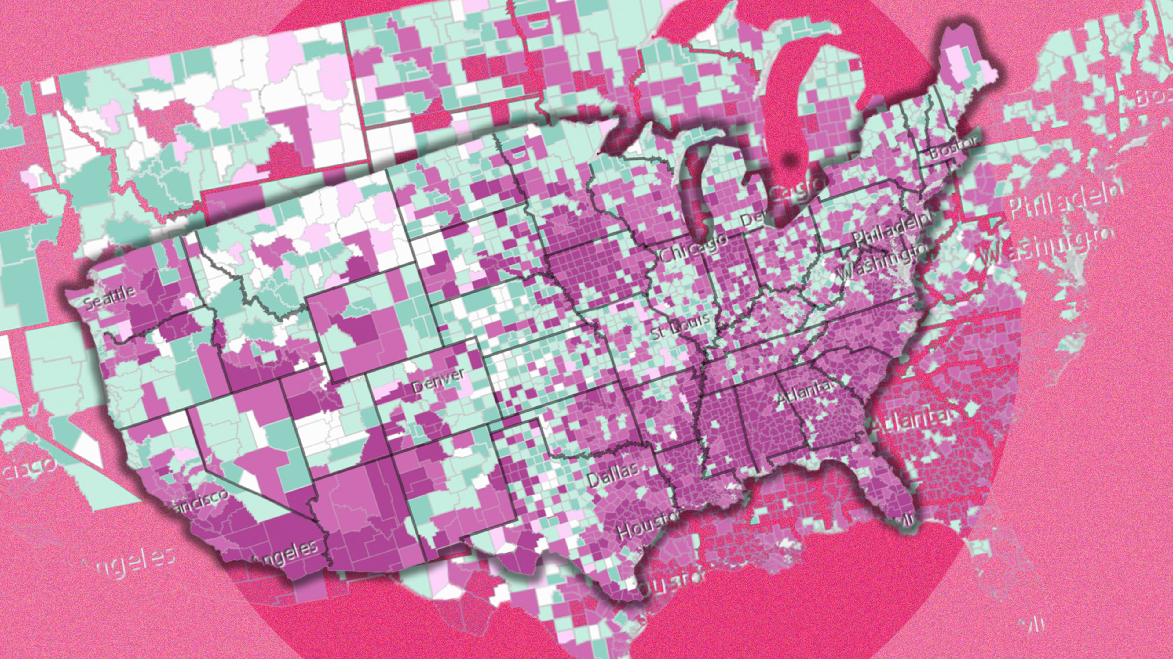
The latest data from spatial analytics company Esri brings similarly troubling news. Its map series, “COVID-19 Trends in Each Country,” highlights various data points at the county level, and the maps are color-coded and searchable so you can see which areas are faring better and which are faring worse.
As of Wednesday, Esri’s map shows large swaths of the South, Southwest, and California are showing either a “spreading” trend or an “epidemic” trend. The former is what Esri describes as an early stage of an outbreak that could still be controlled depending on what administrative steps are taken. The latter is simply uncontrolled spread. Neither are good, but epidemic is obviously worse.
Ersi’s data, which is updated daily, shows 1,210 counties with a spreading trend and another 736 with an epidemic trend.
Meanwhile, the number of counties that are considered in the end stages of the COVID-19 crisis—that is, they have no new cases—is also moving in the wrong direction. As of June 20, Esri said that number had dropped to 332, the lowest in almost months. It was even lower today at 321 counties.
You can check out Ersi’s full map series here or via the embed below. The maps source data from Johns Hopkins University and the UN World Urbanization Prospects 2018, in addition to Esri’s own data. The full methodology can be found here.
Recognize your brand’s excellence by applying to this year’s Brands That Matter Awards before the early-rate deadline, May 3.
