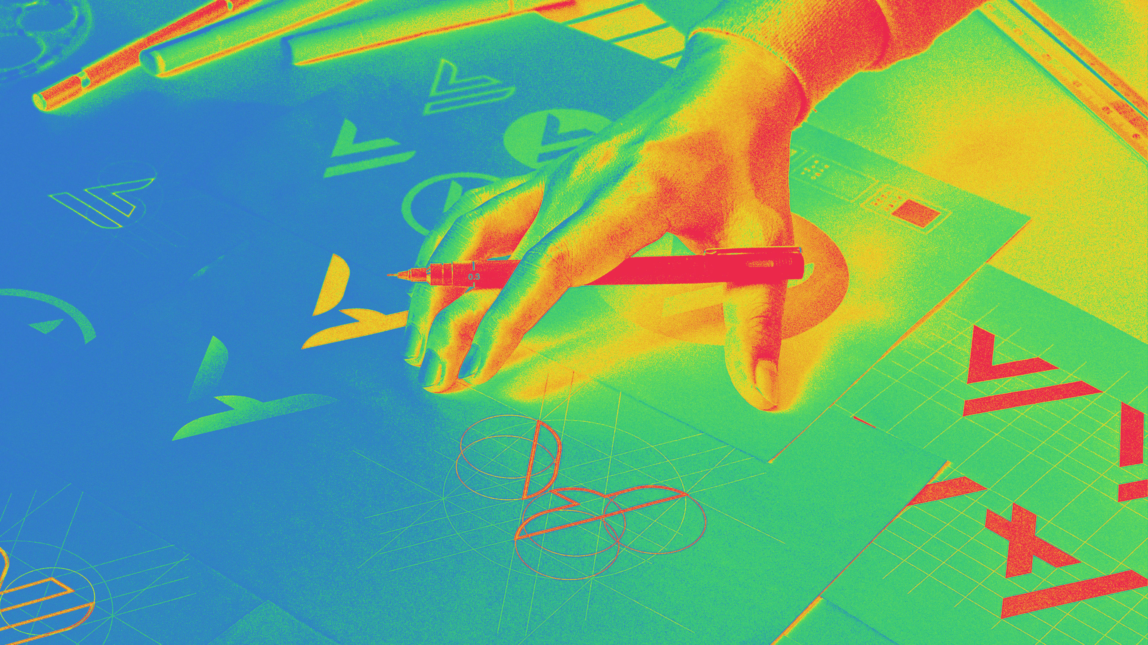
Each year, I write a report on logo trends, and I always look to the past before looking ahead. You can’t tell where something is going if you don’t know where it has been. There’s always a reason something goes viral or takes off—something set it in motion, good or bad. So let’s start by addressing the white elephant on the planet: COVID-19.
Crises often accelerate trends in society and design. It’s very reactive and rushed; if there were a 10-step program that we typically follow to get from point A to point B, we skipped steps six through nine to get there during a crisis. Next year, we’re probably going to see a lot of logos that emerged as a result—some will be brilliant, many more probably won’t be. No matter what, I believe the design industry is going to come out of this better than we were. Some firms will not recover. It’s going to be survival of the fittest. Having said that, we’ll see an emergence of little startups and uncover some talent we’ve never seen before. People will regroup, find their niche, and come out of this with a new resilience. This is a shared generational experience that we’ll never forget and hopefully we’ll all learn from. Next year’s batch of logos will surely reflect this.
As for this year’s trends, we’re seeing some intriguing clusters of design innovation driven by technology and tools. For instance, there are a lot of logos that employ variable fonts and effects filters, maybe for no other reason than we have the capabilities to do it. When new tools are introduced, designers start with the obvious effects and objectify the coolness (which gets tired after a while). Fortunately, there were many great examples by designers who took these tools to the next level, exploiting their capabilities and creating logo experiences that we’ve never seen before.
We’re also seeing two opposite trends that hearken back to the best of the 1970s. Wordmarks with big fat fonts came out roaring this year, perhaps as a counter to the minimalist sans serif aesthetic we’ve gotten used to the last five or six years. At the same time, there are a lot of ultra-minimalist vector images with clean positive-negative fields that may have resulted from a desire to return to clarity and simplicity, a la Saul Bass and Paul Rand—the pendulum swings both ways.
There’s also a tendency toward minimalist effects using transparencies, where one surface hovers closely to another. It’s getting tiresome, and I see a movement away from this. On the other hand, we have what I like to call “Potter Pics,” which reference the little animated movements in some logos, like the wink of an eye. They’re subtle and clever.
Hand-drawn naïve symbols that are more crude are emerging. They’re kind of a New Age throwback. In a similar vein, there are logos with flowers and leaves referencing organics and natural products. Expect to see more of this as the cannabis market expands in the next few years.
Gradient solutions are rampant, but they have taken on a new level, and they’re being applied in novel ways. The simple ways of washing green to blue or red to orange are tired, so now there are more fashionable applications. For instance, there are waves of purple to pink, then zooming into a black hole or interacting with colors that aren’t necessarily adjacent to each other on the color wheel. It’s quick and busy and interactive.
I never grow tired of reviewing the thousands of logos I receive every year. It’s always a fascinating study of creativity and innovation.
Counters
Mazes
Some of these marks identify a path that enters at point A and exits at point B, while others guide you directly into a blind dead end or a goal or starting point, depending on the perspective. Either way, there is a specific pathway that leads you to a timely completion of your task. Having a guide for the journey that might otherwise be interminable is the underlying promise these marks address. As addictive as click bait, they invite consumers to visually trace their route.
Sisters
People like to create order. It gives us a sense of well-being. This is all part of a bigger conversation associated with the Gestalt theory, but for the purpose of this trend, it’s driven by our comfort with symmetry. This group of logos are most often crafted from two identical elements either mirrored or rotationally nestled together after a 180-degree rotation.
It’s not uncommon for the end product to assume the shape of a letterform or be constructed by reflective letters. The symmetry of these logos creates a sense of assurance in much the same way you find harmony in a yin-yang symbol. It conveys the idea of a strong partnership that is well suited and beneficial to both sides. Rotational pairings can easily represent a sense of motion or action that may demonstrate a positive aspect of the client’s nature. Like the siblings this trend is named for, the two distinct elements may be in perfect harmony or reference co-joined elements rife with tension. Regardless they will work it out. After all, they are family.
Chexmelt
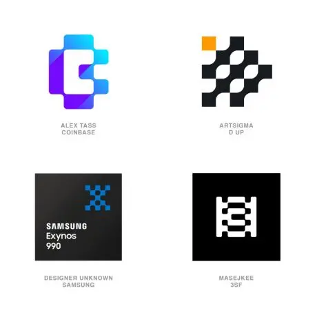
Sometimes an aesthetic meets it demise and no one remembered to tell it. A bit like my feelings for designs that trod out the old circuit board solder pathways careening around like a pair of Tron cycles abruptly flaring out to terminate in a silver dot cul-de-sac. That technology probably took us to the moon and back, but for designers it provided an immediate visual language we relied on and abused right up until the night we met pixels. Now in some karmic incarnation, the two trends bore an offspring with a perfect 50-50 genetic split.
Samsung committed to this trend with their Exynos mobile processor using a mark laid out like a pixel chessboard that softly melts together with a soldered bridge at every corner. Walk away from these marks without a sense of tech and you probably forgot to look. The checkered framework of these logos demonstrates an affinity for building links and pathways between entities. They express the idea of multiple elements coming together to create a greater good, but corner-connecting just enough to maintain modest autonomy all the while keeping their social distance in check.
Bevel tips
For each rounded bend there is a counter corner that draws to a point like the tip of a leaf. No surprise that this shape has found its home in a number of marks that are eco-centric and hope to reflect the language of nature’s building blocks. Foliage, feathers, grain, cresting waves, or any number of other receptive contoured forms. This shape stacks, reconfigures, and pairs well with other soft shapes or blends with harsher geometrics to soften their effect. It serves as a refreshing addition on a number of stiff sans serif fonts, to add a wisp of nature and whimsy.
Petri dish
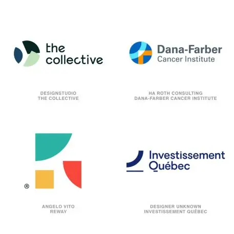
I’ve always thought of a petri dish as a fully contained ecosystem that investigates bacteria and other phenomenon. Those clear dishes serve as our little round window into discovery of the unknown, while sealed to protect us from their content. Exactly like these logos. These micro views of a macro world are tightly cropped shots, often framed in a simple circle or square. That cropping purposefully focuses the consumer on just enough detail to extrapolate the rest of the story.
Swimming in these pools are right angles, arcs, points, and curves—just enough to telegraph the actual contents as circles, squares, stars, or whatever the visual totem happens to be. This places faith in the public’s participation and their deductive skills at ferreting out the intended message. Dana-Farber captures the arc of a D and the right angle of an F coming together to form a human with a focused Venn diagram at the intersection. Investissement Quebec crops in on its proprietary Q just enough to show a profit chart with a sweeping upward trend. You have to appreciate an entity that avoids pure literal solutions in favor of placing faith in our ability to attain our own aha moment.
Variable type
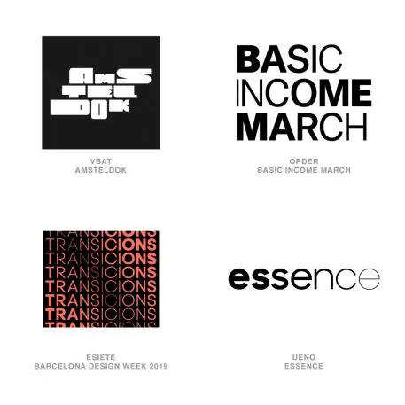
Unfortunately, the only time variable type can be identified as such is when it’s shown in contrast or motion. Amsteldok, the WPP offices in Amsterdam, have really done an astonishing job of embracing regional and historic influence for their proprietary font, and have used the variable capabilities to create a highly flexible system. That system manages to hold together admirably but also is designed to morph and gyrate.
Blackletter
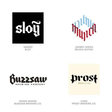
Hard to throw too much shade at a font that was Europe’s only choice from the 12th to the 17th century. Blackletter fonts never completely vanished and became the preferred text for Germany, which probably explains its recent resurgence with the vast array of microbrew pubs dotting corners across the globe. It’s never truly been out of mind, serving as the font of choice for nameplates on hundreds of newspapers worldwide. It even worked pretty well on your diploma and for Disneyland, but how did it make the jump to AC/DC and Snoop Dog? Now that’s some kind of flexibility!
Though it’s no friend of legibility, it will never be accused of lacking personality. That may be the reason it’s on every designer’s casting call as we investigate counter measures to the blandification of wordmarks crafted from soulless sans serif sameness. The slab and angled strokes have a sharp graphic appeal that allow for abundant customization and retooling. Plenty of Blackletter-inspired fonts are popping up with myriad weights, in-lines, swashes, ornaments, and other iterations. It’s a perfect mouthpiece for demonstrating a client’s heritage and craftsmanship—and expresses both with inspired drama.
iDrops
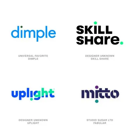
After seeing too many solutions like Dimple or Medallia using the color dotted “i” only, I have tried to show a broader range of applications under this umbrella that demonstrate some of the stronger conceptual thinking. Admittedly the lower case “i” is often cast as the person in the letterform with the dot serving as the head. Often a few extra colored dots on letters that don’t really call for one, help describe the family or a team. Uplight flopped their “i” and lit their bottom, while Mitto is just burning its “i” at both ends. Clever.
Handout
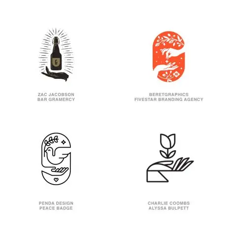
Take a look at this beautiful array of hands that are abundant this year. Dramatically different in illustration style, and beyond the hands themselves, there’s one distinct commonality: They all have something either hovering above them or we captured these elements in free fall. This may be symbolic of the magical essence of the relationship between the product and the user. Granted, the bird has reason to hover but there is some kind of special levitation going on when a bottle not only rises out of the hand but GLOWS!
When a hand appears as part of a logo, it’s often to represent a human experience that’s part of the brand assurance. I think these demonstrate a receptive attitude with palms up, open and at ease. These hands impart a New Age culture and are likely to be accepted in an artisan boutique or definitely in a business-to-consumer category. Handcrafted products seem to fit this genre, but more likely these are associated with an experience with an extraordinary promise. These marks tell enchanting stories and ask the consumer to both suspend belief and to believe at the very same time.
Bolts
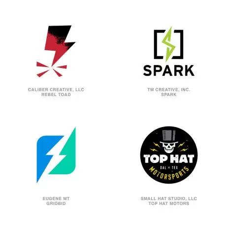
A symbol is only a representation of a thing or concept. We know a human heart looks nothing like the symbol we use to represent it. Nor does a star, or fire or a cloud. The ancient Greeks used a symbol for lightning that looks nothing like our modern-day interpretation. And our interpretation looks nothing like the real thing. Even so, it was in abundant supply in this year’s crop of logos.
For millenniums, lightning was almost exclusively looked at as a weapon or punishment from the gods. They were in charge of it and could release it at will. We’d not really fathomed the idea of electricity so it’s not surprising that the idea of a bolt representing energy, illumination, or a flash of brilliance is only a recent association. The Top Hat design used lightning as a small detail that’s a universal representation of action. I like to think that these phenomenon represent an inexplicably awesome event. Stick around and it may happen again.
Twinkle
We evolve and so do the trends. That planting of seeds a few years back not only sprouted a healthy set of legs this year, it’s grown into an Olympic sprinter. Leman Jewelry laid claim for the center stroke on their letter E, where every stone has that glint. This trend has pressed forward to the obvious, which is creating a star as the negative space at the convergence of four curves. For a client, this builds a good story of coming together to create a brilliant solution or a star from many. Remove any one of the pieces, and the achievement vanishes.
Cornered
Designers understand that there are many triggers for consumer engagement and deceptive dimension is one of them. Anytime we can extend that mental participation in what we design for our clients, we are creating neural links with their brand. We refer to these as “Cornered” because each has manufactured the illusion of space by wrapping their design around an artificial reality. These all reside on a flat plain of white that gives no hint of dimension, but that can serve as the perfect canvas for these to dimensionally exist in undefined space.
Letter illusions
There are things in life that can make us feel uncomfortable or on edge but that captivate us nonetheless. It’s the old theory of a train wreck and not being able to look away. Feeding the public’s mind with the unexpected or seemingly impossible is not just a way of creating disruption; it’s also the way of communicating a promise, achieving the impossible or scouting a path to the unobtainable.
Virile strains of these marks have cropped up this cycle, with many using letterforms as a mnemonic reminder of the entities name. As if lifted from the pages of a book on optical illusions, these marks range from linear outlines like you’d find with DIY instructions, to the fully illustrated with gradients, shadows and spectral light pings. The use of graphic illusion is nothing new, but the abundance this year hints at a rediscovery of miraculous problem-solving skills and a unique perspective—or possibly the ability to teach your customers how to achieve the same. And when you can’t quite explain a client’s complicated process, laying claim to a little bit of magic is a great fall-back explanation.
Chiseled shadow
Demonstrating dimensionality of form is a foundational way of shifting a flat image from second to at least third gear. Finding that hybrid between committing to gradient tone and graphic surfaces that imbue reality and a simple vector outline really only offers up a handful of tricks. Shadow has long been a staple of the designer to convey space in a flat graphic. They are less about the absence of light than they are about defining a light source. Harsh shadows on these marks can help to communicate a client’s desire to be under the focus of a spotlight and open for complete inspection with nothing to hide.
What differentiate this group from other shadow marks are the 45-degree angular cuts that would ordinarily be cast if the surface it appears on is a separate plain angling away. This is modestly troublesome in trying to actually model the realism of the light conditions. I’m convinced these designs are less about crafting reality than they are about creating a dramatic fictional dimension, embellished by stark shadows with flexible rules. The mass appearance of this effect is mostly played out on sans serif letterforms and tends to hearken to the angled effect of a serif, excised from the letters in a chiseled dimensional form.
This article was adapted with permission from the author. Read the original here.
Recognize your brand’s excellence by applying to this year’s Brands That Matter Awards before the early-rate deadline, May 3.
