On November 6, Johns Hopkins University published an article about a simulation to explore how the United States would respond to a fast-moving new virus. The subtitle, which read in part that the simulation “envisions a fast-spreading coronavirus with a devastating impact,” could be mistaken for a headline in today’s papers.
Simulations and games are often used to train expert teams to respond in times of crisis. Today, our own individual choices have just as great a bearing on the spread of COVID-19 as policy decisions. Rather than being limited to policy wonks and first responders, simulations have emerged as a critical way for individuals to understand complex concepts and examine the impact of their decisions on their communities. Critically, they do more than just inform; they help users build empathy for others.
How games cultivate empathy
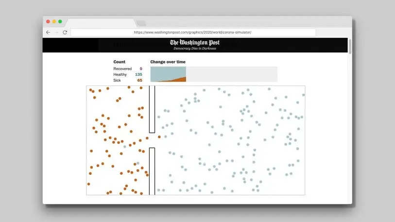
Perhaps the most widely experienced simulation about the novel coronavirus is Harry Stevens’s “Why Outbreaks like Coronavirus Spread Exponentially.” The “flatten the curve” animated dots helped Americans understand how important social distancing was in slowing the spread of COVID-19. The article is now the most viewed page of all time on The Washington Post website.
These experiences unfold as stories in their own way, and stories are sticky, memorable, and invoke a sense of empathy with the characters when told well. In these simulations, we get to place ourselves in the role of the protagonist, and our community becomes the cast of characters, often simplified into little animated dots or icons on a screen.
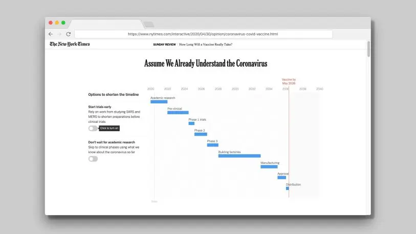
Simulations of COVID-19 extend beyond making sense of case numbers into policymaking and understanding regulations. The speed to develop a vaccine has produced some ambitious targets that even pop culture has tried to temper with humorous pragmatism. Stuart A. Thompson of The New York Times puts you in the seat of the vaccine developer: What toggles do you turn on and off for the sake of speed to market? Do you choose not to wait for academic research? Each choice you make moves the proposed launch date, shrinking or expanding bars representing the time needed for different phases of development.
In this simulated vaccine timeline, you’re faced with a penultimate choice: Would you choose to be vaccinated with a product delivered with such a compressed timeline? And as you select (somewhat arbitrarily) which estimated value you’ll use as an input in a model, you can’t help but think about the challenging choices facing modeling teams around the world as their work is informed by incomplete case counts and uncertain measures about the virus itself.
Leveling up to a multiplayer game
Simulations typically tackle one facet of our understanding of COVID-19, like exponential spread of a virus or how inputs to models are selected. Shirley Wu and Stephen Osserman’s People of the Pandemic game combines local demographics, exponential spread, hospital capacity, and the consequences of individual decision-making into a rapid multiplayer game.
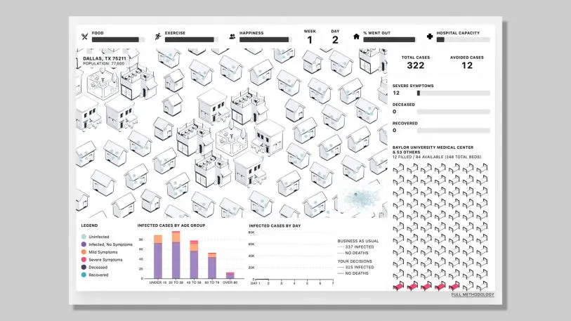
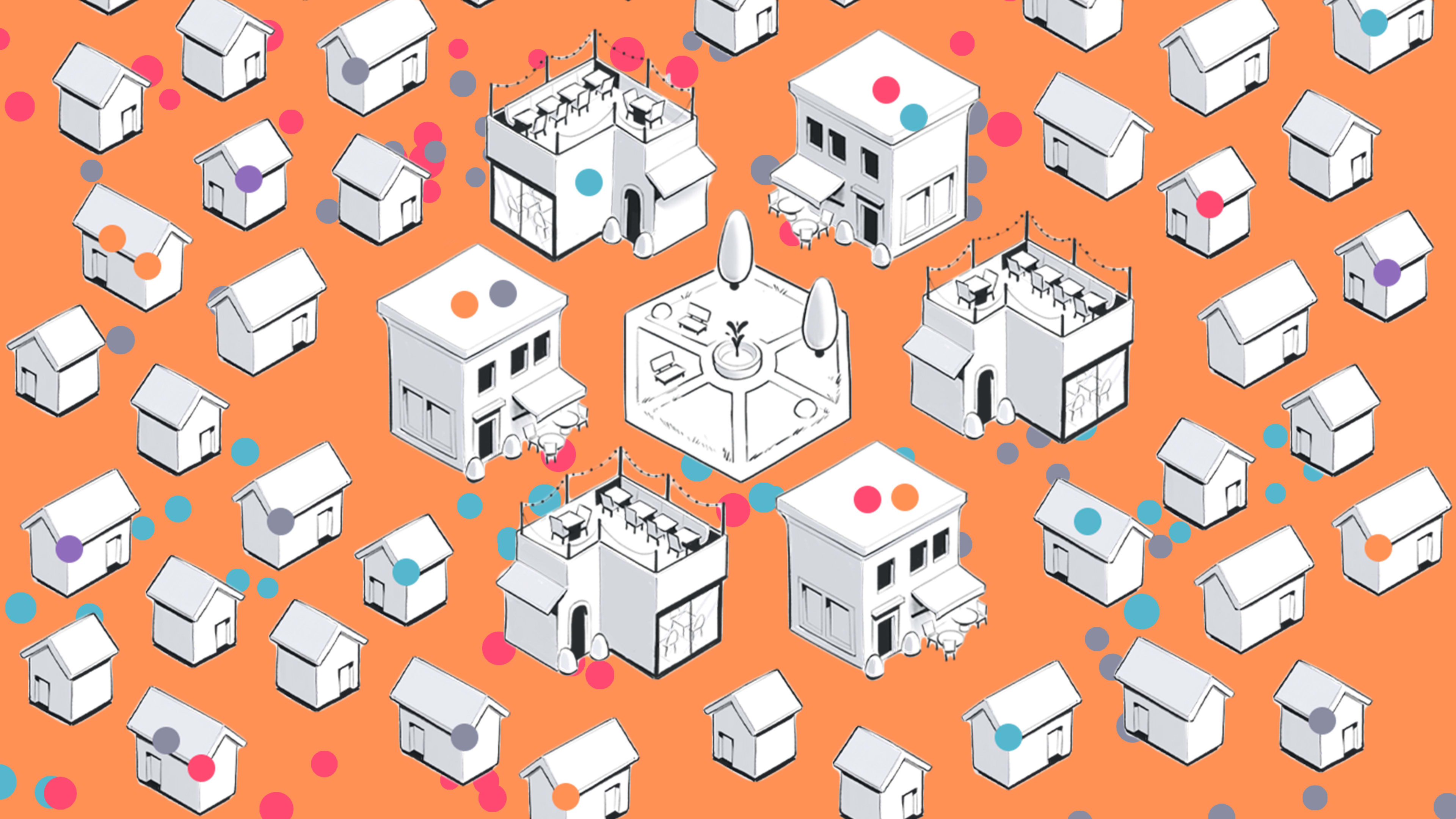
During the game, you enter your zip code and make decisions over five illustrative weeks on how frequently you’ll go out in your community alongside 19 other players, while a highly contagious respiratory virus modeled after COVID-19 is spreading in your community. If you go out too often, hospital capacity could be overrun due to spikes in infection, but if you isolate and never leave your home, you could die from not having any food. The interface is made all the more real in the visual displays, like the hospital beds labeled with the name of a hospital from near your zip code and movement patterns of small figures flitting between sketches of buildings.
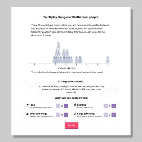
At the end of your five weeks, you’re given a final choice: Lift all restrictions, and see what happens over another four weeks without social distancing? “It really is shocking how quickly the numbers go up in a community that has been physically distancing, to suddenly reopen to normal,” says Wu (presumably without any additional prevention measures, like mandatory mask wearing, being put in place). The summary at the end drives home how your decisions, which may seem trivial as you make them week by week, actually contribute to a collective whole in your community.
One of the challenges in designing the People of the Pandemic game was finding ways “to let individuals see the consequences of their actions, but also emphasize that their actions are important precisely because they’re part of a larger community—and that’s why we have the team aspect, of having other peoples’ decisions affect their game, and in turn their decisions affect future players,” Wu says. The game both creates a personal, localized experience for U.S.-based players and a collective experience in minimizing the spread of disease.
In this way, People of the Pandemic creates an intuitive understanding of a concept that we struggle to glean from words or charts alone. “It’s one thing to get a call from a local elected official or see in a newspaper that you should stay home or avoid large gatherings, very hard in the abstract to know why or what that means, what the impact is,” says Larry Samuelson, professor of economics at Yale University. “The game illustrates that very nicely.”
Using a simulated disease (and avoiding big data debates)
Interestingly, the data used in these simulations is not specific to COVID-19. The many uncertainties around COVID-19 make creating an accurate forecast difficult. Why overcomplicate a simulation, when a vague simulitis pathogen can just as easily illustrate the potential impact of a virus that spreads exponentially?
Using an illustrative virus has the advantage that users can focus on the game itself and what we learn from the experience, rather than nitpicking if the reproductive rate of the virus that the designer used is accurate at the time of play (though perhaps that level of scrutiny would be constrained to epidemiologists). With great uncertainty related to transmission dynamics, risk, and even the burden of disease, inputs would need to be frequently updated to simulate the actual SARS-CoV-2 virus.
The Washington Post‘s Harry Stevens worked with collaborator John Muyskens to tackle a second challenge: Why are all of the models of COVID-19 making such different predictions? Through a series of emails and choices, like deciding which journal article’s number to use for how fast the virus spreads, the screen renders charts that show how forecasted curves can vary with the change of a single parameter. No choice is easy: Each decision requires selecting an input with some degree of uncertainty. All of the choices are designed around an illustrative disease though, not the specific features of COVID-19.
In the flatten the curve and model design simulations from Stevens, an illustrative fast-spreading disease with similar features is used rather than the real characteristics of COVID-19. In the vaccine development explainer, real information about the vaccine development landscape to date is presented, but best estimates and projections modeled from the vaccine development history for other diseases is what gets plotted.
Considering how evergreen these simulations could be, Stevens says, “the simulitis stories I’ve written are more about diseases in general than COVID-19 in particular, so using real [coronavirus] data would not help explain anything any better than simulated data.”
The model behind the People of the Pandemic game is different, with inputs that have been updated over time and tailors the input to the player’s location. But the team is still clear in their disclaimer on the game: While the disease spread in this game is modeled after COVID-19, it uses a simplified model not intended to be a precise forecast. It’s modeling a virus, not the virus.
“We created a more complex model than a lot of others we’ve seen: We have people going to different destinations per day depending on their activity, and we have a weighted risk of exposure depending on those destinations,” Wu says. “We have a higher rate of mortality if hospitals are overrun, and other nuances. We wanted the decisions the players made to feel close to reality, while acknowledging that we’d never be able to model the complexity of the real world.”
Challenges with simulating a high-stakes issue for a broad audience
Still, seeing plots and graphs implies a certain “truthiness” to what we’ve viewing. Models forecasting COVID-19 have frequently been shared as “what will happen” rather than acknowledging all of the uncertainties that plague forecasts of emerging diseases.
“If we’re not straightforward about uncertainty—in this case, the fact that models may over- or underestimate the severity of COVID-19—people may not trust science in the future,” says Dr. Jessica Hullman, who researches how to effectively visualize uncertainty, in a recent webinar. “All we can do is be very clear about our assumptions.”
But that may be lost in a world of fast-fingered retweets. When you read the long-format articles that simulations are published in, authors are usually clear that their intent is not to predict the future. Often visuals from simulations are shared outside of that broader context though, as evident in the viral spread of Stevens’s flatten the curve simulation.
Designers must carefully balance the realism of what they create and the impression that the simulation is creating real predictions, with the constraints of using a simple model for the world. “We as individuals (especially if we’re not as versed in data) tend to conflate forecasts and simulations,” Wu says. “That’s one of the biggest reasons why we decided to [create] a game – so that there’d be no mistaking the simulation as a forecast, so that no one would think we were trying to forecast into their local community’s futures.”
A new mode of communication?
As we physically distance ourselves from others, the collective impact of our individual choices can seem invisible, particularly for those with the privilege of working remotely. An occasional venture to the grocery store or walk around the neighborhood has visual reminders, like people in masks or, signs on the store doors about 6-foot distancing, but unlike a natural disaster, we don’t have flattened houses or flooded streets to remind us of what’s happening in the world.
We’re a game-playing people (when we’re not using stacks of board games to hack together standing desks at home). Shifting from consuming messages through the news to experiencing data in the news feels like a change in how we interact with information. While game theorists and behavior economists have long used games to understand and communicate about human behavior, journalism about COVID-19 has brought a new wave of simulations accessible to a general audience. Is the popularity of these simulations a natural evolution in the way we communicate?
Games and simulations give us a way to develop an intuitive understanding of complex topics. They can create the foundation for a shared experience that can inform conversations with our friends and family about our individual and collective choices. And perhaps they can even temper our expectations around the pace of reopening or the speed of vaccine delivery—even as forecasts show flattening curves—by emphasizing the real-world impact of our choices.
Amanda Makulec is the senior data visualization lead at Excella and holds a masters of public health from the Boston University School of Public Health. Find her on Twitter at @abmakulec.
Recognize your brand’s excellence by applying to this year’s Brands That Matter Awards before the early-rate deadline, May 3.
