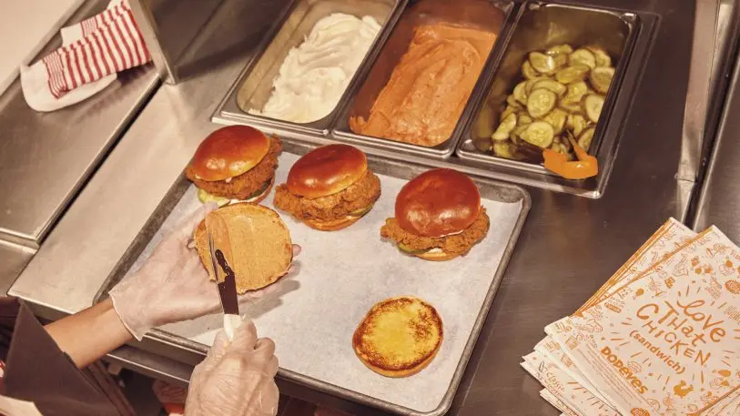
Popeyes might not have the brand recognition of Burger King or McDonald’s, but some would argue it has something even better: a killer sandwich. After starting the #ChickenSandwichWars last August with the launch of its chicken sandwich, the fast-food chain has been gaining in popularity and quietly overhauling its brand in the meantime.
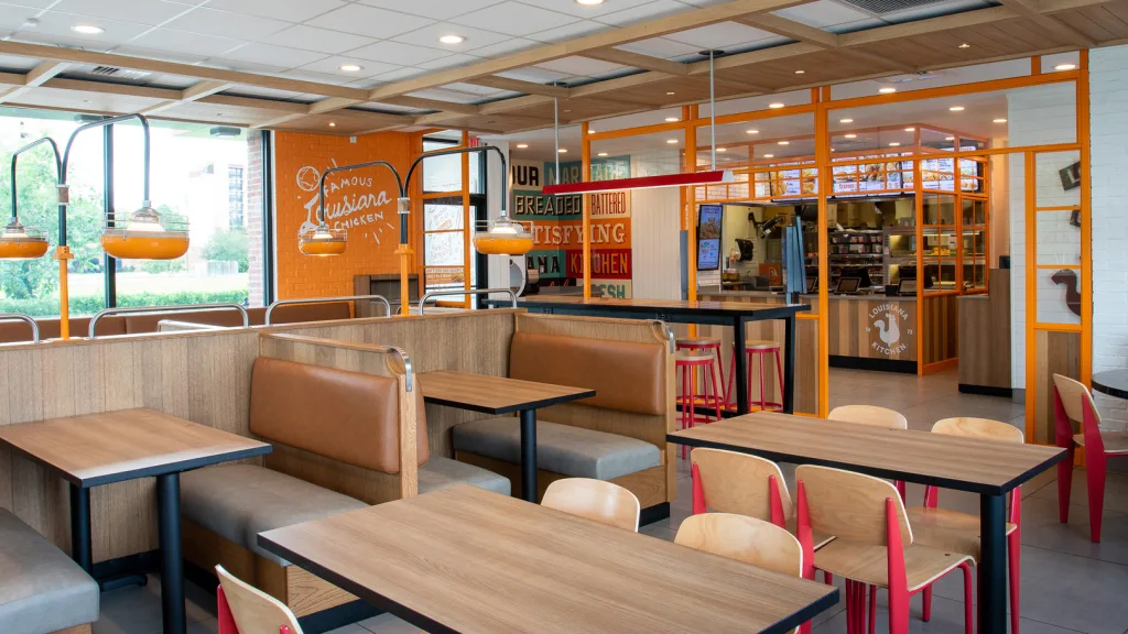
Now, it’s taken the turf wars to a new level. Popeyes opened its first flagship store in Shanghai on May 15, with a whole new look. Truth be told, Popeyes had been working on a brand revamp since late 2018. But with the immensely successful launch of its chicken sandwich, which sold out in just over a week, and steady sales growth, it was time to reimagine Popeyes’ visual brand in its entirety, and for a whole new audience.
Popeyes opened its first restaurant just outside New Orleans in 1972, and its visuals have always been rooted in a sense of quirkiness and play, meant to evoke the sights, sounds, and smells of New Orleans. But while that origin story was important to its brand culture, there was never a cohesive visual system. “Everything was dissident,” says JB Hartford, creative director at Jones Knowles Ritchie, who was hired by Popeyes to modernize its look while staying true to its roots.
“It’s probably the hardest thing for a designer to do because you want it to be clean, cool, contemporary, and relevant, but you don’t want it to lose the warmth, humanity, and familiarity of a brand that people know,” Hartford says. This strategic balancing act of new and old isn’t unique to Popeyes. In fact, it’s become a rather common conundrum as heritage companies seek to maintain the brand familiarity they’ve built over decades with the practical fact that a logo needs to read well whether it’s on a billboard, a menu, or within the confines of a smartphone screen.
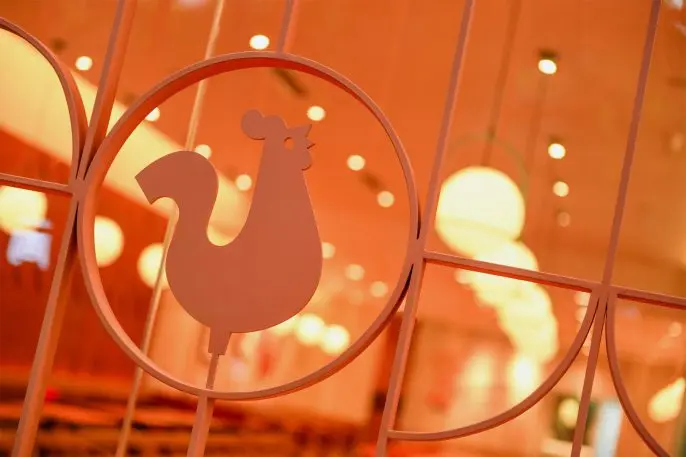
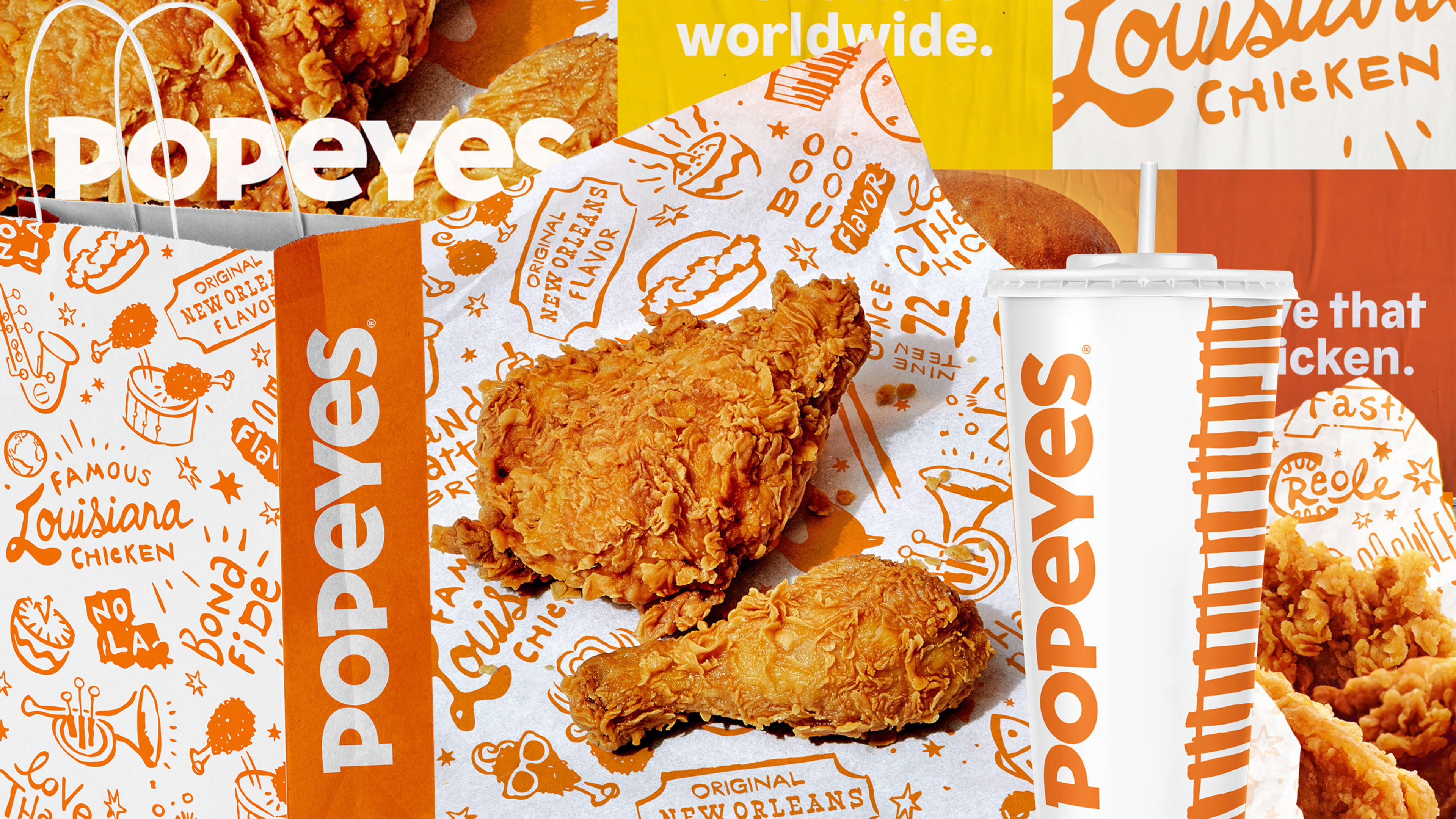
With this in mind, Hartford and her team created four principles that would guide their design decisions: put food first, use color from the brand’s long-standing playbook, celebrate its Louisiana heritage, and balance human touch with bold graphics. They brought on former Bon Appétit photographer Alex Lau to add a higher-end editorial feel to imagery that emphasized color and shape. They brightened the brand’s signature orange based on that photography (and even pulled the color from a photo of the chicken itself, using the Adobe eyedropper tool). Hartford and her team also created new, original illustrations on food packaging to pay homage to New Orleans icons and the Popeyes cooking process, and a new chicken icon called “Poppy.”
[Image: Popeyes]
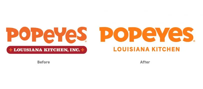
Meanwhile, they streamlined other elements, like its logo and typography. Hartford brought the letters in the wordmark down to a consistent baseline and rounded them out (though they kept the mix of upper and lowercase letters). “It is clean and confident and a vast improvement over the goofy bouncing letters of the previous logo,” says Debbie Millman, the chair of SVA’s Masters in Branding program. “Popeyes fried chicken sandwich is the best in the category and the new logo telegraphs that much more appropriately.” A cleaner, consistently spaced wordmark also means a more legible one—which better translates to the small screens where a lot of customers come into contact with the brand these days.
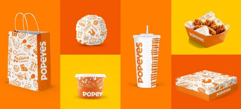
JKR also worked with type foundry Colophon to create an original typeface called “Chicken sans” that has a crisp, modern feel. Popeyes also plans to introduce Louisiana architectural influences into redesigned restaurants with elements like powdered colored metals inspired by a New Orleans street car and tiling inspired by Louisiana signage.
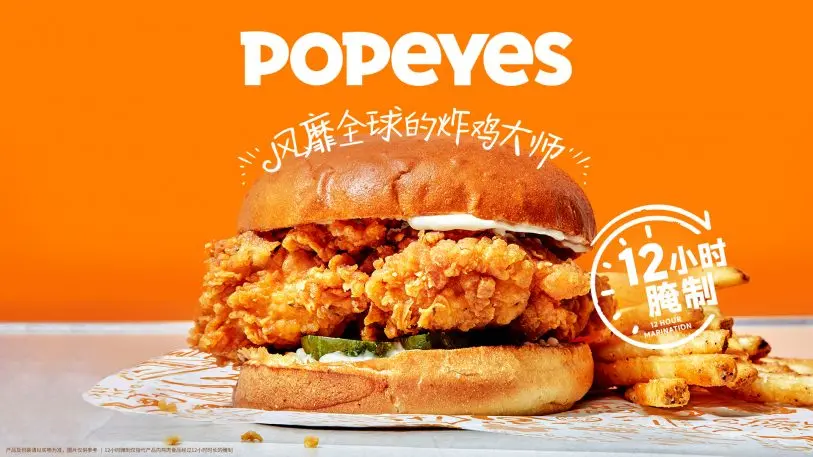
It’s clear that the chicken sandwich has become Popeyes’ signature, and communicating both that product and the company’s brand is going to be extremely important for staking out new territory: The company plans to open more than 1,500 restaurants in China over the next decade. Meanwhile, the graphics designed by JKR are already in place in the U.S., and restaurants across the country will get a facelift over the coming years. Like any quality recipe, consistency is key. A modernized visual system just might be its secret ingredient.
Recognize your brand’s excellence by applying to this year’s Brands That Matter Awards before the early-rate deadline, May 3.
