America is reopening. But is it ready?
The short answer is “no” (unless you live in New Mexico). The longer answer is something you can explore for yourself on a site called COVID Exit Strategy. Built by public health experts with no affiliation to the current government administration, it tracks the latest publicly available data on COVID-19 outbreaks to provide an at-a-glance breakdown on the readiness for every state in the United States to reopen.
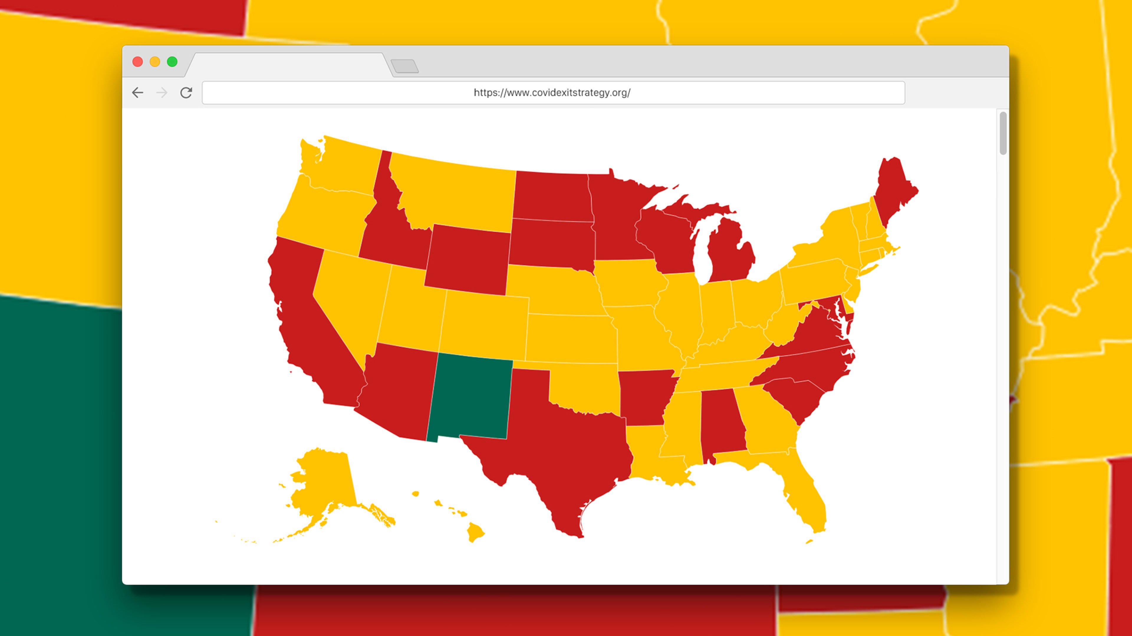
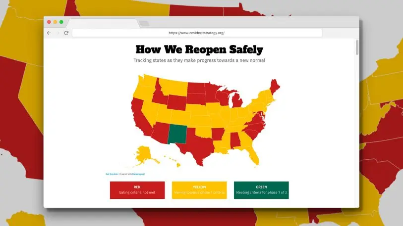
The project is a collaboration between 20 bipartisan healthcare experts, including the healthcare nonprofit United States of Care and volunteers at U.S. Digital Response, along with Duke University. It’s spearheaded in part by Andy Slavitt, the former acting administrator of the Centers for Medicare and Medicaid Services appointed by President Obama. And the core of the site is a red, yellow, and green map.
This map is undoubtedly inspired by Slavitt’s own love for color-coded readiness graphics. He spoke to me last month about how he admired New Zealand’s color-coded COVID-19 resources, explaining how colors can cut through jargon and could help the public more easily track the 18 months of ongoing outbreaks many experts estimate we’re likely to endure.
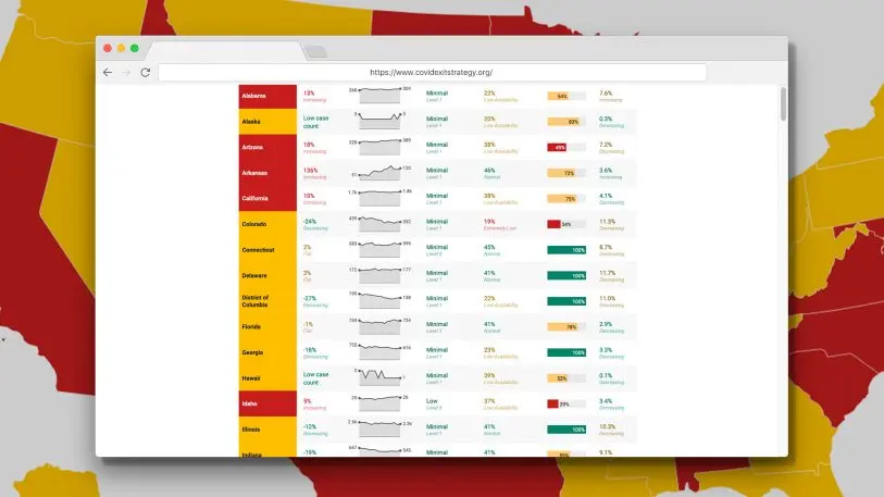
The final product, seen here, is modeled in just three colors. Using the White House’s own guidelines, the green states are ready to begin the first phase of reopening, which allows healthy people to stop sheltering in place (but still limits gatherings to 10 or fewer people). The yellow states are making progress toward that goal. And the red states haven’t met any of the three criteria for reopening: 1.) fewer reports of flu-like symptoms for two weeks 2.) fewer confirmed cases of COVID-19 for two weeks, and 3.) adequate space in hospitals for everyone who needs crisis care along with COVID-19 testing for those who need it.
People don’t need to somehow remember what five different colors might mean, as they did with the Homeland Security Advisory System that followed 9/11. Instead, COVID Exit Strategy uses a traffic light metaphor to convey reopening guidelines in simple terms: Is it time to stop, move slow, or go?
Slavitt launched the project alongside an op-ed in USA Today, in which he and several public health experts argued for reopening the country—but not until COVID-19 is actually under control and we have the processes in place to track future outbreaks. The team makes a strong argument, but it’s a sad state of affairs that this objective public health data can’t speak for itself.
Recognize your brand’s excellence by applying to this year’s Brands That Matter Awards before the early-rate deadline, May 3.
