


COVID-19 is taking a huge toll on mental health. The pandemic has had a devastating effect on all parts of life—filling hospitals, emptying public spaces, shuttering businesses, and closing social circles to the confines of our homes (save the occasional Zoom call). If someone is feeling alone, the self-isolation that quarantine requires might make that person feel the most alone they’ve ever felt.
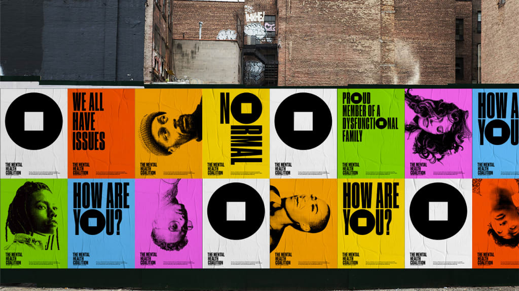
Paula Scher and her team at the design firm Pentagram have created a brand identity for the newly launched Mental Health Coalition, started by fashion designer Kenneth Cole. The coalition brings together leading U.S. mental health organizations, creative and media platforms, and celebrities to share their mental health stories, build a community of support and resources, and break the stigma around discussing mental health. For the launch, Scher created a bold brand identity that could transform mental health from a hush-hush topic into something that’s part of the everyday conversation. ‘I . . . hope it can become an international symbol for mental health,” Scher says.
[Image: courtesy Pentagram]
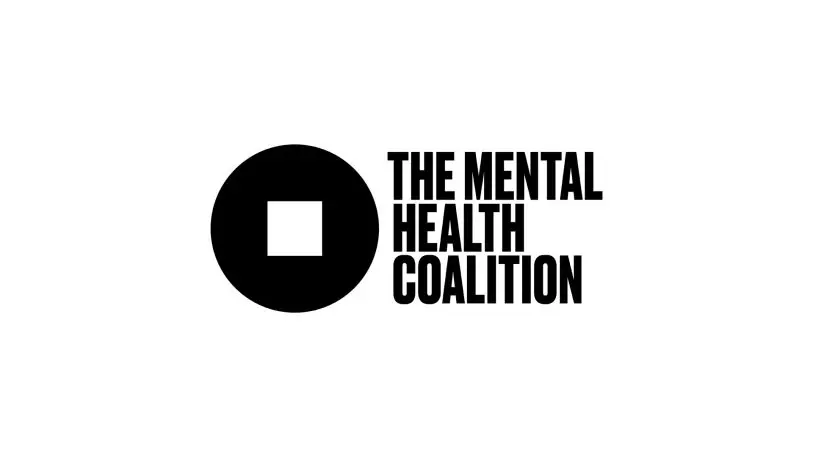
The keystone of the brand identity is its logo, a black circle with a yellow square at its center, or as Scher describes it, a “square peg in a round hole.” It’s meant to visualize the way people feel when they’re in the throes a mental health crisis. “Kenneth Cole originally requested a logo that would represent a movement that takes away the stigma of mental health issues,” Scher says. She was inspired by the ’80s anti-AIDS campaign “Silence=Death,” which used a simple triangle as a symbol. “I wanted to create something that would have equal power and recognizability,” she says.

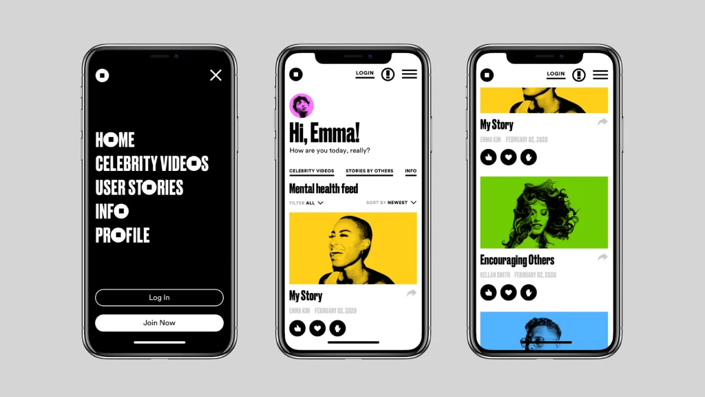
“It seemed appropriate to design something powerful and not timid,” Scher says. “We certainly didn’t want to use a color system that felt like a sanitarium.” The look is continued to a secondary part of the initiative, which asks users to answer the question, “How are you, really?” over a softer, approachable pale blue gradient. Scher dialed down look here to make it easier for users to participate and share their thoughts.
“Our hope is that people feel that’s okay to feel badly sometimes,” Scher says. The platform is a gathering place “for sharing stories and finding empathy and hope in the process.”
Recognize your brand’s excellence by applying to this year’s Brands That Matter Awards before the early-rate deadline, May 3.
