Here at Fast Company, we absolutely love design. We celebrate it annually through our Innovation by Design program, and write about it daily here on Co.Design. Our magazine gives us a perpetually fresh canvas to practice what we preach. That’s why, as creative director, I find it important to continually evolve our look—it keeps us fresh and energized about design. With that, I’m excited to announce a brand-new redesign for Fast Company.
A great design process is key for creating a great product. The more excited your team is, the better the results are going to be. When we began this redesign in the summer of 2019, I left the completion date open-ended. This would allow my crew the essential time to experiment and be as creative as possible.
We started with an inspirational warm-up. Art directors Alice Alves and Chelsea Schiff, along with interns Penny Sachdeva and Elise Garcia, pulled visual reference from other design sources. This exercise broke us out of our box and let the ideas flow. We discussed what made sense for Fast Company, and found intersections between each person’s mood board. By doing so, we now had a similar path we could all diverge from.
Over the next few months, we would meet regularly and review design experiments; there were so many new directions we could take! But we were starting to get lost at sea. At this point, it was necessary to take a step back and refocus. We looked back at Fast Company’s three visual principles: “sophisticated,” “playful,” and “gender-neutral.” These were introduced in 2018 with our first redesign, after doing careful research about our reader demographics. Using these principles as our North Star would ensure that we made strategic visual decisions for the Fast Company audience.
After completing these experiments, it was clear that a big design revolution wasn’t right for us. With only a year and a half since our last redesign, a massive change would appear unfocused to the reader. There was sound logic behind our previous redesign; it just needed to realign with our visual principles.
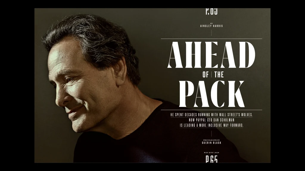
Since this new redesign needed to be an evolution, we chose to maintain our typographic structure: Grifo for section headers, Centra for headlines. Looking back at our previous iteration, the use of those typefaces was heavy-handed. We had a lot of bold, all-caps type, which appeared overly masculine. If our intention was to feel gender-neutral, that needed to change. So we set the section headers in lowercase, and headlines in upper and lowercase. That immediately softened the look.
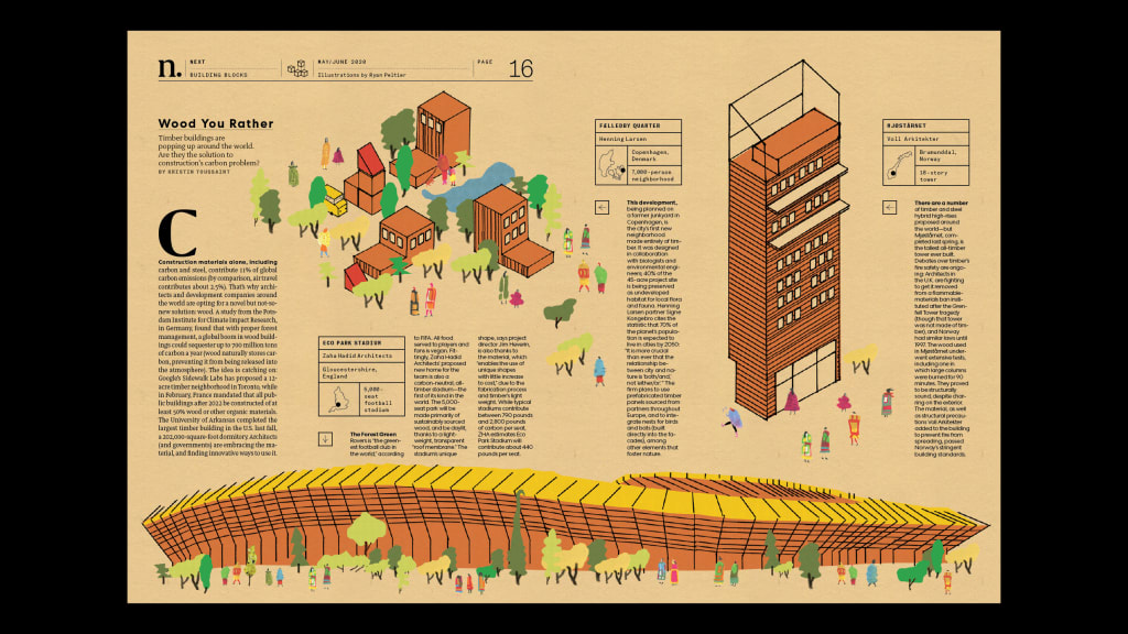
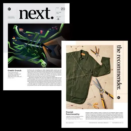
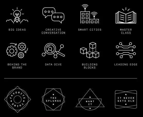
We now have a stronger emphasis on branding. Our Next section features everything from a diagram of timber architecture to infographics on gene editing to a beautifully photographed Q&A with influencer chef Alison Roman. These pages make up just a few of Fast Company’s franchises: “Material World,” “Data Dive,” and “Master Class.” Because they are so integral to the Fast Company brand, we developed an icon system to give each an identity. And our Recommender section, which is brimming with product suggestions and life hacks from some of the top minds in business, is now branded with sophisticated badges for franchises such as “Favorite Thing,” “Want It,” and “It Never Gets Old.”
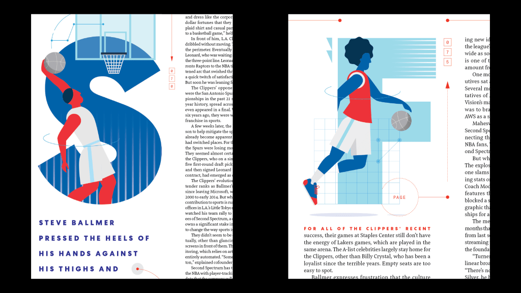
Design is a delicate balance of consistency and variety. With strict branding and typographic systems in place, we now had the freedom to be more playful with our layouts. We thought, What if you take some of the most static elements of the magazine—the page number and section name—and make them the most dynamic? They now ping-pong all over the page: on the top, the bottom, even turned on their sides. And as you flip through the magazine, you’ll notice a fluctuating design for page numbers. It’s our little way of celebrating the magazine medium.
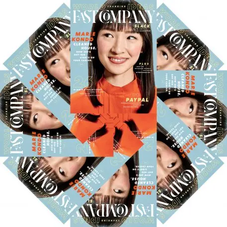
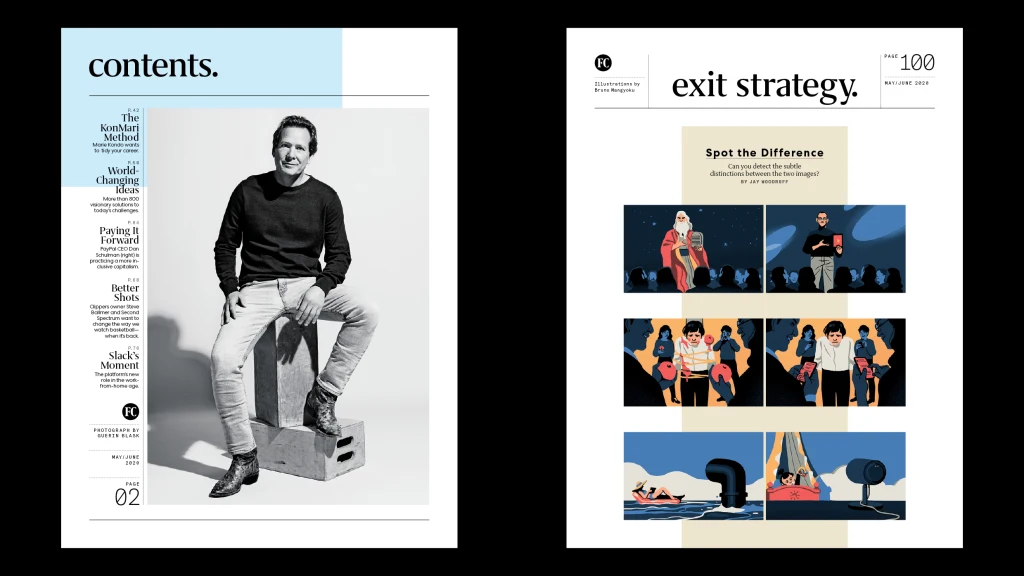
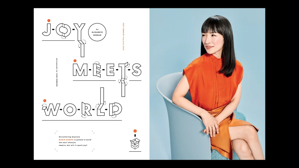
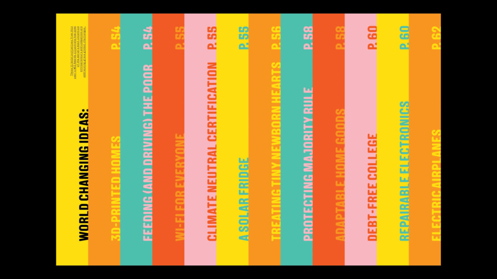
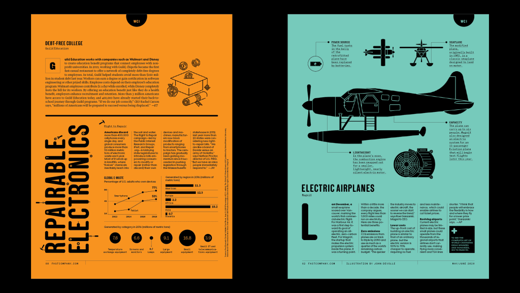
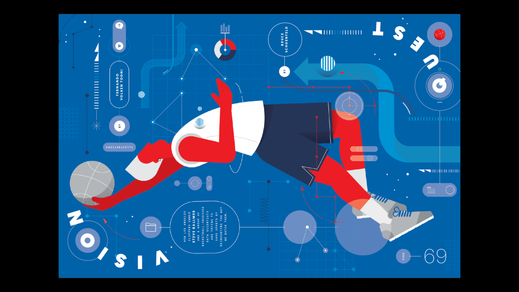
This increased flexibility has allowed us to have more fun with our feature designs. Cover star Marie Kondo’s story opens with a typographic tribute to her folding diagrams. The illustration for Second Spectrum’s foray into augmented reality feels like it’s going to jump off the page. And the joy and wonder behind our World Changing Ideas package is expressed through a broad palette of bold colors and a guest appearance by the rounded typeface New Grotesk.
But what happens when you can’t design the perfect process? While we spent months designing, presenting, and commissioning art for this redesign issue, we never would have planned for the current state of the world. At the very last minute, we crashed in a timely feature titled “Slack in the Age of Quarantine.” No time left for elaborate art plans, and my design team was swamped. I needed to jump in.
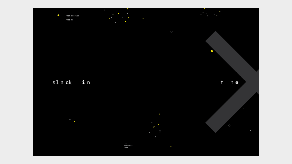
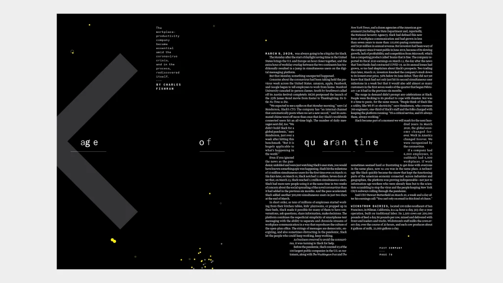
Sometimes, a good idea can be completely reactionary. For this feature, I went back to a classic design school trick: Make the type do what the words say. I literally quarantined part of the headline on the second spread, a solution that may not have surfaced with more time and less flexibility in our new design system.
Sure, a magazine has its limitations. You can’t animate it, and it can’t play music back to you. But within the rectangular confines of the printed page, our design possibilities are limitless. I hope you enjoy the product as much as we did the process.
Subscribe to Fast Company today!
Recognize your brand’s excellence by applying to this year’s Brands That Matter Awards before the early-rate deadline, May 3.
