In 1992, NASA retired its iconic 1975 “worm” logotype in favor of the original 1959 “meatball” logo, which features a blue planet behind an orbiting spacecraft and the agency acronym in white serif type. Now NASA is bringing the worm back.
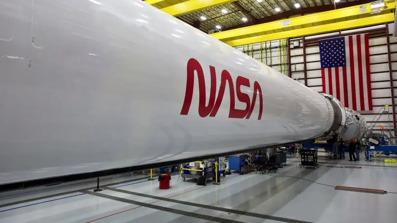
The worm logo, designed by Richard Danne and Bruce Blackburn in 1975, “will help capture the excitement of a new, modern era of human spaceflight,” NASA says in a statement. It will appear on the side of the Falcon 9 launch vehicle that’s scheduled to take astronauts to the International Space Station in mid-May and will commemorate “the return of human spaceflight on American rockets from American soil,” NASA says. The agency is still determining how and where else the logotype might be used, as the meatball logo will remain the agency’s primary symbol.
Enter Danne and Blackburn, who created the worm logo in 1975 under the Federal Design Improvement Program. The logotype is starkly pared down in comparison to the previous design, relying on sleek, curvy type that’s both minimalist and innovative, connecting the ligatures of the A and S, and even removing the bars of the As to bring NASA’s message down to the bare essentials.
Although the worm logo was retired in 1992 (except “on clothing and other souvenir items,” NASA says) it has retained a cult following in the design world—diehard fans can even buy the original standard manual. It also saw a huge brand extension over the years, appearing in unofficial collaborations across the fashion industry. “It seems the worm logo wasn’t really retired,” NASA says in its statement announcing the logo’s return. “It was just resting up for the next chapter of space exploration.”
Recognize your brand’s excellence by applying to this year’s Brands That Matter Awards before the early-rate deadline, May 3.
