The coronavirus is moving at a blurring rate. But researchers, doctors, and health officials still have a lot to learn from even the most recent events. That’s why a group at the Massachusetts Institute of Technology has released a set of tools aimed at helping officials find the people most likely to suffer negative effects from the coronavirus. Included in those resources are a couple of maps that identify the most risk-prone counties all around the U.S.
“I think there’s some very dark days ahead, and in those dark days state and local officials will want to know where are those vulnerable people,” says Simon Johnson, a professor of entrepreneurship at MIT and the former chief economist at the International Monetary Fund, who is co-leading the effort.
Two weeks ago, Johnson and Retsef Levi, a professor of operations management at MIT, formed the COVID-19 Policy Alliance. The two have gathered a team of MIT experts to develop tools to help public officials understand and manage COVID-19 outbreaks across the U.S.

The group is also making recommendations on policy. On Monday, the alliance sent a proposal to the White House suggesting that the government purchase medical equipment such as respirators, scrubs, masks, swabs, and other needed equipment from China and use currently grounded passenger and freight airplanes to retrieve it. Johnson says the group is working with state officials on coordinating similar plans.
MIT’s COVID-19 Policy Alliance is among several institutions trying to use data to help identify vulnerable populations, which may need additional resources as states trying to forestall the virus’s spread enact restrictions on leaving the home.
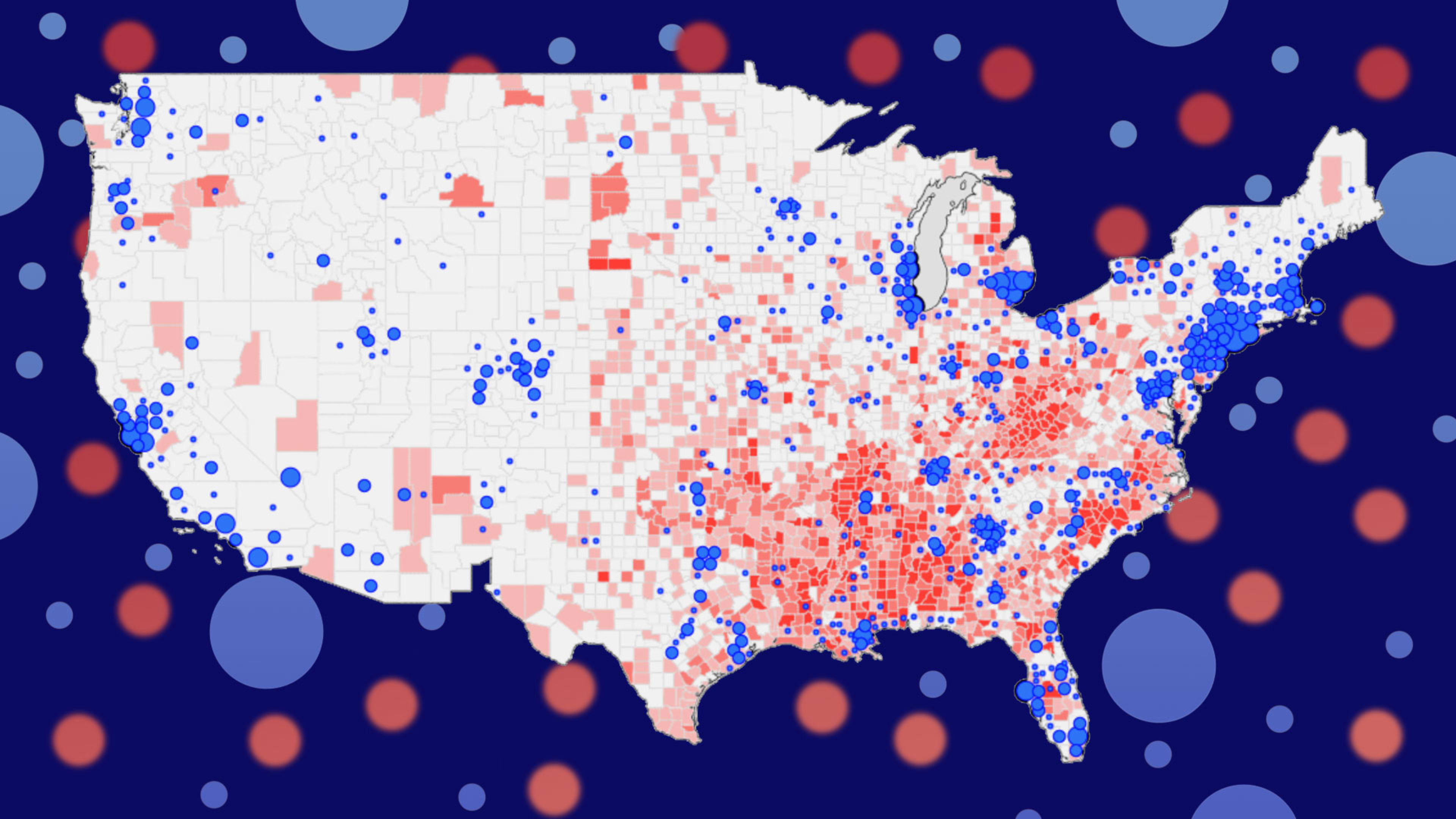
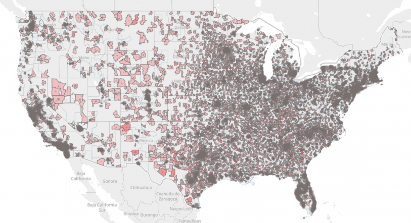
In terms of data analysis, the group has so far published two maps: one that assesses COVID-19 risk for counties around the U.S., and one that assesses COVID-19 risk for nursing homes, senior living centers, and long-term care facilities. The maps highlight regions with clusters of people most at risk of contracting COVID-19: people over 65 and younger people who are obese, diabetic, or have hypertension.
The map devoted to senior health and living systems examines how senior care facilities have handled infection and safety historically to understand how well they’re prepared to respond to COVID-19. The creation of the map was heavily influenced by what happened at the Life Care Center of Kirkland in Washington State, one of the first sites to get hit with the virus, just outside of Seattle. In a matter of weeks, nearly 80% of the 120 residents and a quarter of staff had contracted the virus. As of the most recent update, more than half of the center’s residents have been hospitalized.
“Suggestions and guidelines are not sufficient for sites that struggle day-to-day under regular times to control for infections and in fact have a track record of a lot of violations,” Levi said. He also suggested that the residents of all of these facilities must shelter in place. There should be an aggressive effort to test all seniors living in these facilities, as well as the vendors and healthcare workers who frequent them, to control the risk of infection.
The Policy Alliance’s other map takes a broader look at risk within a region. It calculates a county’s risk based on the percentage of the total population over 65, as well as the percentage of the population that is obese or diabetic. The risk score also takes into account the rate of hypertension cases per 1,000 people. It gives each county a risk score between zero and six, with the latter being the highest. The map also layers on a region’s known COVID-19 case numbers with corresponding blue circles.
For now, the maps offer a limited set of data based on public records. But Johnson says he and his team are working on adding more sources so that their system can offer more robust insight. For example, he’s working on getting access to local symptom data in order to more precisely understand where a potential outbreak may be bubbling. He welcomes other sources of data as well. “If people want to offer data streams they should connect with us,” he says.
By helping regulators understand the risk potential for each county, the Policy Alliance hopes to aid them in acquiring and allocating resources accordingly. For example, Johnson sees an opportunity to use telehealth services to connect doctors with training and patients with screening tools.
But he also thinks the publicly available maps are helpful for individuals as well. “I think that it is always healthy in this democracy for people to be informed,” Johnson says.
Recognize your brand's excellence by applying to this year's Brands That Matters Awards before the early-rate deadline, May 3.
