We’ve known from the beginning that the coronavirus pandemic won’t affect all American populations evenly. If you’re older, uninsured, or otherwise lack access to healthcare, you could be especially more vulnerable to COVID-19, and new data shows that the majority of ICU admissions and deaths in the United States have been occurring in people over 65.
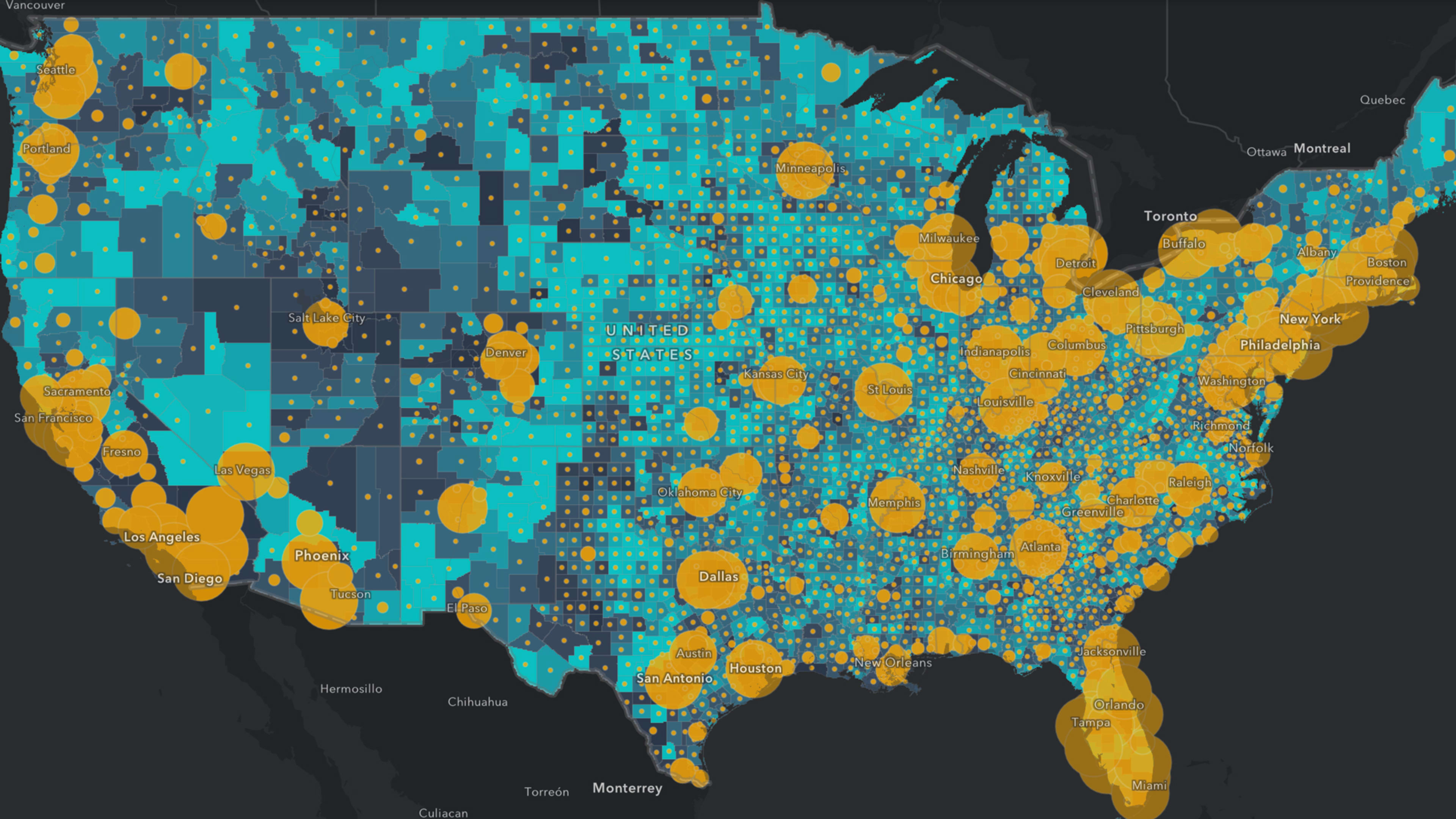
A new collection of interactive maps from spatial analytics firm Esri could help highlights which areas in the United States are more vulnerable to the pandemic by mapping out areas with high concentrations of seniors and the uninsured. The map collection is part of Esri’s COVID-19 GIS Hub, a vast repository of coronavirus-related data and resources curated by Esri’s Disaster Response team.
You can find the collection of nine interactive maps by visiting the Hub and scrolling down, or through the direct link here. It includes the following maps:
- Where are the areas with high daytime population, more travelers, and seniors? This is essentially an index showing the proportion of older people living in areas of “high daytime density.” Those areas typically include bigger cities like Chicago, New York, and Philadelphia. Direct link.
- Where are the most socially vulnerable populations in the U.S.? This maps out populations based on the CDC’s Social Vulnerability Index, which the CDC says “refers to the resilience of communities when confronted by external stresses on human health, stresses such as natural or human-caused disasters, or disease outbreaks.” Direct link.
- Where are those age 65 and over who are working? This shows where older populations are likely to still be participating in the workforce. Direct link.
- Where are the uninsured? This map shows areas in the Southeast tend to have higher percentages of people without health coverage. Direct link.
- Where are the most densely populated areas in the U.S.? This map is helpful since disease can spread more quickly in areas with higher population density. Direct link.
- Where are seniors, and what share of the population are they? This map shows which areas have the highest concentration of seniors. Direct link.
- Where are seniors living alone? This map shows high concentrations of seniors living alone in much of the country, including Florida, Arizona, California, the Northeast, and the Midwest. Direct link.
- Where are the healthcare facilities? This map shows which states have the highest and lowest number of hospitals in comparison to their populations. Direct link.
- What areas are under any kind of U.S. travel restrictions? This final map is a global list of travel advisories by country and could be helpful for people affected by the multitude of travel restrictions that have been put in place since the pandemic began. Direct link.
Check out Esri’s full COVID-19 GIS Hub here.
Recognize your brand’s excellence by applying to this year’s Brands That Matter Awards before the early-rate deadline, May 3.
