As coronavirus continues its inexorable spread across the United States, data visualization specialists and armchair designers alike are developing graphics to help readers make sense of it all. But not all graphics are created equal, and even the most well-intentioned designs can mislead the public and incite panic. So we asked six experts to identify the graphics that do the best job of telling an important story about coronavirus. Their selections range from variations on the now iconic “flatten the curve” chart to an icon-based series that underscores the people behind the numbers. The through line: When it comes to complex epidemiology, which can vary wildly, depending on geography, a population’s median age, and many other factors, the simpler, the better.
A flattening curve shows how “social distancing” slows an outbreak
I’ve struggled with much of the coverage of COVID-19 through visualizations. When facing a situation as uncertain as this—with data being so sparse, incomplete, fleeting, and quickly fungible—designing traditional visualizations such as line graphs or maps of spread may give readers a delusional impression of accuracy and certainty. After all, these charts can’t display actual number of cases—and unknown quantity—but just tested and reported cases, a variable that is dependent on many factors, such as how effective the governments of different countries have been at testing for the disease, and how transparent they’ve been on reporting their data. Many visualizations I’ve seen should have been straightforward tables with plenty of footnotes explaining the limitations of the available data, not fancy interactive graphics.
My favorite graphic so far doesn’t display number of infections, but a much more abstract and useful visual explanation. It’s a variation of the “flattening the curve” chart that many readers have probably seen, but with the addition of an explanation by CNN’s Brian Stelter.
https://twitter.com/AlbertoCairo/status/1236773377865658370
As I wrote in my tweet, good journalism doesn’t consist just of showing data as charts of maps; good journalism is about explaining how to read those charts, and emphasizing what they mean. In other words, the purpose of visualization isn’t just visualization per se, but helping people make sense of data. —Alberto Cairo is a professor of visualization at the University of Miami and author of How Charts Lie: Getting Smarter About Visual Information (2019).
The flattening curve (plus some helpful illustrated advice)
The message is altruistic: we must help sick people who need to be hospitalized. It is not about showing how strong we are. It is not the time to celebrate our healthy body with powerful antibodies. This pandemic must push us to altruism. We risk spreading the virus when we are asymptomatic, thus increasing the chances that a weaker person will end up in the hospital.
https://twitter.com/SiouxsieW/status/1237275231783284736
Unfortunately, the suggestions in this data viz are not accurate enough. Washing your hands, not touching your face, and staying home when sick are important suggestions. I would add a fourth recommendation: “Stay home in any case, sick or not sick” because we could be unconscious carriers of the virus right now. —Mauro Martino, founder of the Visual AI lab at IBM Research AI and Professor of Practice at Northeastern University in Boston.
How exponential change helps explain virus transmission
This visualization effectively explains a number of things, both visually and mathematically. To start with, it clearly lays out how virus transmission works and describes exponential change, showing how it’s about trending—not fixed—numbers. It also explains the difference between exponential curves and logistic curves, particularly how all logistic curves look like exponential curves in the beginning, until they reach their inflection point. The video’s emphasis that, “If people are sufficiently worried, then there’s a lot less to worry about” is the cleanest description of the need for social distancing I’ve read yet. —Eric Rodenbeck, creative director, Stamen
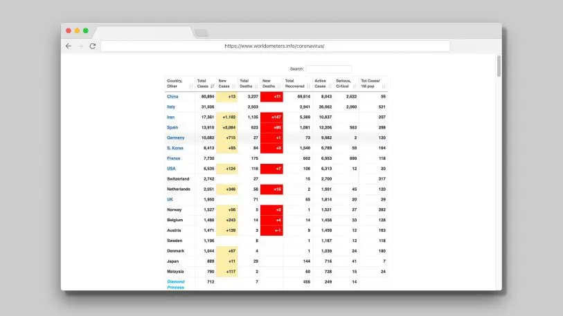
You don’t need a fancy map when a simple table will do
Sometimes the best visualization is a nice table! This one is straightforward, highlighting the crucial country-by-country numbers, and is constantly updated.
A table can display live data without outliers or large scale differences breaking the design. Maps—especially bubble maps—can look good, but they take mentally parsing to understand the data. Plus, elements can get mushy and overlapping if there’s a lot of data. Here, a hierarchical multicolumn table can be absorbed in moments, although a percent case fatality rate would be useful, as it’s sometimes difficult to mentally calculate the severity of these outbreaks. —David McCandless, founder, Information is Beautiful

By knowing where we are, we can understand what’s next
Some of the data visualizations I’ve found most useful have been putting the outbreaks by country into relief with one another. It’s more about the theme of the graphic than how it’s handled visually. At this specific moment, I think people are really struggling to understand a rapidly changing situation being thrown at them, headline by headline. In 72 hours in the United States, we went from seemingly distant observers to an escalation: from cancelation of academic conferences, to students being abruptly sent home from college campuses, to minor sporting events being canceled, to the NBA taking a break, and the NCAA canceling March Madness. Even Disney closed its parks.
Something is obviously happening—and fast—but it’s not necessarily apparent from the number of cases in the U.S. We’ve heard about China and Italy, but it’s hard to put those in context. So this graphic helps show the trajectory of how the virus has spread in various locations, and by keeping time constant, we can get a sense of how far along we are and what’s coming next. It’s not perfect, since things like population density and personal habits in these places are different—but it tells one of the most usable stories.
It’s essentially a “you are • here” image. Which is perhaps somewhat comforting and simultaneously more relatable. —Ben Fry, principal, Fathom
NEW on coronavirus: many western countries may soon face Italy’s situation
Case numbers since outbreaks began in several countries have tracked a ~33% daily rise. This is as true for UK, France, Germany as Italy; the latter is simply further down the path https://t.co/VcSZISFxzF pic.twitter.com/xM6wXuMk4n
— John Burn-Murdoch (@jburnmurdoch) March 11, 2020
Icons Reveal The People Behind The Numbers
In Reuters’ “The Korean Story,” a series of graphics explain the extensive contact-tracing that was conducted to understand where the largest cluster of cases—centered on the Shincheonji church—began. These graphics integrate concepts of interconnectedness with quantitative data visualization in a series that stands out in a sea of maps about COVID-19.

Iconography of small gender-neutral people represents the patients and contacts, with a simple color palette illustrating whether cases resulted from travel (red) or local transmission (blue). When we represent cases and contacts as bars and dots, we can forget about the people behind the numbers: the icons reinforce the human side of this data. Arcs showing how they’re connected focus our attention on the protagonist of the story: Patient 31, and the long string of icons representing 1,160 contacts she came in contact with while presumed to be infectious. —Amanda Makulec, senior data visualization lead, Excella
Recognize your brand’s excellence by applying to this year’s Brands That Matter Awards before the early-rate deadline, May 3.