If you’ve lived in the same city or town for the past 10 or years, you’re probably well aware that the 2010s were a decade of change. Many neighborhoods across the country are virtually unrecognizable compared to what they looked like at the start of the decade, thanks to factors like aggressive development and gentrification. And with those factors, of course, come major shifts in population demographics.
So how much has your neighborhood changed? Now you can find out with help from Esri, a spatial analytics and mapping software company, whose new interactive map visualizes population shifts across the United States between 2010 and 2019.
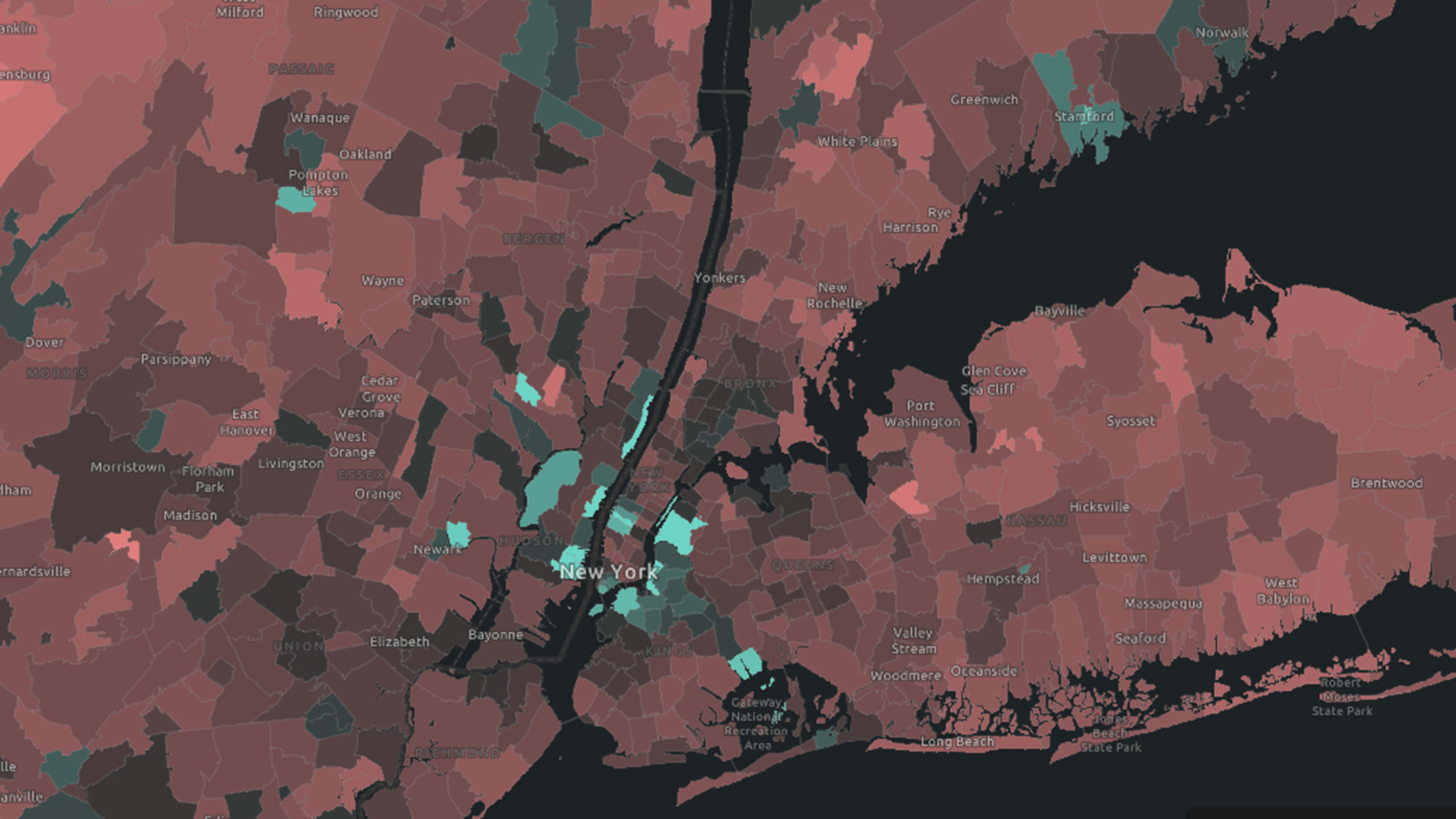
Using data from Esri’s team of demographers (who curate demographic estimates and projections using Decennial Census data as a baseline), the map shows which areas have grown faster in population and which ones have grown slower when compared to the national average of 7.5%. Faster-growing areas are rendered in cyan while slow-growth areas are seen in red. Areas where population has decreased are seen in brighter red.
A broad view of the entire country shows what we might expect: People continue to flock to the South and Southwest, showing swaths of faster growth in states like Florida and Texas.
But things get even more interesting when you zoom in. The map becomes more detailed the closer you get, and since the census data is measured on a tract-by-tract basis, it’s possible to get a very compelling look at how specific cities and neighborhoods have changed over the 2010s.
The New York metro area, for example, shows big chunks of faster growth in New Jersey neighborhoods along the Hudson River and Brooklyn neighborhoods along the East River. Meanwhile, much of Manhattan has stayed pretty much on pace with average population growth, aside from slivers along the far west side and the bottom tip of the island, which have seen much faster growth.
The map is searchable, so you can look up any area of the country by name or zip code. And if you click the map, you’ll get detailed data specific to the area you clicked.
Check out the map here or via the embed above. For demographics nerds, this is a much more enjoyable way to spend your day than following the news cycle.
This post has been updated with additional context on Esri’s demographic methodology.
Recognize your brand’s excellence by applying to this year’s Brands That Matter Awards before the early-rate deadline, May 3.
