The end of a decade is a time for reflection. Ten years is enough time for culture to truly shift, for better and for worse—and for design to follow suit.
Looking back at the 2010s, I’ve compiled a list of the reigning design trends that—while perhaps right for the time—are no longer right for where the world is going. Keep in mind that this list doesn’t cover all design disciplines, such as architecture, urbanism, product, etc., but it will take a particular look at graphic and digital design. And if I’ve missed anything, you can email your suggestions to CoDTips@fastcompany.com. These are the trends it’s time to put to bed on the cusp of a new decade.
“Bad” design by good people
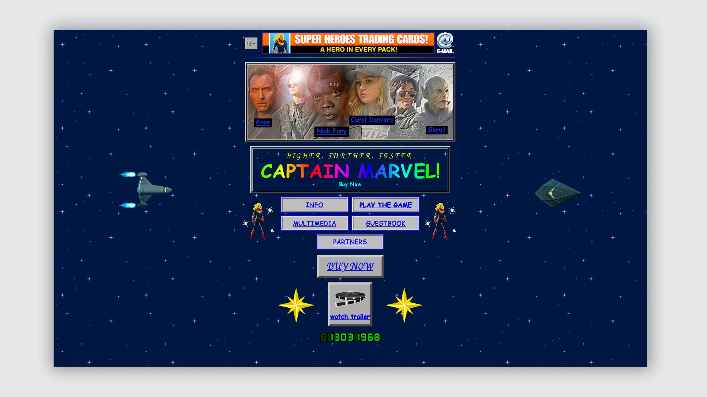
The internet exploded over the past decade. Some even claim to have broken it. And what with anxiety about twitter trolls and misinformation, the proliferation of cat memes, and the infiltration of slick personal site builders (“everyone has a personal website now,” say people like myself in loathing, hushed tones), a certain nostalgia has developed among designers for a simpler time. A less web-optimized time. A time when the internet was still the wild west of weird. The 1990s.
The web design style of that period, created in part by its technological restraints, has in this decade become an artistic choice; use of the (for some reason) universally detested Comic Sans, Word Art, clip art, or simple HTML, and the sometimes antagonistically annoying UX they create, have become a rebuttal to the expectation of a “well-designed,” corporate-looking web. Take that, Squarespace!
Don’t get me wrong, antidesign as aesthetic has been done well—but like anything designed, that only happens when it is contextually purposeful. Dare I say it, but a corporation has done this trend well—Marvel created a retro ’90s site to promote the movie Captain Marvel, which was set in that decade. And dammit, Bloomberg Businessweek, nice job. The magazine’s redesign effectively contrasted the business news it covers with sparse, less-polished visuals that enlighten by poking fun at itself. But otherwise, “bad” design reads as a kind of hipster antiestablishmentism, the design equivalent of saying “~I was just being ironic~”. I get it. You are cool and different. But don’t the kids say it’s not cool if everyone’s doing it?
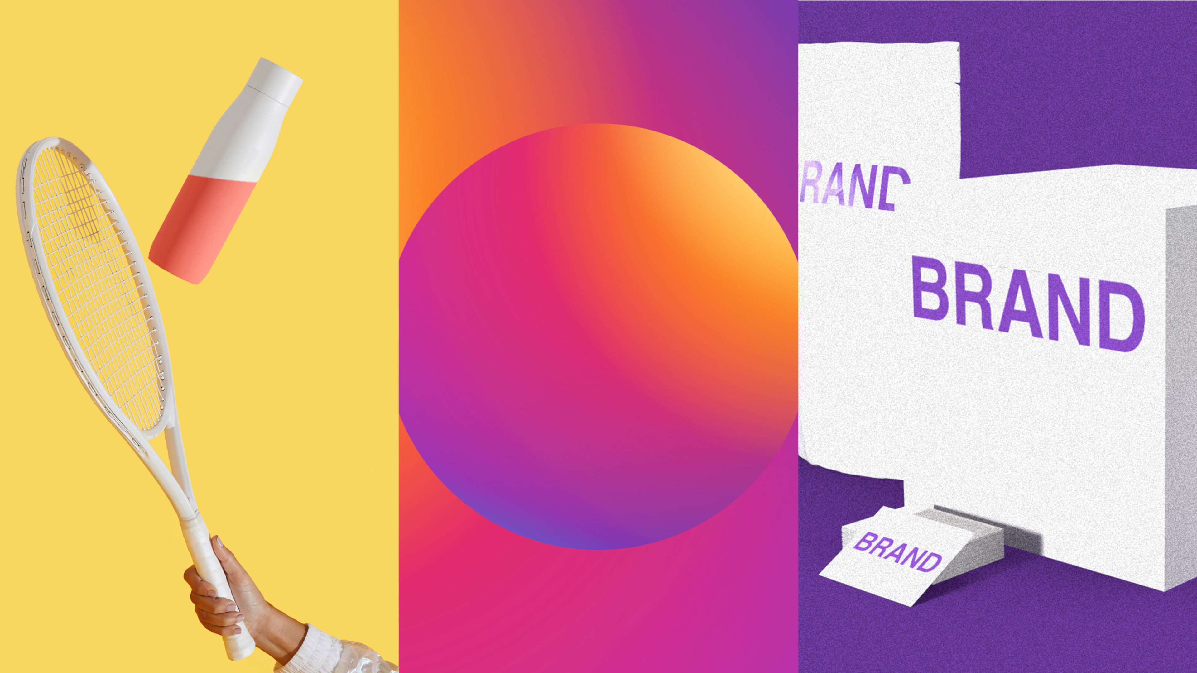
Gradients
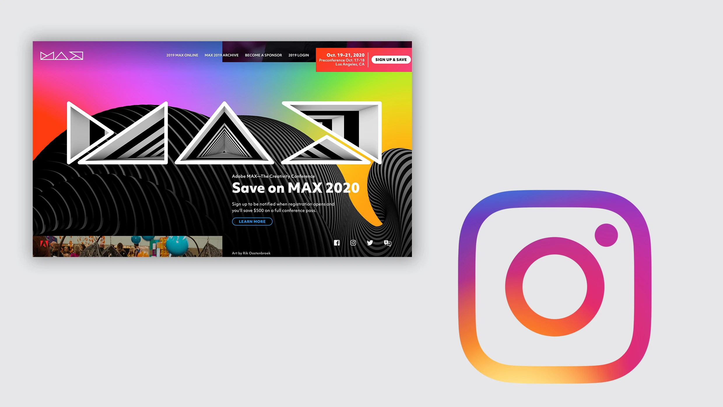
I was going to originally include gradients as part of the “bad” design trend. But because it is used outside of that antidesign trend, it seemed deserving of its own spot in the list. This decade, gradients have been used on everything from antidesign projects to corporate conference identities, and for giant tech brands including Facebook and Instagram, too. They’ve shown up on streaming services such as HBO Max and millennial brands such as the CBD-infused seltzer Recess. Yes, gradients can add depth to a composition, but simpler, flat designs are more transferable, and that universality creates a sense of brand cohesion across devices of any size, making it more user-friendly, and generally more in sync with where the design industry is going.
Infinite scroll of death
[Animation: FC]
Continuous scroll has become a ubiquitous and second-nature part of the 2010s web experience. When I reach the bottom of the “fold,” that is, the edge of the screen, I know to scroll down to keep reading. The top three major social media platforms—Twitter, Facebook, and Instagram—all use it. It’s commonplace on corporate sites and in web design in general today. Even Fast Company’s site uses it. But the design also promotes prolonged use, encouraging users to stay longer and read more, passively refreshing content and daylight away. Aza Raskin, who is credited with designing the infinite scroll, even says the feature was made to be “maximally addictive.” Isn’t it time to be more intentional with tech, and put our mental health first?
Hand-lettering aesthetic
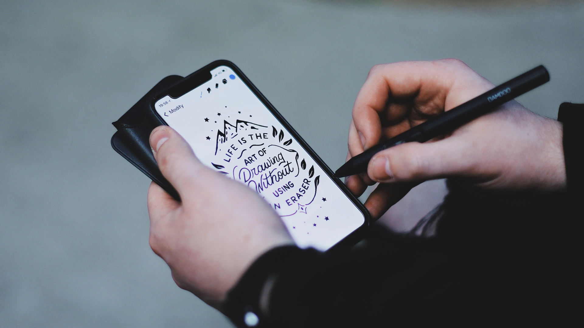
If typography is a form of graphic design, you might say hand-lettering is its illustrative equivalent. Of course the craft of hand-lettering can lead to beautiful results, found across mediums, from liquor and food labels and restaurant identities to book covers and a lot of applications in between. Renowned graphic designer Louise Fili’s decades-long portfolio is chock-full of such examples, and the imprint of her work is felt across New York’s restaurant scene. Illustrators Jessica Hische and Gemma O’Brien found huge success in the past decade too, building portfolios of expert hand-lettering work (hint: Hische worked for Fili early in her career) with both smaller brands and large corporations.
Generic startup aesthetic
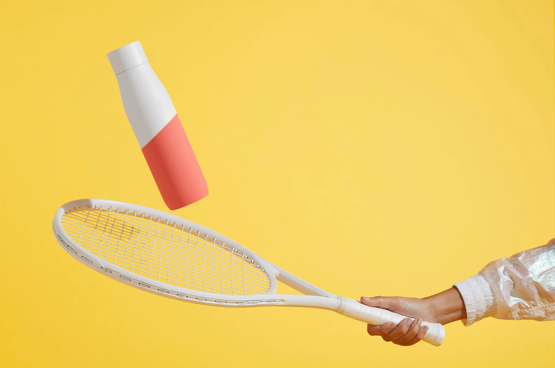
With social media becoming our one true lord over the past decade, brands have found new opportunities to advertise products straight to consumers. A proliferation of small, digitally native startups emerged in the 2010s. Most have no brick-and-mortar stores. They may not have an immediately recognizable logo, either. But they do have one thing in common: a peculiarly similar art direction for ad campaigns. Do you have a hand manicured in a bright color? Do you have a background available in a coordinating, equally bright color? Do you have a product? Congratulations, you can now advertise for a hip direct-to-consumer brand, in the ever-popular “generic startup aesthetic.”
I started noticing the similarity on subway ads over the past year or so: a disembodied manicured hand holding up a millennial startup product. (Bright background and contrasting drop shadow encouraged.) As it turns out, we may have one company to blame for starting this trend. The Brooklyn-based branding agency Red Antler, known for helping many a startup differentiate itself by building its brand from the ground up, is prominent in the space. Red Antler used the look with clients such as Embroker, Movado, and Otherland. But it seems the studio opened Pandora’s box, and what was once a differentiating visual look isn’t so different anymore.
Here’s just a sample of companies that have adopted the aesthetic: period product brand Superior, healthcare brand Hers, dental hygiene brand Quip, vitamin and supplement company Care Of, Nurx birth control, Sir Kensington’s condiments, Daily Harvest quick meals, women’s razor company Billie, men’s razor company Harry’s, and deodorant brand Myro. There are a lot, lot more. Whew, I’m exhausted. Art directors, isn’t there another way? PLEASE. MAKE IT STOP.
Default minimalism
I’m not dissing all minimalism here. I’m talking “default” minimalism that came into prominence in the early part of the last decade (and maybe even earlier)—lacking perspective, and applied in a way that’s lazy, bland, and boring; with thin, sans serif letterforms and enough clinical white space to remind you of a doctor’s office waiting room. Sure, I understand why typefaces like Helvetica, Futura, and Gotham are everywhere. They’re extremely versatile. Heck, documentaries have been made and books written about them. But that’s part of the problem, isn’t it?
The writing is on the wall, and times are changing. A great example of this is Chobani’s rebrand in 2018. Its previous brand identity, with sleek, angular, all-cap black sans serifs against a white background, is a pretty stark way to motivate yogurt sales. And it looked like all of its competitors in the refrigerator section. Its redesign couldn’t have been more opposite. It reintroduced bold, retro Cooper Black-inspired serifs, applied a friendly and approachable color palette, and brought a homespun reaction to minimalism that played into a sense of nostalgia on the part of consumers. In this day and age, we’d all like an escape. Even if it’s only for the time it takes to eat a cup of yogurt.
That brings this farewell note to an end. In no way is this list exhaustive; there are probably many more we could do without. But attention spans are short, so think of this as a starter list to which you can add your own. These trends have had a good run. But as we start a new decade, perhaps we can agree that it’s time, finally, to put them to rest.
Recognize your brand’s excellence by applying to this year’s Brands That Matter Awards before the early-rate deadline, May 3.
