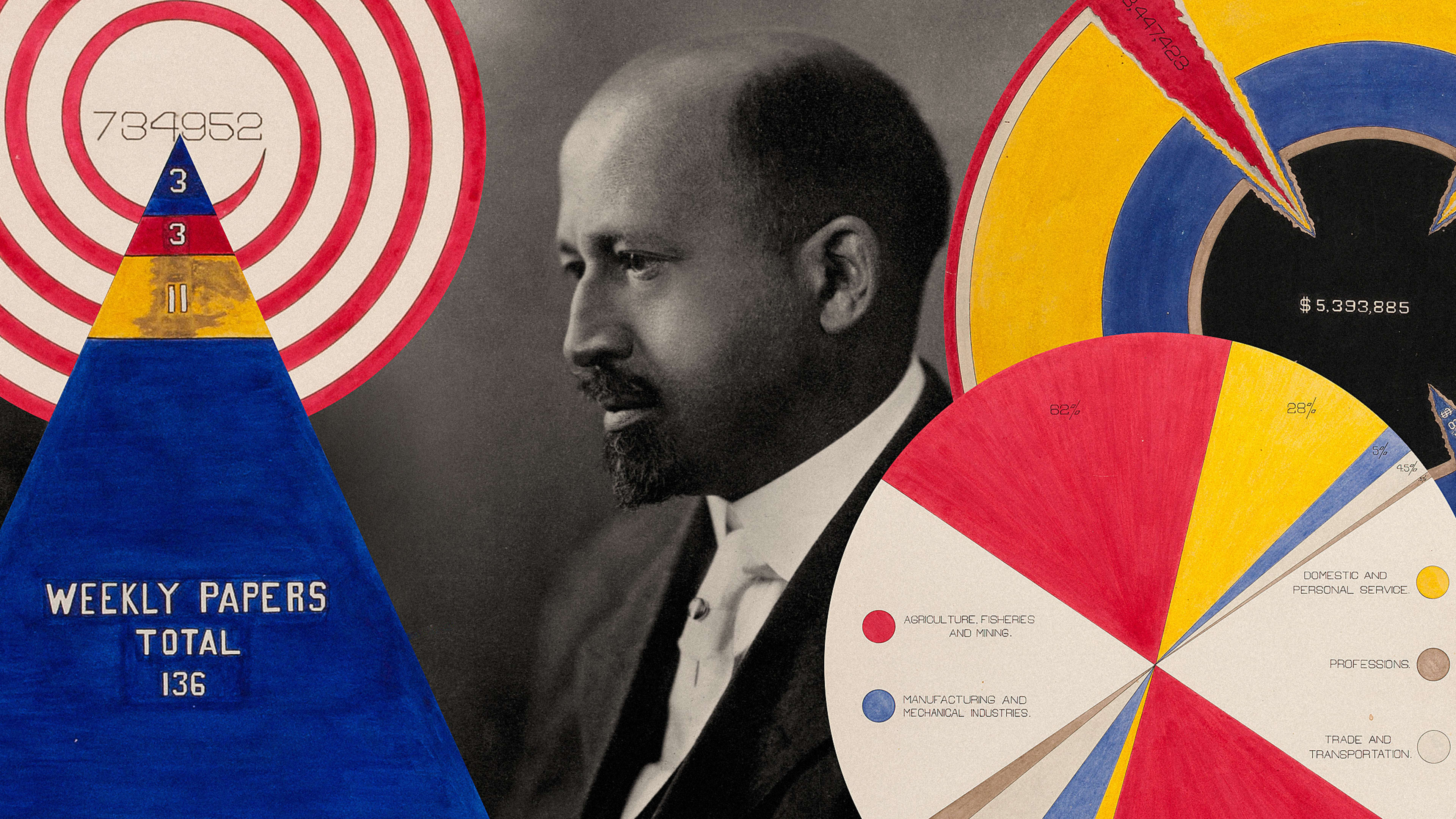


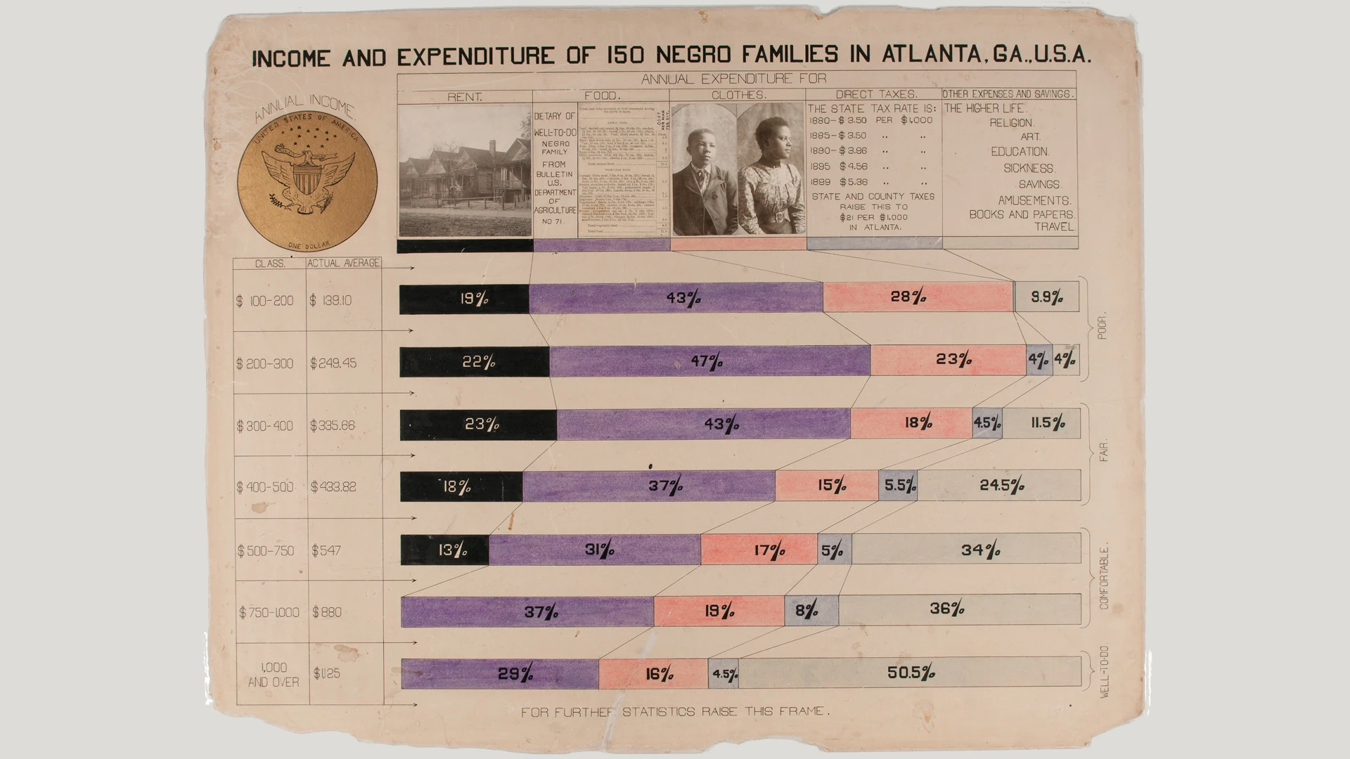
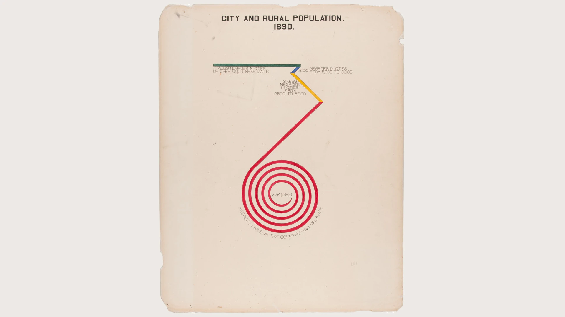
At the 1900 Exposition Universelle in Paris—a global trade fair which welcomed the new century—visitors enjoyed attractions like a giant kaleidoscope in the “Palace of Optics” and exotic marine life in a 2,368 foot aquarium. One booth, designed by historian, sociologist, and prominent civil rights activist W.E.B. Du Bois, was a collection of hand-drawn infographics illustrating data related to black life in post-Civil War America. Du Bois expressed this information in a series of colorful charts—today we’d call them data visualizations—that illustrated everything from household incomes to the number of existing black-owned newspapers. In a new exhibit at London’s House of Illustration, all 63 graphics created by DuBois (and a team of students from his sociology laboratory at the historically black college Atlanta University, now known as Clark Atlanta University) are on display—a first for the United Kingdom, and a reflection of the relevance of Du Bois’s work in the present day.
“The exposition was essentially a celebration of French imperialism, and included displays of ‘living villages’ where black people were shown derogatively as trophies of the empire,” says Katie McCurrach, co-curator of the exhibit, over email. “Du Bois’s display of scientific data was a direct challenge to this degrading presentation, and was a completely new approach to refuting racism, using statistical data to (as Du Bois described it) ‘give, in as systematic and compact a form as possible, the history and present condition of a large group of human beings.'”
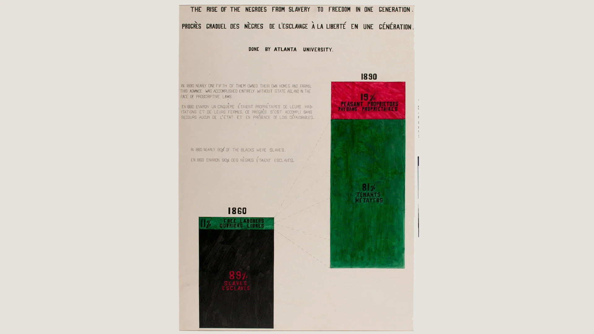
“Interestingly, there seems to be the repetition of the colors red, black and green—these colors later became those of the Pan-African flag, an emblem of black pride and liberation,” McCurrach says. “Du Bois became known as the father of modern Pan-Africanism, a movement advocating for solidarity between those of African descent worldwide.”
The early Pan-Africanist’s charts also use a curious spiral to display data, as opposed to the more traditional bar shape; this was not a conventional way of expressing information, but likely was DuBois’s answer to cramming crucial figures—too large for one page—into the constraints of the page’s borders.
“We were keen to show the full set of 63 charts, as they work together in series to build up an argument—without the full set we might have lost the complex picture of black lives in the U.S.A. that Du Bois had carefully put together,” McCurrach says. She and her collaborator, co-curator Paul Goodwin of the University of the Arts, London, looked at photographs of the original exhibit, which revealed DuBois’s use of flip frames, which displayed his data visualizations like posters. They adopted the same design scheme to honor the sociologist’s original choices, and to ensure that the large 56-by-72-foot reproduced prints would fit in the House of Illustration’s gallery space.
“We have kept the charts in the order that Du Bois intended, and divided [them] into the two sections that he created—charts that look at statistics from the U.S. as a whole, and charts that focus on the state of Georgia.” The exhibit also features a key for today’s visitors that assigns colors to different categories expressed in the graphs, such as ownership, population, and education.
According to McCurrach, three charts in particular are rich examples of how bravely DuBois challenged white supremacy. “One of the charts, Valuation of Town and City Property Owned by Georgia Negroes, shows the change in the value of property owned by black Georgians, mapped against disconcerting sociopolitical events such as ‘lynching’ and ‘Ku-Kluxism’ that indicate the violent context for black attempts at owning property,” McCurrach explains. “The chart also shows the drop in value of property owned by African Americans as new laws discriminated against them. This was a highly political statement—explicitly highlighting the violence and oppression that African Americans faced as they built lives for themselves post-Emancipation.”
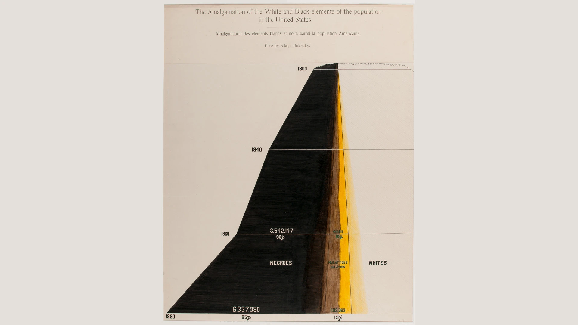
“Another two particularly radical charts are The Amalgamation of the White and Black Elements of the Population in the United States and Race Amalgamation in Georgia. The first shows how the population of the United States changed over the 19th century, particularly how the percentage and number of those with mixed heritage had increased. It challenged the idea that racial categories were binary,” McCurrach says. “Both this and the second chart anticipate contemporary debates in African American communities about ‘colorism’ . . . Although this form of prejudice was unnamed in 1900, those with lighter-toned skin such as Du Bois were afforded more privileges than those with darker-toned skin. Given that interracial relationships were illegal in most states until 1967, the second chart also powerfully illustrates the effect of centuries of rape and largely unacknowledged fathering of dual-heritage children of black female slaves by white slave owners.”
The show also features modern charts from Mona Chalabi, data editor at Guardian US, which use DuBois’s visualization methods but with 2017 statistics. Her works illustrate the disparities between today’s black and white populations, as a continuation of DuBois’s 20th-century approach to using data and design to chart black lives.
Recognize your brand’s excellence by applying to this year’s Brands That Matter Awards before the early-rate deadline, May 3.
