You may think you see the letters you read in books, emails, signs, and, well, the world, as plain as day, but you don’t. In reality, the individual letterforms that make up words have to be drawn in counterintuitive and idiosyncratic ways to adjust for how the brain perceives visual equilibrium. Type designers must employ a series of visual tricks that make you think that the letter B is balanced on top and bottom, and that C and T are the same height—even when they aren’t. All this is to say, the letters you read all day are not as they seem. In fact, type design itself is a craft of illusions.
But unlike most magicians, Jonathan Hoefler is revealing his secrets. The typographer and founder of Hoefler&Co. recently explained on his blog that he and director Brian Oakes wanted his episode in the Netflix documentary series Abstract: The Art of Design to be more than a profile; it should “offer viewers some practical insights into the mechanics of the craft itself.” He’s now made those lessons available free to download on his website, no Netflix subscription required. Here are a few of the “typographic illusions” that Hoefler explains.
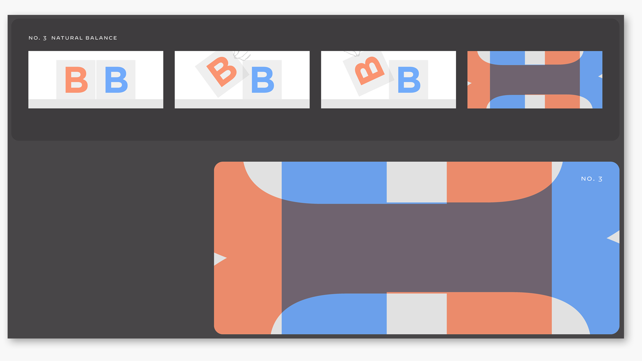
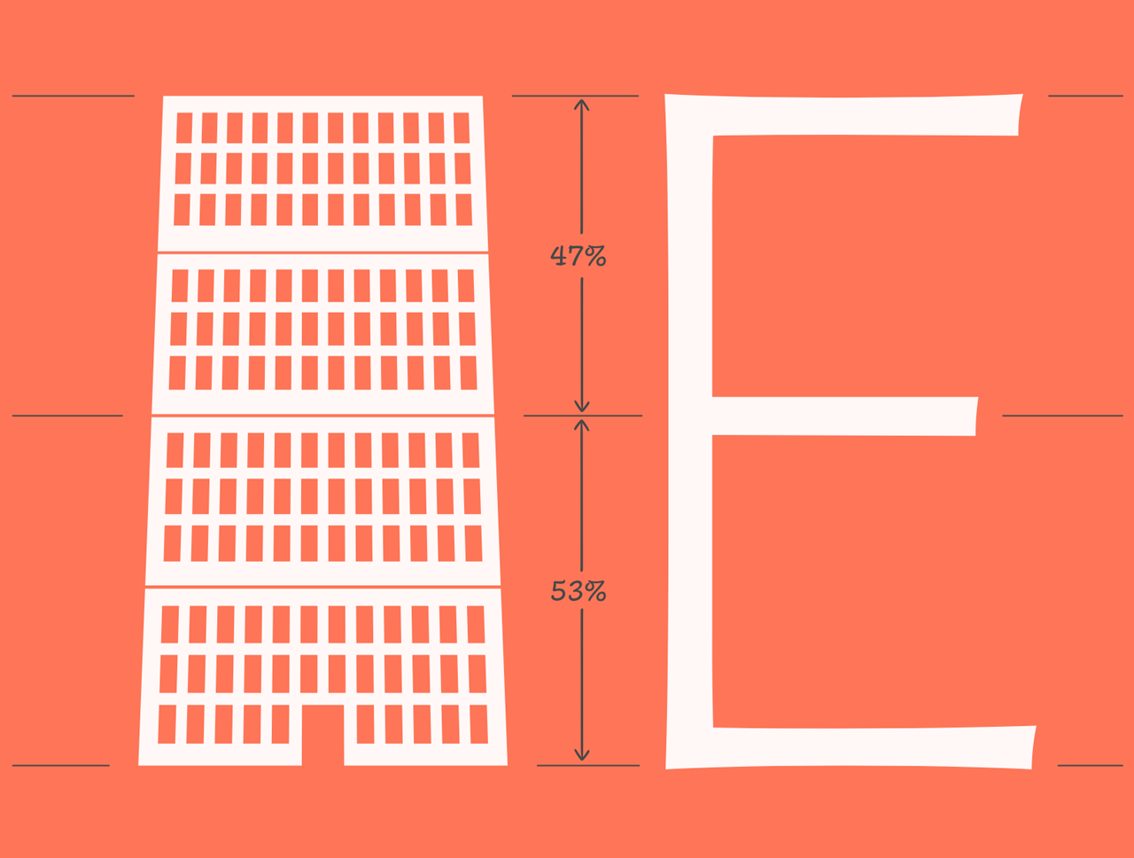
Balance: “Another thing we consistently misjudge,” says Hoefler on the Hoefler&Co. blog. “This may be a vestige of how humans have evolved to process the physical environment, intuitively recognizing that remote objects appear smaller than those nearby.” Take the letter B. The top half must be drawn smaller to make both halves appear as though they match.
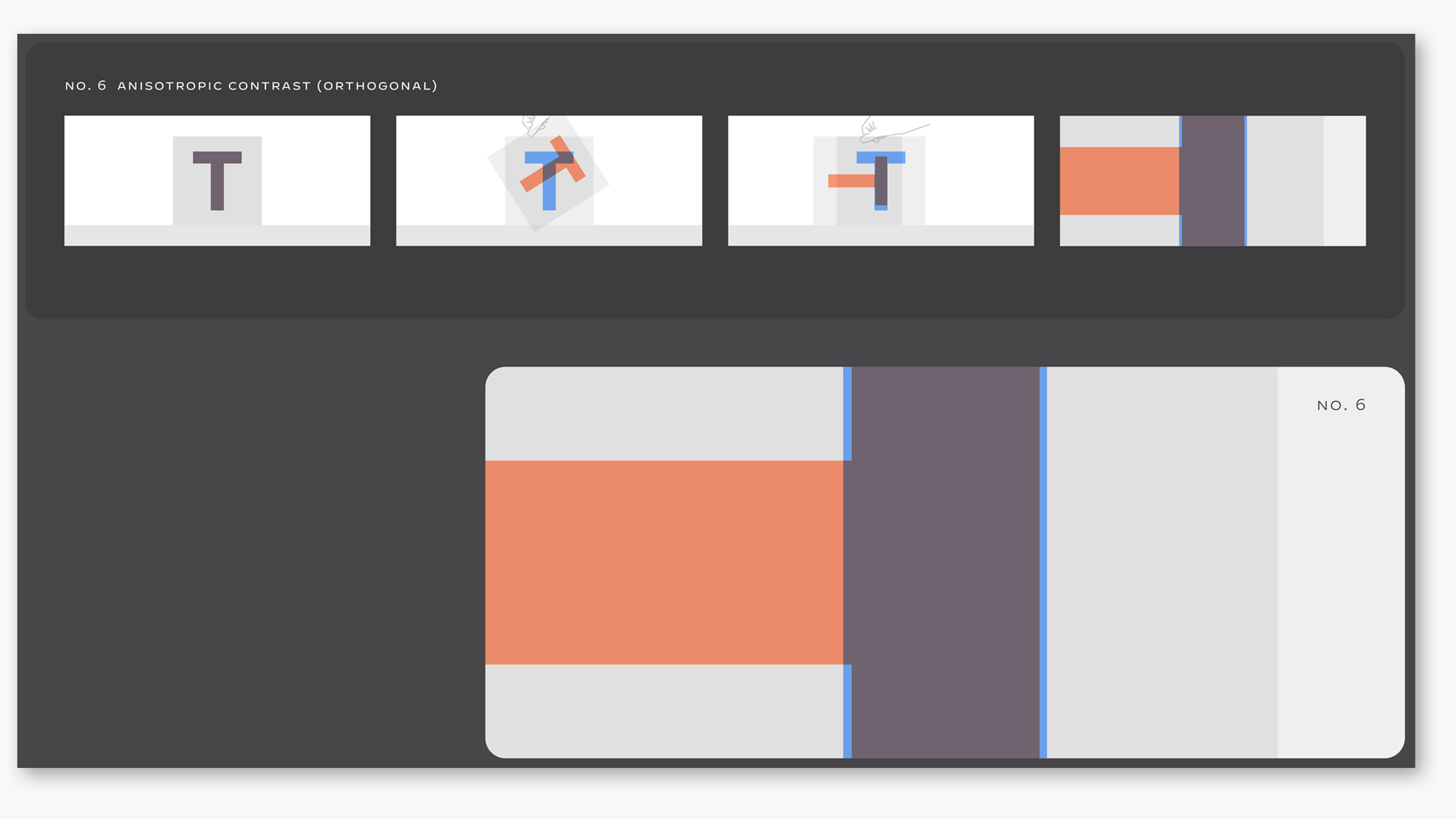
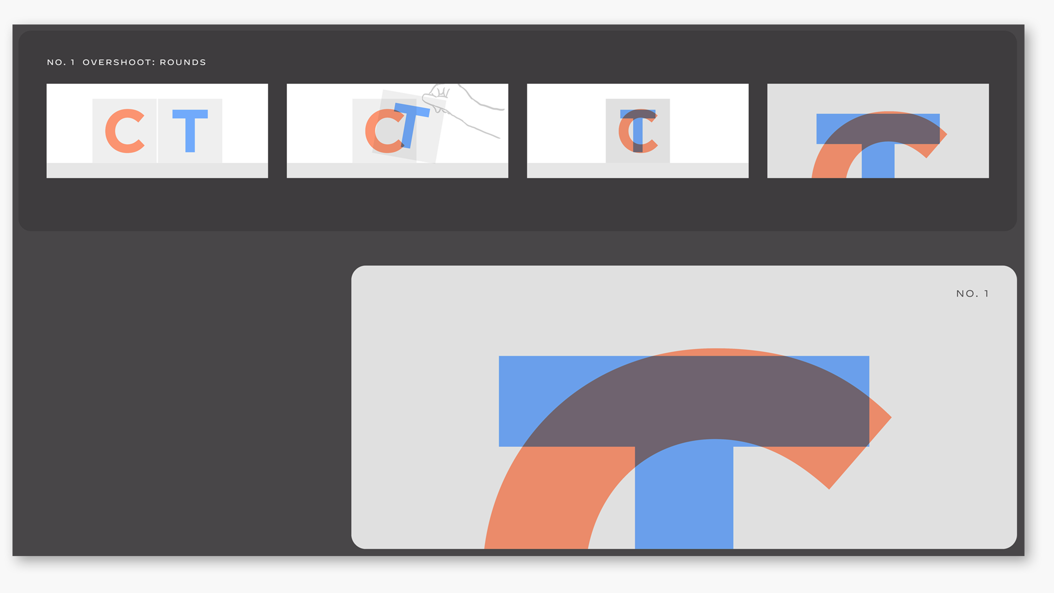
Contrast: In type design, this refers to “one of typography’s greatest paradoxes: that lines appear thicker when oriented horizontally than vertically.” To adjust for this, type designers draw verticals much thicker than horizontals. That T may look even, but it’s really just because your brain infers it to be.
“Anisotropic”—referring to how the behavior changes based on direction—”contrast” applies to S as well. It’s thinner on the top and bottom, thicker toward the middle, and has an overall backward slant. Flip the S over and you won’t find a mirror image.
So why is our mind playing tricks on us? It could be physiological. One theory mentioned by Hoefler, based on a study published in the Proceedings of the National Academy of Science, is that “because our brains evolved to reckon with the three-dimensional world, the expectations that bring to bear upon two-dimensional forms often don’t apply. When there’s a disconnect between what we see and what we expect to see, we experience this as an optical illusion.”
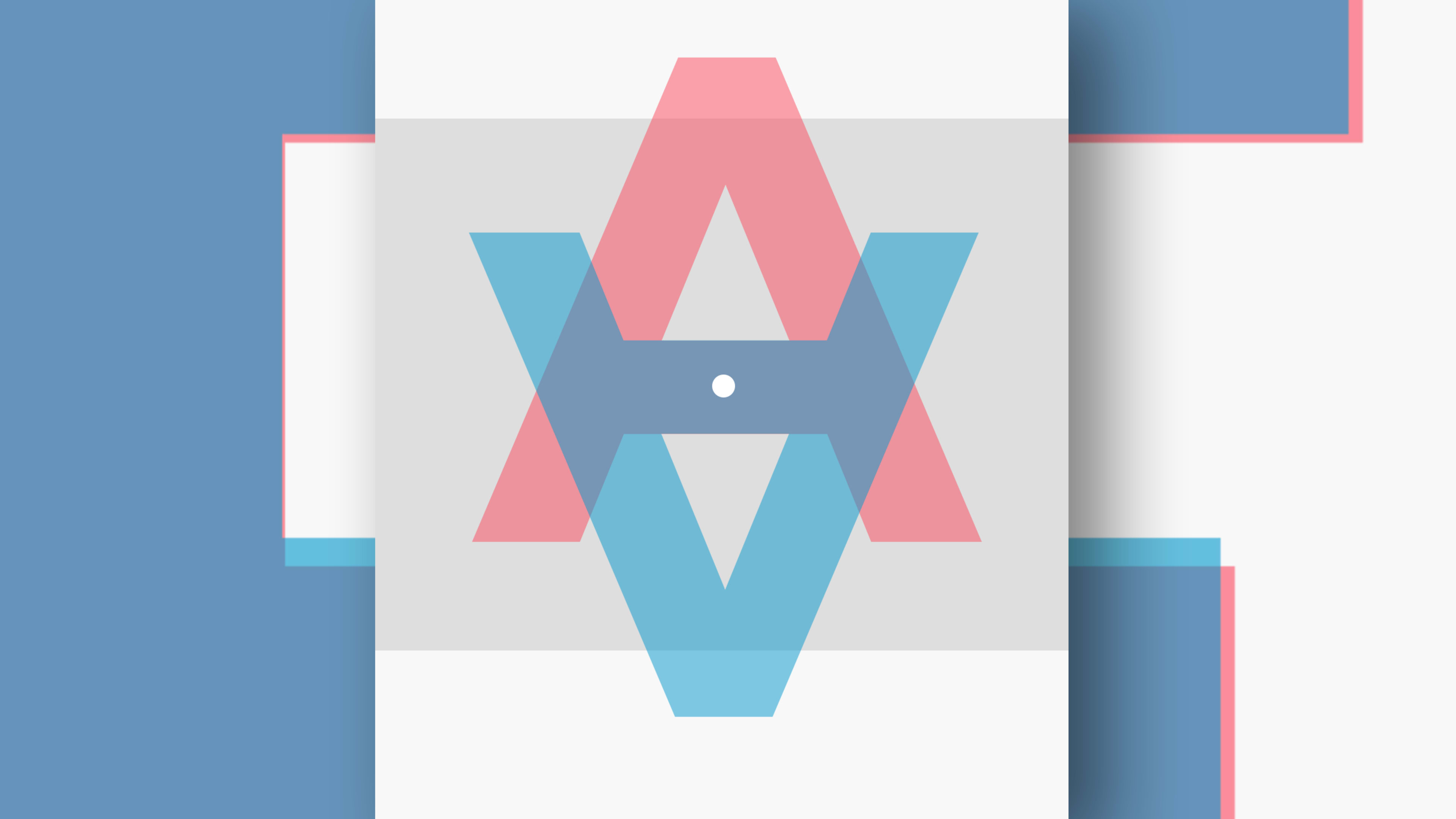
And while these illusions are most closely associated with typography, they can have ramifications for graphic design, too, affecting how we perceive everything from a single arrow to logos and entire visual systems, according to Hoefler. The best way to solve these design problems is to get to know them. With Hoefler’s newly available Tools for Teaching Typographic Illusions, that just got a little bit easier.
Recognize your brand’s excellence by applying to this year’s Brands That Matter Awards before the early-rate deadline, May 3.
