Facebook used to be a website. Then it became an app. But even as the company rapidly expanded, it made sense to keep calling it “Facebook.” Then Facebook started buying other companies and apps, like WhatsApp and Instagram. It acquired its own virtual reality division with Oculus. It announced its own cryptocurrency with all sorts of partners in the banking industry. All of a sudden, Facebook stood for a lot more than an app. Yet, awkwardly, it was still the name of an app!
Today, Facebook—the company—has taken a big step in clarifying its identity as a corporation that owns many apps and companies. It’s launching an all-new brand that’s nearly a year in the making. Call it FACEBOOK.
The key to the new identity is an all-caps logo, which is meant to signify Facebook as a company. Meanwhile, the lowercase “f” logo and “facebook” wordmark will designate the social network’s app and desktop site as it did before. Note that nothing within Facebook’s existing corporate structure is changing as part of this branding announcement. Rather, this is Facebook reestablishing its identity as it becomes a more complicated—and scrutinized—company.
“It’s inspired by this realization that when one hears ‘Facebook,’ they almost automatically think about the Facebook app. [That’s] just a subset of the products and services that are part of the Facebook company,” says Luke Woods, VP of Design at Facebook. “Our hope is with a distinction between the company and app, it will help provide people with a little bit more clarity, clarity that a number of different products they might use that are part of this larger Facebook company.”
As Woods acknowledges, a recent Pew Research poll found that only 29% of respondents knew that WhatsApp and Instagram are actually owned by Facebook. I float that perhaps this was a good approach for users who might be wary of Facebook’s privacy track record. But Woods says that they know people value corporate transparency—and Facebook has conducted some of its own research regarding Facebook’s brands that confirm this. The ambiguity across its many brands and apps been a point of growing concern for Facebook since it acquired the business advertising tool Atlas in 2013. But it wasn’t until 2019 that the company added “from Facebook” to the titles of WhatsApp and Instagram, clarifying their ownership.
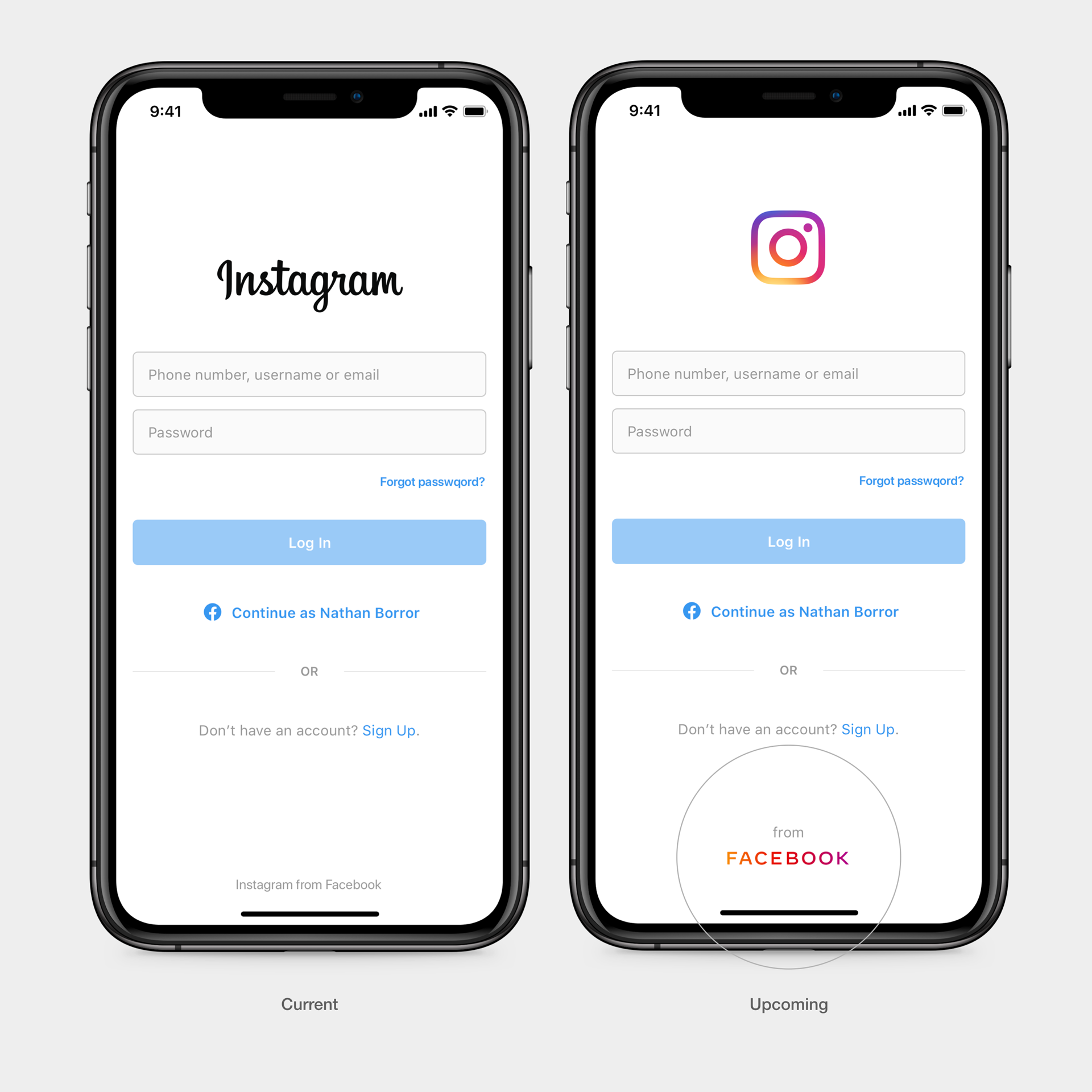
The FACEBOOK identity is meant to finish this brand-defining work. The logo’s characters are familiar but not an actual typeface you know; they were all custom-drawn with assistance from an unnamed external studio. The new logo will sometimes be shortened to a simpler “FB” and appear in place of the “from Facebook” message that features on many of the company’s platforms now.
The logo’s all-caps letterforms, rendered in bold lines, are a confident statement for sure. This is not a company that’s cowering in the face of heightened governmental scrutiny. It is FACEBOOK.
[Image: Facebook]
To link together many platforms, the new FACEBOOK logo changes color to match context. On Instagram, it’s a purple gradient. On WhatsApp, it’s a solid lime green. When it’s just the corporate entity, it’s a blue-grey, the graphic design equivalent of a corporate lawyer’s wool suit.
You’ll note the “A” and the “K” each have a quirky curve to them, the “E” and “B” letters are uncommonly wide for the context, and the tracking between letters is verging on too airy by most proportions.
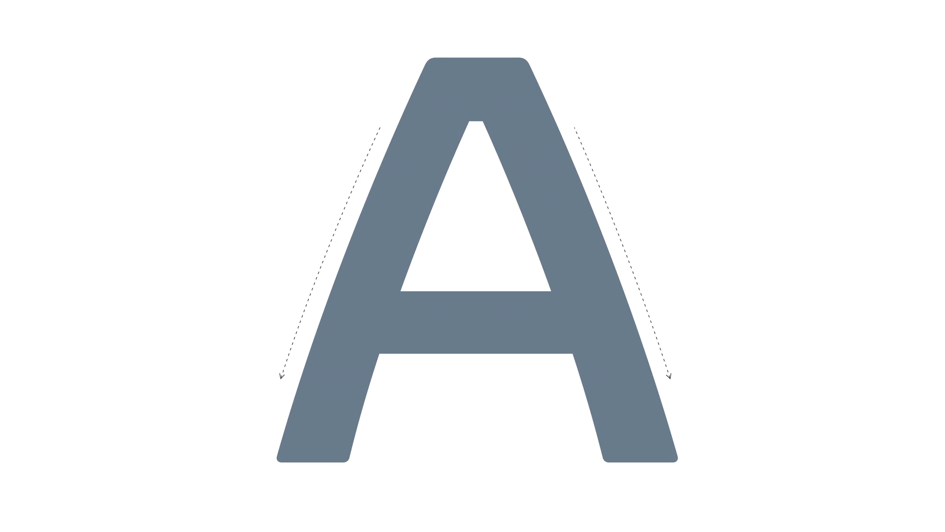
These idiosyncrasies do have some practical purpose. “With all-caps, it’s really tricky to imbue a lot of emotion and unique characters,” says Zach Stubenvoll, design director. The custom curves and spacing also serve as interventions to ensure that Facebook’s logo doesn’t look like any other word art you might whip up in a Google Doc.
Why didn’t FACEBOOK just rename its corporate entity, instead of going through such a difficult design exercise to distinguish the app from the company through colors and caps?
“Certainly, at the onset of any work we’re doing, we consider a whole host and broad range of possibilities,” says Woods. “We think though, we always have been and always will be Facebook. And it’s very important we’re true to that. And we honor that. That’s not something we’re looking to shy away from.”
Recognize your brand’s excellence by applying to this year’s Brands That Matter Awards before the early-rate deadline, May 3.
