Design types are notorious for wearing black (guilty as charged) and they aren’t alone: Black was the most popular color in womenswear in 2017, taking up 36% of the market according to the retail technology company Edited. The popularity of dark hues has even crossed the boundaries of fashion and made its way into UX and UI design, with a slew of popular apps and programs introducing “dark mode” options that reverse the reigning color scheme of the web.
Dark interfaces have been around for a long time, but they’ve become wildly popular with users over the past few years. There’s been a proliferation of consumer-facing dark mode options in the past year alone, including in MacOS, Apple iOS, and Android, as well as across apps and platforms. Instagram debuted its dark mode in early October; the Gmail app introduced dark mode this week.
What’s driving the web’s recent obsession with dark mode? In speaking anecdotally with friends about why they switched to dark mode, a lot of what I heard was that it’s easier on the eyes—i.e., they found the dark background to be less harsh than the bright white background when looking at their phones at night. But while a dimmer interface might seem better for the eyes (and really does save battery), it’s not actually better for legibility.
While Budiu qualified that the firm hasn’t conducted its own research on the usability of dark mode, she says they generally don’t recommend dark mode for “normal vision users,” and says positive contrast polarity, aka good old black-on-white text, is “easier to read and more glanceable,” especially in low light conditions.
Published research in ergonomics seems to back this up. A 2017 study in the journal Applied Ergonomics found that “dark characters on light background lead to better legibility and are strongly recommended independent of observer’s age.” And Human Factors: The Journal of the Human Factors and Ergonomics Society found in 2013 that “the typically higher luminance of positive polarity displays leads to an improved perception of detail.”
For this reason, when it comes to dark mode, Budiu still recommends defaulting to the old reliable black-on-white when you have a lot of reading to do. But if you really don’t want to give up on dark mode, there are a few tips you can use to combat decreased legibility. Apple suggests testing your content by turning on “Increase Contrast and Reduce Transparency” in your iPhone’s settings “both separately and together” while in dark mode.
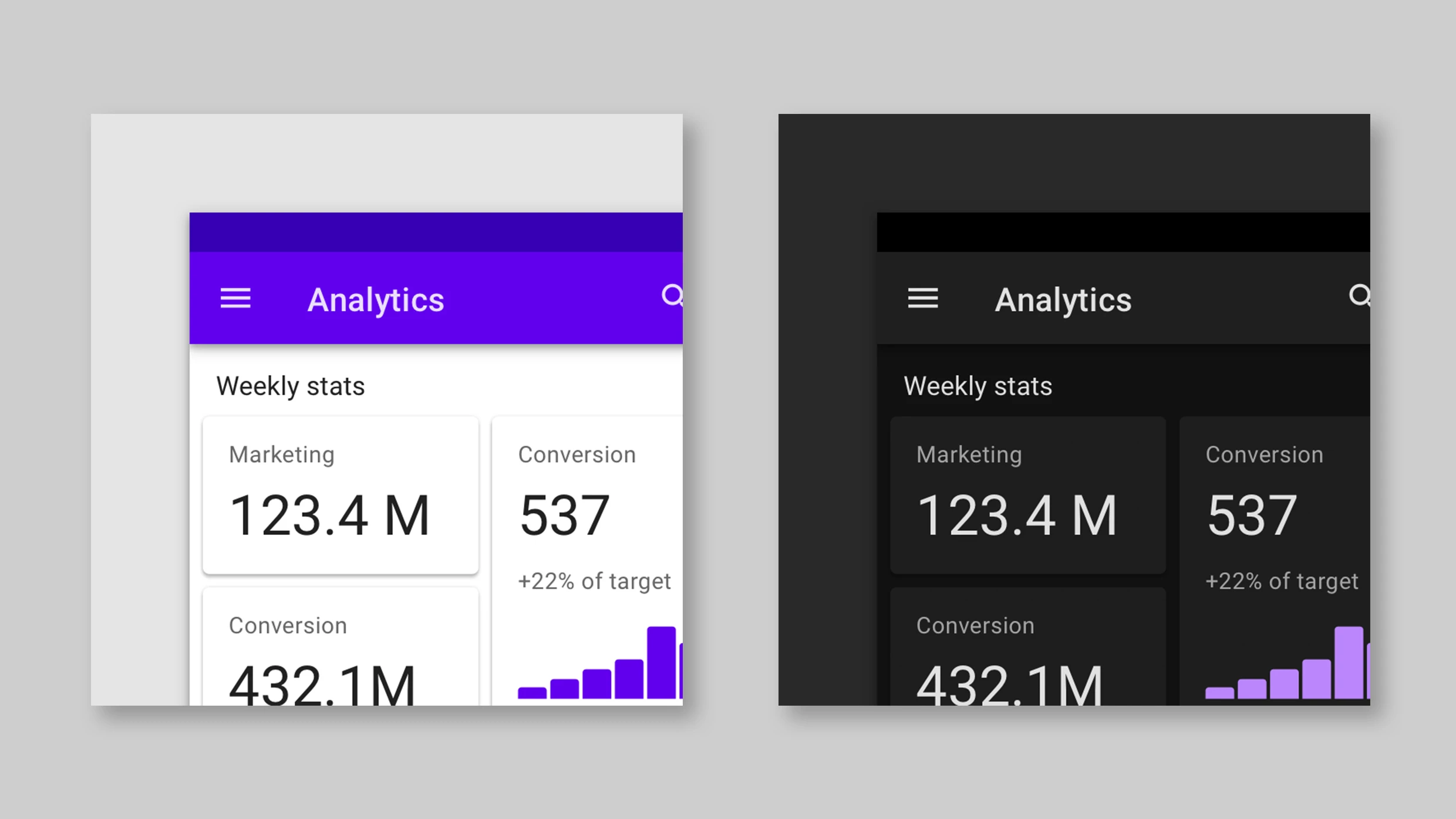
There are some contexts where dark mode can be useful. According to Apple’s human interface guidelines, dark mode allows the “content to stand out while the surrounding UI recedes into the background.” So it does make sense that Adobe Creative Cloud utilizes a dark user interface: Its focus is on image editing, and the dark UI prioritizes the visual by minimizing the less-relevant textual elements.
For this same reason, dark mode works well when you want to encourage the reader to quickly scan stats and focus on key data points, like when looking at stocks, charts, or graphs. Likewise, a Salesforce study suggests that there may be some functional benefits when it comes to reading charts and graphics. After asking study participants to compare charts in both light and dark themes, and rank them by which would be “worth the least or most if they had to pay for each type,” the Salesforce team found that participants made decisions faster, and just as accurately, with the dark interface as compared to a light one. Interestingly, that ran counter to participant’s impressions of the interfaces, as they had a better first impression and associated higher value with the light themes.
The bottom line is, whether or not you choose to go dark should be based on your personal aesthetic preference, because in regard to usability and legibility, dark mode isn’t actually better. Rather, it may be more indicative of a “bigger minimalism trend,” as Budiu puts it, or simply the increasing personalization of user interfaces overall. So yes, you can have the Wednesday Adams aesthetic on your phone interface too. But at this point, it seems to be just that—about the looks.
Recognize your brand’s excellence by applying to this year’s Brands That Matter Awards before the early-rate deadline, May 3.
