Isabelle Olsson, design lead at Nest, has a simple test when designing new products. She brings them home to her three-year-old daughter and asks, “What is this?”
“If she says, ‘Google,’ I know we’re on the right track,” Olsson laugh—before clarifying, “I don’t make all my decisions based upon a three-year-old.”
Still, the recognizability of such otherwise understated objects is a testament to Google’s sharp design language—a design language that continues to evolve with the announcement of two new Nest products.
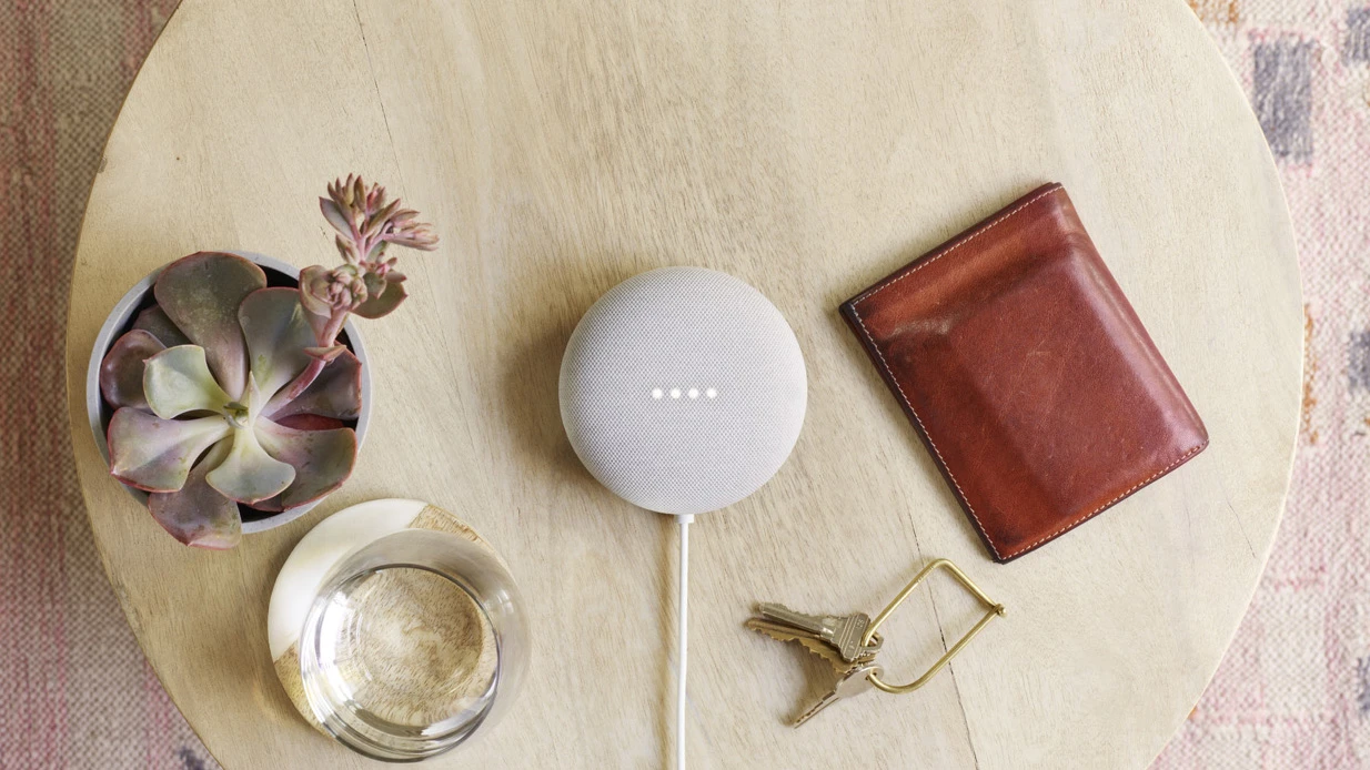
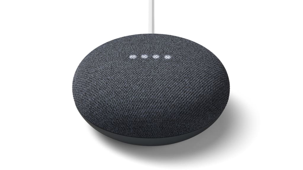
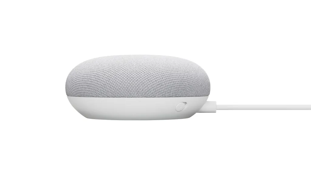
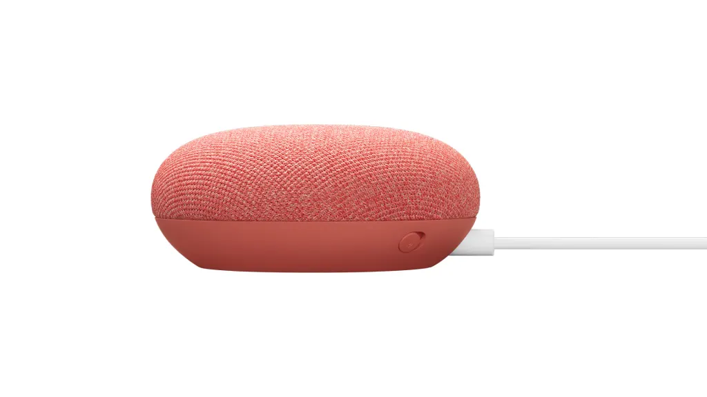
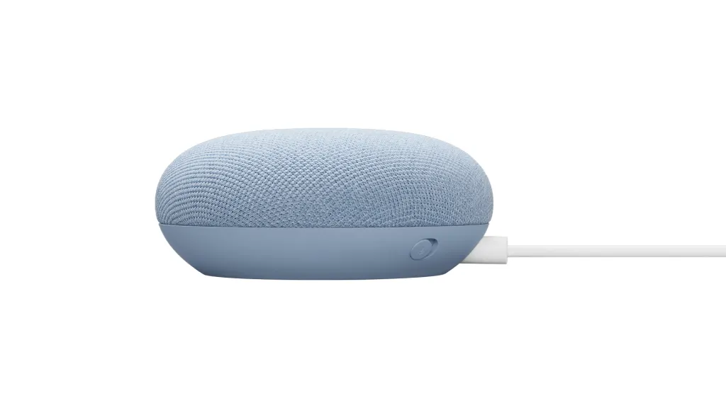
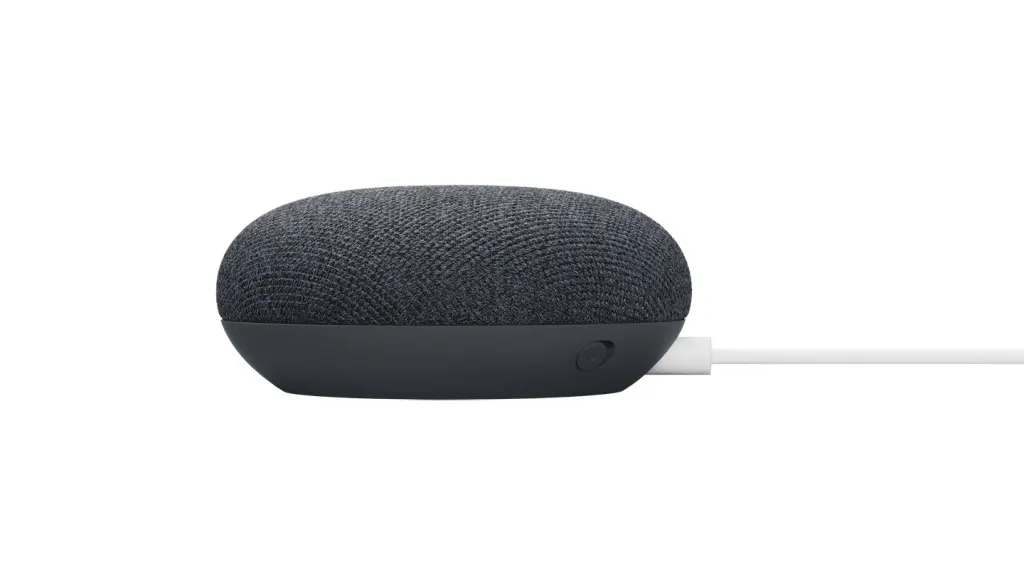
The first product is the new Nest Mini ($49, arriving on October 22), a rebranded sequel to the Google Home Mini speaker and personal assistant. At first glance, it’s nearly identical to the old Mini, with several of its old colors, such as coral and charcoal, but it’s simpler, louder (with 2 times the bass volume), and a bit more sustainably built than before.
The new Mini looks a lot like the old Mini. A sharp eye will notice that its three-piece design, comprised of a fabric top, plastic mid layer, and plastic base, was replaced with a two-piece design of just the top and a combined base. (The reason? Olsson says the team is always aiming for more simplicity). The device also features a tiny indentation on the back, allowing you to mount it on the wall. But most people will barely notice a difference side by side, and that’s by design.
“Keeping the design the same was not, you know, out of laziness. In fact, it’s the other way around. It’s a lot harder to do when you introduce new features and make the sound better,” says Olsson. “But . . . I think it’s easy to feel stressed, if everything keeps changing, that you have to get the next thing, and next thing. In this sense, if you already have a Mini and you buy this one, they still feel like the same family . . . it still feels like the [same] product, versus, this is the old one and the new one.”
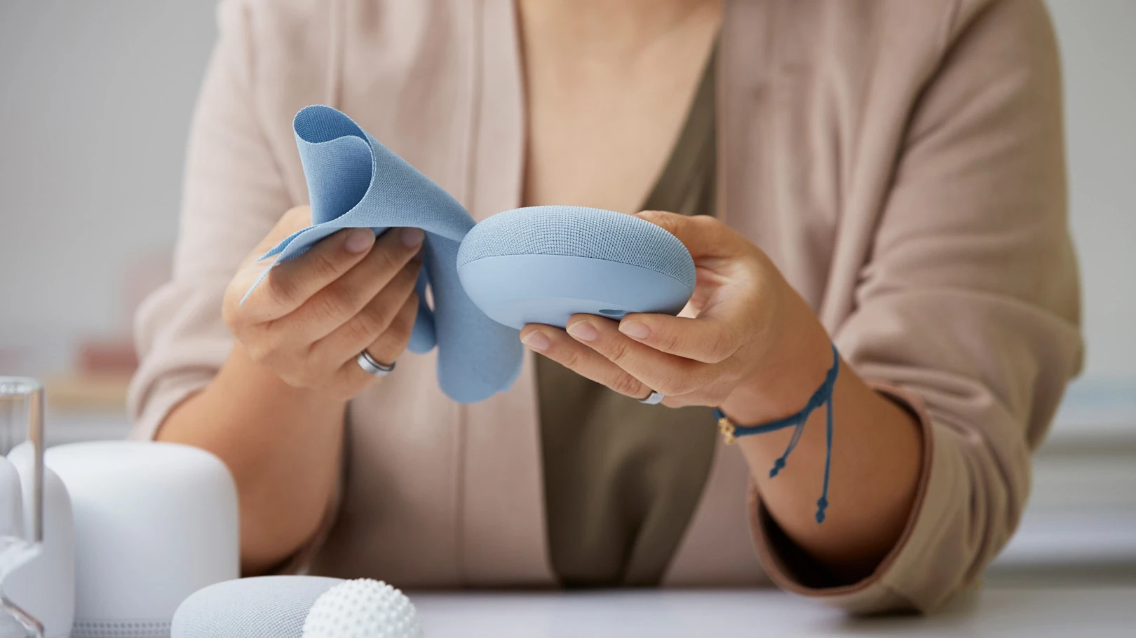
Notably, the Mini sports a hardware design first for Google: a fabric top that’s made out of recycled PET bottles—those clear plastic bottles you see everywhere. Developed by Google’s own internal textile experts in collaboration with commercial partners, the plastic is ground down into flakes, extruded into a bird-nest-like yarn, and woven into textile—but manages to retain not only the softness of the polyester used before, but also the acoustic properties needed for a speaker. Olsson holds it up during a video call for me to see, and I’m struck by how the bolt of fabric drapes like a flowing curtain or dress.
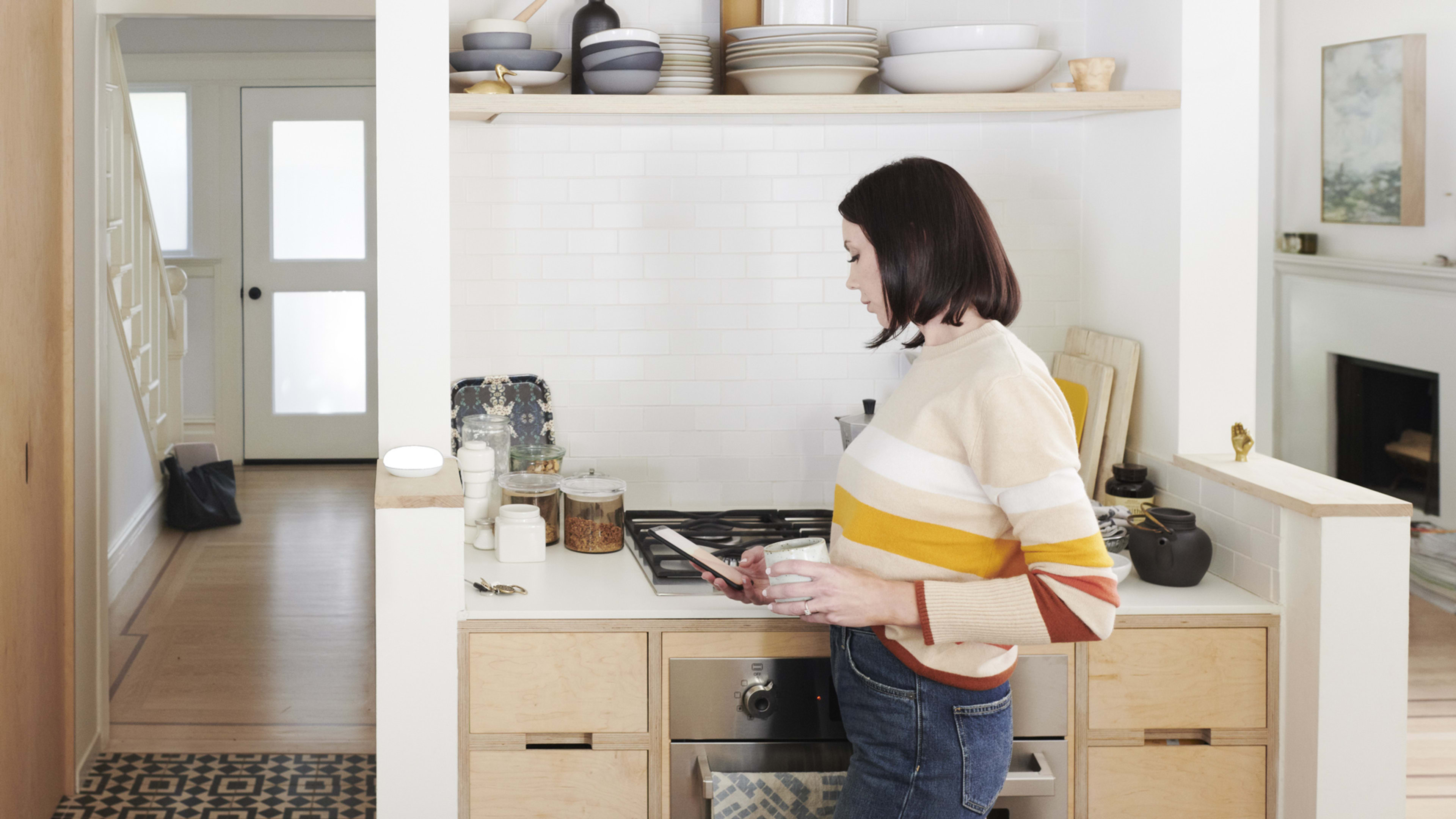
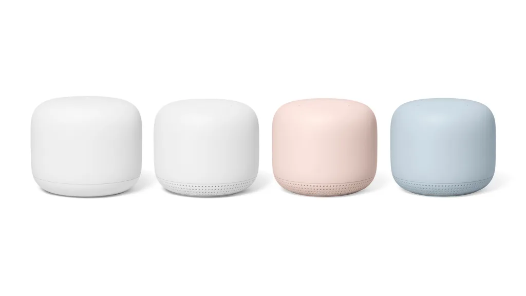
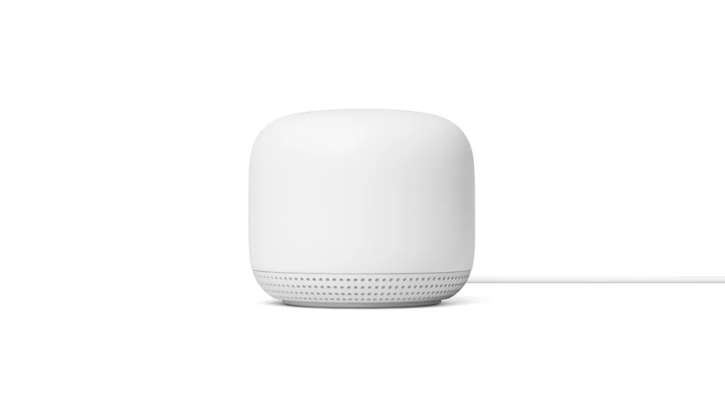
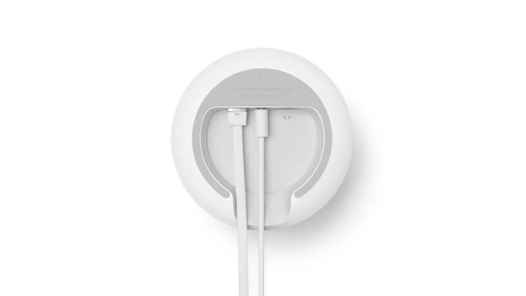
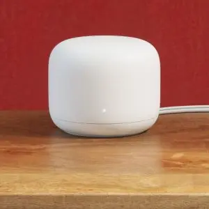
The Nest Wifi was a more traditional industrial design challenge. The team needed to create a reasonably sized device, cramming together the speaker and microphone from the Nest Mini with the hardware inside a mesh router system (a mesh system uses many small nodes, rather than one big router, to make a Wi-Fi network across your home).
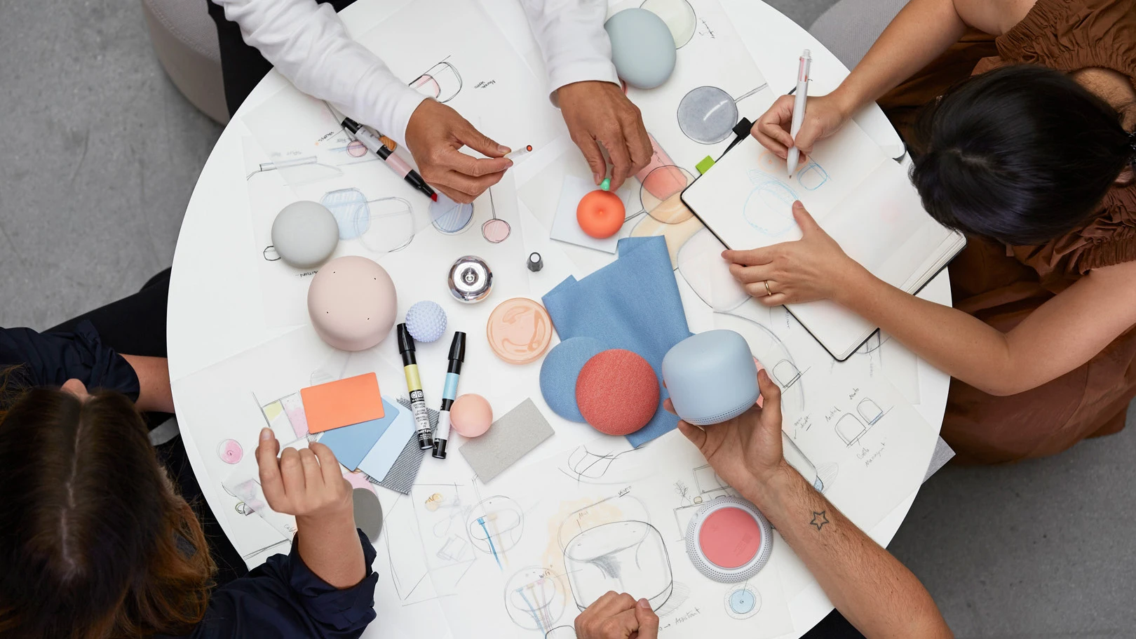
In early experiments, the team experimented with supersizing the Mini, using the exact same design scaled up. Seeing the Mini in various scales, lined up like Russian dolls on a Vitsœ shelf, it’s quickly obvious: A giant version of the Mini looks strangely absurd. “You spin things in CAD, and you get the wrong perspective, honestly,” says Olsson, stressing why Google has such extensive physical design labs. “It’s the same design, the same gesture, but the proportions are awful.”
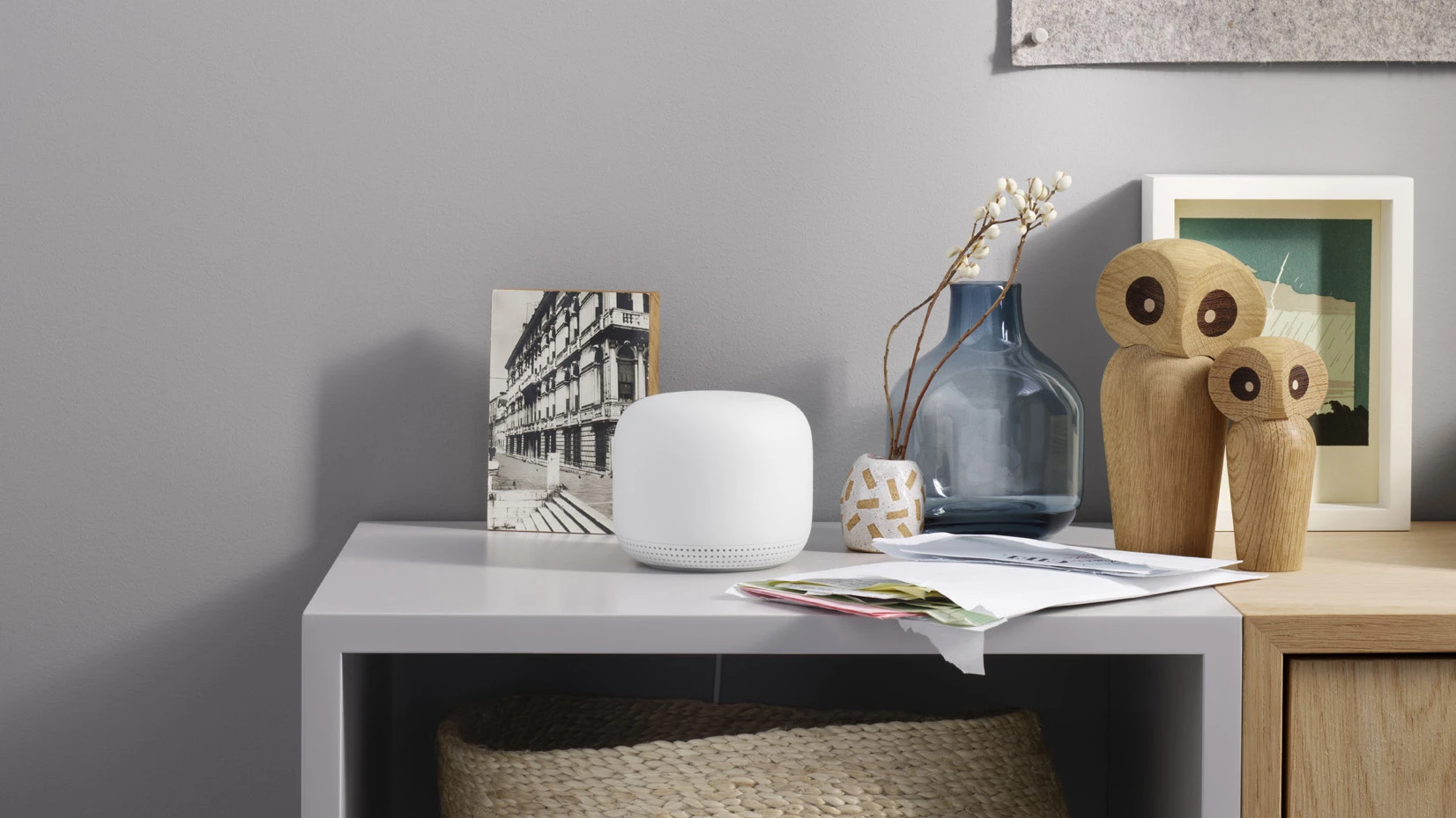
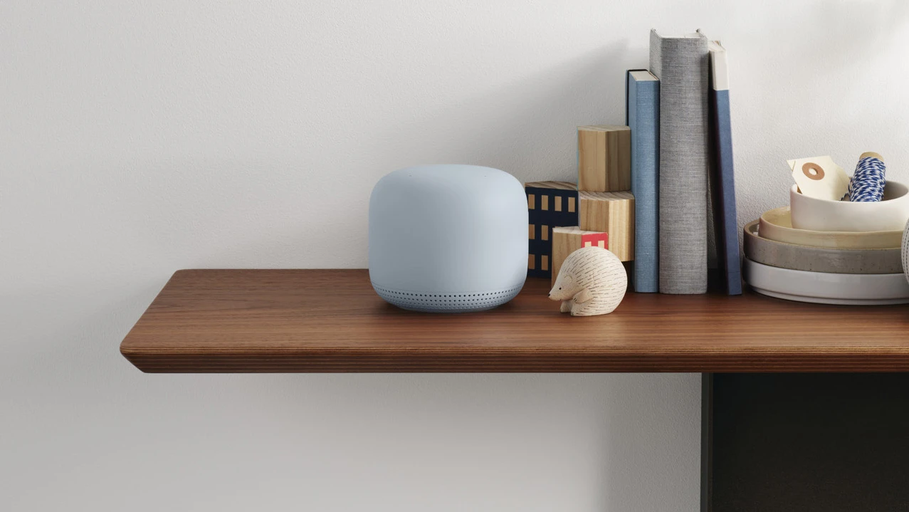
Instead, the Nest Wifi took visual inspiration from ceramic vases and cups (even though the device is built out of 50% post-recycled plastic, not ceramic), with the intention of designing a device that wouldn’t look out of place next to a piece of art at home. The design, of course, has a goal beyond looking good for looking good’s sake. Google wants you to be using its voice assistant to interact with Google, because such data and services are Google’s bread and butter.
“These products should be out in the open so they function well. You don’t want someone to put it in the cabinet, so that will inhibit the function of the product itself,” says Olsson. “Our goal was, how can we design it to be on a side table, shelf, or that beautiful vase you have from your grandma?”
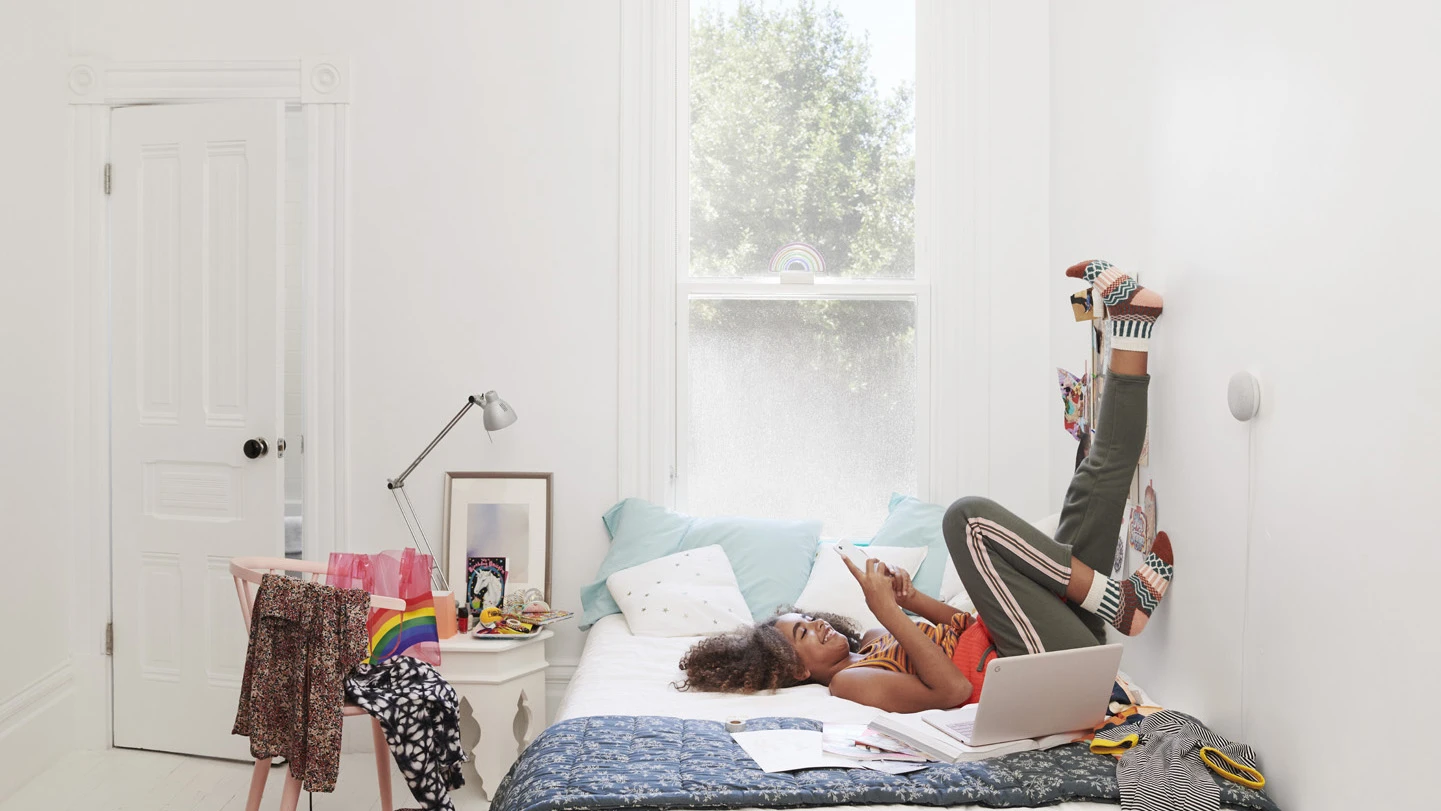
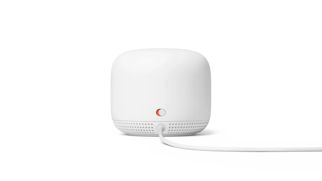
Another notable Nest Wifi feature is its underlighting, a ring of lights that project from its bottom. The lights convey important information from the Google Assistant, related to setting the device up, when it’s thinking, and whether or not it’s muted. The idea is that you can see this ring anywhere in a room, whereas the original Google Home had a sharply angled light display that could be hard to check at a glance.
The Nest Wifi is a quietly ambitious home product when you stack all of these features together. Networking. Speakers. A microphone. And lighting that, potentially, could be used to create a soft, glowing mood across your home. Google design vice president Ivy Ross has said in the past that she wants to rethink not just the next Pixel phone, but our entire living spaces to be more responsive to our emotional needs.
The Nest Wifi that Google is debuting today isn’t that; it’s a combination of personal assistant and mesh Wi-Fi system. But it clearly has the sort of components that could help it challenge Ikea’s Sonos lamp, which can create an aura of relaxation wherever you place it. Olsson even admits that it was, in part, inspired by a lantern.
“I can’t speculate for future use cases for interaction design,” says Olsson. “But it is exciting. When you design something more inspired by the home, it can take these functions that you may originally not have expected and become more.”
Recognize your brand's excellence by applying to this year's Brands That Matters Awards before the early-rate deadline, May 3.
