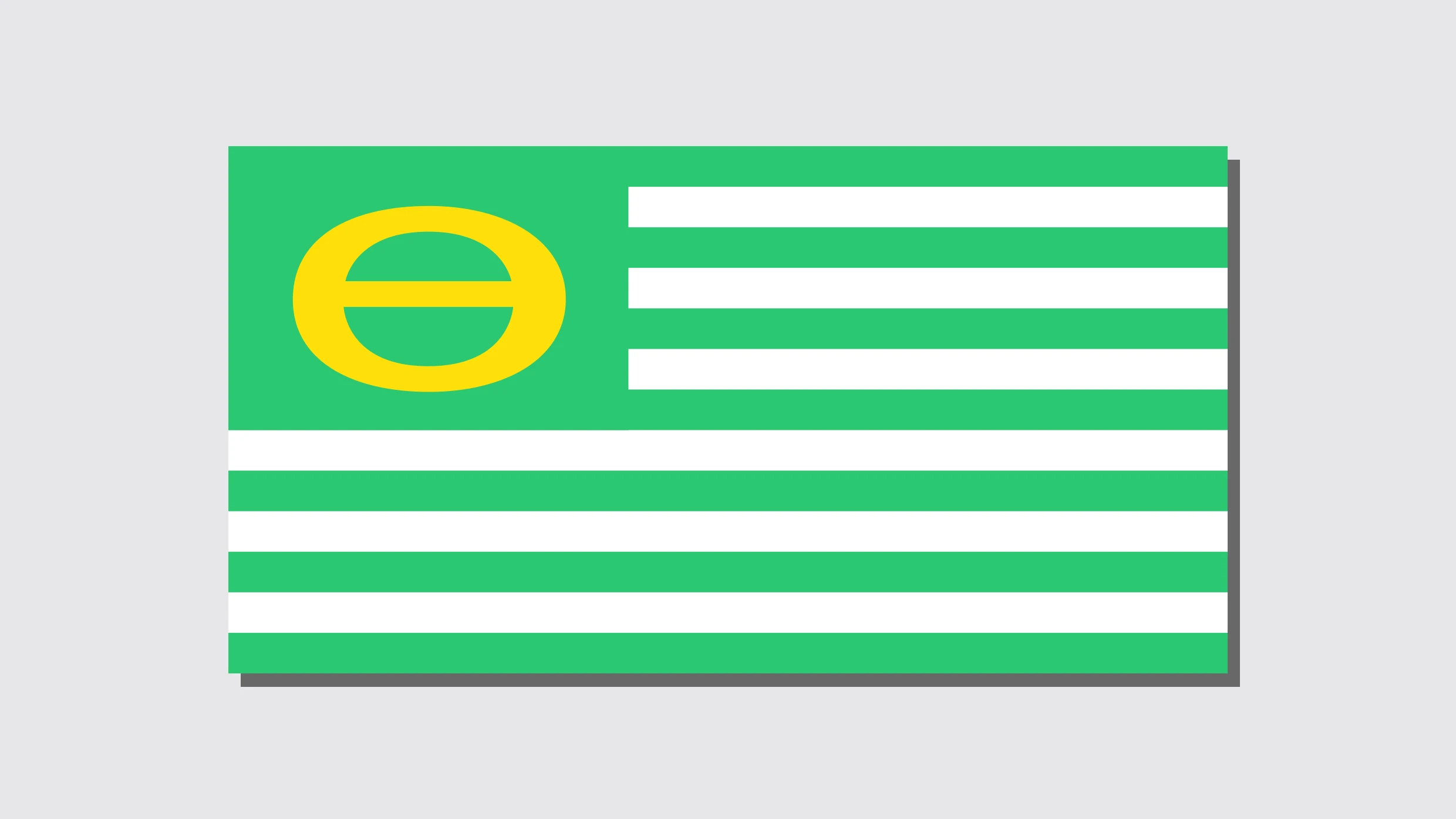
In the 1970s, American environmentalists developed the “Ecology Flag,” a green, white, and yellow mimic of the United States flag symbolizing a commitment to cleaning up the environment. Where the traditional flag’s stars would be, the Ecology Flag sported a specially-designed ecology symbol—a superimposed “e” (for environment) and “o” (for organism) that form a Theta-like shape.
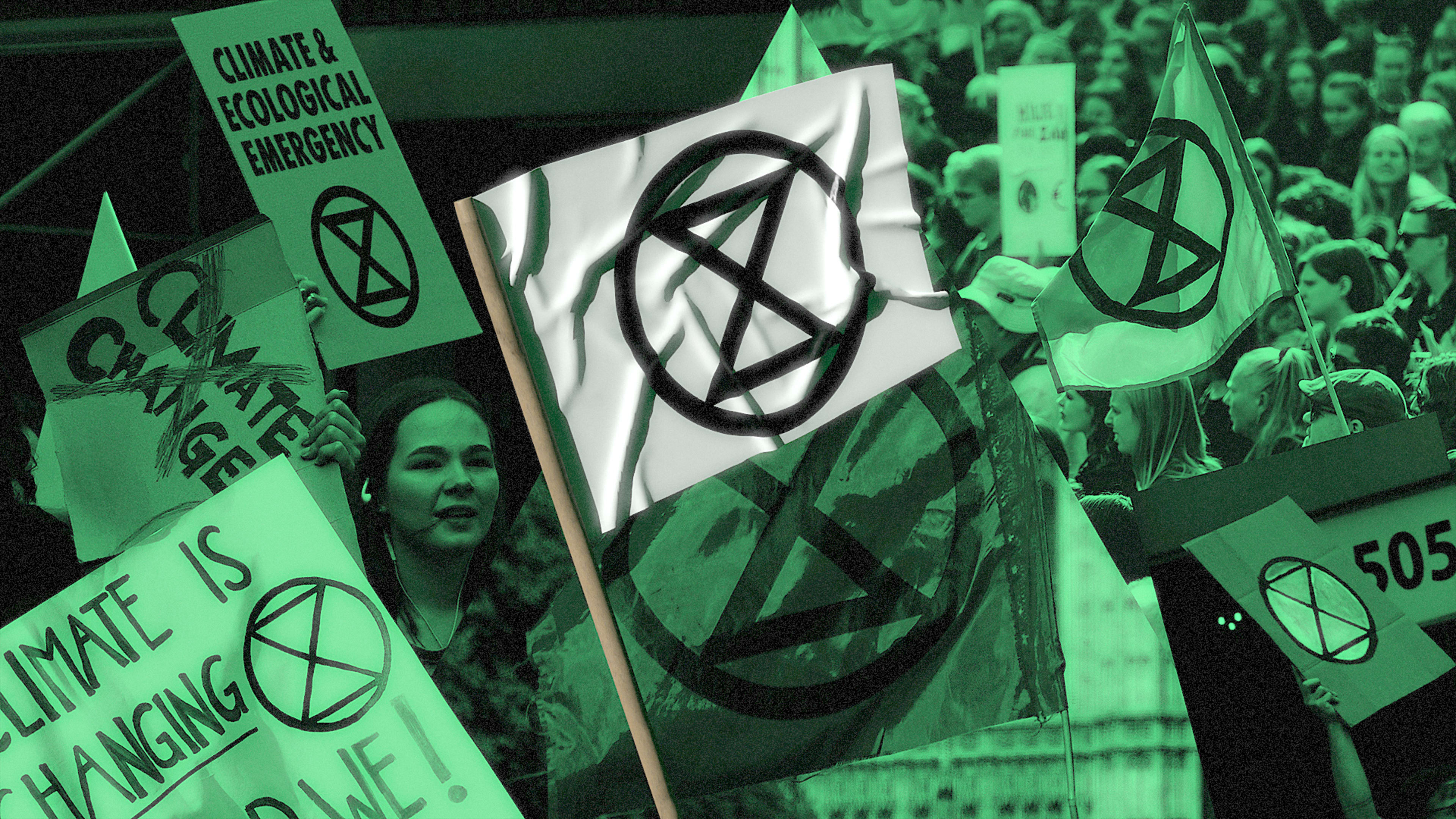
Over the past year, another environmentally-focused symbol has emerged to represent a new generation of climate protests around the world. The Extinction Rebellion, named after the Anthropocene extinction, is an environmental activist group that started in the United Kingdom in 2018. Formed by a collective of 100 academics, it’s intended to pressure governments—by way of thoughtful civil disobedience—to take action against biodiversity loss and climate and ecological collapse.
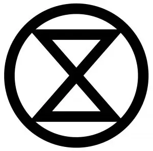
Extinction Rebellion groups, of which there are over 400 in 72 different countries, have organized climate protests all over the world this year, from New Zealand to Berlin to Washington, D.C., and at each event, the group’s stylized symbol has been omnipresent: a circle with two vertical triangles inside of it, which are meant to represent an hourglass superimposed on the Earth.
Its message is obvious: Time is running out for many of our planet’s species if we don’t act mindfully, fast. The design seems to speak to the direct, defiant nature of the protest movement itself: “The world is currently undergoing a mass extinction event, and this symbol is intended to help raise awareness of the urgent need for change in order to address this crisis,” reads the official website where organizers can download the sign. “Estimates are that somewhere between 30,000 and 140,000 species are becoming extinct every year in what scientists have named the Holocene, or Sixth Mass Extinction. This ongoing process of destruction is being caused by the impact of human activity. Such a catastrophic loss of biodiversity is highly likely to cause widespread ecosystem collapse and consequently render the planet uninhabitable for humans.”
It’s not often that a single symbol emerges to represent a global, decentralized activist movement, but the ER symbol is now ubiquitous (both a blessing and, according to one community in England, a curse). It even has its own Twitter feed, where activist applications of the logo are archived. The creator has made it available online in the public domain; individuals can download it for free from the website and use it in any noncommercial capacity. “The free use of the extinction symbol by individuals in their personal artwork or other forms of expression is strongly welcomed and encouraged, but any form of commercial use of the symbol is completely against its ethos and should therefore be refrained from,” the site states. “Please do not use the symbol on any items that will be sold or for fundraising purposes, nor to endorse any businesses or political organizations.”
So who designed the mark? Jane C. Hu of Grist recently dug into the origins of the logo, which was designed back in 2011 by a London street artist called ESP. Hu writes that the success of the logo has to do not only with the fact that it’s easy to replicate, but also because it speaks to the fear and urgency of the crisis. “With no end to the effects of climate change, the ominous look of the symbol drives home the dark threat of extinction,” she observes.
Earlier this year Charlotte Webster, of the site Eco Hustler, tracked down ESP, who shared some of the details of its creation:
I wanted to make some artwork about extinction, so I started researching it and found out things were a lot worse that I’d thought. This was around 2008. I was making protest art about the declines of various individual species for a while, but it felt quite inconsequential in relation to the scale of the problem. I gradually realized that the issue was so big that I couldn’t do this alone, and therefore it needed something simple that anybody could easily replicate. I was really interested in the history of symbols at the time anyway, such as cave art symbols, runes, medieval alchemy symbols, the peace and anarchy symbols, etc. I was thinking about how the environmental movement didn’t really have a well known one of its own.
The Extinction Rebellion’s logo is as visually unappealing as it is optimistic. It’s a wise choice for a design that represents both an empowered collective and the shadow of ecological collapse at the same time. Whether this protest symbol suits an individual’s fancy isn’t the group’s concern; perhaps the most important part of powerful protest art is that it makes you feel anything at all.
Recognize your company's culture of innovation by applying to this year's Best Workplaces for Innovators Awards before the extended deadline, April 12.
