


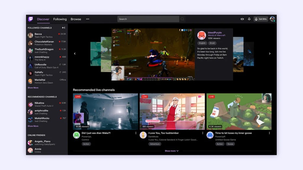
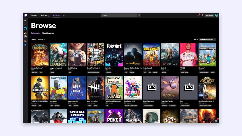

Twitch is a media giant with a size that’s almost impossible to fathom. Now owned by Amazon, the live-video service was built on the backs of streamers—traditionally, people playing video games while talking about their experience, though increasingly more diverse content including cooking and talk shows. That little idea has blossomed into a network with 50,000 channels at any given moment, with more than a million people watching every second, powered by nearly four million people who broadcast themselves every month.
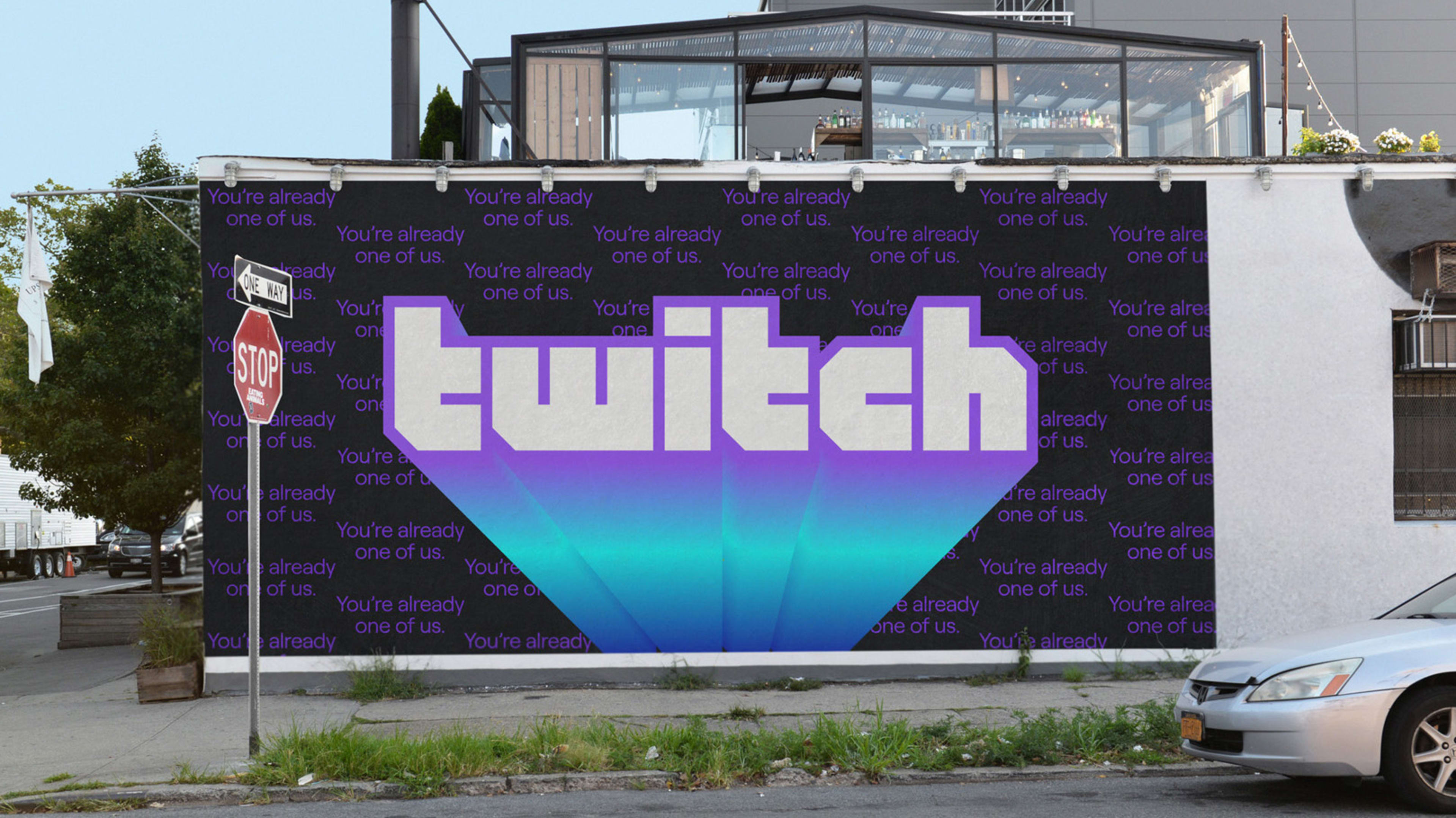
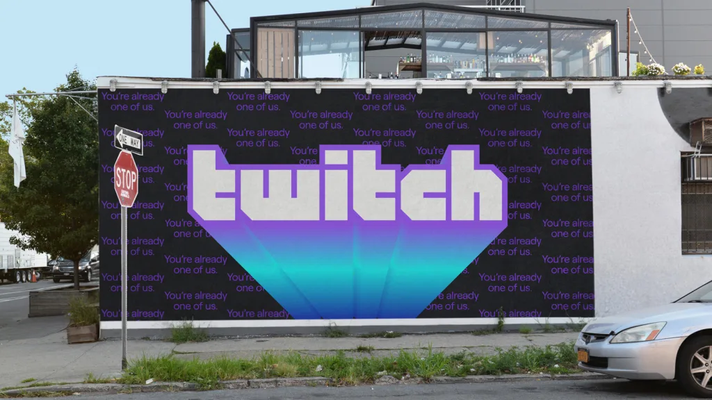
Now, Twitch is launching a bold, updated brand to highlight that community. How? The company built a new brand system grounded with several logos that live on an identity spectrum. At one end, it’s Twitch, the pixely, purple corporation, with its familiar blocky look that reminds us of its video-game roots. In the middle, it’s Twitch blended with the colors of any individual streamer. And at the far end, it’s Twitch as an ever-changing rainbow, the brand and the users all in one. The new brand will launch with a major advertising campaign, the first in Twitch’s history. The tagline? “You’re already one of us.”
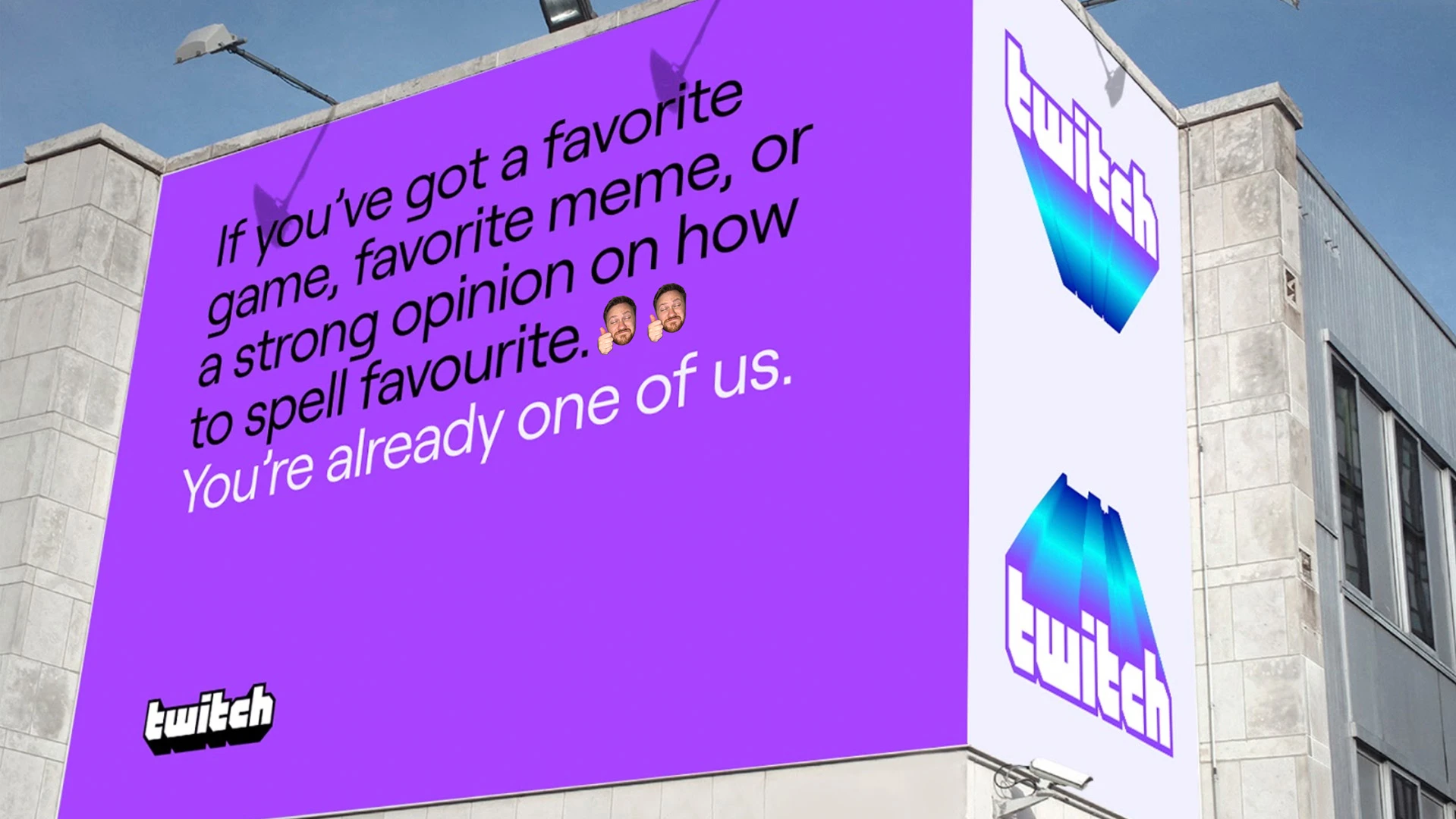
For Twitch, which has grown for nine years without ever advertising itself and no doubt facing a new wave of competition from a hungry Microsoft and a handful of similar, Chinese startups, it was time. The brand is an attempt at corporate maturation . . . without going too corporate.
“It was a really interesting project,” recalls says Sam Johnson, creative director at Twitch. “We’re a brand of millions of different brands—how do we we balance the uniqueness and vibrancy of those creators, lift their bespoke identities, but have a consistent identity for ourselves?”
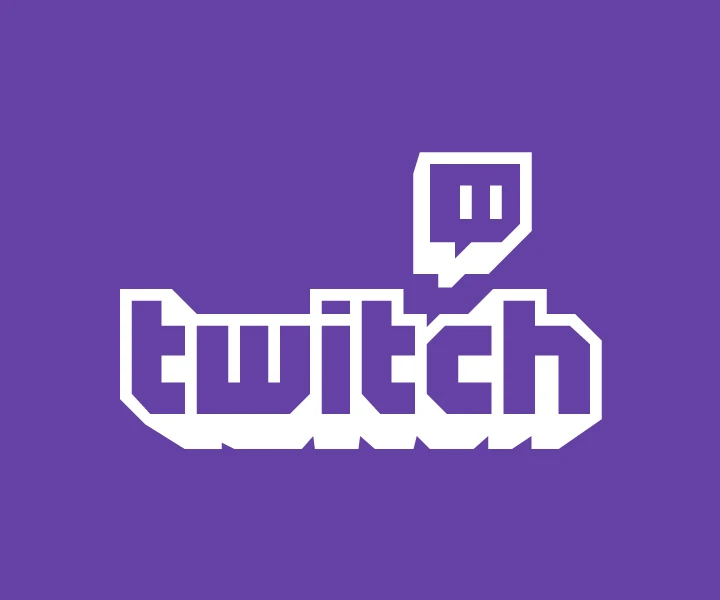

From there, the team developed a new, two-tone extruded logo, designed for co-branding with their streamers. On their Twitch landing page, each streamer can choose their own color scheme—indeed, many big Twitch streamers have their own logos and sponsorships that are independent of the Twitch umbrella. This logo will literally blend the two worlds, on a gradient from Twitch purple to whatever. “It will be used by our creators in a gesture of partnership and co-branding,” says Johnson. “We could be partnering with them on a campaign, or doing a piece of co-marketing.”
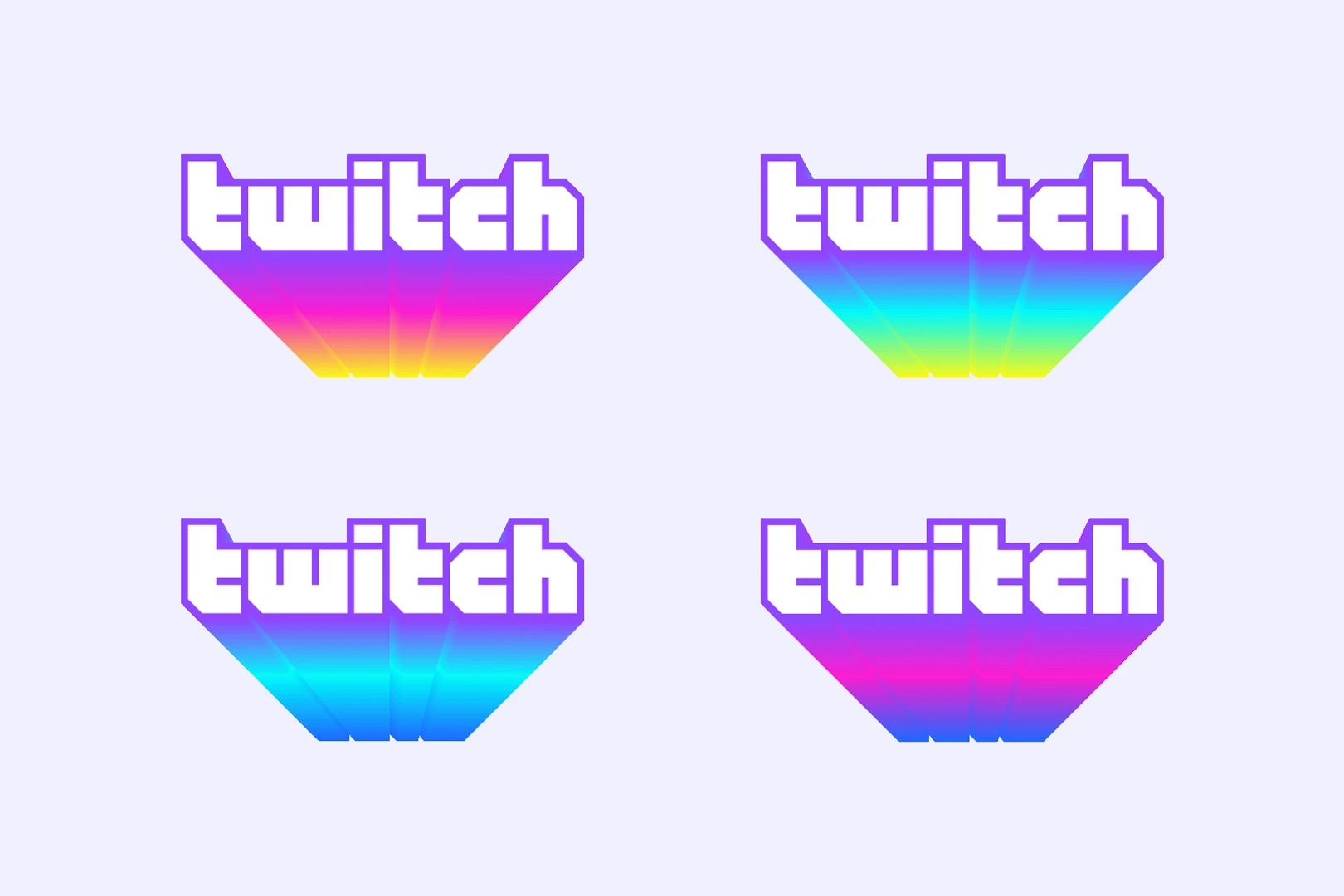
Finally, there’s the ultimate stage of the Twitch logo, which includes a three-tone animated rainbow gradient, symbolizing Twitch and everyone who is part of it. “This mark in dynamic gradient form is when we want to say something in our voice,” says Byron Phillipson, executive creative director at Twitch.
[Image: courtesy Twitch]
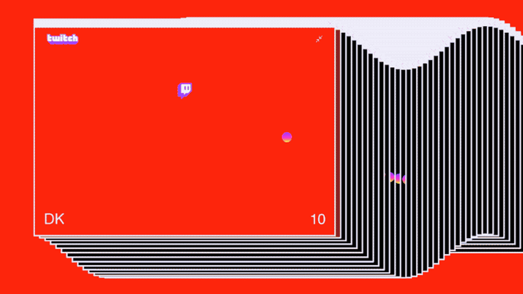
Aside from the new logos, there’s a lot more to the updated Twitch brand. The company adopted a sans serif—a modern and clean-feeling genre of typeface that’s extremely popular in the tech industry right now—for many communications. It also embraced “emotes” in brand advertisements, the extremely esoteric, emoji-like memes that serve as a shared language to the Twitch fans who chat on the site alongside the video streams.
[Image: courtesy Twitch]
These emotes can signify everything from extreme joy to a very dull streamer, and getting them right was a challenge because understanding the visual language of Twitch is an important part of its subculture. Knowing emotes were a way of earning your stripes, but because they also create a steep learning curve to new users (they even necessitate dictionaries), Twitch wanted to find the right way to work them into the brand.
[Image: courtesy Twitch]
“This is our language. We want to show it to the world,” says Phillipson. “[But] we don’t want to be too insider baseball.”
So Twitch is going with a relatively simple strategy. In branding collateral meant for people who know the brand, they’ll use the emotes as fans would—as verbs and nouns that can fully replace words. To the uninitiated, Twitch will use emotes more like a spice, sprinkling emotion and a definite net aesthetic into its materials.
In any case, whatever your personal opinion of the rebrand, it’s nothing like what we’ve seen a brand like YouTube do, which is still presenting itself as an anonymous red television set with a big “play” icon on top. Twitch has presented a highly thought-out attempt to balance corporate needs and fan desires.
But as always, it’s up to the fans to determine what they think.
Recognize your brand’s excellence by applying to this year’s Brands That Matter Awards before the early-rate deadline, May 3.
