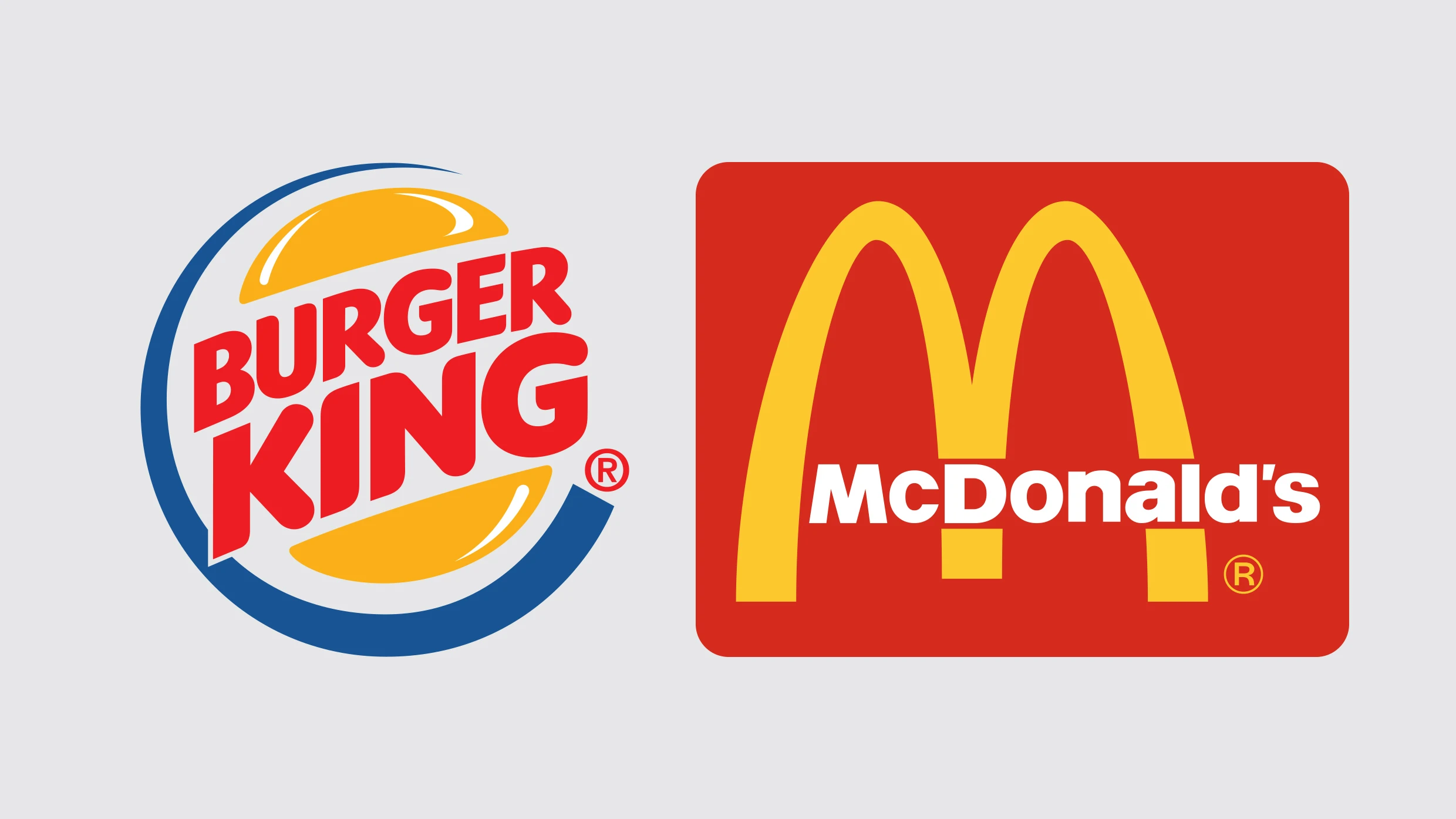
Who has the better logo: McDonald’s or Burger King?
McDonald’s is the more successful company by a mile, and its golden arches are recognizable from blocks away. If history is the judge, it’s got to be McDonald’s. But counterintuitively, it’s probably Burger King that has the better logo—at least it is through the lens of a new paper published in the Journal of Marketing Research. Why? Because Burger King is a descriptive logo. It literally puts a hamburger on its sign along with the word “burger.” And while that approach is anything but sophisticated, their science suggests that it is highly effective.

Your logo should just show what your company does
According to the research, people respond more positively—meaning they consider brands more authentic and worthy of their money—when they have descriptive logos rather than abstract, “nondescriptive” ones like the McDonald’s arches, or even the Nike swoosh.
The findings come thanks to a collaboration between three schools—Montpellier Business School, Westminster Business School, and the Lazaridis School of Business and Economics—which ran half a dozen separate studies, across more than a thousand subjects, analyzing just this topic.
In one study, the authors designed a fictional mountain gear brand and a fictional sushi restaurant. Each fake brand was given two different logos: one descriptive and one abstract. For instance, the mountain gear brand’s descriptive logo had an image of a mountain on it, and the sushi restaurant featured a sushi roll. In the abstract versions, these shapes were changed to a black triangle for the mountain and a black cylinder for the sushi.

Now, even without seeing these logos with our own eyes, it’s easy to imagine them, isn’t it? The nondescriptive, geometric versions sound so modern, with enticing, flat design! They must be the better way to go, right? In fact, subjects preferred the companies with the more literal, or descriptive, pictures. They rated them more likable and authentic.
This core finding wasn’t only confirmed in this one trial. In another case, the researchers collected 174 logos for various startups they dug up on crowdfunding platforms. They were careful to control for contrast and saturation—the sorts of other factors in a logo that could alter your perception of it. When presented to more than a thousand subjects, again, the descriptive logos were deemed more authentic, and thereby more likely successful in driving sales. A follow-up study even seemed to suggest that hundreds of real brands on the market today appear to be more successful as businesses when using descriptive logos. So is it game set match for descriptive logos? Not quite.
Not every brand should be descriptive
There are cases, the researchers found, where descriptive logos are the wrong way to go—namely, if consumers don’t like your product. To discover this, researchers developed two versions of a brand for vegetable oil. One had two drops of oil, the other, two abstract circles.
When subjects were told these logos were for olive oil, which people perceive as healthy and good, the descriptive version was preferred (as you’d expect). But when subjects were told these same logos were for palm oil, the descriptive version received a more negative reaction than the abstract one.
In other words, if someone is buying palm oil—or perhaps bug repellent, or a funeral home service, as the authors write—you’re better off not reminding them just what your product is in a literal sense. That’s right, keep dead bodies and bugs away from your logo, even if that is your business.
The other twist researchers found is that for larger companies, many of these rules are irrelevant. If a brand is recognized by consumers already, making it more descriptive has little impact. (The researchers tested this by updating a brand for a tea company named Nemi by adding a tea pot. People who knew the brand weren’t suddenly smitten.) This is one reason why McDonald’s absolutely shouldn’t change its logo, adding that burger to it now. Though perhaps the strategy would have helped the company expand in its earliest days in California, before Ray Kroc honed the franchising model.
Finally, the researchers speculate that brands with a broad reach of services, like Uber or Procter & Gamble, probably benefit from more abstract symbols that don’t pin them down to a single product offering. It makes sense. When Uber started food delivery, it didn’t want to be just a ride-share company anymore.
But all in all, it seems that many brands may be going too flat and streamlined, abstracting their offerings when they should be far more specific. Especially if you are a small startup that sells one thing, just stick that thing in your logo. It’s what the people want.
Recognize your brand’s excellence by applying to this year’s Brands That Matter Awards before the early-rate deadline, May 3.