Whether you love or hate its coffee, there is no denying that the Starbucks brand is a juggernaut. The green siren logo—with her ingeniously asymmetrical face—is a universal beacon for a caffeine fix. And there is no mistaking one of the company’s hyperbolic beverages like the Tie-Dye Frappucino, which you can spot on the street from a block away, for a drink made by any other chain.
With more than $24 billion in revenue, 31,000 locations worldwide, and countless promotions and menu items that vary regionally, keeping the brand operating at scale is a major job. But for the past year, Starbucks’s internal creative team has been updating the brand system that makes up everything from its in-store signage to its promotions on Instagram. And now, it’s published the brand’s full guidelines—complete with color codes and typographic weights—onto a public website for anyone to explore.
“We were just proud of the work, and inspired by other brands being more transparent about their creative process,” says Ben Nelson, creative director at Starbucks.
Brands like Uber and Netflix have taken similar approaches to pulling the curtain back on their brand identities through public microsites. Such sites also serve as a tool that anyone in the company, or agency partners, can access globally to quickly double check brand standards.
Some of the core elements of the new creative don’t look a whole lot different than what you’ll find inside of any Starbucks today: The logo is the same as it’s been for years, and employees still wear their green aprons.
Using these details as an anchor, the design team redeveloped everything else. The result is an overall sharpening of the global Starbucks look. From my perspective, it’s not trying to be your neighborhood coffee shop in the way it has for the last decade or so. It’s trying to be your nearest Starbucks. It does this through a combination of changes focused around two themes: First, the design prioritizes legibility and conveying information as clearly as possible. The other half is about expressivity, emotion, and all the other intangibles Starbucks wants to spark in the consumer. Depending on the context, the brand system allows designers to dial up either trait as needed.
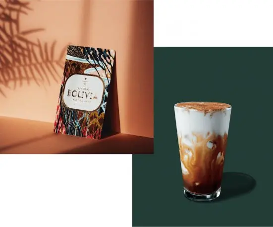
The new menu board articulates the clarity the design team was going for. “We really cleaned it up and made it more functional for our occasional customers, for those who just want to come in and order their Caramel Macchiato,” says Nelson. “But then, on the other side of the spectrum, we have a lot of artfulness in our creative expression. You’ll see that in merchandise, like [gift] card packaging.”
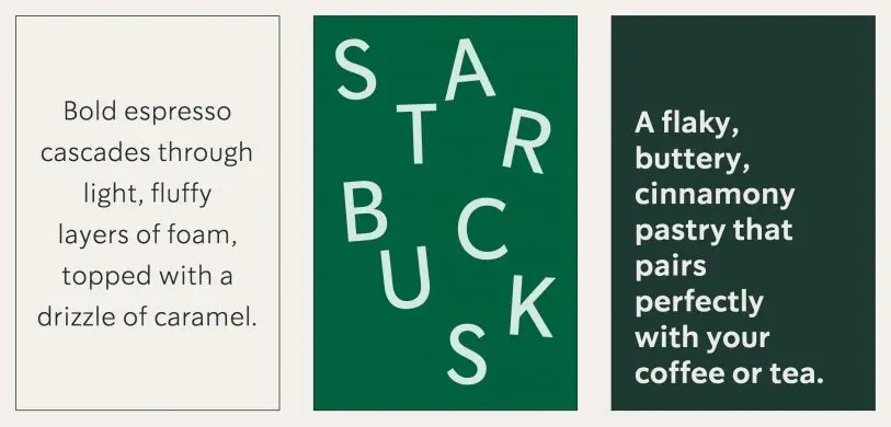
Starbucks is moving away from hand-lettering—a staple of coffeehouse culture it had used in the past—altogether. Instead, it collaborated with an unnamed external firm to develop two new typefaces. Sodo Sans is a streamlined typeface used for most of the company’s body copy. Lander is a serifed typeface with character that looks perfect for social media. And a third off-the-shelf typeface, condensed Trade Gothic LT, is a means to squeeze a lot of words into tight spaces.
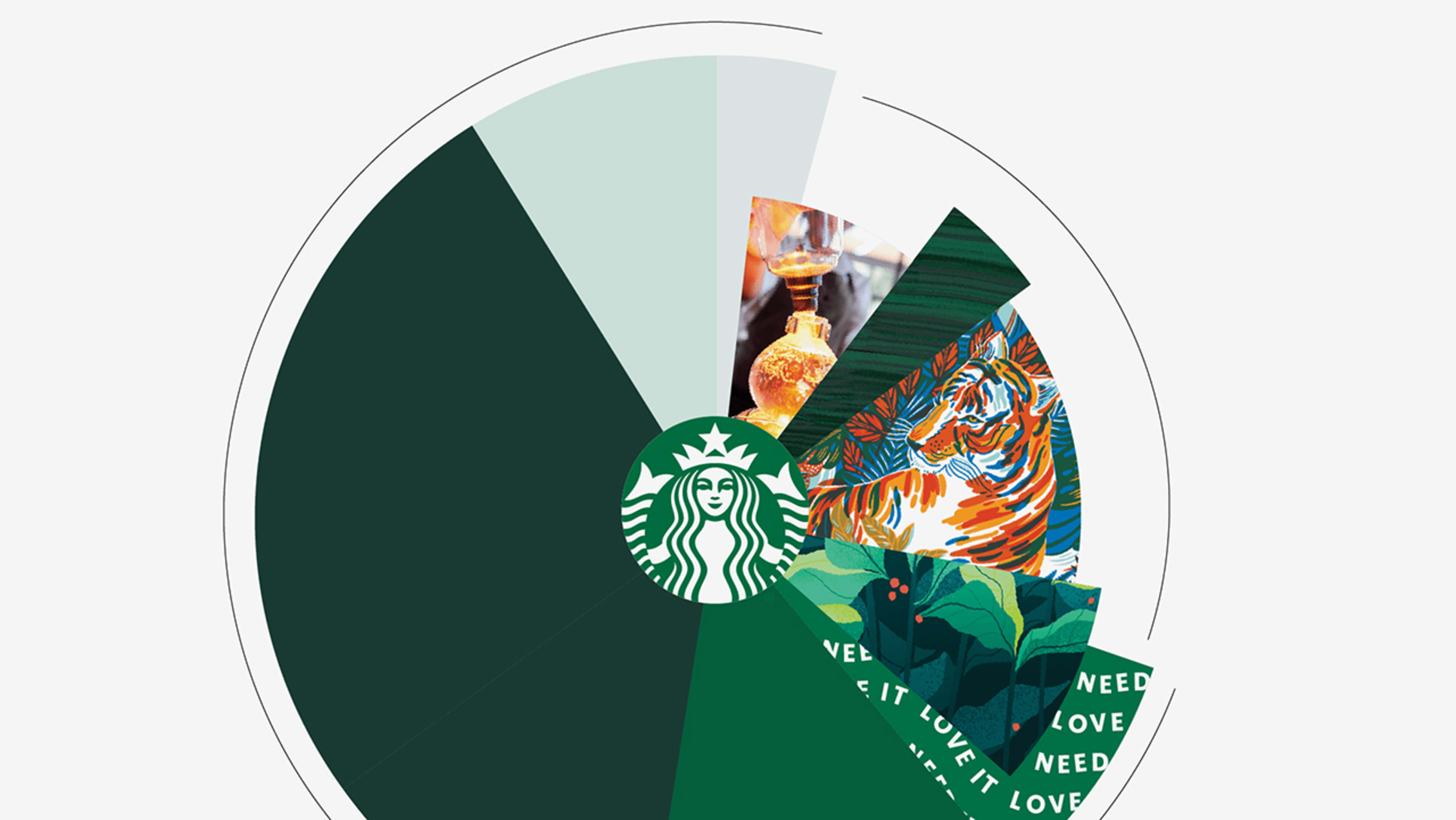
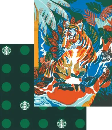
On the expressive end, the design team focused heavily on illustration and color—which the new branding uses to articulate a sense of time, cueing you into the changing seasons, and seasonal drinks, available at Starbucks.
“We started with this kind of world of greens, building of course from our green apron,” says Nelson. “Then each season, we’re choosing colors that are on trend, inspired by our coffee craft or beverages, then building a cohesive campaign across channels as well.” So far, spring is defined by coral, turquoise, and goldenrod, while summer includes soft pink, along with a yellow and peach that resemble desaturated watercolors. In each case, foundational Starbucks greens ground it all.
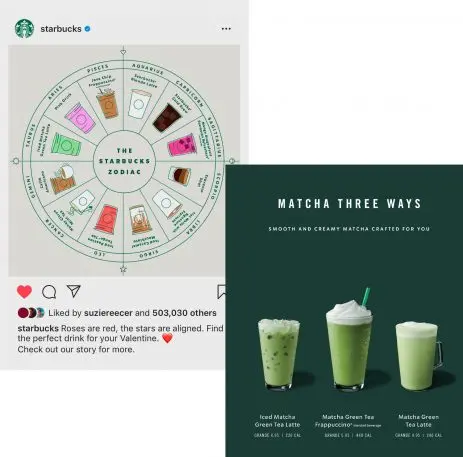
The way it all comes together feels quite poised. Starbucks’s drinks appear with a crystal clarity, their milky swirls frozen in time on top of sharp lettering. Sometimes the vibe is stoic, as three matcha drinks are lined up side by side with all of the excitement of a public transit sign. Sometimes it’s cheeky, like a meme-y Starbucks zodiac illustration. But broadly speaking, any bohemian aura that was lingering from the bygone, ’90s-era coffeeshop culture has been ironed out of the updated global brand. Of course, a few things remain the same. If you stare long enough, those Caramel Crunch Frappuccinos still start calling your name.
Recognize your brand’s excellence by applying to this year’s Brands That Matter Awards before the early-rate deadline, May 3.
