


When the city of Oslo audited its books recently, it found something unsettling. With 50,000 government employees working in over 200 organizations, it was paying 40 million kroner a year—or about $5 million—for agencies to spend on new logos and updated brand guidelines. That’s because every organization within Oslo had its own identity, and some had a few; the official count of bespoke logos exceeded 250 in all.
“I think the actual [cost] number is a lot higher, but they had to make a conservative estimate,” says John Aurtande, design consultant at the customer experience agency Creuna. “It’s very complicated to maintain all these identities. When you have 250 brands, some need to have an upgrade every year.”
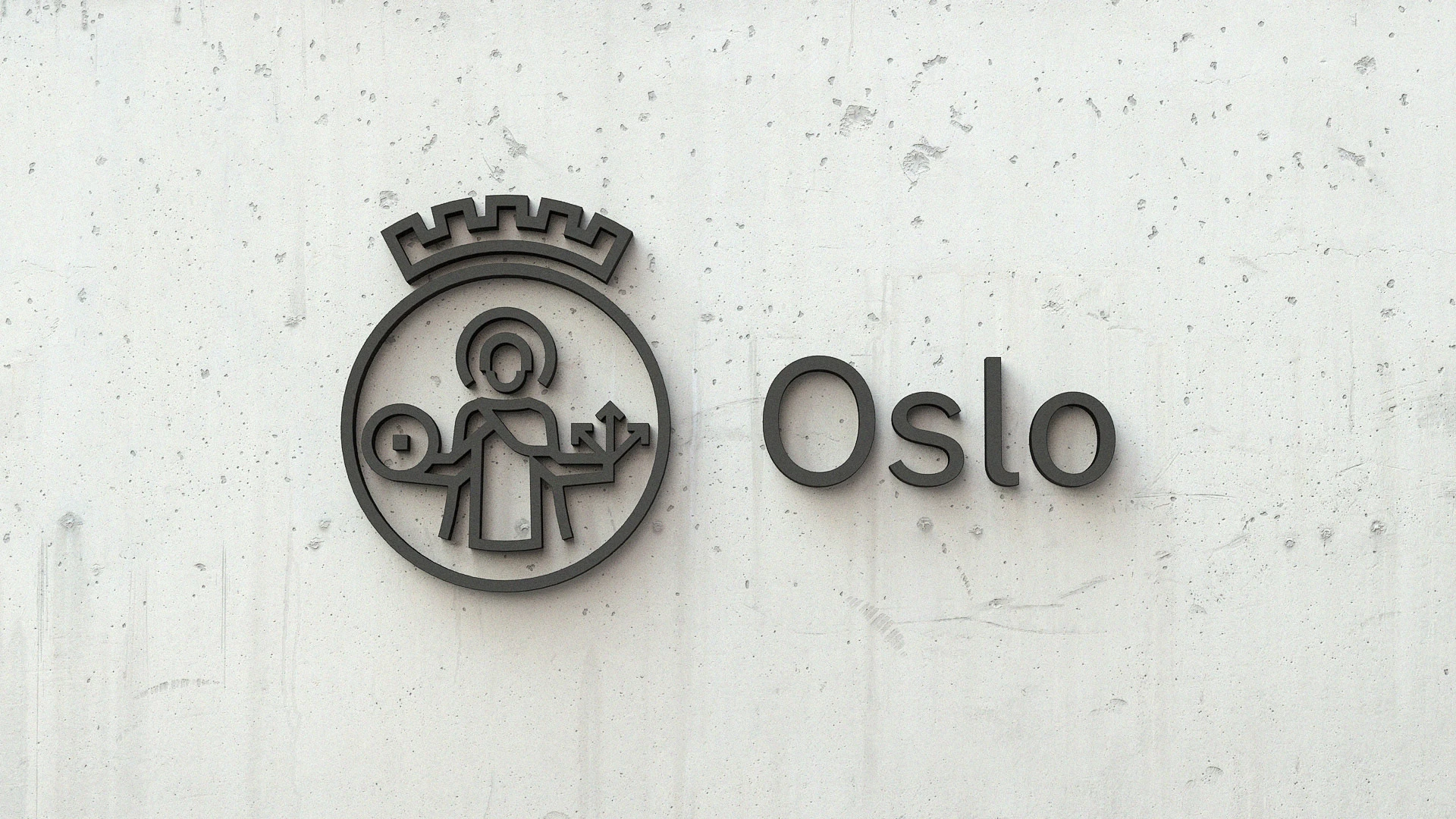
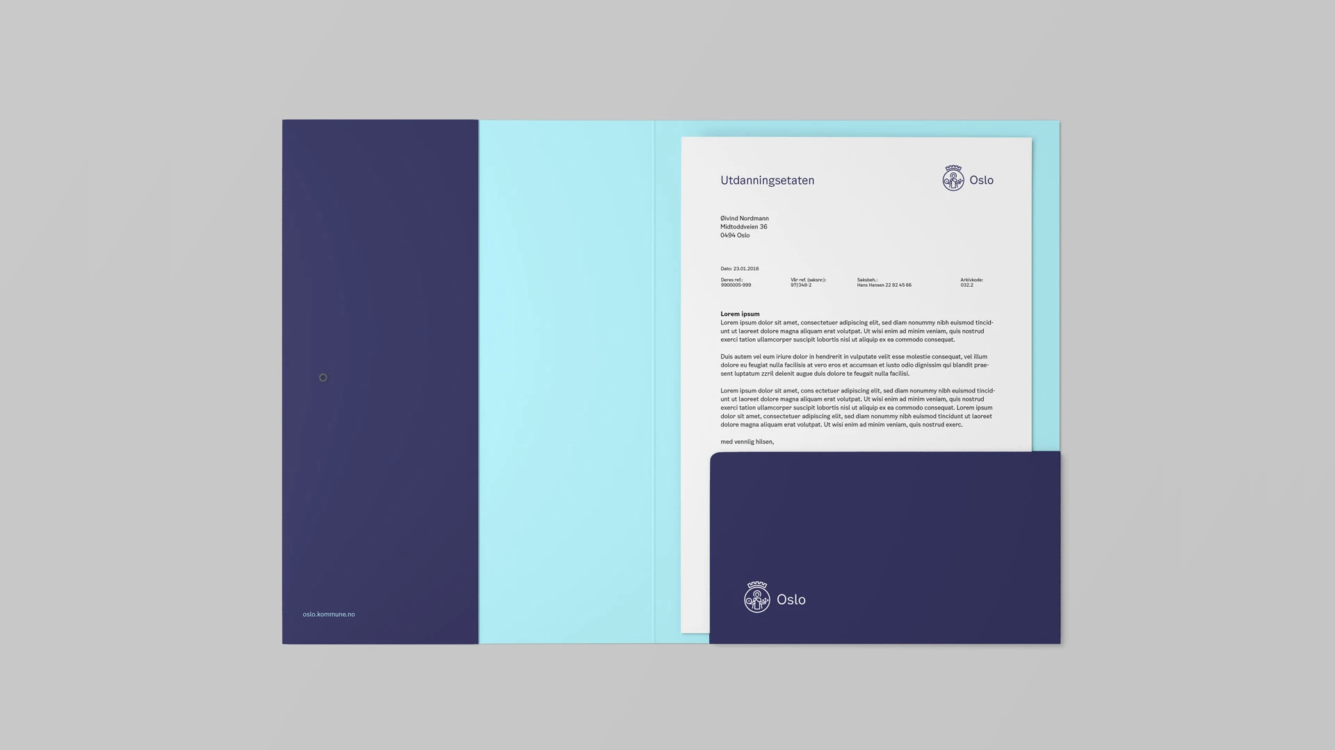
In turn, Creuna was tapped to simplify the branding—and it ultimately landed on a single new identity for Oslo that could cover every sub organization. The firm homed in on the city coat of arms, originally designed in the 1930s in analog fashion. They rebuilt it cleaner, more legible, and digitally native. In the image, patron Saint Hallvard holds a millstone and arrows. Inspired by the clean geometries of Oslo itself, designers drew the stone as an O, and used an L-shaped sharp edge for the arrowhead.
“We had lots of workshops, and different tests, and brought people in. We’d listen, learn something, find we can’t quite do it this way, adjust, bring more people in,” says Aurtande. “We say it’s been designed by committee—and that’s been a positive. Usually that’s not.”
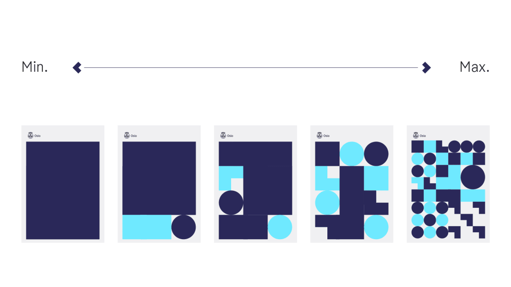
[Image: Creuna]One development every city employee could appreciate was that Creuna built a simple piece of software, which would allow anyone to generate a custom, on-brand graphic without any knowledge of Photoshop or PowerPoint. It allows plenty of options and flexibility, suggesting many different designs someone can modify with sliders.
Ultimately, Aurtande believes that they got to a point where most government employees were happy with the work. But he points out that the money savings was only one part of the project’s appeal—and that the update was a necessary public service. The city was also aware, through polling, that citizens were confused by the multitudes of brands, unsure of where the government ended and private and nonprofit sectors began. “It was very difficult to understand what the city does: ‘How is my tax money spent?'” says Aurtande. In other words, the rebrand doesn’t just save the city of Oslo money. It proves the government’s value to its citizens, too.
Recognize your company's culture of innovation by applying to this year's Best Workplaces for Innovators Awards before the extended deadline, April 12.
