Fast company logo
|
advertisement

See the world’s temperature shoot up, in a sea of red.

This is one of the simplest and best climate change graphics we’ve ever seen

[Image: courtesy Ed Hawkins]

BY Adele Peters1 minute read

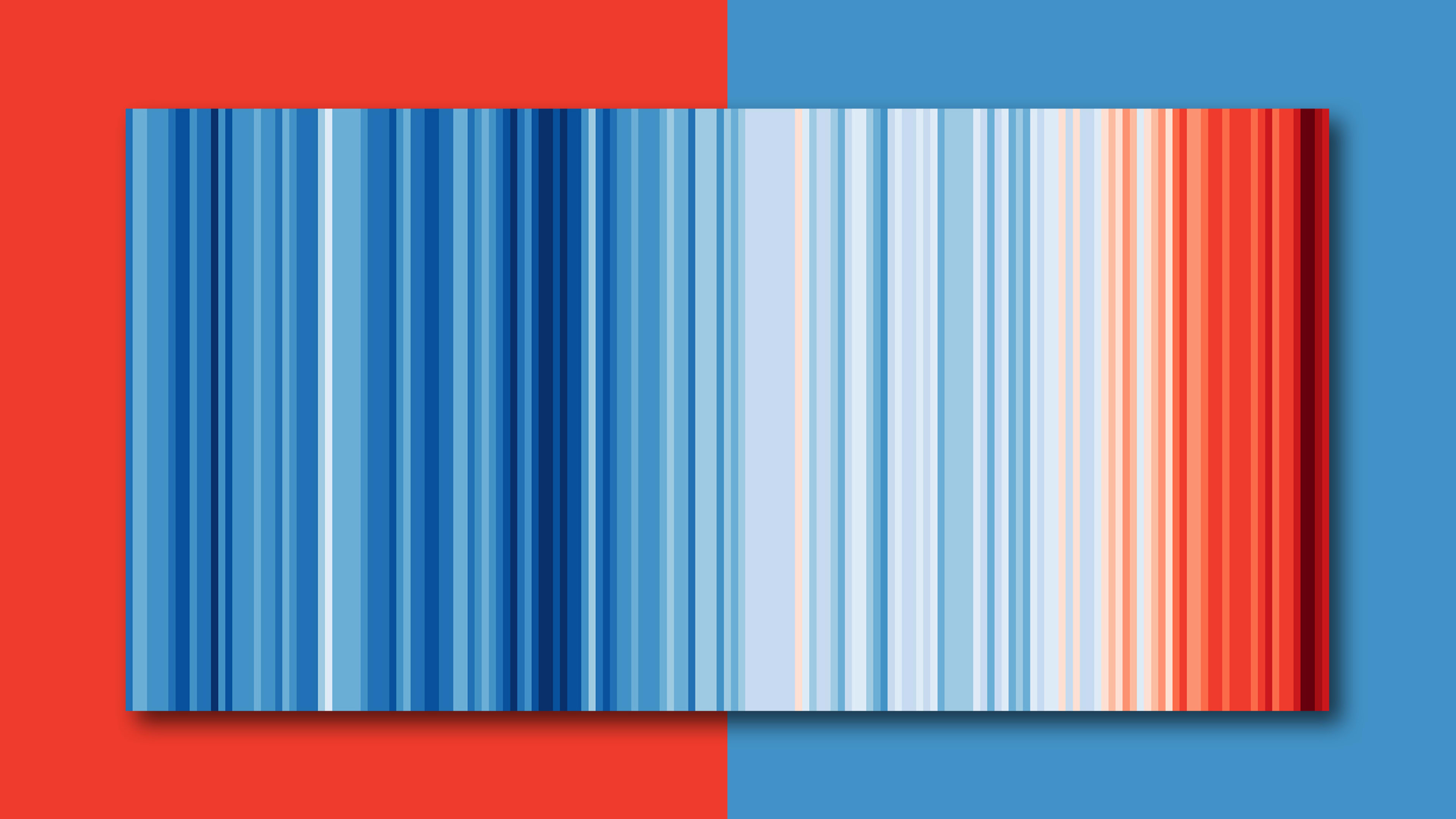
Since the beginning of the Industrial Revolution, the average global temperature has risen about one degree Celsius, a number that might sound small, but is in fact enormous: The last time the Earth was this hot—around 120,000 years ago—a large part of Florida was underwater and hippos lived in parts of Europe. The changing temperature is usually illustrated with a basic hockey stick-shaped graph. But one climate scientist designed a more visual graphic, with stripes turning from blue to red to show the increasing temperature for each year from 1850 to 2018.

This more complex version of the chart shows changing temperatures for every country in the world. Click here for a larger version. [Image: courtesy Ed Hawkins]
“Ultimately, we’re just trying to find simple, visual, compelling ways to communicate the changes that have occurred to our climate over the last hundred years or so,” says Ed Hawkins, a professor at the U.K.’s Reading University. “Scientists love making very complex figures for our everyday work, but we need to communicate far more clearly when we’re talking to the public. So the idea of this was to simply strip away all of the unnecessary detail and to simply leave a visual, which is unmistakable about what’s going on. It’s compelling. And you know, anyone can take one look at it and understand what’s going on.”

[Image: courtesy Ed Hawkins]

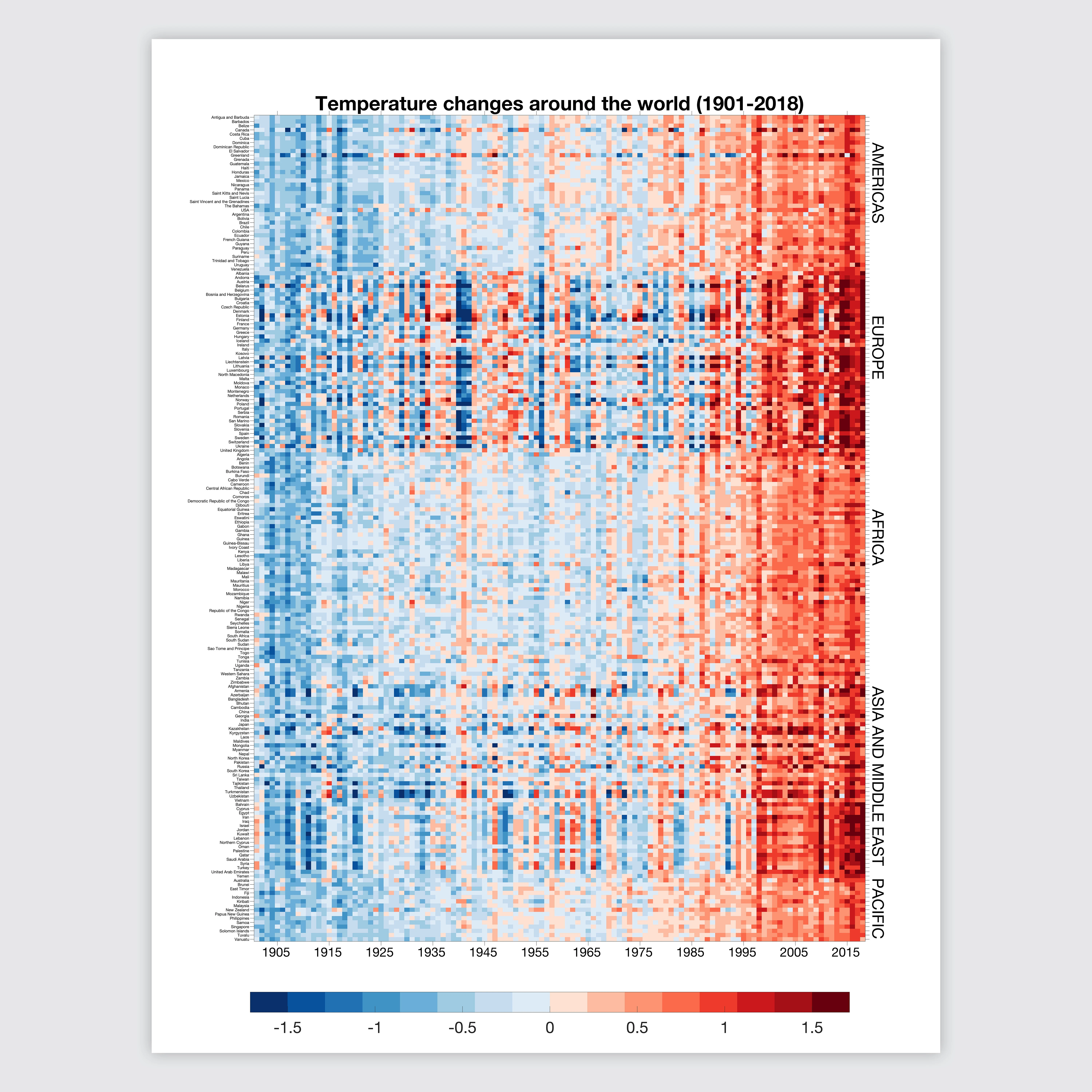
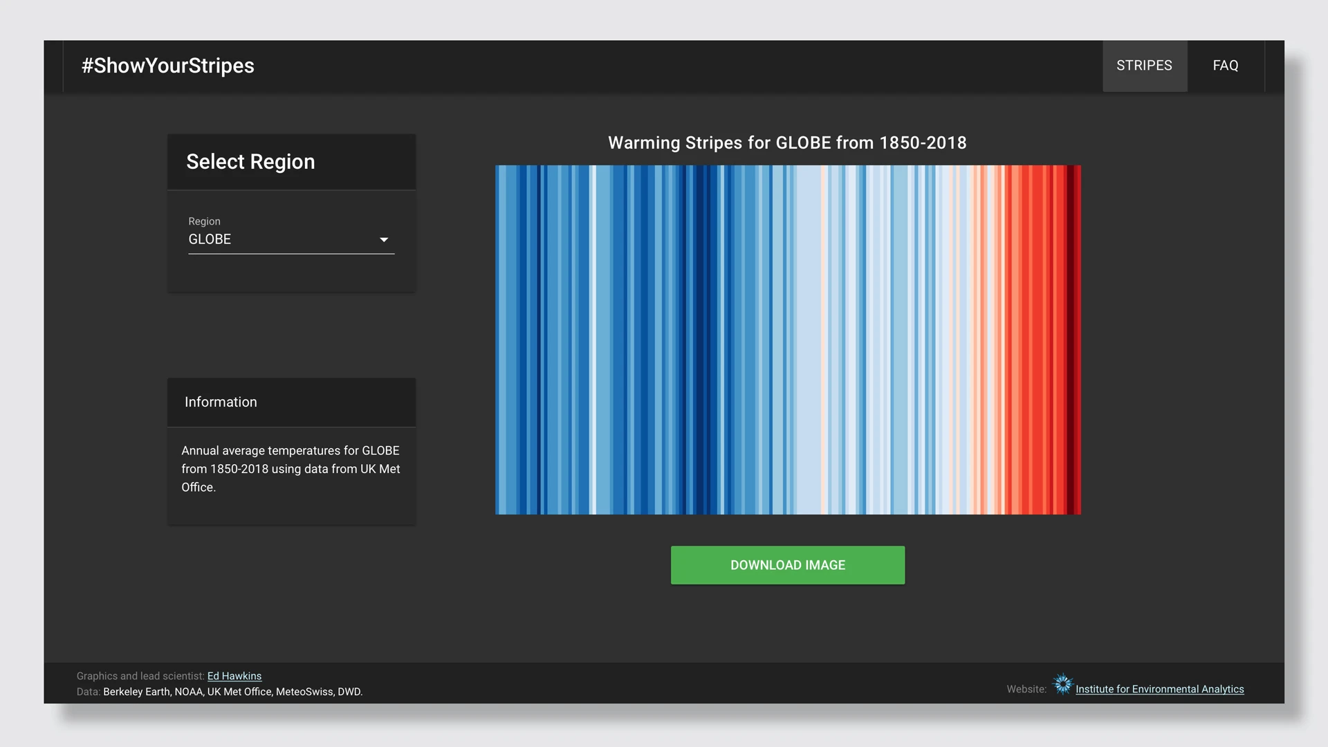
A new site, Show Your Stripes, shares versions of the graphic for different countries, since different parts of the world are warming faster than others. In these versions, the stripes are presented without a color scale, dates, or other text. “There’s plenty of sources of information out there if people want the additional detail, and that’s very important,” he says. “But this starts the conversation.” The graphics are free for anyone to use, and people have started using the design in everything from art installations to printed flip-flops. One Tesla owner painted the stripes on his car. “He says it starts conversations with people who wouldn’t normally be talking about climate change,” Reading says.

advertisement

Recognize your brand’s excellence by applying to this year’s Brands That Matter Awards before the early-rate deadline, May 3.

ModernCEO Newsletter logo
A refreshed look at leadership from the desk of CEO and chief content officer Stephanie Mehta
This site is protected by reCAPTCHA and the Google Privacy Policy and Terms of Service apply.
Privacy Policy

ABOUT THE AUTHOR

Adele Peters is a senior writer at Fast Company who focuses on solutions to climate change and other global challenges, interviewing leaders from Al Gore and Bill Gates to emerging climate tech entrepreneurs like Mary Yap. She contributed to the bestselling book "Worldchanging: A User's Guide for the 21st Century" and a new book from Harvard's Joint Center for Housing Studies called State of Housing Design 2023 More


Explore Topics