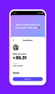
This week, Facebook announced a new pseudo-cryptocurrency called Libra, which you can access through a Facebook spinoff company called Calibra. The currency’s logo is a tilde, or a “~” symbol. And as CNBC reports, it’s nearly identical to the logo of another online bank, founded in 2016, called Current.
this is what happens when you only have 1 crayon left pic.twitter.com/2JY5JfesQD
— Current (@current) June 19, 2019
So far, this is your typical convergent thought logo drama, similar to those already weathered by Silicon Valley startups like Airbnb. But there’s a twist, in this case: Both Current and Calibra used the same San Francisco design firm, Character, to create their logos. As a result, the world is left scratching its head, inventing weird conspiracy theories to explain what’s going on. For instance: Did Character think no one would notice if it copied its own idea? Did Facebook hire Character because it wanted a clone of Current’s design? Is it all somehow a coincidence? To be honest, there’s no single trail of logic that makes any sort of satisfying sense.
I’d argue that ultimately, the “why” doesn’t really matter to the general public—and that we should be more concerned about Calibra’s design for another reason.

I get it: Libra is supposed to be its own currency, so it needs its own symbol. And its value will constantly shift in relationship to USD or EUR or any other globally accepted currency standard. That’s how money works on the international scale. But Americans lost $5 billion by owning and trading Bitcoin in 2018, specifically due to its approximate value and incredible volatility. Sure, Libra is backed by real assets by more than two dozen founding members, while Bitcoin is not backed by anything but theoretical use cases. Yet, Facebook is positioning Libra as a much more accessible product—in fact, as a de facto payment method between friends and family members on Facebook, Instagram, and WhatsApp. It is the tool with which Facebook hopes to replace banks in nations around the world. With billions of potential customers already using these social networks, it’s hard to imagine the currency not succeeding at some tangible scale.
Which is why Libra’s brand language, based on approximate values, seems so inappropriate. Though perhaps Libra’s fuzzy symbology is doing its potential users a service: it says it’s about as dependable as Facebook itself.
The extended deadline for Fast Company’s World Changing Ideas Awards is this Friday, December 13, at 11:59 p.m. PT. Apply today.
