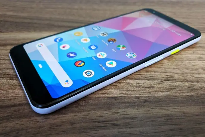
Google’s Pixel 3A phone has a lot of admirable qualities. It sports a great camera that rivals the higher-end Pixel 3. Like other Pixel phones, it’s first in line for Android updates straight from Google. You can squeeze it to speak with the Google Assistant. And its starting price of $400 unlocked is tough to beat.
If I’m being honest, though, the best thing about the Pixel 3A is the “Purple-ish” color option. So against my better instincts I’ve decided to write an entire article extolling it. The smartphone color schemes we choose tend to be bland, and for good reason: No one wants to spend hundreds of dollars on a phone that ends up looking tacky or drawing too much attention to itself.
The purple Pixel 3A’s great triumph is in the way it manages to be distinctive and subtle at the same time. While Google has always offered at least one offbeat color scheme for its Pixel phones, the purple Pixel 3A is the company’s high watermark. It should be a reminder to other phone makers–and Apple in particular–that they’ve been playing it too safe. Heck, that lesson might even apply to aspects of phones beyond their color.
Don’t call it purple
The key to the Purple-ish Pixel 3A is right in the name: It’s not obviously purple. Depending on how it catches the light, it can just as easily qualify as off-white or plain white. The actual hue only becomes apparent with some extra scrutiny; even Google’s own product photos seem to overstate the depth of purple-ness involved.

The Purple-ish Pixel 3A’s success isn’t a fluke. Instead, it’s an example of iteration by Google’s hardware team, which over the past few years has gotten better at making unique color options that people might actually want to carry around.
With the first-generation Pixel in 2016, Google offered standard silver and black phones, but it also put out a limited edition “Really Blue” model that reminded some folks of Fisher-Price toys, and not in a good way. In trying to create an interesting color option, Google had gone way over the top.
2017’s Pixel 2 line dialed things back with a more subdued “Kinda Blue” option, but it also introduced the idea of contrasting power buttons. The Kinda Blue Pixel 2 came with a light turquoise button to offset the phone’s paler sea-foam tones, while the “Black and White” Pixel 2 XL combined an overly loud back panel with a bright orange power button. (Depending on who you asked, it either earned the nickname “Penguin” or “Panda.”)
Google only seemed to become more confident in its color choices with last year’s Pixel 3 line. It added a minty green power button to its standard white Pixel 3, but it also started playing with understated body colors. The “Not Pink” color option, with an orange power button, looked a bit like the inside of a thoroughly cooked salmon.

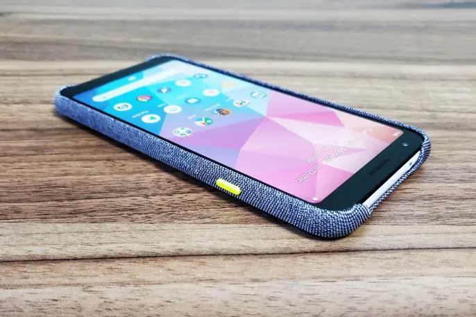
Granted, a lot of folks will just put a case over their phones anyway, somewhat negating the benefits of added color. However, Google has preempted this issue by releasing its own fabric cases. The “Seascape” Pixel 3A case is a deep indigo that stands in perfect contrast to the Pixel 3A’s almost-white body, which remains visible through cutouts for the camera, fingerprint reader, top headphone jack, and bottom speakers. Google’s fabric cases have always made Pixel phones feel less sterile than a typical aluminum or plastic smartphone, and they’ve progressively gotten better at matching the style of the phones themselves.
Learning from Purple-ish
No one—well, almost no one—is going to choose a phone primarily for its color scheme, which means that the Purple-ish Pixel 3A probably won’t get the attention it deserves. Compared to the Pixel 3, the cheaper Pixel 3A lacks wireless charging, waterproofing, and the dual-lens front camera for wide-angle selfies. It also has a flat front panel instead of curved glass edges, which makes it a bit harder to use with the edge swipe gestures in Google’s forthcoming Android Q update, and its processor is slower than high-end handsets. While the Pixel 3A is an excellent budget smartphone, most folks are better off buying something nicer and keeping it longer.
But other phone makers should take inspiration from Google’s choices. While some Android vendors have been getting adventurous with color gradients and “prism” effects, most of their phones lack the subtlety that Google’s achieved with the Pixel.
https://www.youtube.com/watch?time_continue=5&v=vc7LlUtQgNw
The same is true of Apple’s iPhone XR, whose blue, yellow, and coral options make the same mistake as Google’s original “Really Blue” Pixel: When spending $750 or more on a smartphone, choosing a loud color over the standard black or white feels like a pretty big commitment. Meanwhile, Apple continues to play it safe with the iPhone XS, offering the same gray, white, and gold options that it’s been pushing for years. It’d be great to see Apple borrow some of the more subtle playfulness that Google’s pulled off with its Pixel line.
If all else fails, we can at least hope that Google keeps building on what it’s learned over the past few years. Now that it’s mastered understatement for its lighter-colored phones, I’d love to see future Pixels break free of the boring black options that Google’s been offering this whole time. It’s not hard to imagine dark-themed Pixel phones in forest green or burgundy, or even just plain black with colorful power buttons.
Or, at the very least, Google should consider bringing back Purple-ish for the Pixel 4, because limiting the Pixel’s best color option yet to a budget phone just seems like a waste.
Recognize your brand’s excellence by applying to this year’s Brands That Matter Awards before the early-rate deadline, May 3.