In the words of Matthew Butterick–typographer, programmer, lawyer, and delightfully dry-witted design educator–type design is where “candidates tend to be more successful revealing their characteristic limitations.” And this, Butterick argues only half-jokingly, means that evaluating them on their type choices is actually a clear-eyed way of judging their overall competence. “Typography—that’s a real decision candidates have to make today, with real money and real consequences,” he writes. “And if I can’t trust you to pick some reasonable fonts and colors, then why should I trust you with the nuclear codes?”
[Screenshot: courtesy of the author]Butterick puts each of the 23 Democratic candidates under the microscope, and, to nobody’s shock, finds them all wanting. (Remember: He’s a typographer, programmer,anda lawyer—a triple threat when it comes to details.) But thanks to a sense of humor that’s somehow both withering and warm, his critiques never feel mean-spirited. The whole thing isworth a long read over your lunch break, but here are some highlights.
[Screenshot: courtesy of the author]Wedunked on Joe Biden for his logo, but Butterick deems his typographythe best of the bunch—which is, admittedly, a low bar given that Butterick describes the entire field’s design strategy as one of “radical boredom.” Biden gets points for not reusing Gotham, the typeface that made Obama famous. But Butterick grudgingly admits that Biden’s typography does what type design does best, while also visualizing what Biden’s campaign is really all about: “look[ing] relaxed and effortless.” The trick to pulling this off, he says, comes “only by being exceedingly specific in its details.” That’s successful type design—and politics—in a nutshell. Biden’s typography isn’t blowing anyone’s minds, butmandoes it look like he’s got people handling it who know what they’re actually doing. And after Trump, it’s easy to see why that feels like exactly whatso many voters actually want.
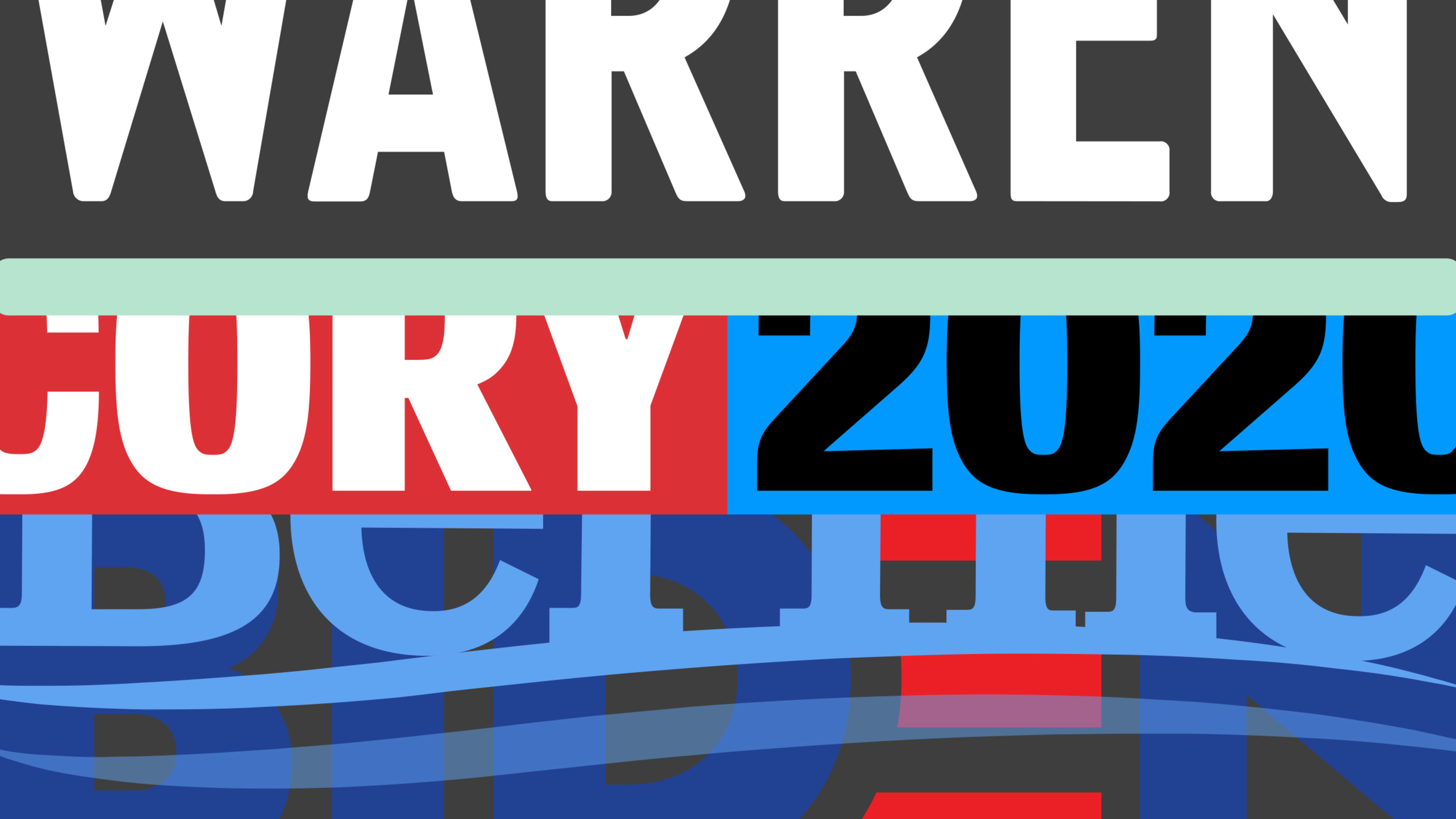
The opposite of that? Cory Booker, according to Butterick. Booker picked a non-obvious display font in Conductor—which should have earned him points, given that almost everyone else is still imitating Obama’s “geometric sans serifs”—but everything else Butterick deems “totally inept.” He’s right: There’s type design that looks “bad” on purpose, which is its own kind of genius (as anyone who followed Tracy Ma‘s 2011-2016 run at Bloomberg Businessweek will attest). This . . . isn’t that:
[Screenshot: courtesy of the author]As a typeface designer himself, Butterick may be biased when he criticizes candidates for using using free fonts. But it’s hard to disagree with him whenhe sniffs that Michael Bennet’s uninspired useof Source Sans and Source Serif “contribute to an overall vibe of Bennet as the knockoff-brand candidate.” You’re running for leader of the free world, man. Drop some coin and differentiate yourself, typographically speaking.
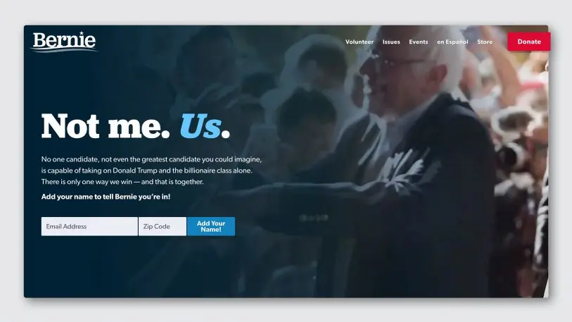
That said, Butterick also isn’t impressed with holding on too tight to a successful brand. Bernie Sanders’s choice of Jubilat in 2016 as a flagship font was nearly as iconic as Obama’s Gotham. But for 2020, Butterick thinks it risks “creating a sense of ‘let’s do the same thing and expect different results!'” (He rightly points out that even Obama significantly modified Gotham for his 2012 run.)
advertisement
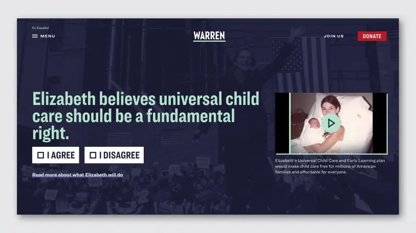
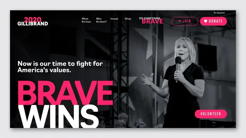
[Screenshot: courtesy of the author]What Butterick seems to respect most is less a facility with flashy fonts or wordmarks than an ability to organize type in sensical but unexpected ways.Kirsten Gillibrandisn’t afraid to let letterforms overlap;Elizabeth Warren’s layoutfeels more “like an issue of theNew York Timesmagazine” than a campaign shingle. Biden’s typography may telegraph confidence and competence, but these designs subtly inform us that their candidates havevision.
[Screenshot: courtesy of the author]Of course, it wouldn’t be an internet typography essay without some snicker-out-loud jabs. Butterick deftly needles Pete Buttigieg, Jay Inslee, and Amy Klobuchar without coming off as entirely mean-spirited. After all, Democrats will have to vote for one of these people eventually. You still have time to turn things around, Senator Booker!
John Pavlus is a writer and filmmaker focusing on science, tech, and design topics. His writing has appeared in Wired, New York, Scientific American, Technology Review, BBC Future, and other outletsMore