It’s easy to overlook one of the most important elements of UI design: text. It hides everywhere – tucked inside button labels, scattered through tool tips, skulking under home-screen icons.
In laying out text, designers must strike a balance between historic principles, forged through the centuries, and new practices. Just like in the days of metal type, white space must still be perfectly balanced, and text aligned to other objects –but now everything also needs to be rendered correctly on pixels of many sizes and screens of many dimensions. It’s a cacophony of factors, and it makes handling text very difficult.
I’ve made a career out of thinking about this kind of thing. I’m writing a book on the history of keyboards, and earlier this year, joined the collaborative design tool Figma to focus on typography. We recently changed the way we handle line height, and this project took me deep into the annals of type alignment history. I studied how laying out text evolved since Gutenberg, and how computers – first graphical user interfaces, then the web – further complicated the issues.
The early centuries of typesetting
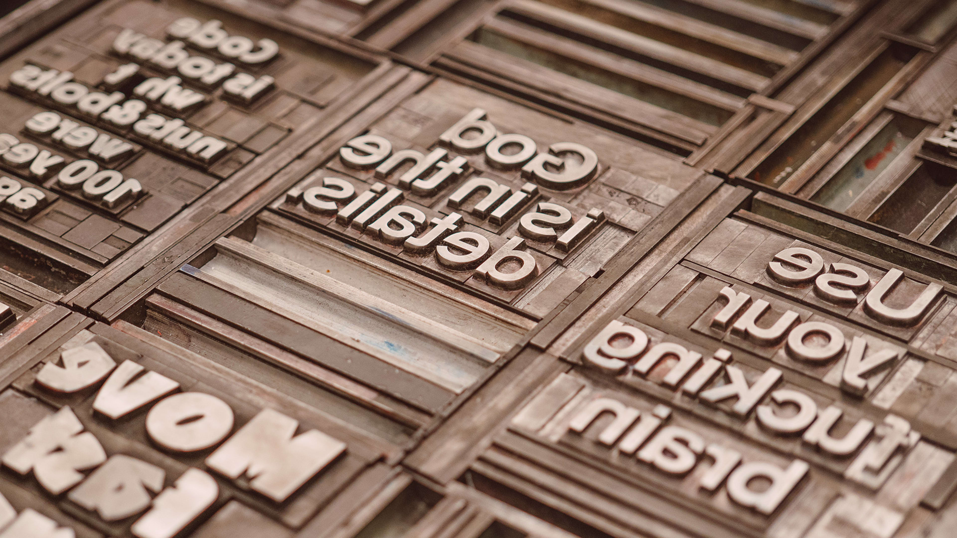
Things were simpler in the days when type was made out of metal. There were two main roles – type designer and typesetter – and their work was constrained by the rules of the physical universe.
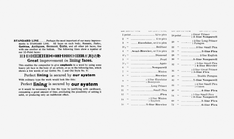
It also helped that by the late 1800s, the type industry had figured out most of the basics. A life of a typeface would start on paper, with a type designer spending weeks or months sketching all the necessary letterforms. After they were done, the drawings of the typeface were turned into a font: actual physical blocks of lead.
You needed to buy one or more such blocks for each letter. You also needed to buy additional metal blocks for different sizes of text. But font size wasn’t defined as the size of the letters –it was the height of the metal block holding them, expressed in a unit known as point (each point was a 1/72 of an inch, or about 0.4 mm). The block height was known, but within it, the type designer could do whatever they wanted: Fonts of the same size could be bigger or smaller, their baseline (the line each letter “sits” on) placed higher or lower, and so on.
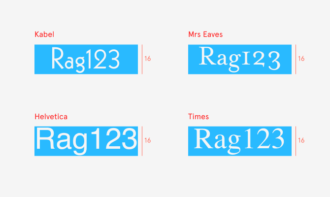
Typesetters could put lines of blocks immediately one after another, in a process called setting type solid, since it resulted in solid, unspaced blocks of lead. Usually, however, they inserted extra-narrow strips of metal to space things out, let text breathe, and make it easier for the reader’s eyes to jump from one line to another.
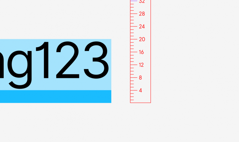
Since the spacing strips were made of lead, the practice of adding that space was called leading (pronounced “ledding”). Here is an example of a 16-point type with 4-point leading, which gives us text with a combined line height of 20pt.
Enter pixels, enter problems
Then computers ruined it all. As we transitioned from paper and metal to screens and software, typography inherited everything that computers have to offer–including bugs, incompatibilities, and updates.
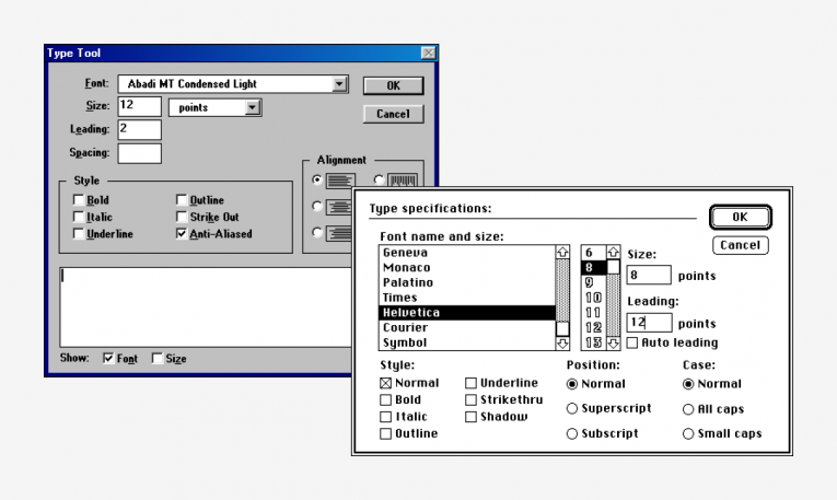
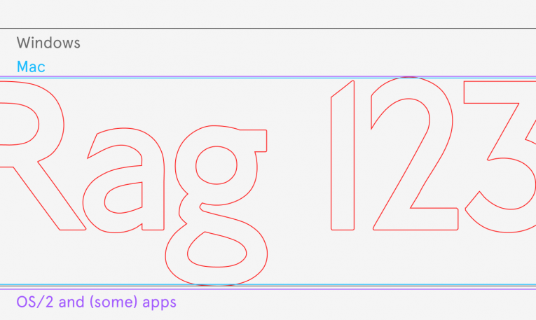
Fonts were no longer solid blocks of lead; instead, they arrived as collections of numbers packed into files. A type designer or type foundry also had to prepare their fonts in different file formats, subject to the requirements of early graphical platforms–Windows, Macintosh, and now-forgotten OS/2. (Plus, the platform’s rendering of fonts was sometimes quirky or buggy, and type foundries had to adjust for that, too.)
Not everything was horrible, of course. Computers gave both type designers and typesetters unprecedented amounts of freedom. Pixels were subject to few of the restrictions of the metal universe–things could overlap at will, or stick out of their once-rigid boxes. As a typesetter, you could add as much leading as you needed without requiring any actual lead. Alternatively, you could remove said leading. Even all of it, if you so desired.
Adding and removing leading on the screen. [Image: courtesy of the author]In the physical world, a box needed to have actual minimal dimensions, since leading could only be added. But in digital type, the default line height of a font could be set to a completely arbitrary number– and it often became taller than font size and more comfortable to read (as opposed to setting things solid, which usually felt too tight).
Leading in design software. [Image: courtesy of the author]Things evolved from there. As computer screens spread, they became a destination rather than a stopgap. More work was designed for screens themselves, and different needs arose. Particularly in user interface design, it became much more important to carefully center text vertically next to an icon, or an avatar– an issue that wasn’t as crucial in the world of print.
At the same time, some of the old traditions disappeared. Fonts and line heights started to be expressed more often in pixels, rather than points. Following the disappearance of lead, the word “leading” was slowly replaced with the more abstract term “line spacing.” (Thankfully, no one thought of “pixelling” or “electroning.”)
All the competing font standards converged, too. We invented OpenType, the one unified type of font that could work everywhere. It was a bit of an illusion, though– inside the font file, there would still be three different sets of values, and different platforms and programs would only pick one of these sets.
The web of lines
Then in 1989, the web was born– and the challenges compounded.
People putting together the building blocks of the early web made two decisions that changed the nature of line height. First, they distributed the extra space that was once a strip of lead both above and below each line. They nicknamed the new system “half-leading.”
Leading on screens (left) and half-leading on the web (right). [Image: courtesy of the author]I reached out to the creators of CSS to understand the rationale behind the change. They explained to me that while early proposals for web style sheets matched the print universe, they had good reasons for deciding to go with half-leading. Namely, web’s text boxes had more responsibilities.
In the world of print or early programs, a text box only needed to hold the text inside it. The web added new responsibilities. “I was aware half-leading wasn’t a traditional typographic concept,” mentioned Bert Bos, who worked on CSS1 in 1995 and 1996. “But the problem I had with adding leading only below the lines was what happened to a paragraph when you put a background behind it or a border around it.”
If leading appeared only at the bottom of such a box, that box would feel bottom-heavy and would require additional work to look good. Half-leading offered a way out of this new problem.
The other change CSS introduced? The 100% line height was redefined as “100% of font size.” Before, a font designer might have given a 16-pixel font a default line height of 20 pixels. But on the web, 100% line height of a 16-pixel font came to be exactly 16 pixels, regardless of what the original designer dictated.
The reason for that change was simple: knowing the default line height of a font required loading that font, which could be really slow on the early internet. Multiplying line height by font size, on the other hand, could be done immediately. “We wanted to do as many calculations as possible without having to load the font,” mentioned Håkon Wium Lie, co-creator of CSS. Line height no longer understood the font inside– luckily, the fonts weren’t required to fit within physical boxes, so that wasn’t that big of a problem.
(Half-)leading could be expressed in three ways in CSS. [Image: courtesy of the author]Web also took away some of the control from typesetters. What in the print era were absolute rules, now became suggestions. Positioning the text box exactly where you wanted it to be not only became harder –it was often discouraged. Web browsers, after all, could be found on vastly different computers, each one with a different screen and a different set of installed fonts.
Browsers, like platforms before them, now had to take some of the responsibilities for type rendering and typesetting–but, as you can imagine, they also came with their own sets of bugs and idiosyncrasies. Each one did things slightly differently: be it alignment, rounding pixels up or down, or interpreting the various incantations of CSS.
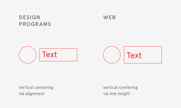
The history of web design can be seen as a set of tensions between designers wanting things to be positioned with utmost precision, and the web pushing back on some of that control. One of the unexpected casualties of that push and pull was line height. The early web didn’t allow for easy vertical centering of text–cue literal decades of jokes about aligning a text to an icon next to it being the hardest problem in computer science –but line height provided a quick workaround for a situation much more common in user interface design than in the world of print.
Now on everyone’s computer, there were apps and websites– and both groups looked at fonts slightly differently. It was hard to say which approach was more proper than the others, but it was easy to notice that they weren’t compatible.
Still-young digital typography amassed quirks and baggage quickly, too. I love keyboards as much as I love type, and the common a joke in the keyboard world is: “Why is this key in this particular weird place on a keyboard? Because it was there on the keyboard before it.”
The same holds true for typography. Platforms and browsers started adding hacks and exceptions to make things look like they did on previous popular platforms and browsers, and type designers compensated for rendering quirks by moving things around. Most importantly: People developed different expectations depending on where they first started interacting with typography.
The end result? There is no longer one way to think of type.
It’s all led to this
That’s a scary conclusion, and all of the above might seem like a world of pain. It can be, particularly if you have to frequent some of those worlds at the same time–or if, like me, you work on a design tool that needs to smooth out a lot of that history so that people aren’t overwhelmed, but understand that the same design tool needs to coexist with both CSS and apps.
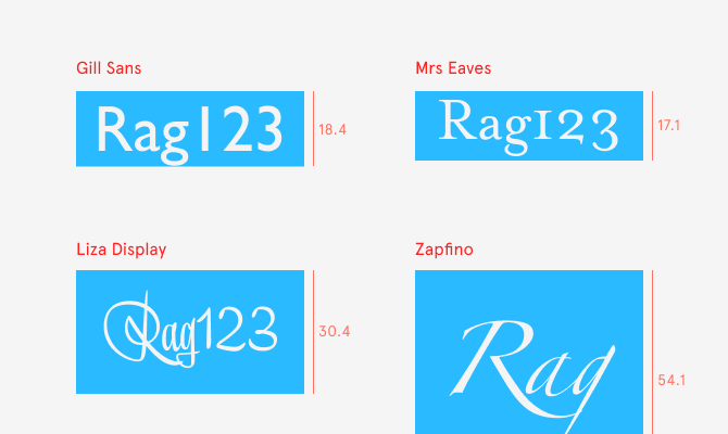
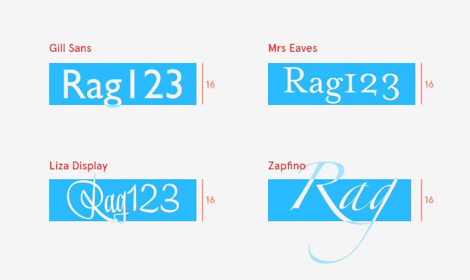
To make things more complicated, it’s hard to even agree what vertical text alignment really is. The world of type happens to be the world where things often feel right even when the measurements don’t quite add up. Any of the examples below could be considered vertically aligned– even though they’re mutually inconsistent.
But there’s another way to look at all this. There is a saying in urban design: “If you can understand a city, that city is dead.” How people live and organize their buildings and lives evolves in all sorts of unpredictable ways. It’s easy to see that as messy or annoying, but one can also see it as beautiful and very human.
I often look at typography that way, too, as a thing of infinite complexity, rich in history and meaning. After embarking on this project to understand line height, I was surprised at the incredible depths to what originally seemed like a narrow scope.
Recognize your brand’s excellence by applying to this year’s Brands That Matter Awards before the early-rate deadline, May 3.
