Okay, now it’s official. Absolutely everyone has their own typeface. That includes Apple. Google. Airbnb. Coca-Cola. And most recently? The U.S. government.
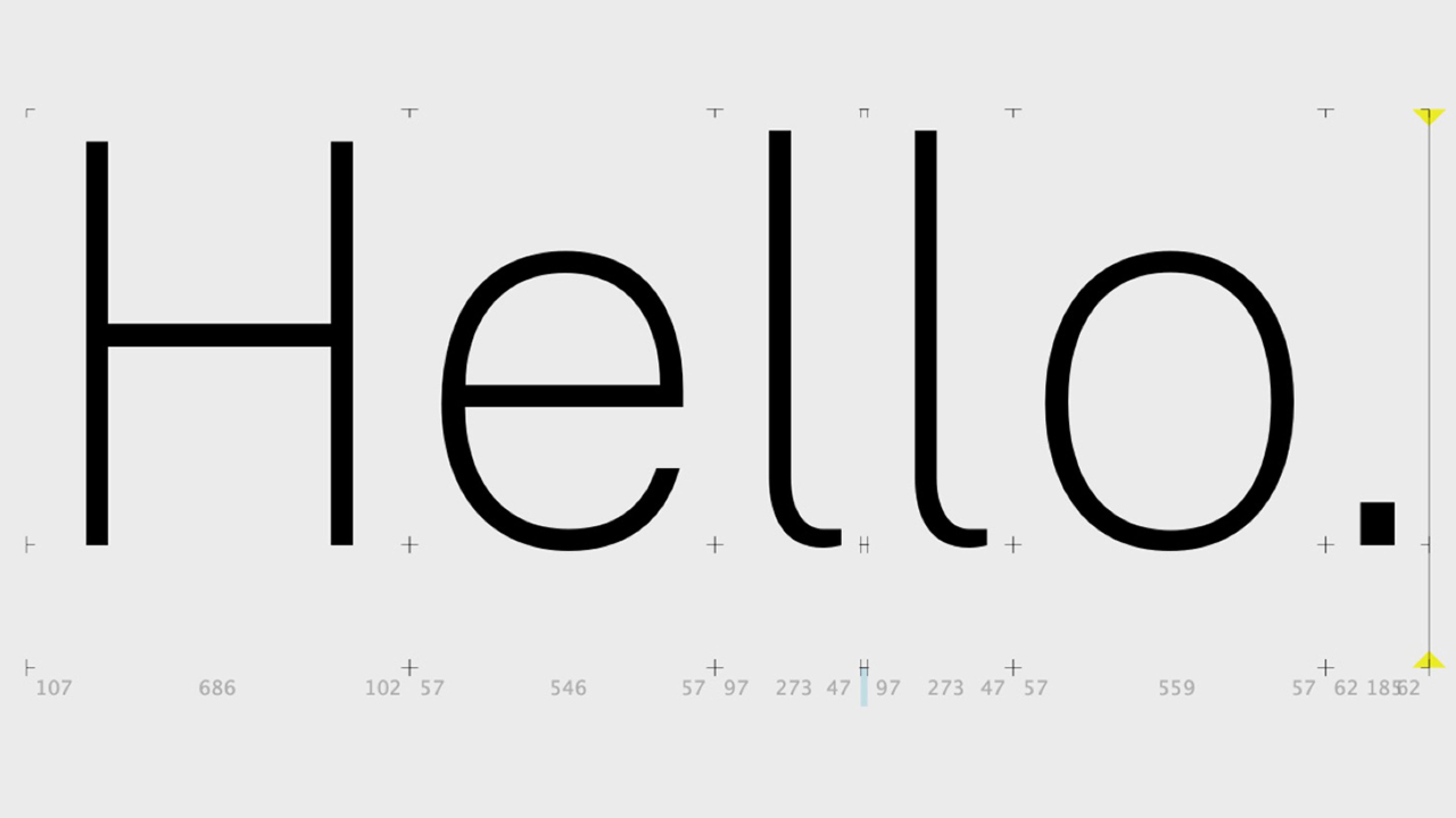
The government has released a new set of tools dubbed the U.S. Web Design System 2.0. It’s a set of code and design standards that make it easy for government organizations to build websites that speak a common visual language with one another. And as part of that system, the government debuted Public Sans. It’s an open-source typeface that has the same modern sensibilities of pretty much every other typeface we’ve seen produced out of Silicon Valley lately. Like the newly modernized Helvetica, the font is good for everything from bold headlines to block paragraphs of text, but with a few flourishes here and there (like what’s called a “tailed” or sloping lowercase “l”) that give it some personality.
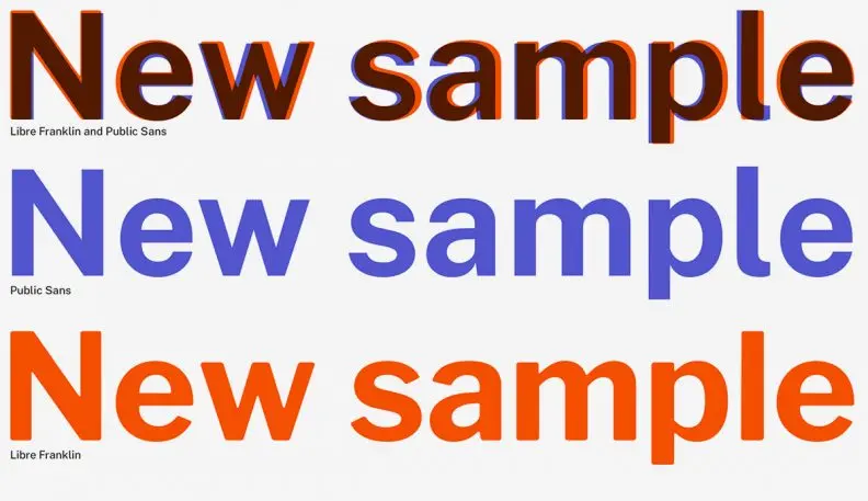
As the Public Sans Github page puts it, the typeface “takes inspiration from geometric sans faces of the 20th century, as well as the original Franklins of the 19th, resulting in something of a mongrel face that retains its American origin.” It’s a modernist mutt.
Curiously enough, the typeface was designed not to stand out in some “America, fuck yeah!” fashion, but to play well with existing offerings from Apple and Google. “It’s designed to have metrics most similar to SF Pro Text (the Apple system font) and to fall somewhere between SF Pro Text and Roboto (the Google system font) in its overall size and appearance,” the description reads. So if someone is running a computer that for some reason can’t display Public Sans, government websites should still look okay when the text defaults to the typefaces of Apple and Google.
What can we read into the government weaning itself off open-source fonts created by third parties–including Google’s own Roboto, as Motherboard reports? In 2019, the government’s relationship with Silicon Valley is changing. People like Senator Elizabeth Warren (D-MA) are calling for Google, Apple, Facebook, and Amazon to be broken up, as we enter what could be a new era of regulation. In this context, it feels hypocritical, or perhaps just hopeless, for the U.S. government to be using a Google-born font, which subliminally reinforces Google’s omnipresent brand.
Recognize your brand’s excellence by applying to this year’s Brands That Matter Awards before the early-rate deadline, May 3.
