The caller ID was ominous. Our corporate lawyer for IP, copyright, and trademarks. He wasn’t happy.
I had done something potentially dangerous. I’d exposed my brand to an unspecified assault. There could be . . . consequences. It was bad.
Or at least that was his take, and in his defense, he was conveying the concern any lawyer would convey to someone who got cheeky with an iconic, $100 million brand’s logo.
You see, in an effort to acknowledge what was then the first widespread use of user generated content, I had our creative director strike out the “This” in the This Old House logo and right above it pencil in “Your.” The idea being, this website, this magazine, wasn’t the business, it was your business, because you made it.
The campaign was short-lived, and though it won Ad Age‘s Idea of the Year, we returned to our regular logo almost immediately. I don’t recall much of a kerfuffle, let alone the hellfire my attorney cautioned against, and This Old House rolls on, now in its 40th year on television. So much for the power of a brand’s visual identity–and the perils of defacing it with a false mustache.
My precious!
Marketers (and lawyers) place huge import on a logo, and so do the companies hired to create them. But the only time we really hear much about logos is when they are changed. Some would say this is how it should be. It means the consumer is sensitive to the design. But I’d say it’s more because most logos are wallpaper, and it’s only the supporting press around launch or redesign that creates that sensitivity or awareness for consumers.
When we learn that a little pinch and a slight counterclockwise turn of the Pepsi emblem cost $1 million, we pay attention. When we learn in our news feeds that the Gap or Tropicana or the Florida State University Seminoles athletic department has changed its logo, we are outraged, because, well, change. But would we notice otherwise? If J.C. Penney were giving consumers what they wanted on the selling floor, would it really matter that it had four logos in the span of three years–one of which was a sacrilegious shortening of the store’s name to the letter mark JCP? See, it’s easier for a corporate team to crow about, not to mention implement, the superficial aspects of a brand retrenchment than do the hard work of actually winning over consumers with smarts and data and strategy and a lot of unsexy back-office implementation. Which is why it didn’t matter when an ascendant Gentleman’s Quarterly changed its name to GQ, and why it matters even less that there’s an arrow in FedEx, the smile (also an arrow) going from A to Z in Amazon, or the excited partygoers at the Tostito salsa bowl.
Because here’s the thing: Consumers, even brand loyalists, couldn’t recall your logo in any detail even if they had to. Seriously. Ask them.
I guest-lectured to a group of university business majors in a consumer behavior class recently and got into a discussion with a few self-described and seriously passionate coffee brand loyalists. I asked them what they liked about their preferred brand, where the passion came from, why they couldn’t do without the daily dose. Then I asked them to draw their brand’s logo.
As a last-minute wild card, given the collective astonishment the group had that any company would have paid nearly $10 million in today’s dollars for a logo redesign, and more than $200 million to implement it, I threw in BP for one confident soul who was pretty sure she knew what it looked like. Their work is on the left, with the actual, current logos on the right.
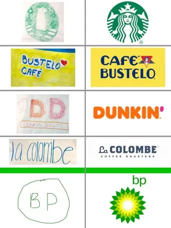
- A bishop on a green and white chess board;
- A name logo that botched the name but did it with love;
- Sort of a version of an old logo clinging to the donut Dunkin’ now wants so badly to dunk;
- A correct name (but little else);
- And nothing more than the green in the green, life-affirming messaging of BP’s somewhat cynical “helios” logo.
Interestingly, the person who transposed the Café Bustelo name, calling it Bustelo Café, actually carries a jar of its instant espresso in her backpack at all times. That’s how close she is to it. She later recalled that the heart she added, rather than the logo’s actual red triangle, appeared on a Bustelo T-shirt she owned.
We did other logos that day, and I’ve tried this test other times with other products and their loyalists. Consistently, the most accurately depicted logos come from Nike and Apple. Not so with Reebok, Adidas, Windows, and Android.
Four lessons
There are a couple lessons one might tease out of that and the coffee brands above, and while those lessons can apply to anyone pondering their brand’s visual representation, they’re especially useful for cash- and time-strapped startups that have far more important things to worry about.
First, don’t sweat it. Logos can be altered. While visual recognition can be valuable, it doesn’t need to be immutable. In fact, the airline Southwest ditched the airplane in its logo just this year, Apple axed Isaac Newtown and his apple tree, and Google, whose original logo was created by Larry Page with a free graphics program in 1998, has modified its design at least seven times in the company’s two decades, most recently to be more properly applied to its family of desktop products and apps.
A second might be that while you want to be in the brand ballpark with your selection, trying to wedge meaning into a logo isn’t that important, since it’s only the broadest of elements–color, rough shape–not nuance (or even the name!) that consumers recall.
Third, from the Nike and Apple examples, it’s more important to choose a distinct and unfussy logo rather than a representative and complex one. A plain black swoosh, a flat fruit silhouette, has more recall than any sort of Android, which may or may not have eyes and antennae (That’s a quiz for you . . . ).
A fourth consideration: In the beginning, spending on broader sales and marketing initiatives have a more immediate return and awareness. The Nike logo story is famous (“I don’t love it . . . but I think it’ll grow on me,” Phil Knight told the design student who created it before paying her $35), and Toyota’s and Wikipedia’s logos were products of contests, the latter won by a 17-year-old. There’s plenty of time, if your business model works, to update, adapt, or adjust to other uses, placements, and products. (Though you still don’t need to spend $10 million.)
To be sure, logos are a complex enough topic that I can hear designers and marketers already screaming at me, and certainly any you choose needs to be in the brand ballpark. But the logo is just one piece of your consumer messaging, and like all messaging, its meaning and relevance and appropriateness can and should be changed over time. Or as my former colleague and acclaimed creative director, John Korpics, now with the Harvard Business Review, told me: “Unless you’re starting out to strategically compete in a highly cutthroat landscape, I wouldn’t worry too much about the logo at the beginning. Have fun with it, make it interesting and somehow personal to your idea for the company or product,” he said. “It’s kind of like a band name. You need something so they can put your name on the marquee, but if you don’t write great music, the name isn’t going to help you. And no matter how good your music is, you still shouldn’t name your band the Doobie Brothers. That’s just bad.”
Scott Omelianuk lectures in entrepreneurship at the Stevens Institute of Technology and is an entrepreneur in residence at the Stevens Venture Center. He is a founding partner in MediaScience.io, consultants to startups and challenged businesses.
Recognize your brand’s excellence by applying to this year’s Brands That Matter Awards before the early-rate deadline, May 3.
