One of the biggest challenges in humanitarian aid is actually delivering the product to the people who need it most. Vaccines, disease-battling insecticides, and new advancements in solar technology can all help people in developing countries stay healthier and have better-quality lives. That is, if you can locate them. In many places, smaller communities are spread out over vast and relatively uncharted terrain.
Facebook is trying to help change that by creating a high-resolution population density map for nearly the entire continent of Africa. Developed by the company’s Boston-based World.AI team, it’s really a demonstration of the company’s immense computational and processing power (and a play to help telecom services get internet service to more of the continent faster, which means more Facebook users).
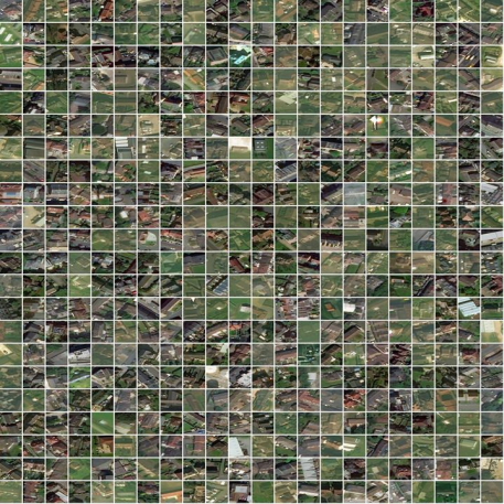
[Image: courtesy Facebook]The more immediate hope is to share this information with nonprofit groups and aid organizations working in areas like disease control and disaster preparedness. “Accurate population density forms arguably the backbone for any public sector or social service intervention you can think of,” says Laura McGorman, a public policy manager with Facebook’s Data for Good division. “The fact that these exist means that organizations working across a range of foreign assistance and poverty alleviation interventions will now have much more accurate maps to do their work.”
Facebook essentially subdivided a 16 million-square-mile landmass into billions of snapshots, each of an area of land about the size of a softball field. The overhead images came from imagery company Maxar Technologies. Once it knew where people lived, it could combine that with census data to figure out about how many people might actually be in those abodes. That information came from the Center for International Earth Science Information Network at Columbia University, which folds together many disparate kinds of population measurements from different governmental and research organizations to give a good estimate of how many people are living in different parts of countries.
The maps and census populations basically cross-check each other. Maps are good for spotting places where people live, but not how many people actually live there. Census data in developing places is rudimentary at best, so it’s pretty good for telling you how many folks should be in a general area but not where they likely reside. Combine both, and you now have a decent residential layout and an idea of how many folks you’ll find once you arrive there, so you know what kind of supplies to pack and how many people to send.
As Facebook explains in a post about its methodology, one census population zone in Africa, for instance, spans 150,000 square miles but contains just 55,000 people. In an area that large, you might know where people generally cluster, but there may be small settlements going unnoticed or even key geographical features about how a town is laid out that might make accessing everyone’s home tricky.
“A census data set is a set of geographical polygons, you know, so like the outline of some city district and a number of people in there,” says James Gill, a Facebook engineer who worked on the project. “What we do is we find locations of buildings. To a good approximation, people live in buildings, and not in fields and forest and mountains. So instead of placing the people in the census district everywhere, we only place them where there are buildings.” Aid workers obviously know this intuitively. The maps help them show up more prepared and ensure no one gets missed.
The result works more like a road map with approximate addresses for the continent’s 1.2 billion people. It builds on a previous mapping effort from the company. Over the last several years, Facebook has prototyped detailed population maps for 22 different countries as part of its ongoing effort to figure out how to bring internet connectivity to the entire world. Those worked for the limited turf covered but required what Gill calls plenty of “bespoke, manual work” as opposed to an easily replicable process. At the same time, the data was immensely helpful for both the company and humanitarian groups. “The resolution of these maps are great because maybe you have a village of 10,000 people, but what’s the actual geometrical configuration of the houses? Is it a long line? Is it a circle? Is it a star shape? Each of those would have very different cell-tower placement strategy,” he adds.
[Image: courtesy Facebook]There’s a couple of ways that information shapes smarter aid deployment. With more detailed mapping of Malawi, for instance, the Missing Maps Project and Red Cross have been able to execute targeted campaigns against measles and rubella. As Facebook reports, 97% of the country is uninhabited. By focusing strategically on the chunk where people live, a smaller corps of volunteers could be effective. With street-level layouts, the logistics of each day got easier. For instance, a crew of 3,000 volunteers was able to visiting 100,000 homes in three days.
In Tanzania, where less than one-third of the population has power, nonprofit Humanitarian OpenStreetMap worked with a different set of collaborators to figure out the most efficient spots for adding decentralized renewable energy sources. Facebook’s information helped planners figure out exactly who wasn’t covered by the existing grid, and how many people might be in each community, so it could identify places with the largest immediate need. From there, organizers were able to travel door-to-door to survey people about what kind of solutions they might want and be interested in maintaining. It’s the type of work that aid groups might otherwise have to do in a more disorganized and labor-intensive way.
Facebook reports that other groups like Doctors Without Borders, the Bill and Melinda Gates Foundation, and World Bank have benefited from their initial maps. World Bank additionally worked to confirm that the estimates are indeed accurate on the ground. “We’ve heard from organizations in public health, that these will be indispensable tools for things like indoor spraying campaigns, where volunteers go house-to-house to protect against malaria,” McGorman says. “We’re just really excited to see more maps out there being hopefully put to good use to save lives and improve well-being.”
Recognize your brand's excellence by applying to this year's Brands That Matters Awards before the early-rate deadline, May 3.
