A common question in my first-year design seminars is also a popular question in the design community: “Why is Comic Sans considered such a bad typeface?”
Discussing typefaces with people who have just started to learn and practice design is tricky. There are good and bad typefaces. But there are also personal preferences and aversions. For a teacher–and a professional designer–it is important to differentiate the two correctly.
Obvious criteria for good typefaces are consistency, efficiency, elegance, versatility, and robustness. It is important to learn about the functional and aesthetic qualities of letters as well as the production quality of a typeface. Students and professional designers should be able to judge typefaces based on these criteria.
But choosing a typeface is not just pragmatic. As with so many other things, there are also personal favorites and dislikes. To be clear: Bad type does not suddenly become “great” just because you think it is “cool.” But to choose between all the quality typefaces out there, you need more than technical specifications. You need taste and a sense of style.
Taste is personal. You might like a typeface that other people find a bit bland. And you might hate a typeface everyone else reveres. Sometimes the devil is in the details. Helvetica is not bad–sometimes it is even quite pretty. But, personally, I deeply and passionately hate the capital “R” in Helvetica. I consider it one of the ugliest letters out there.
Choosing a typeface is about context. There are always functional criteria, but usually they are not so clearly defined that they narrow the options to just one possibility. Typefaces have to feel right for the occasion. They have to convey a certain manner.
This line of argument makes sense to designers. However, most people are not aware of the multitude of typefaces and the intricacies of type design. In order to illustrate the subtle qualities of letters and typefaces, I would like to introduce a thought experiment: Think of typefaces as actors.
I like to compare typefaces with actors and actresses because of their obvious similarities. Actors do not simply speak the words of a television, film, or theater script. They turn an abstract role into a true and believable individual.
Type and actors have a lot in common. They give written language an identity and they give a face to an idea. Just like actors, typefaces convey more than just subject matter. Their personality strongly shapes the way content is perceived. One typeface, one actor, can be a bit neutral, flexible, and versatile, whereas another is more personal, specific, and meaningful.
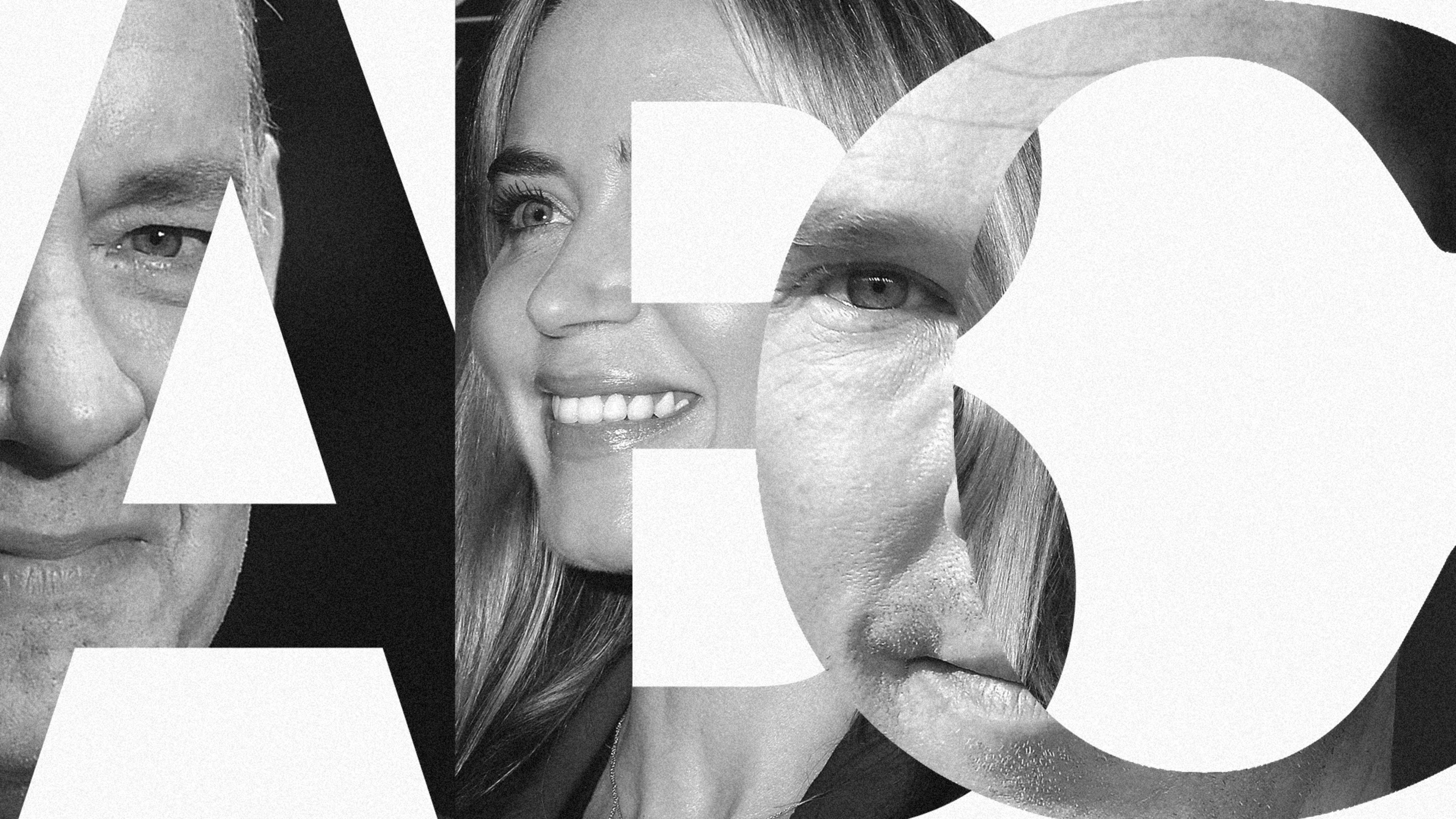
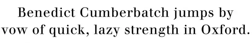
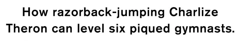
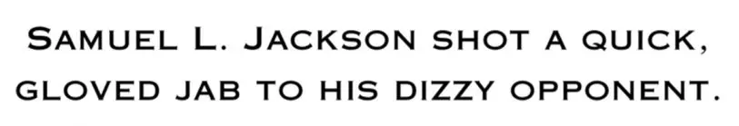
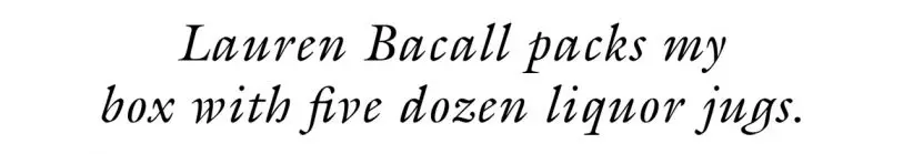
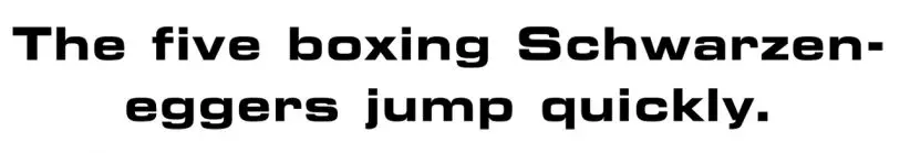
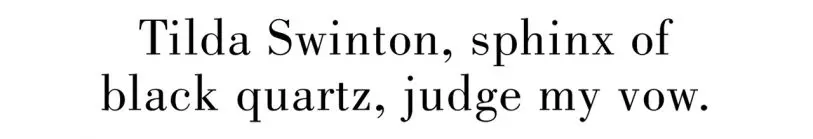
The comparison between type and actors has a number of interesting consequences that lead to compelling lines of thinking. You could cast Arnold Schwarzenegger in the role of Hamlet, which would be very different from casting Benedict Cumberbatch. You could typeset Hamlet in Eurostile Extended–which would be quite different from setting it in Walbaum.
Helvetica is a bit like Tom Hanks: Mr. Everyman, no extremes, could work for the government or in a big company, but would still be a good neighbor with nice kids.


I could go on. So the big question: Who is Comic Sans?
I have to admit, I am struggling to find the proper actor to represent Comic Sans. On the one hand, every red-blooded typographer considers Comic Sans silly, awkward, and embarrassing. So Jim Carrey or Benny Hill comes to mind. But then again, that’s not quite fair.
The surprising thing about Comic Sans is that while it is strongly disliked by designers and typographers, it is quite popular with school teachers, particle physicists, and nondesigner family and friends. Why is that?
I’d suggest that the actor best suited to be Comic Sans is “Uncle Bob.” This is not a specific person but a type of person we all know. He is an amateur actor, a really nice guy who lives down the road. On weekends, he and his troupe perform stage adaptations of Agatha Christie crime novels. Nobody would compare him to Marlon Brando, but it’s fun to watch him act, though a bit embarrassing. He is a nice, approachable guy; after the show, you can go to the pub with him and have a bit of a laugh.
As I rationalize Uncle Bob, I would like to defend the people who use Comic Sans. They do it because it feels right; it’s a well-known, approachable, uncomplicated typeface. Also–they lack alternatives. They are kind of stuck with Uncle Bob.
Comparing typefaces with actors and actresses is a delightful, and instructive, way to talk about typograph–not only within the design community but also with the wider public. Everyone knows actors, but far fewer people know and understand typefaces.
Typefaces will never reach the cultural omnipresence of the stars of stage and screen. Most people take visual language for granted and hardly reflect on the different facets, qualities, and peculiarities of typefaces. Many don’t realize that the design of words and sentences can deeply affect and influence what we read and how we read it. If we reframe our perspective, though, we can perceive distinct differences we might otherwise miss.
So, who is Futura? And who is Bembo? Gill must be British. But who exactly? Who is bland enough to be Arial or cosmopolitan enough to be Thesis? And–of course–which typeface is cool enough to be Uma Thurman? I welcome your comments and suggestions.
This article was adapted with permission. Read the original on Medium here. Boris Müller is professor for interaction design at FH Potsdam and co-director of Urban Complexity Lab. Follow him on Medium and Twitter.
Recognize your brand’s excellence by applying to this year’s Brands That Matter Awards before the early-rate deadline, May 3.
