Fast company logo
|
advertisement

It’s part of designer and professor Jeremy Shellhorn’s Design Outside Studio, which takes on design projects in Rocky Mountain National Park.

The National Parks’ iconic typeface has never been digitized–until now

[Image: courtesy Jeremy Shellhorn]

BY Katharine Schwab2 minute read

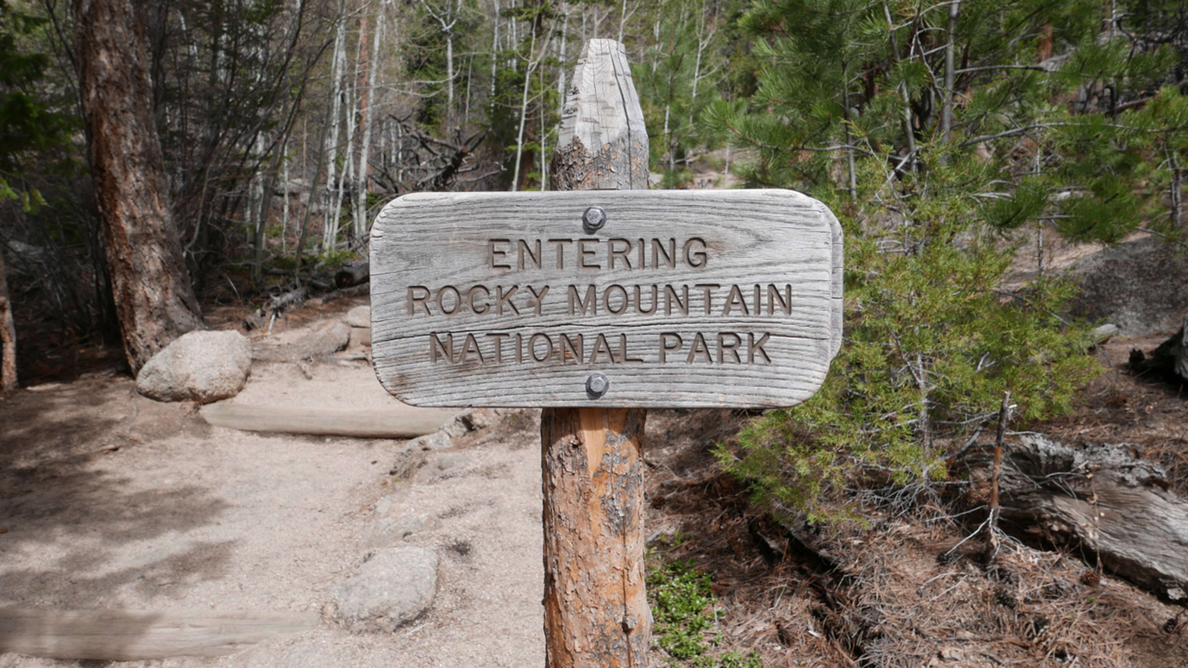
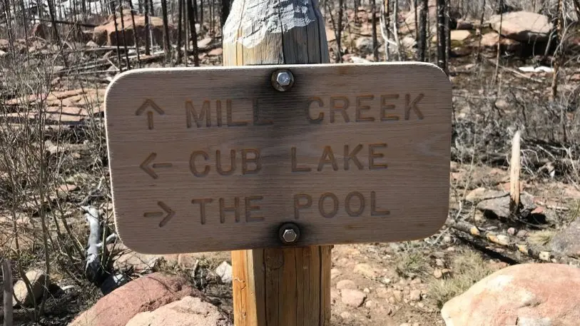
If you’ve ever been to a National Park, chances are you’ve come across signage with the same distinctive lettering. The type, which features rounded edges carved into wood in all caps, has become an icon of the National Parks system.

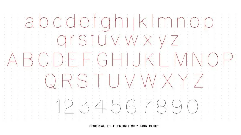
But it turns out that this text isn’t an actual typeface, as information designer Jeremy Shellhorn discovered when he was working as designer-in-residence at Rocky Mountain National Park in 2013.

[Image: courtesy Jeremy Shellhorn]
Shellhorn, who was on sabbatical from his current job as an associate professor of design at the University of Kansas, was redesigning the park’s newspaper and wanted to include the type found on National Park signs. But he soon discovered there was no digital typeface because the letters are simply formed with a CNC router in the park’s sign shop, chiseled into wood. The shape of the letters were determined by the size of the router bit.

[Image: courtesy Jeremy Shellhorn]
Inspired by his discovery, Shellhorn and his students createda digital typefaceusing rubbings from the signs themselves.Available for anyone to downloadfor free, the typeface comes in four weights: light, regular, heavy, and outline.

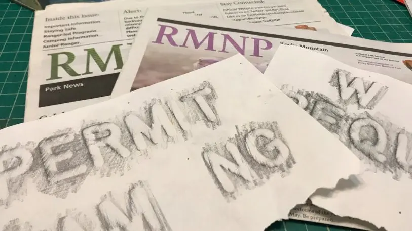
The project was part of a class that Shellhorn teaches called Design Outside Studio, where he leads a group of University of Kansas design students into Rocky Mountain National Park for a week and a half each summer. The group camps in the park and does design projects in service of the park rangers.

[Image: courtesy Jeremy Shellhorn]
Other projects have included redesigning the park newspaper, doing site-specific installations, and putting on pop-up art exhibitions at campgrounds. The studio has also led a design charette for the organizationLeave No Trace, which is devoted to limiting people’s impact on the natural world by brainstorming new ways to engage and educate visitors on their environmental footprint while in the park. Shellhorn is planning to refine ideas with his students and start prototyping this summer.

While the studio is a great way for design students to give back, it’s also helpful for re-energizing them creatively when they’re used to staring at computers all day, according to Shellhorn. “It’s a way to get students off the computer and out of studio,” Shellhorn says. “They can be more creative if they’re not locked into the distractions that ultimately happen when they’re here on campus.”

Since Shellhorn published the typeface in summer 2018, it’s been downloaded by people in all 50 states and in several other countries. Next, he hopes to assign students to create a series of dingbats to go along with the typeface. You can download it here.

Recognize your brand’s excellence by applying to this year’s Brands That Matter Awards before the early-rate deadline, May 3.

CoDesign Newsletter logo
The latest innovations in design brought to you every weekday.
This site is protected by reCAPTCHA and the Google Privacy Policy and Terms of Service apply.
Privacy Policy

ABOUT THE AUTHOR

Katharine Schwab is the deputy editor of Fast Company's technology section. Email her at kschwab@fastcompany.com and follow her on Twitter @kschwabable More


Explore Topics