As 2018 draws to a close, it’s hard not to look back with a surreal sense of time displacement. Was the PyeongChang Olympics really only this year? Or the midterms? Or the shooting in Parkland, Florida, that left 17 people dead? Watershed events tend to blend into each other with kaleidoscopic perplexity when the typical news cycle lasts only a few hours.
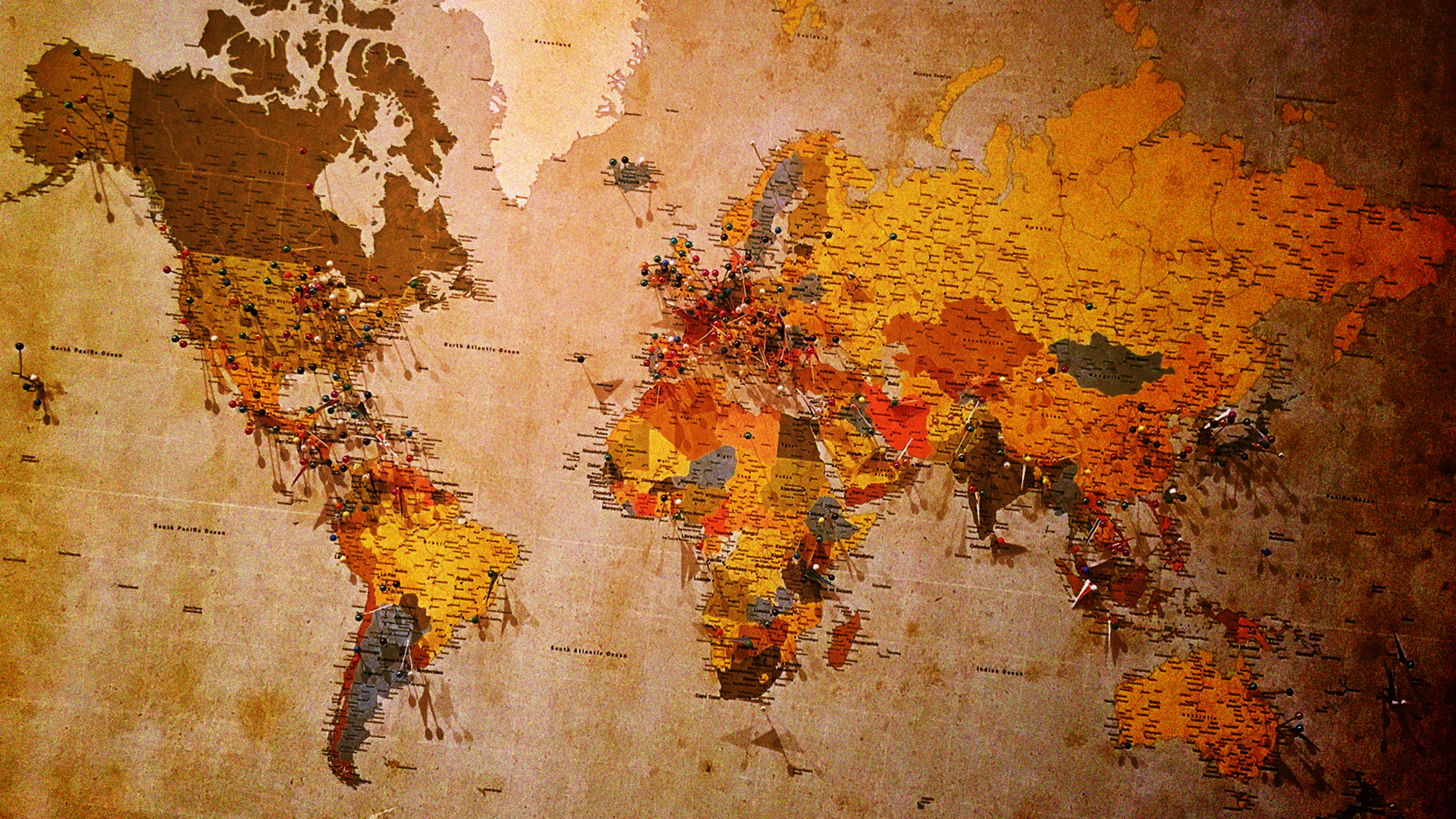
This is why I love maps—they reorient us. They help us make sense of the world when nothing seems to make sense. And over the last year, maps have helped visualize much of the happiness, heartbreak, terror, and turmoil that 2018 has wrought.
To mark the end of this extraordinary year, I compiled a list of some of the most compelling maps we’ve shared on Fast Company over the last 12 months. Most of these came from Esri, a spatial analytics company whose mapping software is used throughout the private and public sectors. The images below are just screen grabs, but you can click the links to find the corresponding interactive maps.
- A flu season to remember: By January, the CDC was calling the 2017-18 flu season the worst since it started keeping track in 2000. That month, Walgreens figured out a pretty interesting way to map out which areas in the United States were being hit the hardest. Find the map here.
- Going for the gold: As the action heated up in PyeongChang, South Korea, for the Winter Olympics, Esri created a series of Olympics-related interactive maps that offer an easy way to parse through the statistics. Find the maps here.
- Mass shootings in schools: In the wake of the school shooting in Parkland, Florida, in February, Esri created a live map of school shootings using data from Everytown for Gun Safety. Find the map here.
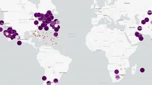
- Putting a face on the opioid epidemic: The “Celebrating Lost Loved Ones” map, which was created by Esri engineer Jeremiah Lindemann, allowed users to add images and descriptions of their late loved ones, along with the place of their death. Find the map here.
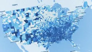
- Income inequality visualized: A mapping project showed the stark divide between America’s rich and poor. Find the map series here.

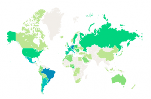
- Where women’s health suffers: To commemorate International Women’s Day, Esri mapped out statistics from the Population Reference Bureau to highlight some of the disparities in women’s health around the world. Find the map here.
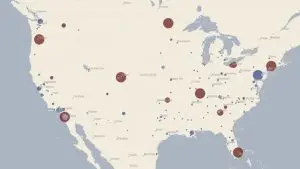
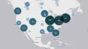
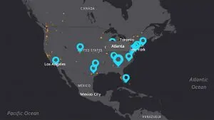
- Amazon’s shell game: As it was searching for a North American city to place its new HQ2 offices this year, Amazon narrowed it down to 20 finalists. Here, Esri mapped them out with key economic and demographic data. Find the map here.
- A sport for everyone: The 2018 FIFA World Cup, which took place in Russia this summer, gave us an excuse to share visualized data on statistics specific to the Russia games (like player ages and average height), as well as broader stats about World Cup history (like all-time wins). Find the map series here.
- Hurricane central: This year maps helped us track numerous deadly hurricanes across the Southeast and Gulf Coast, including hurricanes Florence, Gordon, Michael, and Willa.
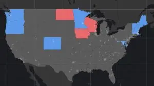
- Voter turnout explodes: To help motivate voters in the 2018 midterm elections, cartographer Philip Kearney created a series of interactive maps that looked at the impact of non-voters in the 2016 election. Find the map series here.
- California burning: As devastating wildfires tore through northern and southern California, Esri sourced government data to create two interactive maps that help people track the progression of the fires and stay up to date on traffic and smoke forecasts. Find the maps here.
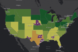
- Mortality rates: This year, life expectancy in the United States fell for the second time in three years. In an effort to visualize some of these grim statistics on a local level, Esri sourced county-by-county health rankings for age-adjusted mortality rates and put them into an interactive map. Find it here.
Recognize your brand’s excellence by applying to this year’s Brands That Matter Awards before the early-rate deadline, May 3.
