


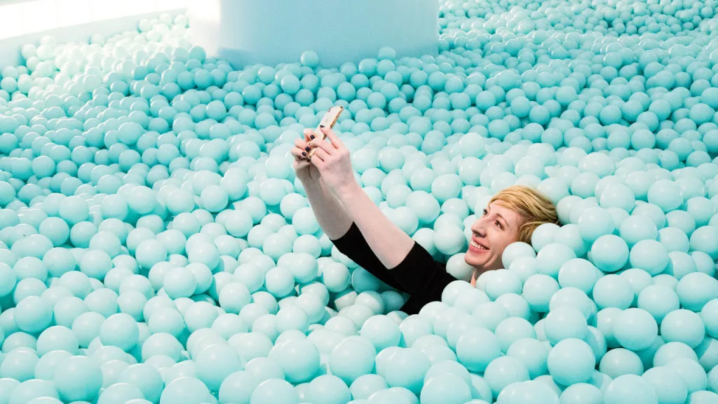
A million plastic sprinkles. A neon-lit sound bath. A giant egg carton, welcoming you to step inside. Chances are, you’ve come across at least one of these sets, designed expressly for staging cool photos, at some point in your Instagram feed. This is recreation in the social media age, designed for users who live to get the ‘gram. Pics or it doesn’t happen.
Instagram is no longer just an app, but a visual lens through which we navigate physical spaces. With 1 billion users worldwide, the social media platform has given rise to a cottage industry of photogenic pop-up “experiences” and installations that cater to preening users looking to capture a memorable, and envy-inducing, experience.
You could argue that this trend began in museums and galleries, with blockbuster interactive installations by artists like Yayoi Kusama and Random International’s Rain Room giving rise to a new breed of cultural tourism. But the Museum of Ice Cream, dreamed up by 26-year-old founder and Parsons grad Maryellis Bunn, is largely credited with kickstarting the social phenomenon in 2016 with the launch of its first three-month run in New York, later drawing celebs like Beyonce, Katy Perry, and Kim Kardashian as it continued on in Los Angeles and Miami. In fact, it was predated by Refinery29’s experience, 29 Rooms, which launched during New York Fashion Week in 2015, first as a staff party of sorts, then as a live event open to the public. Its 29 different activations are billed as “speed dating for ideas and art.”
Since then, the market for experiential events has boomed, with a panoply of increasingly banal themes and copycat events popping up in cities across the country. There’s the Museum of Pizza, the Museum of Selfies, and the Egg House; an avocado-themed one called ‘CADO; the yellow, smiley face-filled Happy Place; Candytopia, The Future of Sports, The Dream Machine; the list continues.
In general, visitors are charged anywhere from $15 to $38 for a single-admission entry to an interactive experience that will likely involve an average of nine to ten elaborately designed rooms (usually including at least one involving mirrors, one giant set you can climb into, and one pool of something to jump into) and a few stops for sugar-laden treats over the course of an hour-long visit. It’s like Disneyland for the Instagram set, timed and condensed for digital attention spans. At least a few of the rooms are bound to be advertorials–sponsored experiences that are baked into the space. Refinery29’s 29 Rooms includes a hefty dose of branded displays, presented in varying degrees of subtlety, with companies like Aldo, Kraft Heinz, Pantene, Revlon, and Smirnoff.

Some critics have painted these Instagram playhouses as a blithe dumbing-down of culture, in which “true” art-viewing experiences have been bastardized into a superficial, photogenic romp that users will happily pay to enter and be peddled to by advertisers along the way. On Instagram, after all, sponsored posts aren’t a necessary evil but a source of cachet and credibility; aspiring, would-be influencers have even been known to fake brand deals for a bit of street cred.
At the same time, some designers are working to take what we know about Instagram spaces and use them to lift up designers and creative communities–offering a more nuanced depiction of how the app is changing the way we experience space. One such bright spot includes the Color Factory, which centers around the phenomena of color and creativity, and has managed to cut through the noise with serious art and design credibility–even as its installations charge $38 a head, and include three sponsors (Maybelline, Gymboree, and Anagram, the world’s largest producer of foil balloons). After an initial one-month run in San Francisco last year extended for several more to meet demand, the organizers launched a bigger, higher-production edition in New York City this summer, which was also planned for one month, but is now likely to continue on into 2019.
I took a behind-the-scenes tour of Color Factory’s New York space one Wednesday morning, when it’s closed for weekly maintenance, and picked the brain of founder Jordan Ferney, a veteran event planner and a career blogger, on how to design memorable experiences in the age of Instagram.
Find great talent and let them do their thing
The idea for Color Factory began organically, Ferney says, as she found herself pitching more and more immersive, experiential projects with clients in her event planning work. She had long thought in the back of her mind that it’d be more fun to launch her own pop-up space, working with artist friends and designers in her immediate circle of friends.
Artist Leah Rosenberg, whose work approach centers on the phenomenology of color in her stark, geometric compositions, was among the first collaborators to sign on, and helped shape the overall theme. “We weren’t trying to create a brand, necessarily,” Ferney says. “We just wanted to make something creative that people could relate to, have it be interesting, and present a unique perspective.”
Focusing the experience around the rather broad theme of color provides obvious opportunities for Instagram-friendly eye candy, but it also smartly lends itself to exploring the world of creativity and art-making. Color Factory’s collaborators include designers Andrew Kuo, Tamara Shopsin, Jon Burgerman, writer Molly Young, color historian Kassia St. Clair, Alex Kalman’s pocket-sized gallery of oddities, Mmuseumm, nonprofit organizations like Dave Eggers’s 826NYC, and even the Cooper Hewitt, Smithsonian Design Museum.
Make it inclusive and human-centered
The Color Factory is undeniably kid-friendly and especially popular with young families in the mornings and afternoons—but its creators make it a point to catch the after-work crowd by staying open until 10 p.m. each day. It’s a popular meet-up destination for influencers, friend groups, or couples on dates, says general manager Becky Sanchez, and the venue’s rules list that all attendees must be 18 or older, or accompanied by an adult, which keeps the space from becoming a funhouse. Accessibility and inclusivity was important to Ferney and her collaborators, too, and that extends to the exhibition content, which contains several jokes for the adult crowd, safely placed at above eye-level from kids. In San Francisco, a room of scratch-and-sniff wallpaper, a la Willy Wonka’s Chocolate Factory, Ferney says, slyly included one scented like cigarettes, six feet up the wall.
As a mother of three, Ferney was also sensitive to a particular annoyance of photo-friendly spaces: As the person behind the camera, moms tend to have tons of photos of their children, but not with them. The installations take this into account with photo booths built into the space; similar to photo packages offered at amusement parks, visitors are given a card to swipe at each station, then receive the images by email at the very end. The system doubles as a convenient way to manage crowds, get everyone in the photo together, and temporarily get them focused on the space, rather than their smartphones.
Crowd control is key
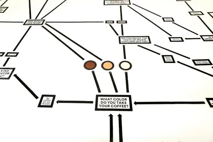
New York–based graphic designer Erin Jang conceived of the Color Factory’s overall branding and visual identity, which centers on a simple system of color dots that are used in the logo (a giant smiley face), on the photobooth cards, and in pamphlets–but also cleverly extends to some of the sweet treats given throughout the experience. You’re welcomed with colorful mochi ice cream balls from at the entrance, and later, a rainbow array of perfectly circular macaroons. In one room, you can take and wear a round, monochrome pin-on button in the color of your choosing; and on the floors, dots strategically designate the next stop, suggesting the best spot to snap a photo, or leading you to the next destination.
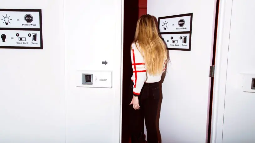
The use of dots–which, intentionally or not, recall Kusama’s obsessive use of dots–are a subtle and effective visual cue that cohesively ties the rooms and experiences together in an artful and logistically sound way. Despite a maze-like plan, the interior layout of the venue is designed as a one-way path to keep visitors moving along, and each photo station and takeaway goodie functions almost as an incentive-based, gamified element to the experience. Like a Pac-Man quest to collect all the dots, there’s little reason to backpedal once you’ve been sated.

Design for all five senses
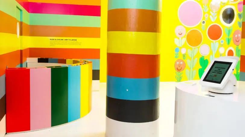
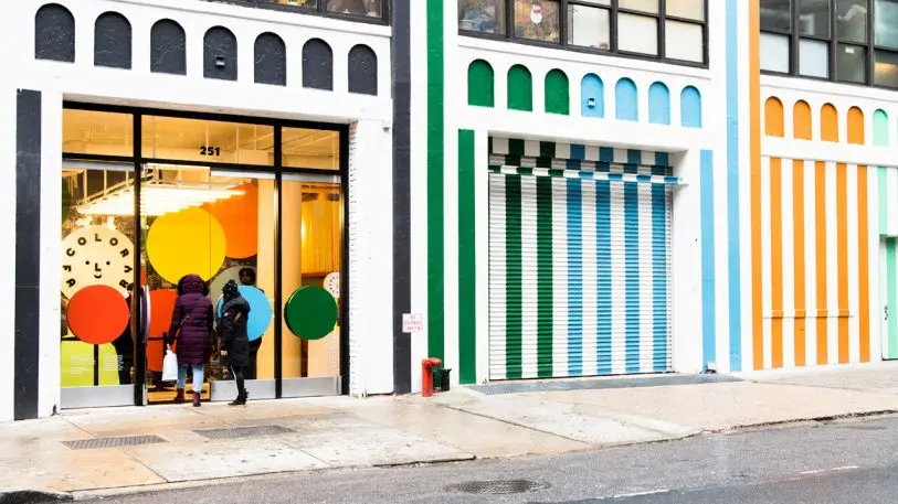
There’s no denying that people come to Color Factory for photo-ops–that much is clear from the moment you walk through the Seussian, colorfully striped building facade–but even the most cynical visitor would end up enjoying the immersive installations, which are designed to appeal to multiple senses beyond sight.
Colorful, dot-shaped sweets stay on brand and keep people wired, and some vendors, like Il Laboratorio del Gelato, the popular ice cream shop on Manhattan’s Lower East Side, have made custom flavors just for the installation. Nearly everything is designed to be touched, and invites play, from a room of xylophone chimes to a disco-themed dance room that plays tunes. Scents are not part of the sensorial wonderland in the New York edition (and thankfully for germophobes, the giant blue ball pit does get cleaned, with a special industrial vacuum used weekly).
Skip the gimmicks and invest in local designers and businesses
While the fantastical space is very much a sweet escape from reality, Ferney and her collaborators made sure to go the extra mile to root and customize the experience to New York City.
“The San Francisco and New York installations were two totally different things. San Francisco was just us being like, ‘I hope this art project doesn’t make me mortgage my house!’ I joke that I’m really good at breaking even,” Ferney jokes. “If the goal becomes just to make money, I get not very interested in things; I have to not make that the primary goal, or I lose interest pretty quick. It’s not that I want to make a profit–I definitely do–I just know that my own personal drive, and the bottom line just takes the magic out of it. It all started as a passion project for us, and turned out to be shockingly successful.”
And tapping into local culture, it turns out, is also a good practice. Jang and others collected and notated hundreds of vibrant colors found on long walks throughout Manhattan, from Soho storefronts to parks, basketball courts, and Harlem bodega awnings, and used them to create a temporary “Color Walk” installation featuring the city’s spectrum of hues, uptown at the Cooper Hewitt. In one room, a series of telephone sets playback recorded docent tours from the most recognizable voice in New York.
“Our strength is strong creative. The people we brought on have reputations, a certain caliber of creative work, and that’s the kind of work we were trying to produce, something interesting, with substance,” Ferney attests. “We wanted to have it come from a good and thoughtful place, and not just waste people’s time or make them feel like they’re being tricked into something. We really worked to come at it with an editorial point of view; none of them are just a set.”
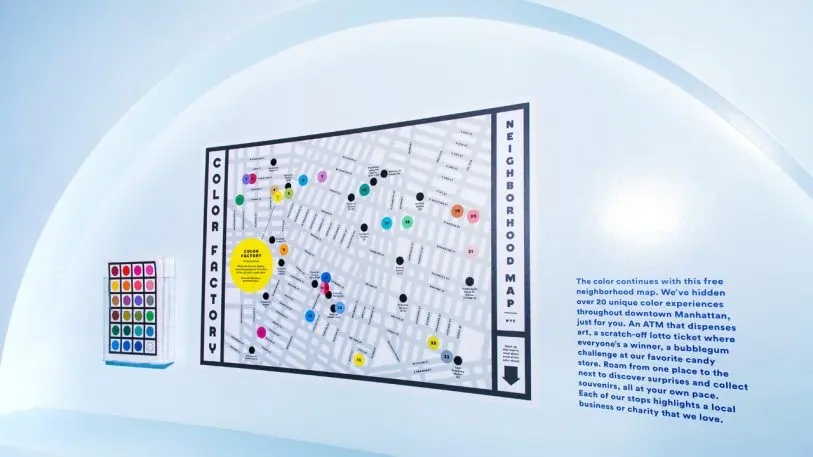
Get people out exploring the neighborhood
Even with all of my questions, snooping and poking around the venue at my own pace, empty and all to myself aside from the maintenance staff, my visit topped out at less than an hour–the official estimate listed in Color Factory’s online FAQ.
While she shies from sharing revenue figures from the venture thus far, Ferney says the surprise success of San Francisco edition allowed them to take on more ambitious programming in NYC: For instance, at the end of the romp, visitors are given a neighborhood map of the local area, plotted with secret destinations–each marked in colorful dots, of course–leading to a scavenger hunt of special surprises, one of which includes an ATM dispensing illustrations by Jason Polan.
Could a neighborhood scavenger hunt, complete with art prizes, become the analog version of Pokemon Go, unhampered by the threat of data collection and geo-location services? If so, it was a welcome nudge away from my screen, and into the urban playground.
Recognize your brand’s excellence by applying to this year’s Brands That Matter Awards before the early-rate deadline, May 3.
