


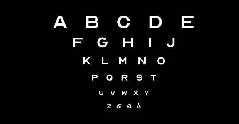
The eye chart you’ve known for your whole life is a lie. Because the letters you read off of it don’t actually make up a whole alphabet. While you’ve probably never noticed it from the optometrist’s chair, there are only 10 unique letters on that chart–putting you 16 letters short of a usable typeface.
Now, a century and a half since eye charts were first standardized, the design firm ANTI Hamar has filled in the gaps, creating a complete functional eye chart font. What’s more, the studio released it as a free font called Optician Sans.
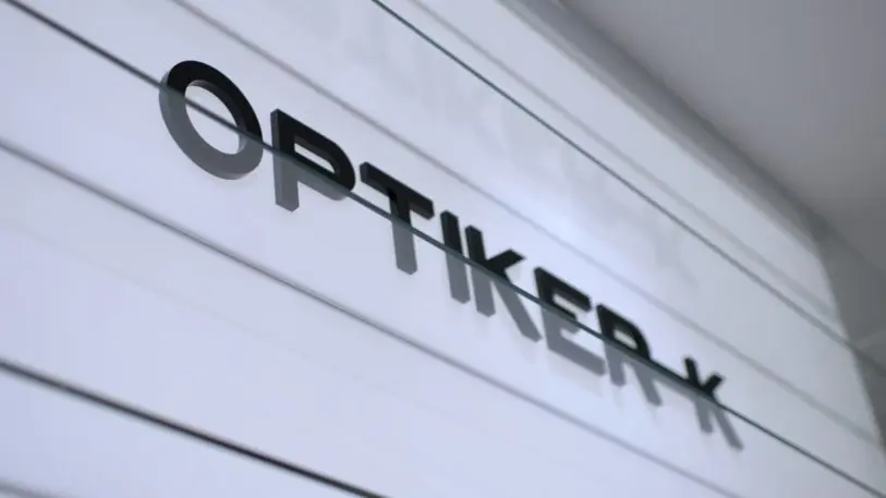
The project began as a rebranding for the Norwegian family optometrist business Optician-K. As the team dug into the history of optometry for inspiration, they discovered that in the 1800s, optometrists each designed their own eye charts for testing patients. There was no standard, though, so the clinical test was far from universal. That changed in 1862 when ophthalmologist Hermann Snellen introduced the Snellen chart. It was made from blocky, seriffed letters that are probably the most closely associated with what we think of as an eye chart.
[Image: courtesy ANTI Hamar]He created 10 letters–10 letters that were tricky enough to be mixed up for one another.
“The point was not to show a complete alphabet, but to measure a patient’s visual acuity,” explains ANTI Hammer art director Simen Schikulski. “So some letters were better, because they looked like other similar letters.”
[Image: courtesy ANTI Hamar]Their construction was anything but random. Snellen built his letters on a pixel-like, 5×5 grid. Each block in this grid translated to exactly one “minute” of a patient’s field of view (a measurement for arc angles), when seated from 20 feet away. In other words, the type’s smallest details offered a true mathematical baseline with which to diagnose someone’s sight.
Nearly 100 years later, ophthalmologist Louise Sloan redesigned the 10 Snellen letters, swapping a few letters out for others. She turned them into a sans serif typeface–slicing away all of the extra filigree into more sleek and streamlined letterforms. Her reasoning was to make the eye chart compatible with another eye test called the Landolt broken rings. These are the glyphs that look something like a backwards or upside down “C,” but can easily be mistaken for an “O.” Sloan’s new letters became a standard in the ’70s and are the basis of the ubiquitous LogMAR chart.
Schikulski’s team wanted to build Optician-K’s new brand from Sloan’s standard, but with only 10 letters, they were extremely limited. (Notably, there’s no “P” “T” “A” or “I” in the set–so even typing the word mark was impossible.) So they filled the typeface out themselves, going all the way back to the original 5×5 grid to construct each letter from scratch.
“We took some liberties on some parts, and stayed very conservative on other parts. We saw that there was some inconsistencies in the original letters in terms of shapes and sizes–as we expected, since the letters were created for optometrists, not as a typeface,” says Schikulski. “So, we made all the optical adjustments (pun intended) you’d expect in a modern typeface, while at the same time keeping things as close to the original letterforms as possible.”
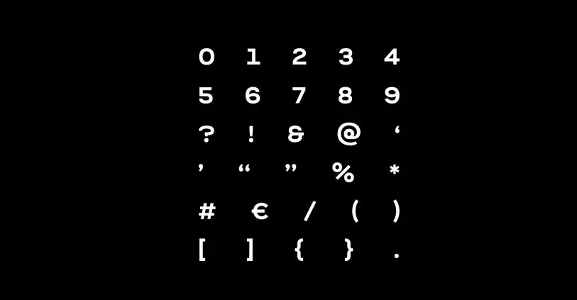
The compromise they came to is beautiful, but of course, a “C” that resembles a Landolt broken ring is nearly illegible at small sizes since that was the whole point of that test. So for designers who prefer legibility over the nod to history, the team developed a few alternate letters that can be used instead.
“After working with the project for a while we saw that this would be a cool thing to give out for free to see how other creative minds could make something cool with it,” says Schikulski. So that’s what they did. And since then, the firm has received a lot of interest from not just designers, but doctors who plan to test the type in their own practices. You can download Optician Sans here to try it for yourself.
Recognize your brand’s excellence by applying to this year’s Brands That Matter Awards before the early-rate deadline, May 3.
