


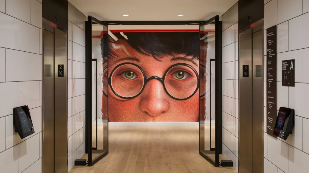
Clifford the Big Red Dog, Harry Potter, and Captain Underpants are staples of any kid’s bookshelf, courtesy of the New York-based book publisher Scholastic. So when the publisher redesigned its headquarters in 2018, it was only natural to decorate the walls with these famed characters.
But that posed a problem: children’s book illustrations look fantastic in context, but they can seem childish when blown up on the walls of a publishers’ office. “It looks great small, in a book, but if you blow it up on vinyl it becomes tacky looking,” says Paula Scher, the Pentagram partner who designed a series of supergraphics for Scholastic’s HQ in New York. “It feels like a promotional piece in a store–if you were at a retail [store] and they blew up a giant image from the book that’d be on some kind of cheesy stand that you threw out in five minutes.”
[Image: courtesy Pentagram]
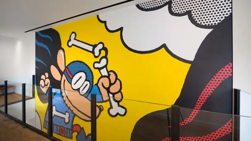
Others are just downright playful. The Magic School Bus comes to life in the form of a giant yellow pegboard with 15,000 dowels. Clifford the Big Red Dog’s portraits are actually shaggy with red fur. A large sculpture of Captain Underpants explodes through one of the walls. In fact, that wasn’t Scher’s original vision. “I wish I could have had Captain Underpants completely as Jeff Koons,” she says, though ultimately she decided that the reference wouldn’t come across to her audience.
Beyond the graphics, Scher’s crowning glory in the space is the reception desk, which is encased in what looks like a floating bookshelf. The 800 books are all replicas of titles from the Scholastic library, with Pentagram-designed fonts along their multi-colored spines. To achieve the illusion that they’re floating, the Pentagram team pinned all of the books to the desk itself, making the appearance as magical as the contents. “Those are their heroes on the shelves,” Scher says.
Recognize your brand's excellence by applying to this year's Brands That Matters Awards before the early-rate deadline, May 3.
